What is the color of the year for 2023? Here are the shades we know so far
Nurturing, grounding and comforting and the words that define our favorite paint brands' Colors of the Year for 2023. We take a peek at what's in store

There's no doubt about it - paint trends represent the mood of the moment. Every fall, paint brands announce their color forecast predictions for the year ahead including their Color of the Year, a shade they believe will define our next circle around the sun. But what are they, and how do brands make their decision?
With so many paint companies out there touting the latest interior design trends, it's hard to keep up with which colors you should be using when it comes to redecorating. Choosing the right color for your home can be overwhelming at the best of times, not least when there are multiple shades that claim to be 'the one' for the upcoming year.
'Colors of the Year are a relatively new phenomenon, but one more and more brands are adopting year after year,' explains Livingetc's Editor, Pip Rich. 'They offer a chance to measure the mood of decorating at a specific moment in time through color, and a chance to reflect how our interiors respond to the world we live in.'
In a nutshell, the hues chosen each year are a reflection of the times we're living in. During the pandemic, these colors veered towards earth tones, safe and grounding, while last year's crop were more cautiously optimistic. As 2023 looms ever closer, we're seeing a move towards warmer nature-inspired tones that nurture our wellbeing by offering coziness and comfort.
To inspire your decorating ideas this fall, we've compiled our top picks from some of our favorite paint brands on the market. 'Of course, some Colors of the Year capture our imagination for decorating our homes more than others,' Pip adds. 'Regardless if it's a gentle neutral or an eye-gaugingly vibrant shade (anyone remember Pantone's Ultra Violet in 2018?), these shades are sure to elicit strong opinions on either side.'

Lilith is an expert at following news and trends across the world of interior design. She regularly shares color stories with readers to help them keep up-to-date with ever-changing trends that promise to add personality into the home. For this piece, she's rounded up all the Color of the Year 2023 shades from across our favorite paint brands that you'll want to decorate with in the year ahead.
1. Dulux – Wild Wonder
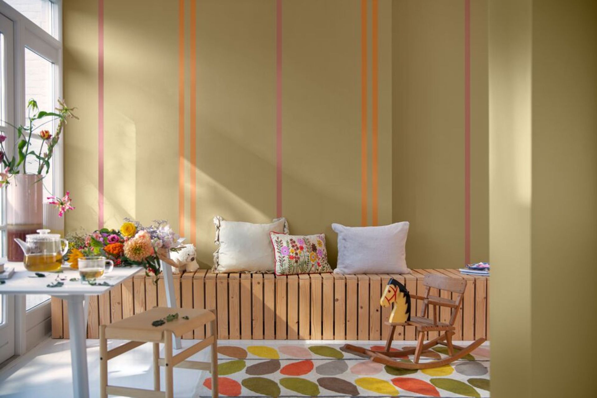
Dulux, staple of the paint world, has released the Dulux Color of the Year 2023, Wild Wonder, a soft golden yellow with a subtle green undertone. The paint shade that's set to be the color trend of the upcoming year reflects our eagerness to prioritize our mental wellbeing during post pandemic, immersing ourselves within calming and enriching spaces.
Nowhere does this better than our natural environment, which forecasters believe is the place to draw inspiration for our interiors in 2023. 'Wild Wonder speaks to us in a language we instinctively understand,' says Marianne Shillingford, Creative Director at Dulux. 'Nature is what inspires us and makes us feel better in our lives and in our homes. That’s why, for the first time in 20 years, our entire color palette is inspired by the rhythms of the natural world.'
This warm, inviting hue is more daring than most, but it promises to bring an uplifting yet cozy feel to any space. Appearing more yellow or green depending on the natural light, it's a versatile color that works well in most rooms of the home.
2. Sherwin-Williams – Redend Point

A beautiful blush pink paint is the comforting color announced as shade of the year by Sherwin-Williams. Redend Point is a gentle and earthy clay pink shade reminiscent of soft desert sands, something we're seeing a lot of across this year's color forecasts.
'Redend Point was inspired by the idea of finding beauty beyond ourselves,' says Sue Wadden, director of color marketing at Sherwin-Williams. 'It's a heartening hue that invites compassion and connection into any space.'
As such, the shade lends itself well to sociable spaces in the home, such as a living room or entryway, where it creates an inviting feel for the family and guests alike. As Sue notes: 'The color is a natural choice for those looking for a warm and joyful neutral in both interiors and exteriors.'
It also has a feel of classic paint colors like Farrow & Ball's Sulking Room Pink, which make it a great alternative for this popular shade.
3. Dunn-Edwards – Terra Rosa

Household name Dunn-Edwards has predicted a similar pink hue will be the talking point for designers in the year ahead. Terra Rosa shows the enduring popularity of a humble pink paint. Darker and smokier than Sherwin-Williams' Redend Point, this deep, rosy pink adds a touch of terracotta to the mix, sure to work in harmony with the growing desire for brown tones.
This rich color exudes coziness while also being elegantly sophisticated - a mood we're all trying to replicate in our homes. 'We’ve moved from an introspection of behaviors to empowerment and action, independence and self-reliance,' says Dunn Edwards' Color Expert and Stylist, Sara McLean. 'We’re putting health and wellbeing first, making time for escapism and embracing nostalgia.'
In the midst of our busy modern lives and the unpredictable events happening across the world, Terra Rosa offers solace and stability. 'This translates to design through lush, sophisticated touches with equal parts prettiness and drama,' Sara adds.
4. Mylands – FTT-006

Paying homage to the enduring Barbiecore trend that's graced our Instagram feeds this summer, British paint brand Mylands have announced a hot pink shade, FTT-006 , as their Color of the Year for 2023.
As part of their Film, Television and Theatre range, (marking their longstanding involvement with the British entertainment industry), FTT-006 adds unique character and personality to any space. A bold choice for the home, it's made from a strong mix of red and magenta for an energetic feel, perfect for a playful bathroom or statement woodwork. It's the perfect antidote for trying times.
'FTT-006 is an unfailingly cheerful and bold pink that’s proving not only to be incredibly popular, but also more enduring than just another trend or fad,' says Dominic Myland, color expert and founder of Mylands. 'It’s a confident shade with the power to completely transform a space, and its intensity makes it hard to forget.'
5. Krylon - Spanish Moss

Krylon spray paint have opted for a more natural hue for their Color of the Year with a deep green called Spanish Moss. Available in a matt finish only, this earthy green balances both cool and warm accents with its grey undertone, making it extremely versatile.
'This year’s color selection is inspired by the comfort and reassurance found in the past, as we look to find contentment in the future,' said Ashley Banbury, Senior Color Designer for Krylon. 'Spanish Moss is a timeless, organic hue that embraces the raw beauty of the natural world. Historically, green has inspired homeowners both indoors and out, and today, it continues to deliver a renewed and contemporary look to heritage pieces.'
We think this is one of the best green paints to use for your upcycling DIY projects. With more character than subtle sages and pairing beautiful with brass accents, we predict Spanish Moss will be the color for our furniture in 2023.
6. Benjamin Moore - Raspberry Blush

Vivid, vibrant and vivacious are the three adjectives that capture Raspberry Blush, the new Color of the Year from Benjamin Moore. The definition of charismatic color, this rich coral shade is tinged with a hint of pink which promises to inject energy into any space.
Amidst such unpredictable and unstable times, Raspberry Blush is all about entering the new year with optimism. The bold color is at once comforting and playful, offering the perfect opportunity to experiment with the bright blues, soft taupes, and pale pinks that dominate their 2023 palette.
According to the team at Benjamin Moore, their 2023 palette was chosen for its distinct presence and personality, so be bold! We recommend embracing these characterful hues in a kitchen color scheme or living room for a more convivial, uplifting space perfect for hosting guests.
7. Graham & Brown - Alizarin
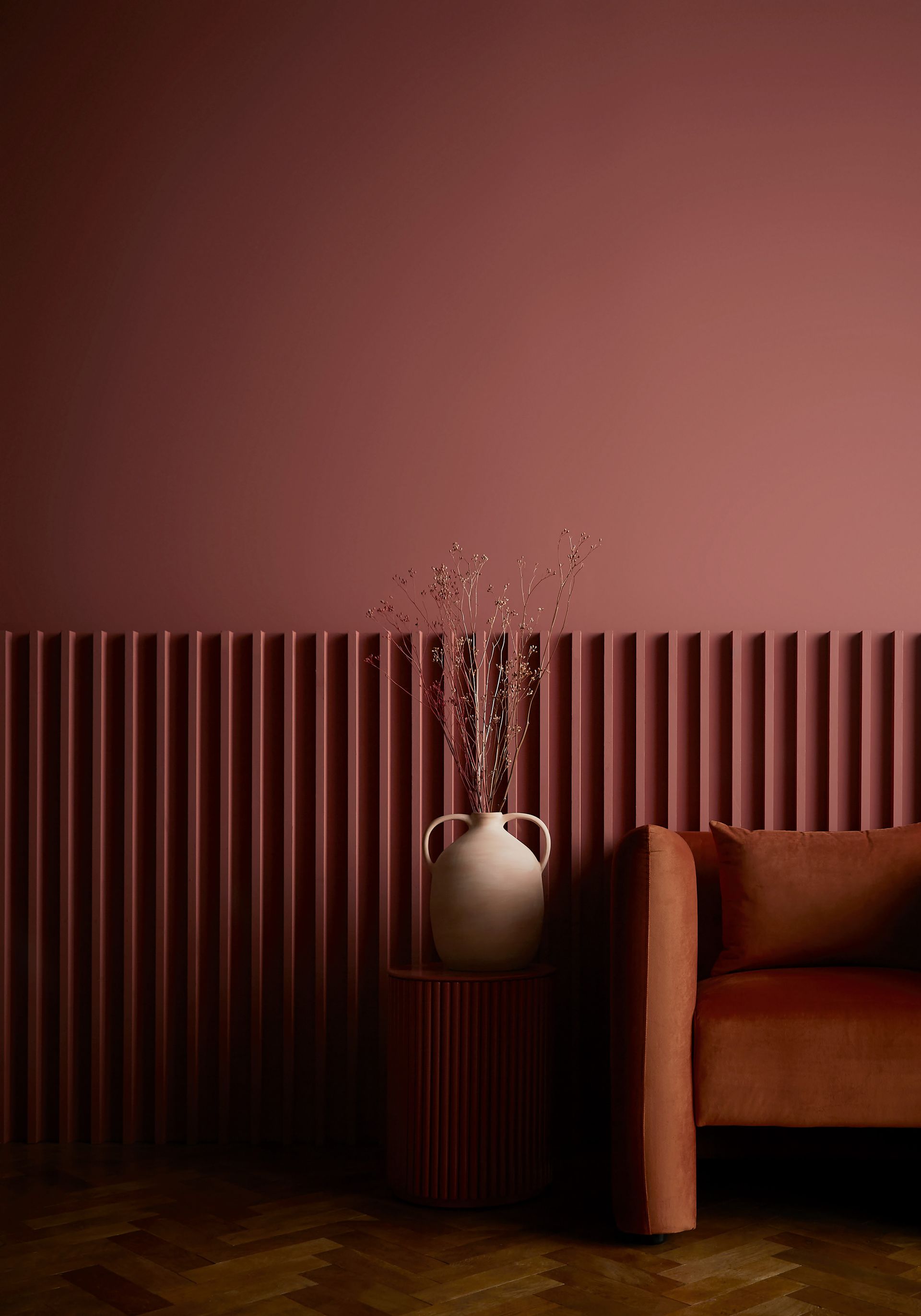
British paint brand Graham & Brown have also predicted an earthy pink-red hue will dominate our interiors in 2023. Their Color of the Year, Alizarin, is a wonderfully warm auburn red shade named after a pigment derived from the Rubia plant species, which has historically been used as natural dye.
'This deep and moody hue embodies the best russet reds and spicy terracotta shades, highlighting the beauty found in natural earthy tones,' says Maryanne Cartwright, Head of Design at Graham & Brown. 'In the studio we enable this by seeing the beauty in items that would be discarded and making them shine again, creating a bespoke and special object.'
Instantly comforting and inviting, this shade is perfect for use in small spaces to create a cocooning effect or, equally, in larger rooms where it has a more luxurious feel. The darker, warmer tones in this shade feel quintessentially British, and we think it would work especially well on woodwork details, like door trim.
8. C2 - Tiramisu
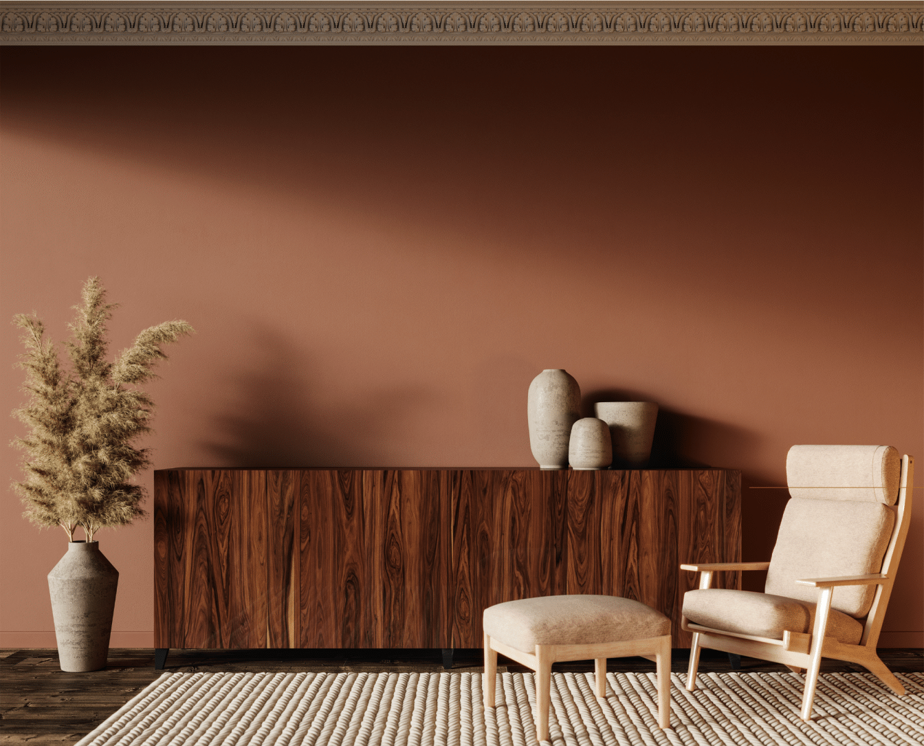
Similar to Dulux's approach, C2's Color of the Year for 2023 is all about going back to basics and celebrating our origins. Tiramisu is a rich, restorative cedar with a warm undertone, inspired by the diverse range and tonalities of natural wood. Two complimentary colors, Stout a near-black, and En Pointe, a graceful off-white, culminate in a grounding neutral canvas perfect for a neutral color scheme.
'Our capsule of colors are based on research, trends, and most of all, intuition, with much consideration to how they will translate to the human element of design,' says Philippa Radon, C2 Paint Color Specialist. 'We take inspiration from around the globe, imbued by the diversity and wonder of culture, craft, and nature, where each instills a sense of originality and reflects an authentic connection to its source.'
We know the brown color trend isn't going anywhere anytime soon, and this mid-tone shade is the perfect base for those earthy palettes. Nurturing and dynamic, Tiramisu emits warm, ambient undertones that flicker gold and copper in different lightings. The nuanced color provides a rich canvas for neutral furnishings and with its rich, grounding tones.
Be The First To Know
The Livingetc newsletter is your shortcut to the now and the next in home design. Subscribe today to receive a stunning free 200-page book of the best homes from around the world.

Lilith Hudson is the News Editor at Livingetc, and an expert at decoding trends and reporting on them as they happen. Writing news, features, and explainers for our digital platform, she's the go-to person for all the latest micro-trends, interior hacks, and color inspiration you need in your home. Lilith discovered a love for lifestyle journalism during her BA in English and Philosophy at the University of Nottingham where she spent more time writing for her student magazine than she did studying. After graduating, she decided to take things a step further and now holds an MA in Magazine Journalism from City, University of London, with previous experience at the Saturday Times Magazine, Evening Standard, DJ Mag, and The Simple Things Magazine. At weekends you'll find her renovating a tiny one-up, one-down annex next to her Dad's holiday cottage in the Derbyshire dales where she applies all the latest design ideas she's picked up through the week.
-
 The 12 Best Table Lamps for Reading —I'm a Certified Bookworm (and Shopping Expert)
When it comes to table lamps for reading, I don't mess around. If you're the same, this edit is for YOU (and your books, or course — and good recommendations?)
By Brigid Kennedy Published
-
 "It's Scandi Meets Californian-Cool" — The New Anthro Collab With Katie Hodges Hits Just the Right Style Note
The LA-based interior designer merges coastal cool with Scandinavian simplicity for a delightfully lived-in collection of elevated home furnishings
By Julia Demer Published
