What is Barbiecore? Top designers on this fun new decor trend that's perfect for summer
So much more than just plastic and pink, Barbiecore takes its lead from Margot Robbie's movie style for a fun new decor trend
When someone says Barbie, your mind conjures a plastic blonde doll on a beach lined with palms, clad in an excessive amount of pink. It's this Barbie pink color - in all its bright, playful, and girly glory - that's been taking the world by storm.
With the filming of the new live action Barbie movie starring Margot Robbie and Ryan Gosling underway, there's been a recent resurgence in this hyper-pink aesthetic. In the fashion world, Anne Hathaway, Vanessa Hudgens and Kim Kardashian have all recently graced the red carpet with their own take on the hot-pink look.
But as most young girls will tell you, it's not just Barbie's clothes that are pink, but her entire home. The trend, known as Barbiecore, has infiltrated its way into our interiors, so we asked designers how we should be embracing this quirky and playful trend.
What does Barbiecore mean for interiors?

Although Barbie's Malibu Dreamhouse might have been, Barbiecore doesn't have to mean hyper-pink homes. The Barbiecore trend is all about embracing a flirty, fun and smile-raising vibe that's perfect for summer.
'It's about creating a free-spirited and uplifting space where no-one needs to take themselves too seriously,' says Pip Rich, editor of Livingetc. 'This doesn't have to mean wall-to-wall pink but could instead mean floral cushions, garland lights, and retro furniture.'
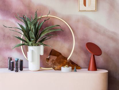
Hot-pink, which can often feel a bit garish in the home, isn't the only way to embrace this trend either. More subtle blush pinks, such as Farrow & Ball's pale shade Setting Plaster, can create a softer feel, or it can be paired with richer colors to make a space feel more sophisticated.
'Setting Plaster can feel a bit soft and fluffy on its own,' says Joa Studholme, Farrow and Ball's color curator. 'But you can make it seem more modern by contrasting it with Preference Red. This a really dark, luxurious shade and it's really exciting when you're combining these two hues in one space.'
Think outside the box

As mentioned, Barbiecore doesn't have to mean the pink bedroom of your childhood. All-pink walls can feel a bit overwhelming in areas such as the living room or entryway. Instead, if you want to experiment with pink paint, why not consider painting a door trim, shelving, or kitchen bar stools to make a statement? These smaller features will catch the eye and bring an element of playfulness into a room without feeling imposing.
'My pantry is painted a seriously hot pink,' says Joa. 'It's joyous and it makes you smile but you go into it, get what you need, and come out. You don't spend any time in there, otherwise it would be slightly exhausting.'
She recommends using brighter pinks in these sorts of smaller, functional spaces. 'Maybe it's a downstairs powder room or even the inside of a cupboard. Nothing makes you smile more than opening your cupboard and there's some really bright color in it. Then you can shut the door so you don't have to be with it all the time. Be adventurous!'

Pink bathroom features can also help achieve this fun-loving effect in the home without being garish, such as this bathroom sink chosen by Jeffreys Interiors.
'We were looking for bathrooms that would play a little tongue in cheek,' says Jo Aynsley, design director. 'We came across this gem of a sink at The Discontinued Colored Bathroom Company. Along with the towel rail and shower fittings, the shape echoes a more traditional style, however the bright pink color paired with the more contemporary finishes, curves, clean lines and tile patterns give it a whole new lease of life. Less 80s avocado suite, more Milan Chic.'
Be careful what you pair pink with

People often find it difficult to know the best colors that go with pink. We've all heard warnings about clashing pink and red or perhaps pink and orange, but there are instances when they work - the trick is to know when, and in what setting.
American-based designer and the brains behind the real-life Barbie Malibu Dreamhouse in California, Jonathan Adler, says it all depends on what you put it with: 'I think when playing with pink, it's not where you use it, it's what you use it with.'
These different pairings can create an entirely different vibe. As Jonathan adds: 'Pink and black can be really like harsh but could be punky, which is not a bad thing. Pink and grey can be mournful in an eighties way, while pink with orange can feel very sixties. There's also pink and white, which is very fresh.'

Think about what you use your room for, how much light it has, and what color your furniture is before adding pink into the mix. If you have natural wood flooring, try using a softer pink which pairs well with brown. If you have a dark orange sofa in your living room, maybe a pink wall will be too much.
In this last case, you could embrace the clash and emulate a sixties theme by adding pink 'flower power' patterned cushions. It's important to think about the textiles too. David Harris, design director at Andrew Martin says, ‘Start with the soft base linen colors and tickings for your sofa, and then try mixing in hotter pink cushions for added zing.'
If your indecisive, try double sided cushions which you can flip depending on your mood. 'Choose hot pink on one side and cool blue on the other,' says David. 'It's possible to have a bit of what you fancy, even if it’s not all of the time!’
Be The First To Know
The Livingetc newsletter is your shortcut to the now and the next in home design. Subscribe today to receive a stunning free 200-page book of the best homes from around the world.

Lilith Hudson is the News Editor at Livingetc, and an expert at decoding trends and reporting on them as they happen. Writing news, features, and explainers for our digital platform, she's the go-to person for all the latest micro-trends, interior hacks, and color inspiration you need in your home. Lilith discovered a love for lifestyle journalism during her BA in English and Philosophy at the University of Nottingham where she spent more time writing for her student magazine than she did studying. After graduating, she decided to take things a step further and now holds an MA in Magazine Journalism from City, University of London, with previous experience at the Saturday Times Magazine, Evening Standard, DJ Mag, and The Simple Things Magazine. At weekends you'll find her renovating a tiny one-up, one-down annex next to her Dad's holiday cottage in the Derbyshire dales where she applies all the latest design ideas she's picked up through the week.
-
 These 12 Best Table Lamps for Your Desk — Perfect Glows for a Creative Home Office
The best table lamps for your desk is have a soft, targeted glow. Elevate your WFH set-up with these stylish picks endorsed by Style Editor Brigid Kennedy
By Brigid Kennedy Published
-
 The Nespresso VertuoPlus is 30% Off for President's Day, and it's Kim Kardashian's Coffee Maker of Choice
This sleek and stylish coffee maker was spotted in Kim's home bar, and you can currently save $60 if you buy yours from Amazon
By Lilith Hudson Published
-
 The Y2K interiors trend is a controversial look. But we found these 3 things to love about it
Y2K is here to stay. Forget contemporary interiors – these designers predict that 2023 will resemble something closer to 2003...
By Lilith Hudson Published
-
 We're itching to decorate with Benjamin Moore's Color of the Year 2023 – this insider explains how it's done
Benjamin Moore's Color of the Year, Raspberry Blush, is a vibrant and vivacious shade we can't wait to decorate with. Their Director shares her tips on how it's done
By Lilith Hudson Last updated
-
 This Spanish hotel suite might be my favorite example of modern rustic style ever
Natural plaster, exposed wooden beams and patterned tiles culminate in a beautiful example of modern rustic style in this boutique Spanish hotel
By Lilith Hudson Published
-
 Be the first to see the new lighting collection Livingetc has designed for Lights & Lamps
Marble, concrete, rattan and crackle glaze, we couldn't be prouder of our second lighting collection for Lights & Lamps
By Pip Rich Published
-
 There's a new coffee table styling trend designers are loving for a less pretentious living room
Stacking coffee tables high with books is the interior trend we didn't know we needed. Here's why you should try it, and why it might just have been inspired by Elton John
By Luke Arthur Wells Last updated
-
 Livingetc Style Awards 2022 - see the best in modern design as the winners are announced
Our judges have chosen the very best products for your home now
By Livingetc Published
-
 Top designers are all following this new trend that makes your home office a much more creative space
Hint: it's a piece of furniture you wouldn't have thought of but that changes everything about how your office feels
By Aditi Sharma Maheshwari Published
-
 5 ways to make the right color choices to totally transform your space, by Little Greene's Creative Director
Little Greene's Creative Director Ruth Mottershead knows the power the perfect palette can have. Here's how to get it right
By Ruth Mottershead Published
