Dulux Color of the Year 2023 – Livingetc's experts and editors react to this calming color trend
The Dulux Color of the Year 2023, Wild Wonder, is all about reconnecting with nature to instil a sense of calm
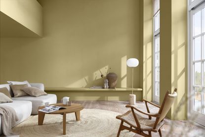
After a year that's seen us reconnect with the sociable spirit of 'home', it makes sense for Dulux's new Color of the Year 2023 Wild Wonder to speak to nature, rebirth and regeneration.
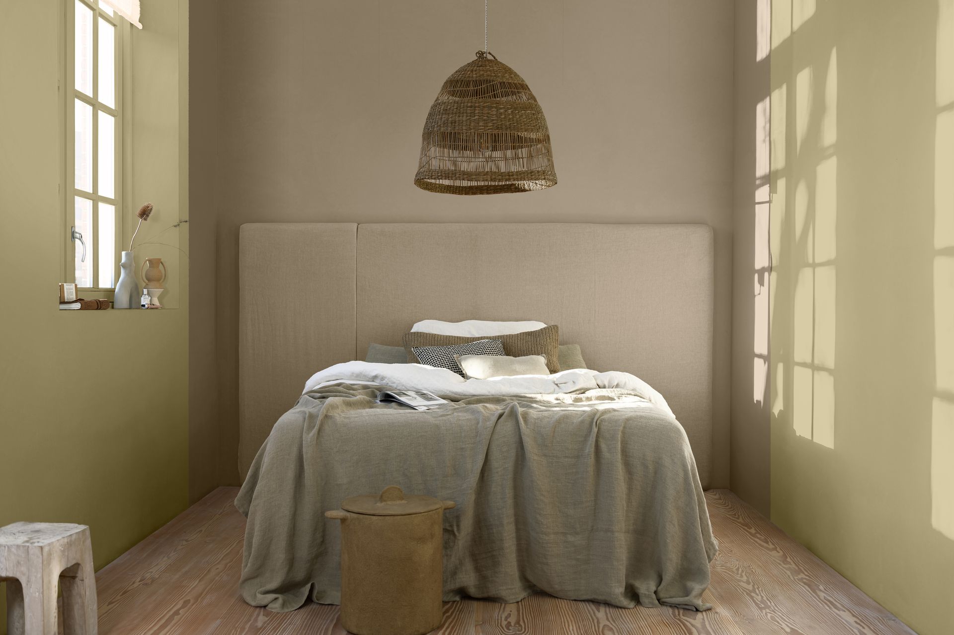
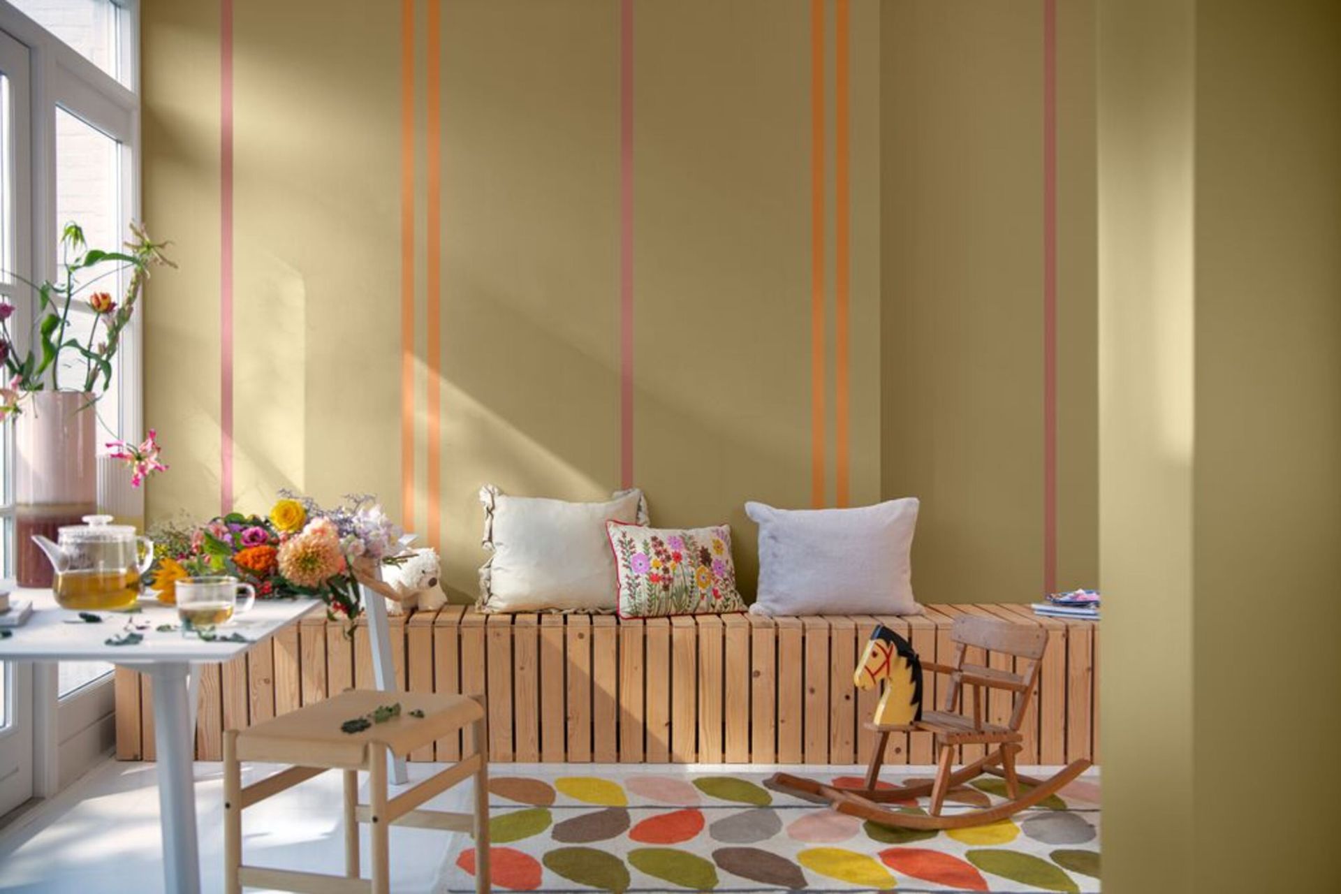
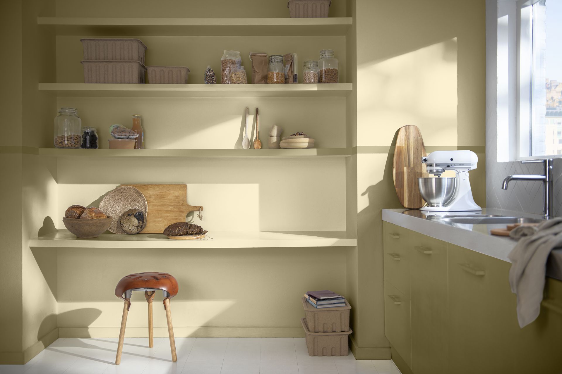
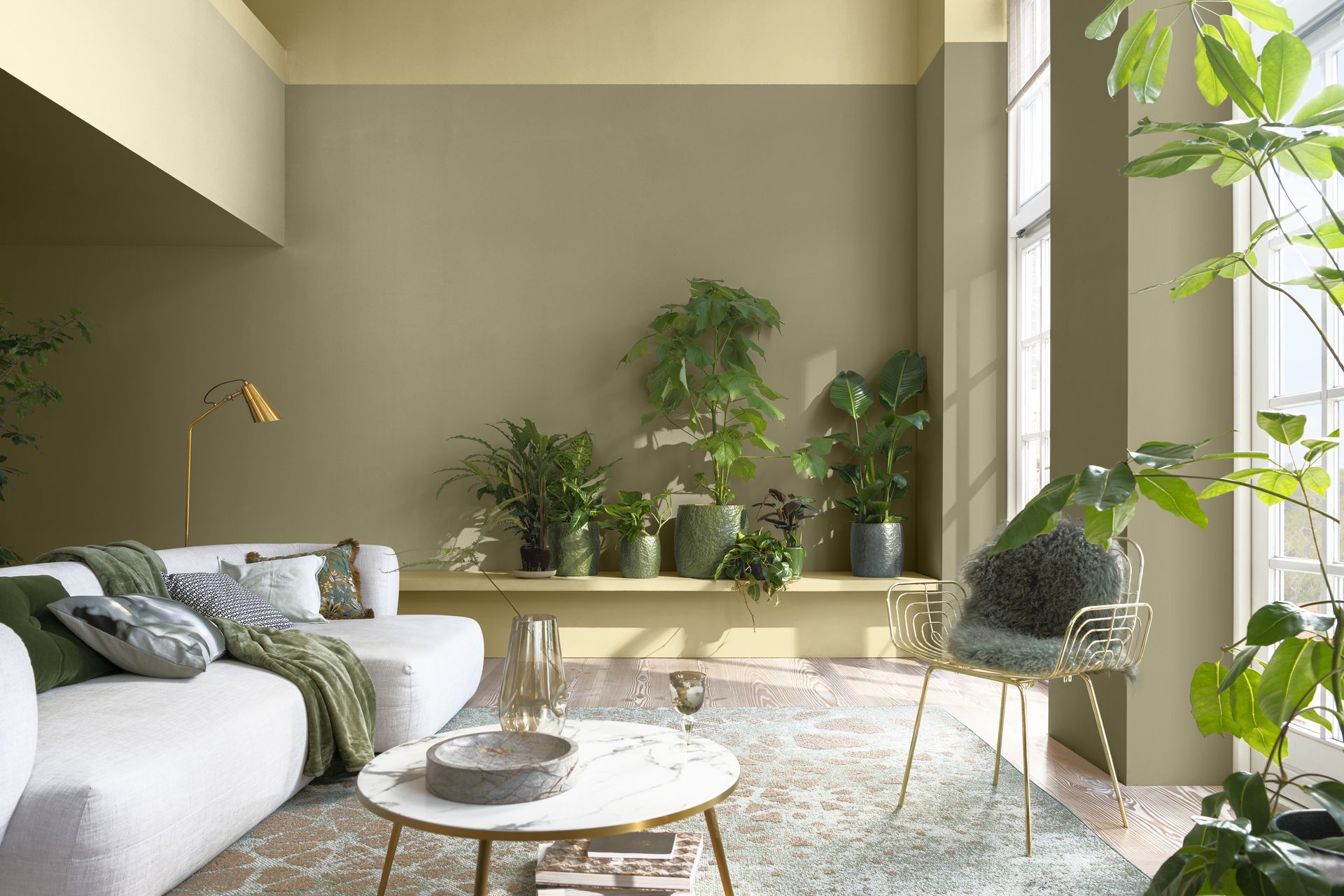
Wild Wonder is a soft yellow with a green undertone that looks more yellow or green depending on the light it's in. It's a hue inspired by the warm tones of harvested crops with an uplifting glow that's sure to instill a sense of energy and optimism in any room.
The paint color that's set to be an interior design trend of the year ahead is said to reflect our eagerness to prioritize our mental well-being, immersing ourselves within calming and enriching spaces. Nowhere does this better than our natural environment, which forecasters believe is the place to draw inspiration for our interiors in 2023.

Lilith is an expert at following news and trends across the world of interior design. She regularly shares color stories with readers to help them keep up-to-date with ever-changing trends that promise to add personality into the home. For this article, she spoke with Dulux's color expert as well as leading designers to gather advice on how to use Dulux's Color of the Year 2023 in our designs.
While decorating with neutrals has proven to be a timeless design idea that helps to create a calming and cozy home, Wild Wonder's nuanced color composition means extra care must be taken when incorporating it into our designs, especially in darker, north-facing rooms.
To help you get a better idea of Wild Wonder and how to embrace it in your home, Livingetc's editors and experts share their opinions on the unique shade, alongside tips on how to create a color palette using this humble hue.
Pip Rich, Editor
Livingetc's Editor Pip Rich is a seasoned pro when it comes to color trends, having seen many successful (and unsuccessful) color forecasts come and go in his time.
Pip thinks Wild Wonder has the potential to be a popular shade for the year ahead, but he's quick to note that it would probably work best used alongside warmer shades in a room with plenty of natural light.
'I think this color plays well into what we're seeing in design at the moment - greens with yellow bases in them that work well with oranges, terracottas and paprikas,' he says. 'This color palette is really smart and cozy but warming, too.'
For a statement paint idea, Pip recommends experimenting with tonality in a monochromatic color scheme. 'I'd use this shade on a ceiling when perhaps I've used darker greens lower down in the room with bolder accents on the woodwork,' he explains.
Ellen Finch, Deputy Editor
Ellen, Livingetc's Deputy Editor, believes the power of a bright and optimistic paint color like Wild Wonder shouldn't be underestimated. After the uncertainty of the past few years, she thinks the grounding, mellow tone of Dulux's Color of the Year is exactly what's needed in our homes.
'We've seen neutrals take the crown for a couple of years now, but Wild Wonder feels a little different – it's bright, dynamic and charged with energy, yet still adaptable enough to be used in so many palettes and schemes,' she says.
Ellen suggests Wild Wonder as an option for fans of yellow who want to avoid the potentially garish appearance of brighter hues. 'In taking its inspiration from nature, it feels like a lovely gentle alternative to yellow, be it sunshine or mustard,' she explains. 'I'm obsessed with yellow kitchens at the moment, and this feels like a great alternative for a warm, uplifting but more pared-back space.'
While she sees it making a great addition to a neutral color scheme for a calming social space like a living room, she agrees that brighter color combinations could be the way forward. 'Pistachio feels like the perfect pairing – or perhaps lilac, the interior world's ongoing color love, which would make for a more playful look,' she adds.
Aditi Sharma Maheshwari, content editor
Livingetc's Content Editor, Aditi, is no stranger to a colorful interior, and she knows a well-executed paint idea when she sees one. Her appeal to Wild Wonder though is largely to do with the emotions it evokes.
'Wild Wonder reminds me of the outdoors, the soothing fields, and invokes a sense of freedom,' she says. 'While fall, and the cold winter months will soon take over, interior colors will help us feel warm, and cocooned yet in touch with the outdoors. This hue does just that.'
Aditi also praises the color for its sophisticated feel. 'The color has an inherent sense of wellbeing and a soothing, understated yet elegant look,' she explains. 'It can work as a wonderful hue for color layering. Pair it with other warm tones of orange and yellow, or for a bold statement, red. If you want a refreshing, close-to-nature look, partner up this tone with moss green or sage green.'
Eva Sonaike, interior designers
While not a Livingetc editor, designer Eva Sonaike is certainly part of the Livingetc family. Although she isn't a personal fan of neutrals and is better known for embracing bolder color palettes, she's open to incorporating Dulux's new Color of the Year for 2023 in her designs.
'I feel like this color would make a really nice neutral backdrop in our homes that can offer flexibility to experiment with more color around it,' she explains. 'Because of its green undertone I'd definitely pair it with warmer colors like soft oranges and yellows, and avoid combining it with cooler shades.'
Eva says she wouldn't be afraid to color drench a room using Wild Wonder by painting the ceilings and walls the same color. 'I think it would look beautiful when used floor to ceiling in a living room, paired with a really dark green velvet sofa,' she explains. 'I also think it could look really elegant as a color on kitchen cabinets because it's so fresh and clean without being clinical.'
In terms of how Wild Wonder speaks to the year ahead, the creative director believes the shade is an optimistic one. 'We're living through really uncertain times,' says Eva. 'Going back to basics during such a challenging time is very important and this color defines rebirth and regeneration. Hopefully it's a sign that there are new beginnings in store.'
Be The First To Know
The Livingetc newsletter is your shortcut to the now and the next in home design. Subscribe today to receive a stunning free 200-page book of the best homes from around the world.

Lilith Hudson is the News Editor at Livingetc, and an expert at decoding trends and reporting on them as they happen. Writing news, features, and explainers for our digital platform, she's the go-to person for all the latest micro-trends, interior hacks, and color inspiration you need in your home. Lilith discovered a love for lifestyle journalism during her BA in English and Philosophy at the University of Nottingham where she spent more time writing for her student magazine than she did studying. After graduating, she decided to take things a step further and now holds an MA in Magazine Journalism from City, University of London, with previous experience at the Saturday Times Magazine, Evening Standard, DJ Mag, and The Simple Things Magazine. At weekends you'll find her renovating a tiny one-up, one-down annex next to her Dad's holiday cottage in the Derbyshire dales where she applies all the latest design ideas she's picked up through the week.
-
 How to Thaw a Frozen Pipe — Learn Everything You Need to Know in 5 Minutes With This Guide
Winter storm caught you off guard? We asked an expert — just how do you thaw a frozen pipe?
By Hugh Metcalf Published
-
 The 12 Very Best Silk Bedding Pieces — As Our Style Editor Says: 'It's What Dreams Are Made Of!'
Slumber in lustrous luxury with the very best silk bedding sheets, duvets, pillowcases, and more — your sleep score will thank us later
By Julia Demer Published

