Best green paints – 9 gorgeous shades as chosen by top designers
Choosing the best green paint can be overwhelming, but our expert insight and suggestions will help you get it right
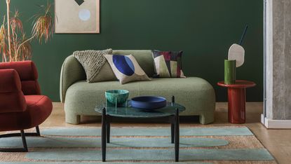
The color green has an emotive quality – just thinking about it calms you down, because it is nature's hue. The color also symbolizes rebirth and renewal, invigorating spaces with optimism. There's no doubt that this shade has a rightful seat in interiors. And from vibrant, playful to dramatic, there's a best green paint to suit all styles.
The appeal of green is unsurprising, as its vast palette injects elements of growth and renewal across the walls of our homes, at a time when we all need it the most. This fresh paint idea is taking over interiors and can be seen on walls, cabinets, countertops, and even ceilings.
‘A dark green is particularly effective for giving us a soothing feeling in rooms where we seek comfort such as a bedroom or living room’ says Ruth Mottershead, Creative Director of Little Greene. ‘Dark greens make us feel reassured and comfortable,’ agrees Dominic Myland, CEO of Mylands. ‘Because they’re so prevalent in nature, they bring a sense of calm to a space and they help us feel connected to the outside world.’
However, with so many shades to choose from, it is hard to know which particular green to begin with – until now. If you're looking to go green, then start with the suggestions of some of our favorite designers, who share the natural hues they have welcomed into their own homes...
How to choose the best green paint

There are several ways to determine which green paint is for you. A rule of thumb is that deeper tones should be reserved for places that receive natural light. This way, the interior won't feel too closed in. Lighter tones, on the other hand, work in almost all areas with varied types of lighting. Also, tones can be chosen based on the mood you want to create. If you’re seeking a cozier feel, choose green on a darker end. For a more serene vibe, a lighter green may be better.
Once you have a few choices of greens you'd like to experiment with, consider painting swatches of those on the walls. Keep that color on your wall for a few days, just to see how you live with it. You also want to keep in mind whether your paint color has cool or warm undertones – for this, a designer can be invaluable in helping you identify the subtleties. Look at the samples at various times of the day, to see how the hue changes with the different light settings. When a clear winner emerges, you can start to build out your palettes with other colors that go with green.
1. FFT collection 012, Mylands – a bold turquoise green

Disregarding the famous myth that kitchen colors should remain neutral, this green kitchen laced with the rich, bold shade creates an eye-catching setting. Perhaps the busiest space in the house is the kitchen, so smart design ideas are always preferable. In smaller city apartments, where spaces do double duty, the kitchen usually ends up becoming a socializing space. One of the lushest kitchen color schemes, this hue gives a wonderful, decorative touch and makes the room truly stand out.
'The green wall painted Film Television and Theatre by Mylands is directly connected to a wall of Ivy in our garden and that connection is seamless! It also reminds us of malachite, our favorite stone,' says Jordan Cluroe, co-founder, 2LG Studio who designed this fabulous space.
2. Balsam, C2 paints – a well-balanced, warm green

Going green doesn't have to mean a whole remodel. You can ditch the walls and instead paint furniture or storage units to give them new lease of life. There's a growing trend for painting woodwork the colors you would have once just kept to the walls. The effect can be dramatic, adding a contemporary twist to a traditional room. Remember, even in the most subtle sage shades, the color green easily stands out.
'This home office has natural light pouring in through lovely large windows allowing the surrounding verdant gardens to be visible from this area of the house. Balsam by C2 Paints proved to be the perfect color to compliment the varying shades of green and allowed us to achieve a seamless visual experience from indoor to outdoor in this Northern California home,' says Stephanie Waskins, co-founder, LARK + PALM.
3. Lick Home, Green 09 – a pale sage green

Green 09 by Lick
Nobody knows color quite like Eva Sonaike – the London-based designer who has established herself through her daring color spectrum and signature rainbow hues. So, we couldn't wait to hear all that Eva had to suggest.
'I love Lick's Green 09. I am just about to paint my dressing room in this color. It is a pale green but light and refreshing at the same time. This shade feeds my senses and evokes a feeling of happiness and hope in me.'
'Lick are also launching their first outdoor paint, and I am contemplating painting our rear extension in this shade,' Eva added.
4. Studio Green, Farrow & Ball – a deep, dark green

In some ways, green is one of those 'go big or go home' colors, and a dark hue like this is impactful in small doses, especially when used to highlight interesting architectural elements. In this space, Colin Stief, co-founder, General Assembly, decided to give a deep-toned, cocooning effect to this bedroom with Studio Green by Farrow & Ball. To balance the daunting tone, a vibrant wallpaper was used, reducing the moody effect of the wall color.
The hue has slight hints of black when the light is low and can appear much darker than the original paint, so be sure with any dark paints to order samples and text out how dark the shade will be in your space.
5. Treron, Farrow & Ball – a grey-green shade

If you're looking for kitchen cabinet color ideas, Treron is an ideal shade; this is also the dark green version of the classic Farrow & Ball Pigeon. While the color may have more of an understated, traditional look, it works perfectly well in modern homes too, where natural materials abound. Paired with marble and white tiles, this slightly rustic kitchen has a luxurious but calming feel.
'When selecting paints we find it's important to get the mineral balance right, to give a tone that is natural and has a calm, muted quality. In our Mews, Belgravia project the custom-made HÁM kitchen is painted in Farrow & Ball's deep green, Treron,' says Tom Cox of HÁM interiors.
6. Andrew Martin, Canopy – a deep grey green
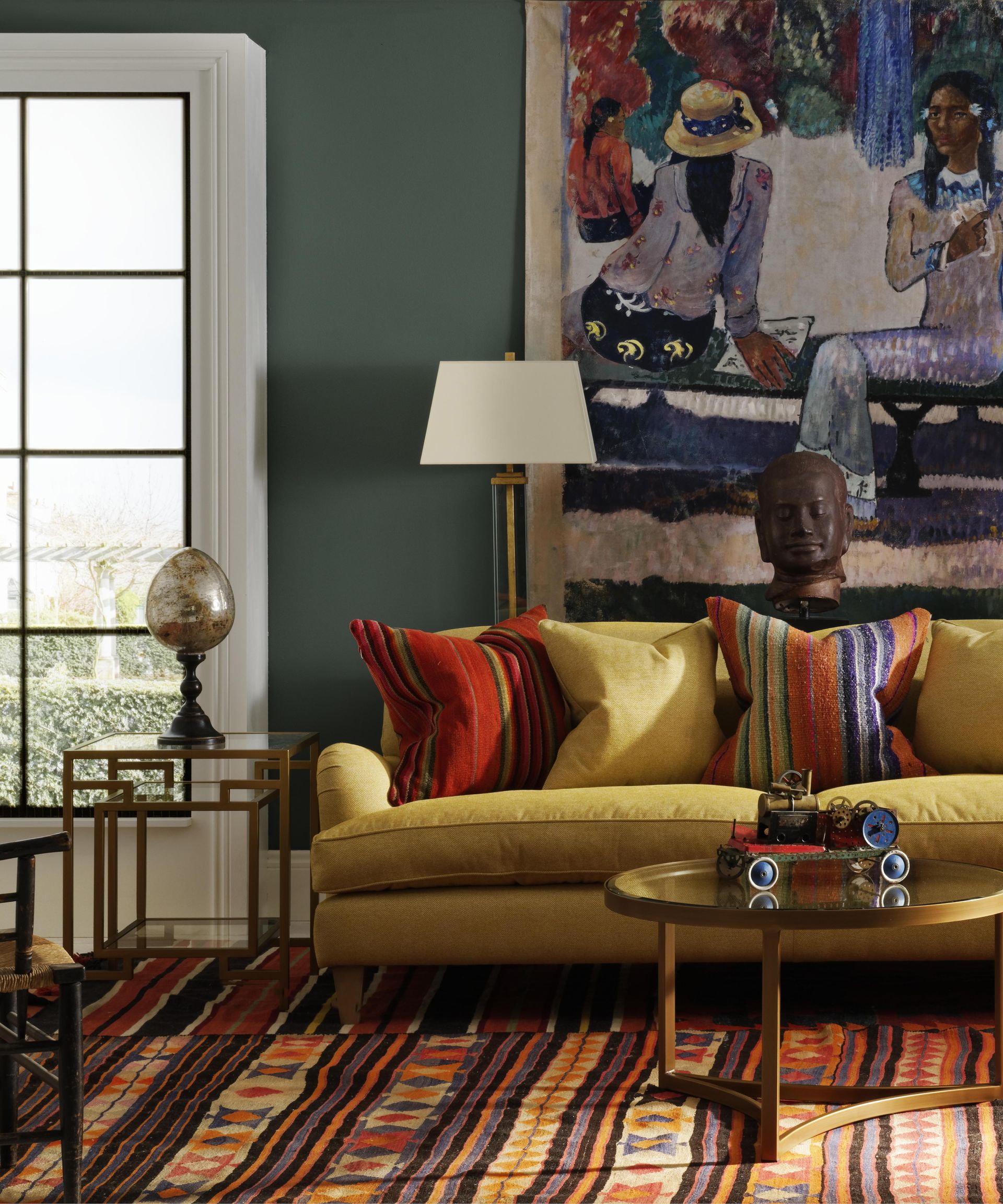
Canopy by Andrew Martin
In the wake of Andrew Martin's new paint collection, Founder Martin Waller suggests two shades to bring into your home Guatemalan Jungle and Canopy. However, the designer offers his suggestions with a stark warning that might just surprise you.
'Having painted a room green, it may take time to accustom yourself to the look. You're likely to be horrified. People find it difficult to cope with change. Leave it for a week, and your feelings will alter. I suspect you won't hate it, and if you do, repainting isn't that difficult.'
'If you are still hesitant, start your transformation in a cloakroom or small bedroom, since richer colors work well in such spaces, despite the accepted wisdom that white paint makes a room seem larger,' Martin added.
7. Guacamole, Benjamin Moore – a bold saturated green

If you're looking for bedroom color ideas, this bold accent green is a great contender as it gives an elegant touch to the bedroom while the white walls and ceiling give the darker hue a lift. Guacamole being a saturated hues does not overpower and helps create an outdoorsy mood. The color painted on the window wall conjures an indoor-outdoor effect, bringing the hues of nature and the blue skies together.
'Green symbolizes growth, harmony, and freshness. I am passionate about infusing biophilia as a way to have positive effects on well-being. Guacamole by Benjamin Moore has so many organic references and I believe it brings the healing powers of nature when you use it in your space,' says Jennifer J. Morris, principal, JMorris Design
8. Garnish, Dulux – a yellow-green mix

Yellow tones greens are ideal for enhancing light-filled spaces. They have a very fresh, spring-like feel that looks so crisp when paired with whites, as can be seen in this living room/study space.
'The green study room is a place of contemplation and is used mostly in the evening. This shade of green is calm, contemplative, and has a lot of yellow in it. I was inspired by the color of brass in the Sir John Soane Museum in London, and I used an Old Sanderson color called Green Lane Lt, which is sadly no longer available. A close match is Dulux Garnish (90YY 21/371),' says Natalie Tredgett of Natalie Tredgett Design.
9. Dry Sage, Asian Paints – a pale calming turquoise

Many psychologists talk about the calming effects of green on the mind. Many color studies have proved that green has more positive emotional connotations. In that respect then, it's the perfect bedroom color that needs to be calm and restful.
In this bedroom, Mahek Lalan, principal architect, SML Architects wanted to create a wall of memory and the color that could uplift the black and white family portraits was this Dry Sage by Asian Paints.
'Also, we chose this hue to resemble the fresh green color of lush vegetation; something that was visible from the windows of this space,' says Mahek. While it may seem counterintuitive to have a dark bedroom as the deep hue won't boost light, choosing it anyway will help emphasize the coziness of the room.
Best green paint colors for bedrooms
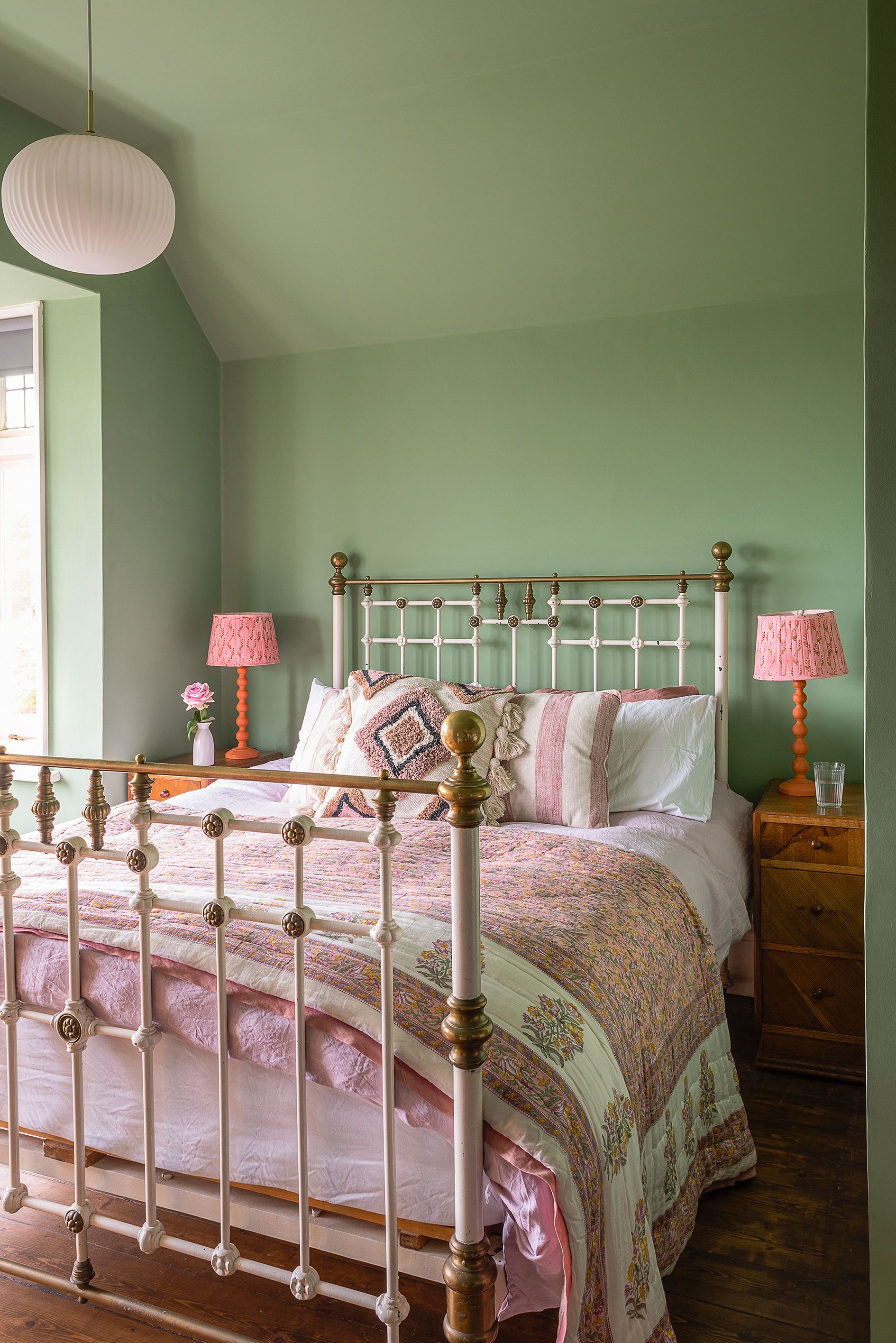
‘The most important aspect to choosing a paint color for the bedroom is that it must be a tone you like and are drawn to. Generally, soothing natural shades work well in this setting,’ explains sleep expert Christine Hansen, CEO of Sleep Like A Boss. ‘Pastel colors such as soft green, blue and lavender calm and relax, and help with anxiety. Avoid dark colors which will make you feel more confined and won’t motivate you to get up in the morning.’
‘In the bedroom, we want to feel rejuvenated and energized as we wake up, and safe and relaxed as we wind down for sleep, so colors should be soothing and not overwhelming,’ agrees health and wellbeing-focused interior designer Oliver Heath., pointing to green as a brilliant master bedroom idea. ‘Calming, natural color schemes include soft blues, greens, and browns.’
Best green paint colors for a living room
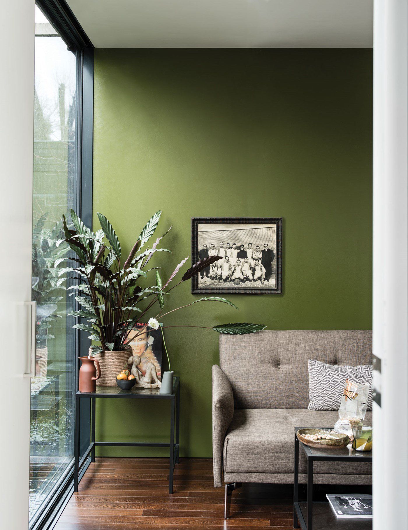
‘The living room is somewhere to relax and plays a key role in supporting our wellbeing and comfort at home, so it’s a place for a natural color palette,’ advises Oliver Heath, health and wellbeing-focused interior designer. ‘A small living room could be made to feel ‘cocoon-like’ using darker hues or bright and airy with lighter tints. Regardless of the shade, toning-down the color intensity here will create a peaceful atmosphere.’
‘Choose a living room shade based on the tone you want to set – our moods are highly influenced by color,’ advises wellbeing expert Christine Hansen. ‘Green, blue, grey and tan all help reduce stress and neutral shades work well to help calm a busy mind. The best green paints will soothe you - avoid intense and dark hues as they are very stimulating.’
Best paint colors for a kitchen
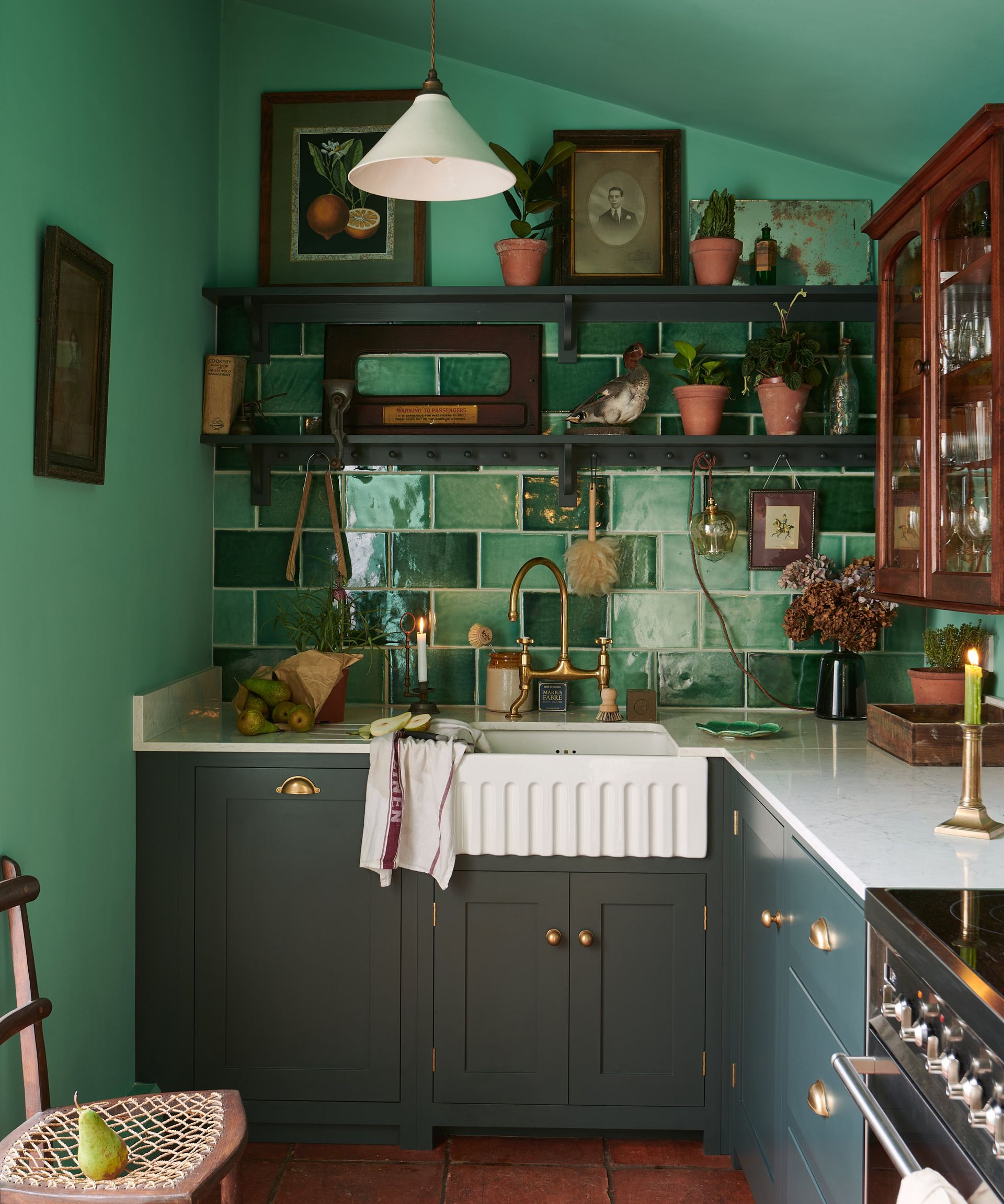
‘The kitchen should be a light, bright space, so painting it in cool shades will foster the concentration you need to cook - sage green kitchen ideas are a big trend for this reason. ‘White and pale gray tints will make a small kitchen look bigger, while natural tones will soothe’ explains wellbeing expert Christine Hansen. ‘Whatever kitchen paint color you go for, this is a room for hosting, so make it something inviting and friendly.’
‘When choosing what color to paint the kitchen walls, consider what will be flexible and suit activities ranging cooking, eating, socializing, entertaining, and working,’ says health and wellbeing-focused interior designer Oliver Heath. ‘The kitchen should be bright and stimulating – different shades of white can provide a good backdrop, interjected with pops of brightness to keep it fresh. The lights can always be dimmed in the evening to make the space more atmospheric.’
Best green exterior paint colors

Walls in Boringdon Green by Little Greene
Using one of the best green paint colors outside blends man-made spaces and objects in the garden or on the exterior of the house with nature, buoying the natural and merging outside and in. ‘Play with tonality on the outside of buildings – a deep British racing green can feel smart and formal for exterior woodwork, while turquoise on a bench brings a moment of whimsy to an orderly garden setting,’ advise designers Campbell-Rey. ‘Using green outside is a great way to introduce a sense of uniformity while the other elements of the garden – borders or a meadow for example – are encouraged to go wild.’
‘Greens are a really useful way of connecting a building with the outdoor environment. Because we are so used to seeing green in nature, using it outdoors can help a building communicate with its surroundings,’ says Dominic Myland, CEO of Mylands. ‘Look at the colors around you and choose something that works with the visual references already outside such as a green from a nearby tree or one that tones nicely with a neighbor’s paintwork.’
‘For a bold, impactful color which creates a strong outdoor presence, we love the amazing teal green Mid Azure Green by Little Greene,’ says Studio Ashby Co-Director Fiona Blanchot. ‘It’s a traditional tone, but feels contemporary when used externally.’
‘For cooler colors on your exterior walls like greens it always a good idea to make sure they have a touch of yellow in them like our Balmoral, to create a soft, calmer outside look,’ says Cathryn Helsby, Head of Creative at Earthborn Paints. ‘The olive tone creates a beautiful, natural-looking exterior, which blends the home serenely into its natural surroundings.’
What colors go best with green?
‘Green is hugely versatile, which is why it’s probably the most useful color in a designer’s palette,’ say designers Campbell-Rey. ‘Olive green with pale blue, grass green with coral pink, eau de nil with a deep cherry red, it works with almost everything, especially other greens.’
‘Greens are incredibly adaptable and pair well with many different shades, from soft coral and blush to golds, naturals and electric primary colors’ explains Creative Director and Founder of Claybrook Rob Whitaker.
‘My absolute favorite color to pair with green has to be pink, it is just wonderful – the color combination of flowers!’ enthuses Francesca Wezel, Founder of Francesca’s Paints. ‘Blue and green also green work well together, a reminder of the sky and the green of the forest.’
‘Pink and green should always be seen!’ agrees interior designer Martin Brudinizki. ‘It brings to mind gelato stands in Naples and beach houses in Palm Beach – the perfect combination.’ ‘Whether you’re pairing a dark green with a pastel pink, a sage green with an earthy terracotta pink, or a hot pink with a bright green, they all work!’ adds color and paint expert Annie Sloan.
‘Often people say “blue and green should never be seen”, but the right modern green with an aqua or turquoise blue looks stunning,’ says Rishi Subeathar, founder of Eicó and Nordfärg paints. ‘Khaki shades look good teamed with tan or earthy shades, even pink and fresh lime pop when teamed with clean white for a more modern feel.’
What is the most popular shade of green paint?
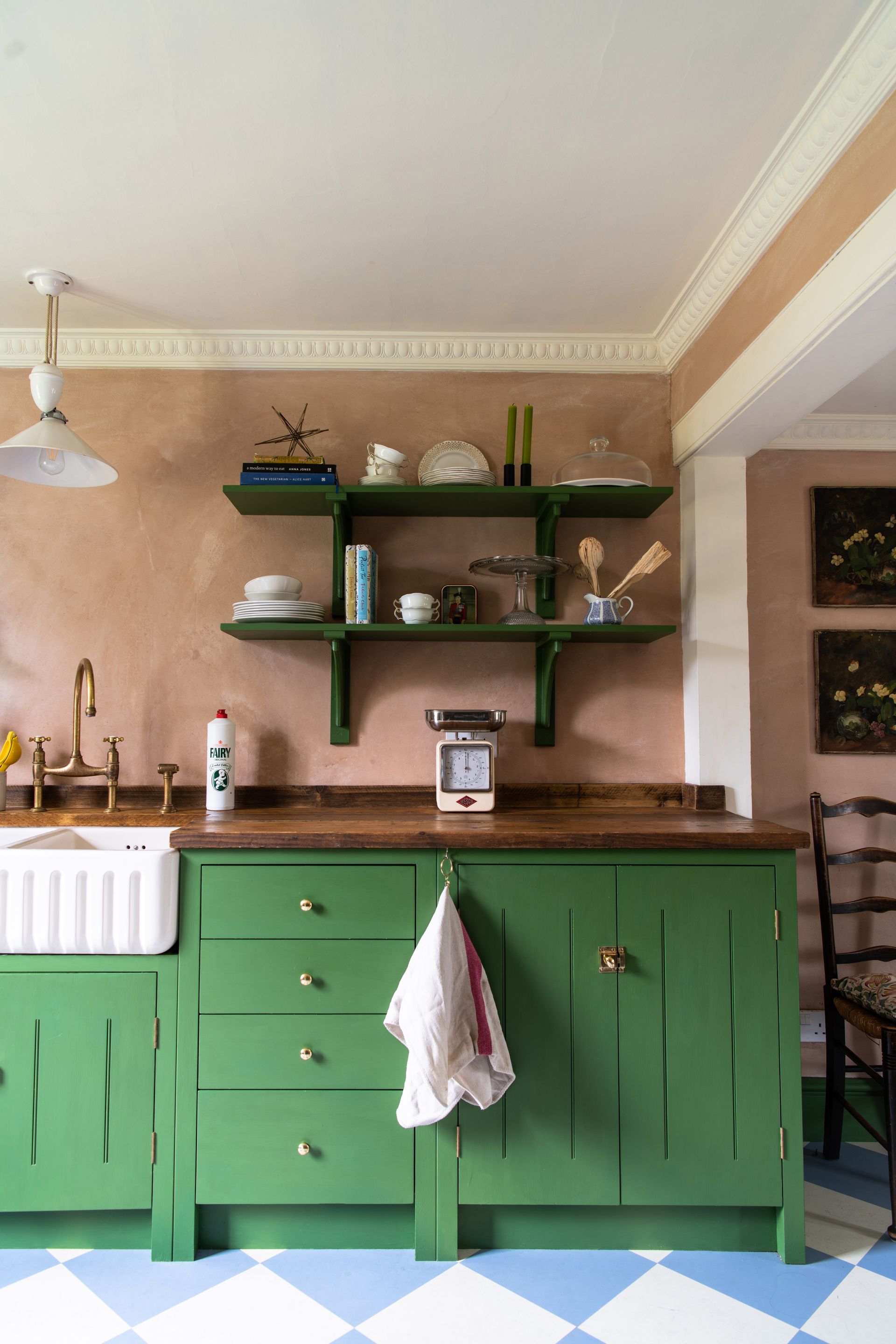
The best thing about green paint is that the color is super versatile. Not only can it singularly command a room, but it also looks lovely next to other colors. The paint can be used on several surfaces such as walls, floors, furniture, doors, exterior trims, and create a range of moods – from soft and refreshing to moody and dramatic.
Some of the popular green tones are Studio Green by Farrow & Ball; a deep-set color that can convey a sense of luxury and elegance. This is a great paint for kitchen cabinets, bedrooms, and for architecturally-detailed exteriors. ‘Studio Green is increasingly being used instead of the leaden greys so popular over the last decade,’ says Joa Studholme, Farrow & Ball’s Color Curator. ‘Its rich pigments respond extraordinarily to light, magically appearing much greener where it is surrounded by white, and in poor light conditions its deep hue appears almost black.’ It pairs well with wood tones, oak, and even metals like brass.
Balsam by C2 paints is an instantly calming, stabilizing, and embracing tone – one that reminds you of a summer garden. It pairs beautifully with blue and yellow and can be painted on table tops, mantles, or cabinets.
Another trending hue is Benjamin Moore's Avacado, which is filled with a retro vibe. The delicious hue works well with mid-century modern furniture and can even be used to paint an indoor cigar lounge. Pratt & Lambert's Jungle is so out there, that you'd need a rather confident homeowner to pull it off. This medium-dark shade of green comprises hints of red and blue.
Finally, another designer favorite is OMGreen by Clare, which is a lovely combination of a little sage and seafoam. The hue also has a slight cream undertone, so this warm blue-green is easiest to work with in interiors.
Be The First To Know
The Livingetc newsletter is your shortcut to the now and the next in home design. Subscribe today to receive a stunning free 200-page book of the best homes from around the world.
Amy Moorea Wong is a freelance interior design journalist with a decade of experience in contemporary print and digital editorial, previously News Editor at Livingetc. She writes on a broad range of modern design topics from news and interior zeitgeist to houses, architecture, travel and wider culture. She has a penchant for natural materials, surprising pops of colour and pattern and design with an eco edge.
-
 How to Thaw a Frozen Pipe — Learn Everything You Need to Know in 5 Minutes With This Guide
Winter storm caught you off guard? We asked an expert — just how do you thaw a frozen pipe?
By Hugh Metcalf Published
-
 The 12 Very Best Silk Bedding Pieces — As Our Style Editor Says: 'It's What Dreams Are Made Of!'
Slumber in lustrous luxury with the very best silk bedding sheets, duvets, pillowcases, and more — your sleep score will thank us later
By Julia Demer Published

