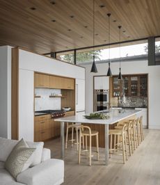
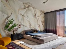
Color Trends 2024 – 19 Awe-Inspiring Palettes For a Fresh, Confident, and Forever Stylish Home
These color trends 2024 are a ready reckoner when it comes to designing your home. Take a look at these shades and get painting
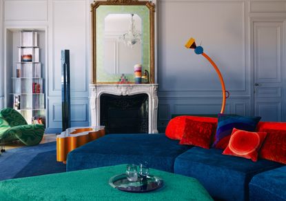
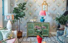
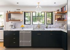
Color trends 2024 highlights a fresh, new mood — that of being bold and confident with your choices. Gone are the days of soft, light palettes that created 'safe' looking interiors. Today the trend is to create multidimensional interiors using layered tones, and deep shades.
'I see the current color trend swinging towards cooler tones and brighter colors as people are becoming more daring with their interiors,' says Lucie Ayres, founder of 22 Interiors.
To help you navigate the interior design trends for colors, we asked experts to tell us about the trending hues for 2024. Take a look at this list and give your spaces a brand-new identity.
1. Cobalt
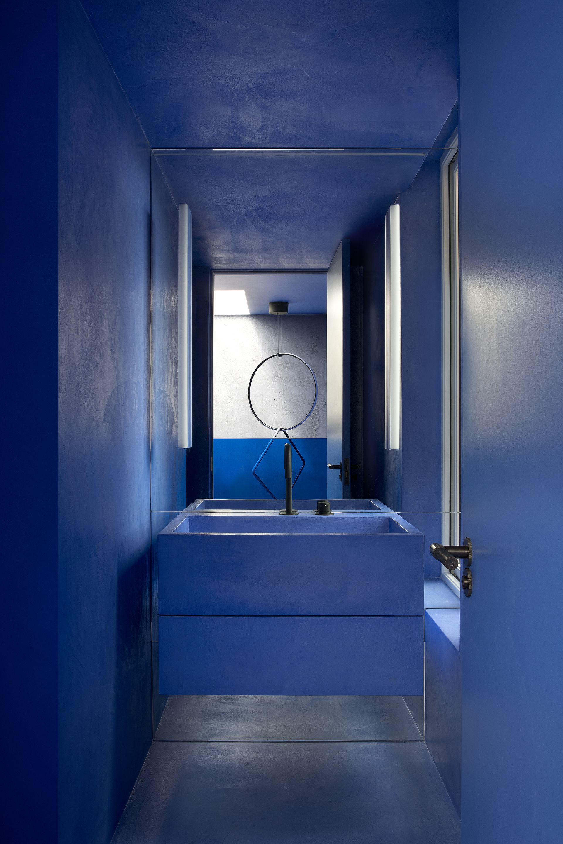
When it comes to bold, daring interiors, no color comapares to a dark blue. This is because this tone is not only packed with personality but also has an underlying charm to it. Cobalt blue decor is reminiscent of the outdoors yet is a modern, crisp tone to use.
'In this project, cobalt was applied to walls, floor coverings, and bathrooms using a single material — micro cement — allowing the finish to blend as one where walls appear to melt to floors and steps wrap into seats,' says Róisín Lafferty, founder of Kingston Lafferty Design. 'The cobalt is picked up in key furniture pieces offset from core linking spaces creating a harmonious atmosphere. This dominating, intense block of colour diffuses the space entirely blurring the lines between what is wall, floor, joinery, art & sculpture.'
2. Red
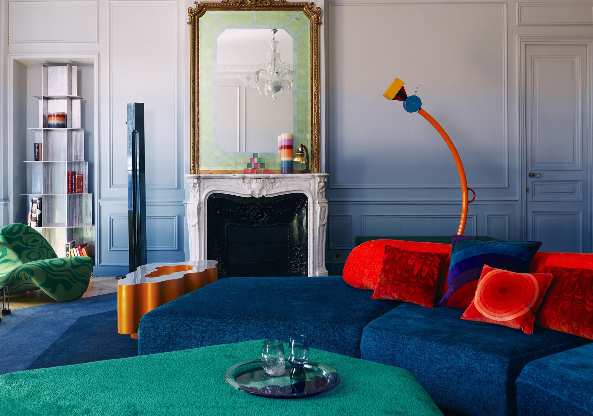
Another personality-filled, confident hue to try is red. While it may not be recommended to use the color in large swathes, in smaller decor pieces and accents red can do a lot good to the interior. Plus, many colors go with red allowing you to bring in more hues to dial down the impact of this fiery color.
'When using colors like red, you're approaching the design with the intent to make a statement,' says Katie Paulsen, interior designer at Maestri Studio. 'To give a space a soothing quality, you can soften the brighter values of the red by pulling in wood tones and by adding in warmth with the metal finishes.'
3. Grey
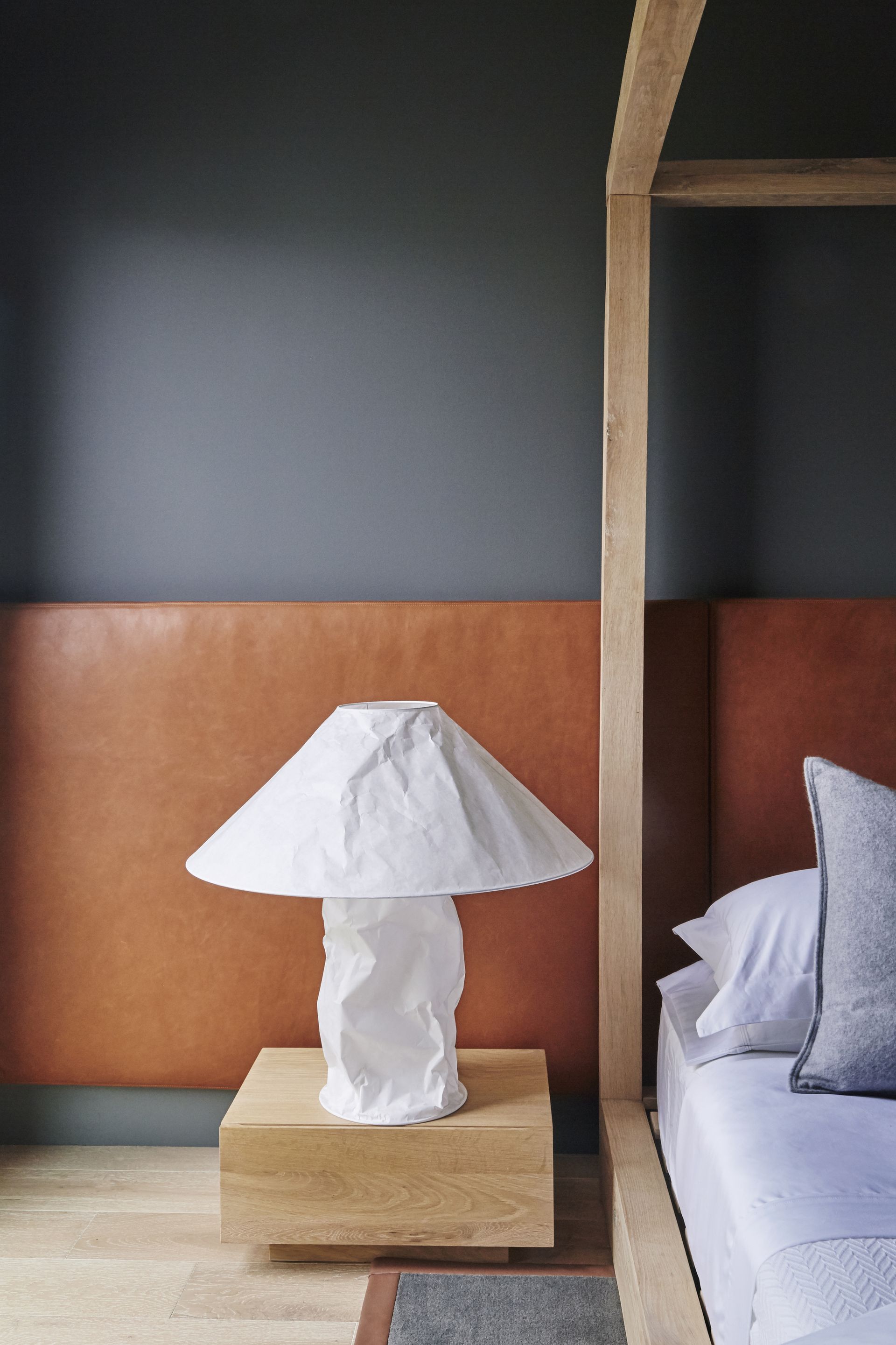
'Grey is a lovely go-to color for many homes as it is easy and flexible,' says Julia Mack, founder of Julia Mack Design. 'Consider a warm grey wall paint as it offers a bright, off-white tone with a lively airiness during the daytime and cozy warmth at night. Elegant and sophisticated, the walls will shine even brighter when paired with a yellow table or chair.'
If it's a more earth tone bedroom or living room you wish, keep your eyes peeled for mushroom grey. A warmer counterpart to traditional grey, with warm undertones, it's one of the colors that's trending, with its roots in nature.
4. Dark green
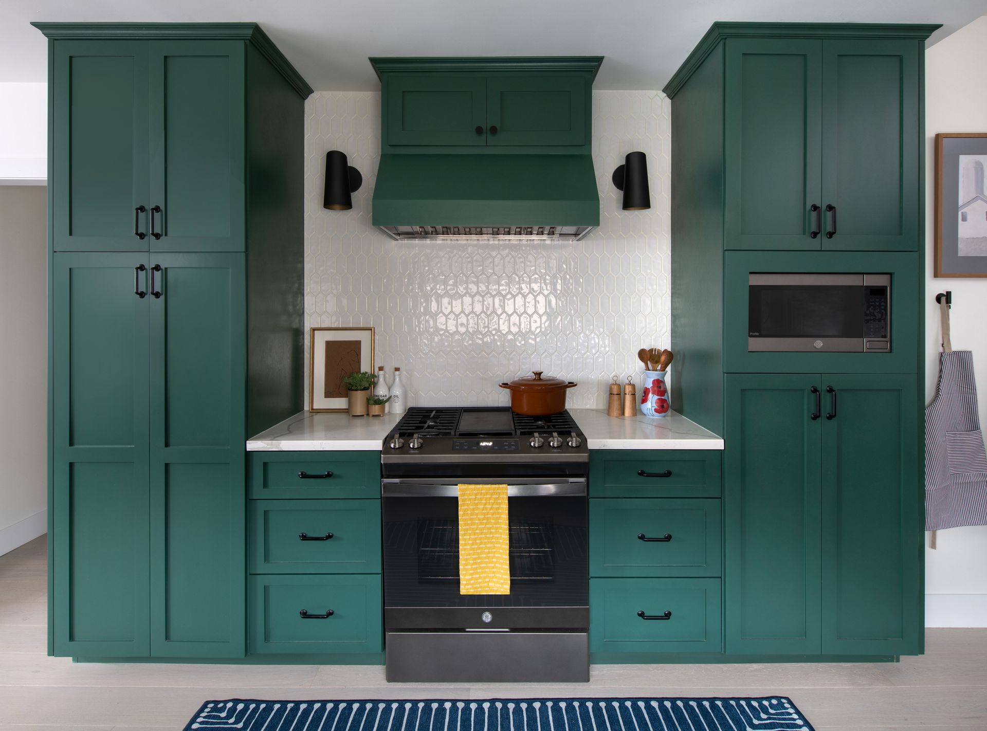
Dark green shade is on the rise in interiors and for the right reasons. For those who are unsure of using hues such as black, red or dark blue can very easily bring in dark green to create an impact yet give spaces a grounding effect. Plus, by choosing colors that go with dark green, you can really push the boundaries of what you can do with this moody hue.
'My client didn't want a white kitchen, and she wanted it to feel fresh and fun,' says Linda Hayslett of LH.Designs. 'We chose dark green to bring in color, but paired the cabinets with white tiles and black accents to keep it light and not too heavy. Sometimes a medium to dark green can be heavy in a space, so pairing it with white helps make it pop and then the black highlights give some anchor to the kitchen.'
5. Dark pink
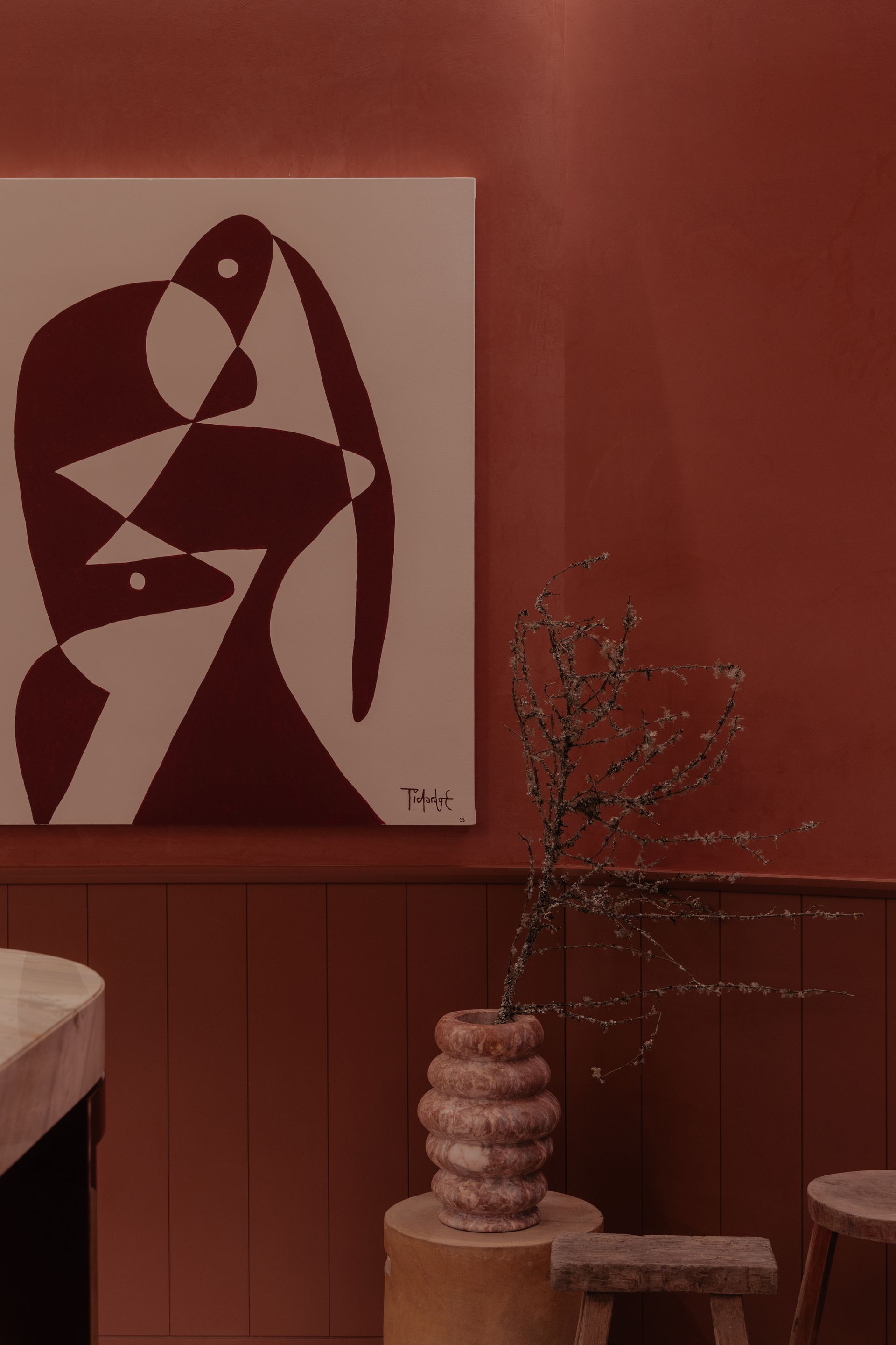
Pink is a timeless color and never seems to go out of fad. Several renditions of this eye-catching hue have been used in interiors over time; be it dark pink, coral, dusty or salmon pink, or rosy tones. Many colors go with pink, making it an easy-to-use, versatile shade.
'The color pink emerges as the central element, defying expectations and transforming the visual experience of the space, making us feel contained and warm,' says Jimena Orvañanos of Cuaik. 'But why pink? Beyond its aesthetic appeal, this choice serves a deeper purpose. It becomes a beacon that guides our attention to the focal point of the house, a space that promotes interaction and connection. If you want to create a layering effect, use two shades of pink in a room. Select a dominant pink for walls and large items, complement it with a contrasting shade for accents, incorporate neutral tones for balance, and add texture and accessories to create a harmonious and visually pleasing space.'
6. Forest green
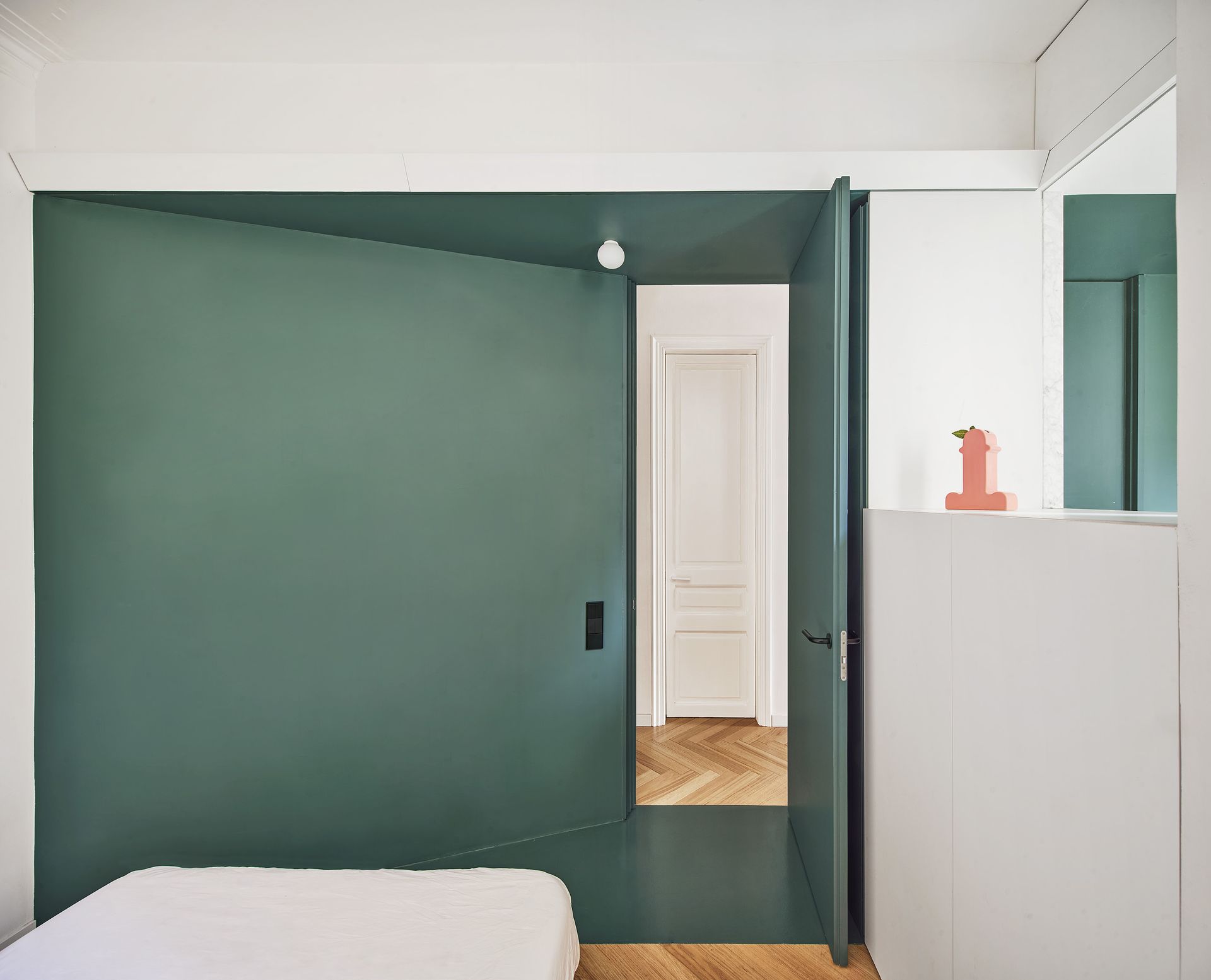
Green has a grounding, warm effect on spaces, and can create modern, atmospheric room schemes. When it comes to colors that go with dark green, the combination can bring balance, drama, or even tranquility to a space.
'We chose a functional green stripe to link the flat from end to end,' say Aureli Mora and Omar Ornaque, founders of AMOO. 'It began with the furniture in the hall, to the counters and cabinets, the bathroom, the corridor and finally to the bedroom. The green color chromatically divides spaces and gives the home personality.'
7. Soft Blue
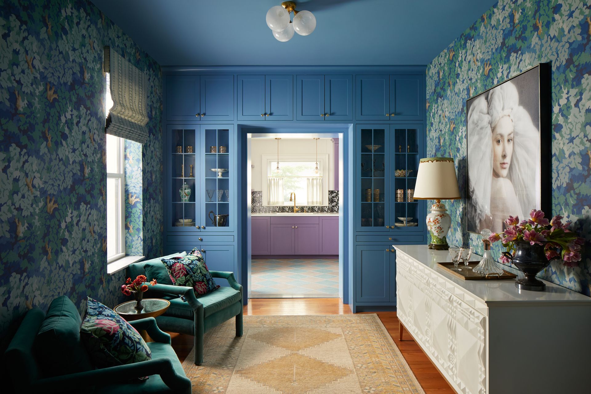
Soft, mid blue is a classic and beautiful color, super easy to live with. It can conjure an outdoorsy environment or remind you of the calm, blue waters. When paired with deeper, darker tones, the combination can look arresting and statement-making. Pair blue with more muted tones, and you have a timeless-looking space. Many colors go with blue and can inspire you with the perfect interior palette.
'We designed the color scheme for this room based on a few factors – one being that this wallpaper was just perfect for the home,' says Michelle Gage, founder and creative director of Michelle Gage Co. 'It gave this room that lush, lounge-like feel that we were after. To make it feel cool and not too traditional, we pulled out this fresh blue tone for the built-ins and ceiling. We went for tone-on-tone with the upholstered chairs and then grabbed the yellow from the wallpaper print’s branches for the rug.'
8. Lavender
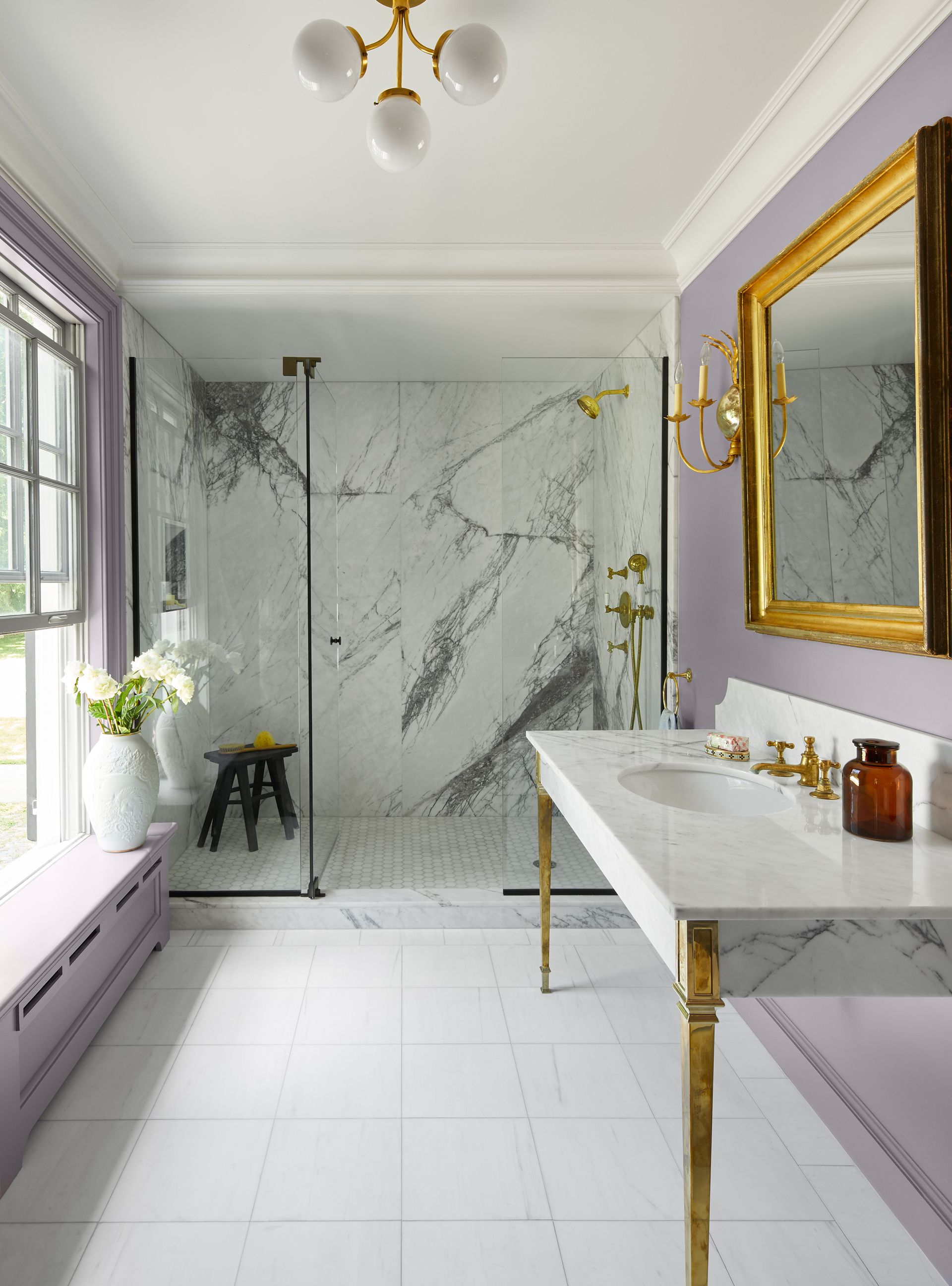
Seen across fashion and interiors, shades of purple have previously been associated with wealth and royalty and, while many might associate it with a traditional interior scheme, designers are incorporating it into fresh, contemporary aesthetics bringing a new dynamic to the color. Plus, many colors go with lavender making it an easy hue to play with.
'Lavender just feels good,' says Lucie Ayres, founder of 22 Interiors. 'It's soothing like a blue and also has the moodiness of a purple. The most underused color in my opinion.'
9. Burgundy
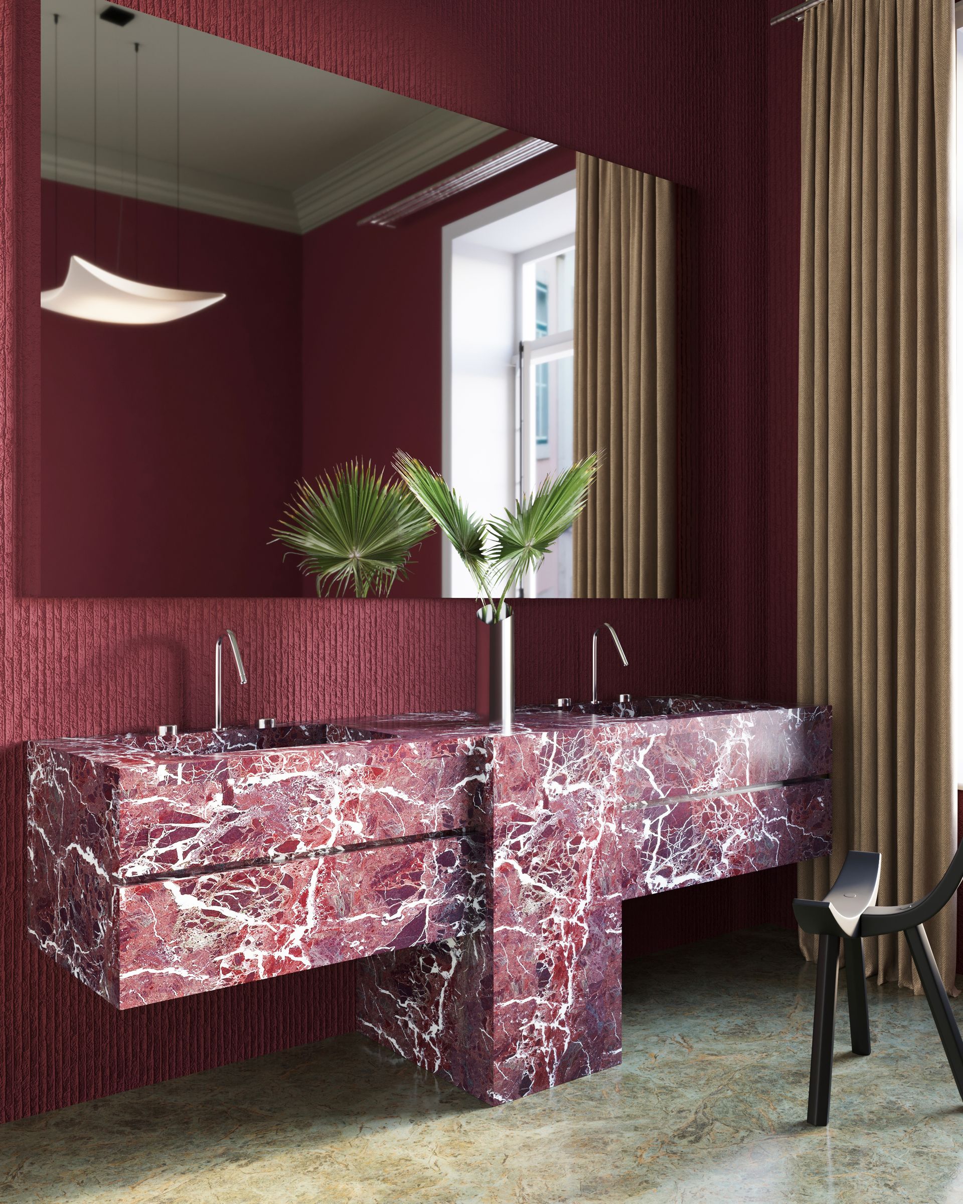
Many colors go with red, even its deeper, more sombre burgundy hue. The perfect hue for interior spaces, this is considered the more livable red.
'Burgundy is a rich sultry color that can be paired with several hues,' says Jasmin Reese, founder of Jasmin Reese Interiors, who points out how many colors that go with burgundy are also on trend right now. 'Burgundy paired with greys works best when the other materials are an eclectic mix of materials like brass, wood, neutral fabrics to really make the color stand out.'
10. Pistachio
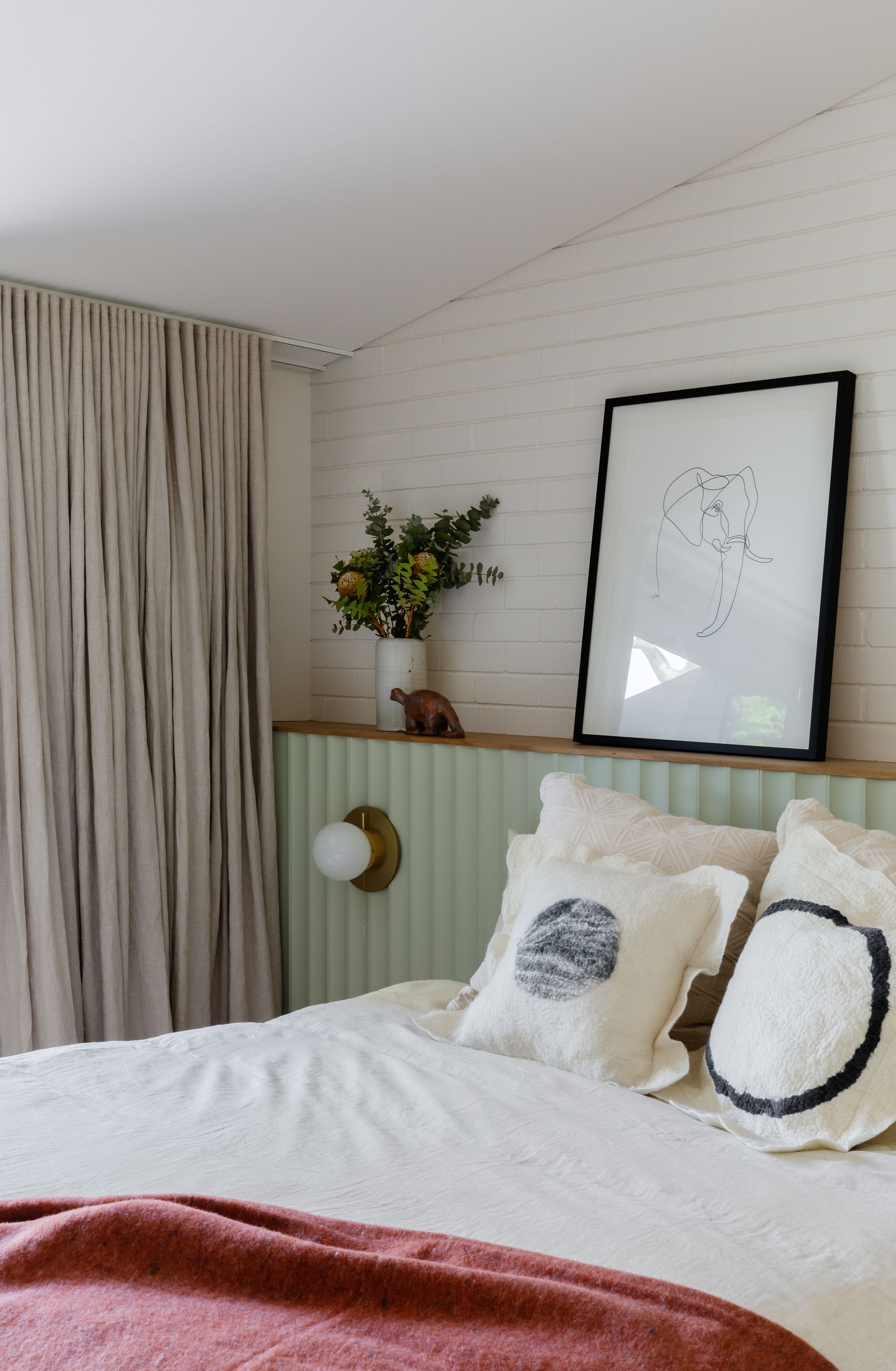
Pistachio is packing a punch at the moment, with the trend for deep, forest greens moving into delicate sage greens and this gentle tone of pistachio. Its retro connotations make it a happy and positive shade, and strips this green of any coldness.
We love the color as it is used here by Carter Williamson Architects, perfect in the bedroom, bringing softness and serenity to the space, and warmed up with a classic pink and green combination.
'Soft and natural, pistachio works wonders on plain, dull walls, particularly when paired with white and natural wood tones and acts as a perfect backdrop for large sunny spaces like sprawling entry halls, large dining rooms and big family rooms,' says Julia Mack, founder of Julia Mack Design. 'Do not mistake pistachio with its more vibrant cousin called chartreuse, with its very bright with eye-catching vibrancy and saturation.'
11. Light pink
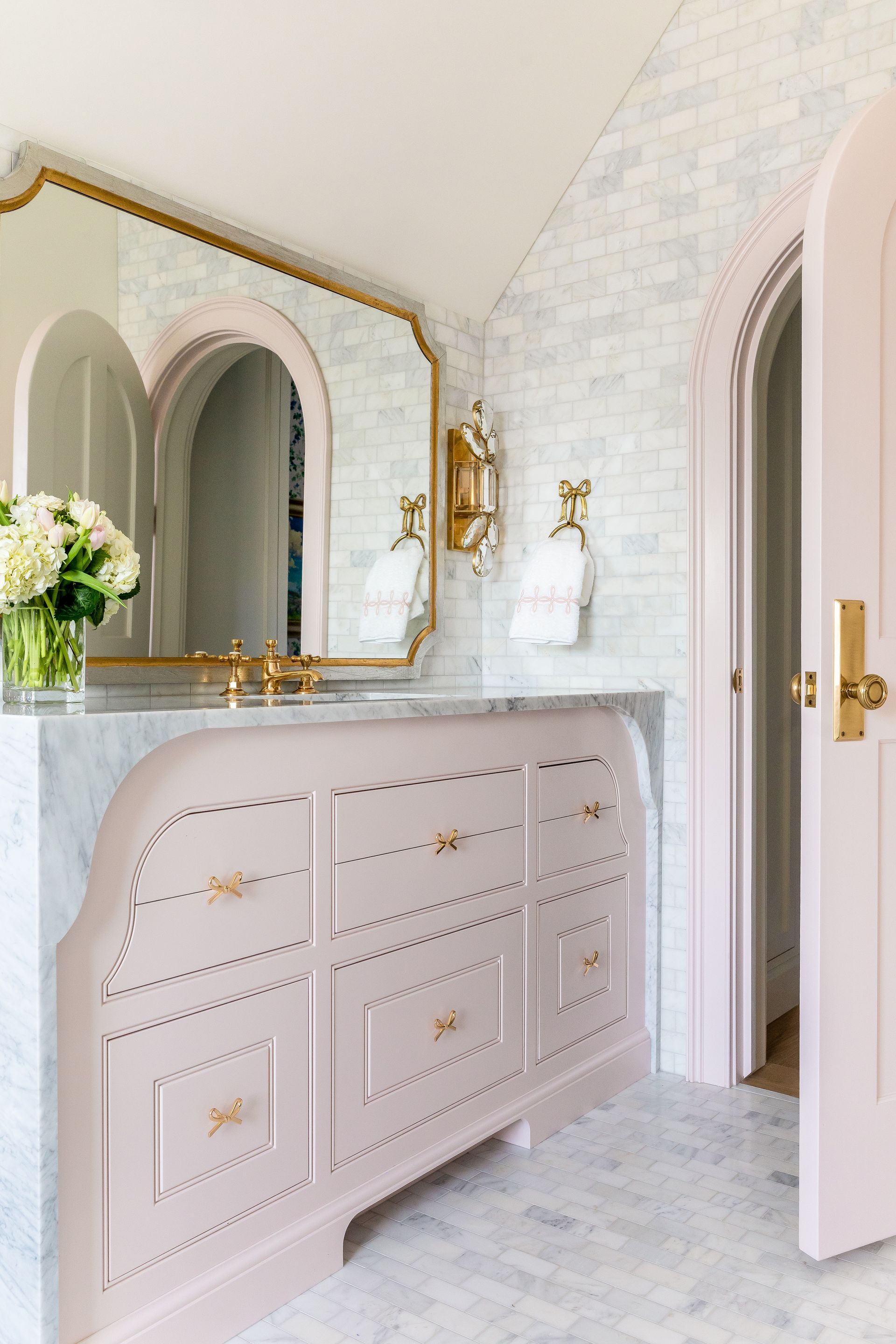
Light pink is the way to go. This tone has been around for a while and plays the perfect companion to almost all tones; sometimes even working as a neutral. Plus, many colors go with light pink, making it an easy-to-use shade.
'Pale or light pink is the winner in terms of popularity; it's been used in fashion and interiors since the 1700s,' says Lucie 'There's something so innocent, delicate, and sweet about a pale pink. It works in shadow or bright light and at all times of day. Timeless for sure. Our favorite is Middleton pink by Farrow & Ball.'
12. Gold
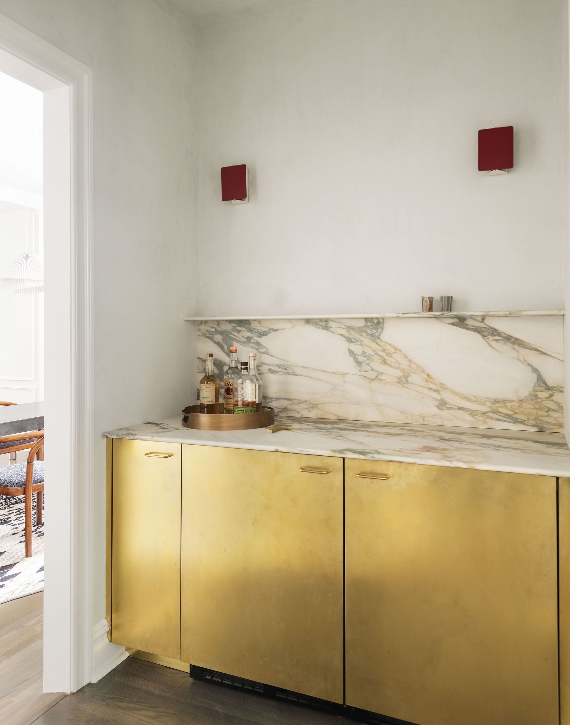
Look to materials as well as paint to bring color into your home, and embrace the opulence brought by a touch of warm brass. With a natural sheen, these materials can reflect and augment other colors in the room and add that touch of luxury that we're looking for in our lives.
'For a space like a den, family room or guest room, consider gold tones paired with a variety of greens in artwork, area rugs and modern lighting, with white walls and light color natural tone wood floor,' says Julia. 'Next, add a large cotton blanket and textural throw pillows for golden warmth. Then add more hints of gold in shiny brass in furniture knobs and pulls, curtain rods and rings and in doorknobs and hinges. The result will be a colorful and impactful space with a balance of warm and cool colors and little pops of shiny warm metal, that act like jewelry in your room.'
13. Jade
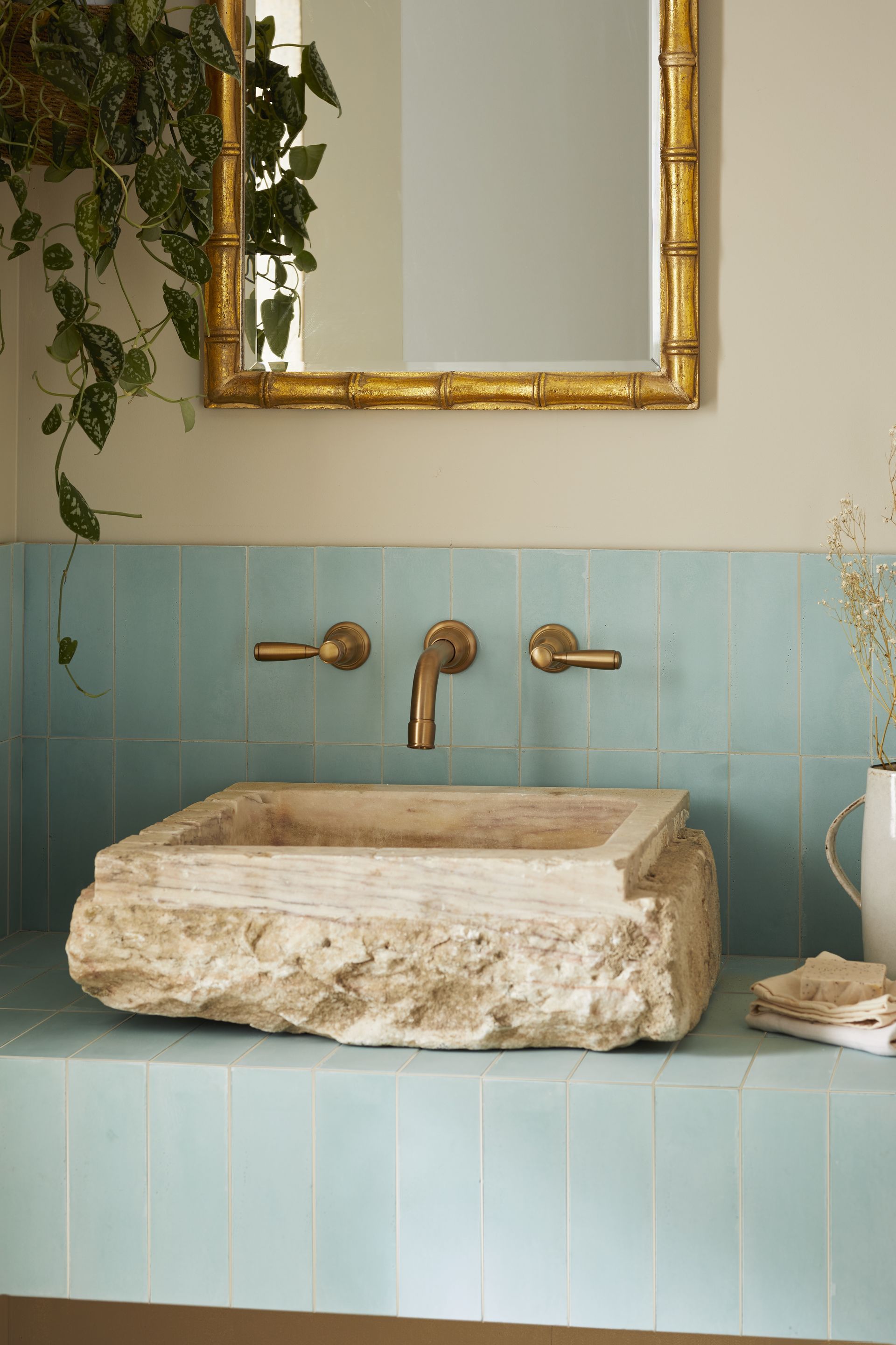
Touches of gold, emerald and jade are popping up in interiors across the world, showing people how to decorate with jewel tones. Pale blues and greens inspired by the natural color of the gem itself are increasingly popular and can be applied to both tranquil and striking aesthetics depending on how it is used.
'There is really no wrong way to use jade in interiors – it pairs beautifully with any tonal white, taupe grey, peach and pink and, the classic, glossy red,' says Julia. 'Going back through the history of interior design, it is impossible to deny the fabulous impact that Asian design has had upon us through the ages by incorporating jade in all its rich glory. It was exotic and rare in the 1850’s then roared through the 1920’s, popping up again in contemporary design of the 1970’s. Almost every designer from Mackintosh, Tiffany to Frank Lloyd Wright had their own interpretation of how to best use jade in interiors.'
'Consider soft and moody textural jade color walls for a main bedroom then repeat the jade color in bedding paired with natural linen curtains and area rug,' says Julia. 'Monotone and soothing, a jade color scheme adds tranquility and subtle sophistication, plus a touch of the exotic to all interior spaces.'
14. Honeyed tones
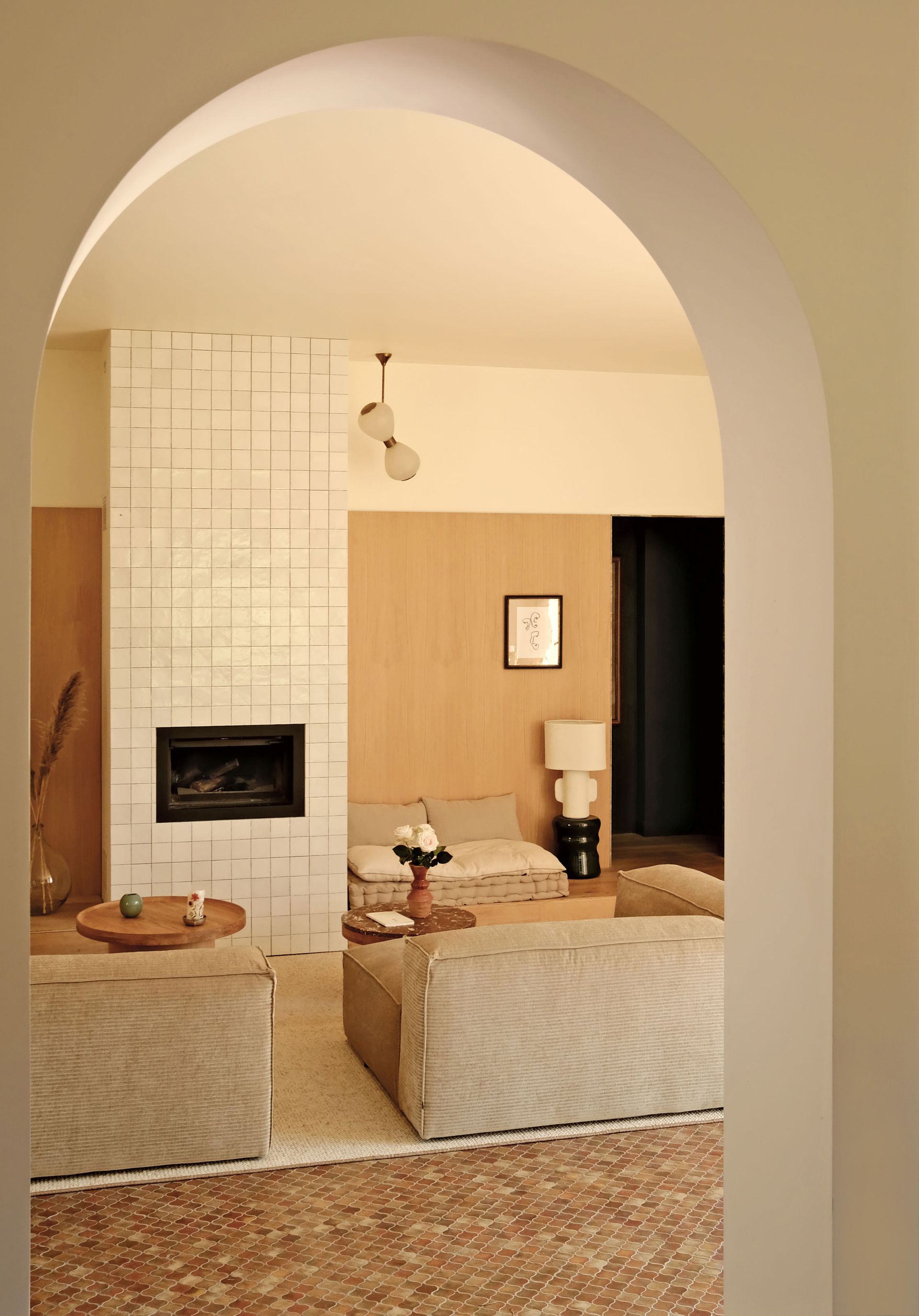
'Honeyed tones absolutely read warm and sexy,' says Lucie Ayres, founder of 22 Interiors. 'They set a mood - honeyed tones in a room scream 'I'm inviting, carefree, and energetic.'
Injecting small pops of the color initially can help build confidence before adding it to the wall. When looking for chic and stylish paint colors for bathrooms or kitchens, matching tonal shades on the tiles and walls brings cohesion to the space.
15. Warm beige
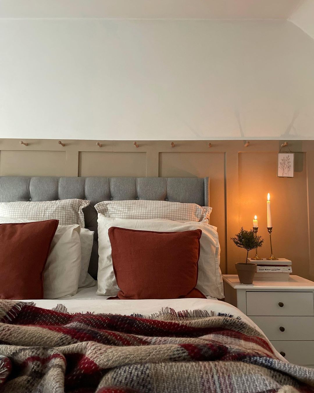
Our love for neutrals has returned, especially in bedroom trends, as it helps create a restful ambiance and a sanctuary to escape in. Warm and earthy creams work well paired with soft terracotta or deep red tones, adding depth to the room.
Remember, with neutral schemes, layers of texture bring tactility and interest to create a distinguished feel within the space.
'In today's color trends, accenting a room with pops of beige in the painting, pillows, and curtains can create dimension, especially when set against a dark background without detracting from the bold impact,' says Lindye Galloway, founder and chief creative officer of Lindye Galloway Studio + Shop.
16. Brown
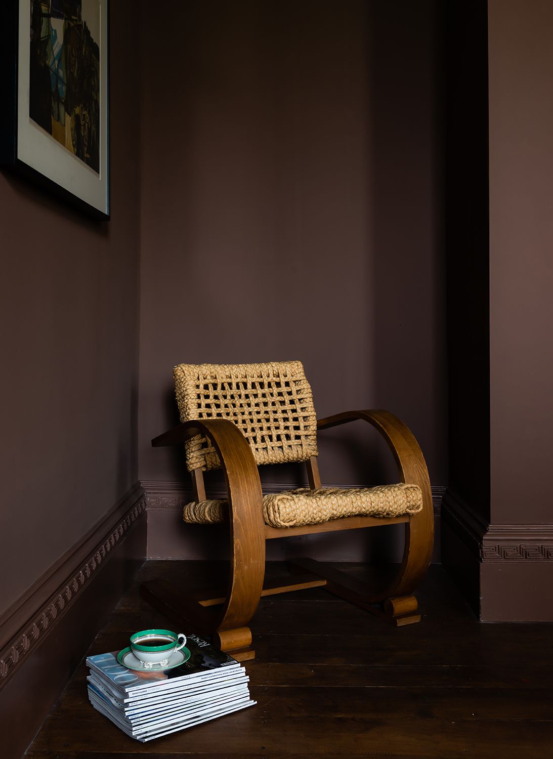
Yes, brown is back. And it’s looking better than ever! With brown often perceived as drab or boring, designers and stylists are helping us to view the color in a new light. Bringing an earthy, yet sophisticated, tone to any interior, brown living rooms are full of drama.
'Often times I will specify shiny dark chocolate brown walls with glossy white for an impactful space,' says Julia. 'Best in tight spaces like hallways, den or half bath, the contrast is a surprising and formal way to incorporate a tonal shade into a more traditional interior.'
17. Yellow
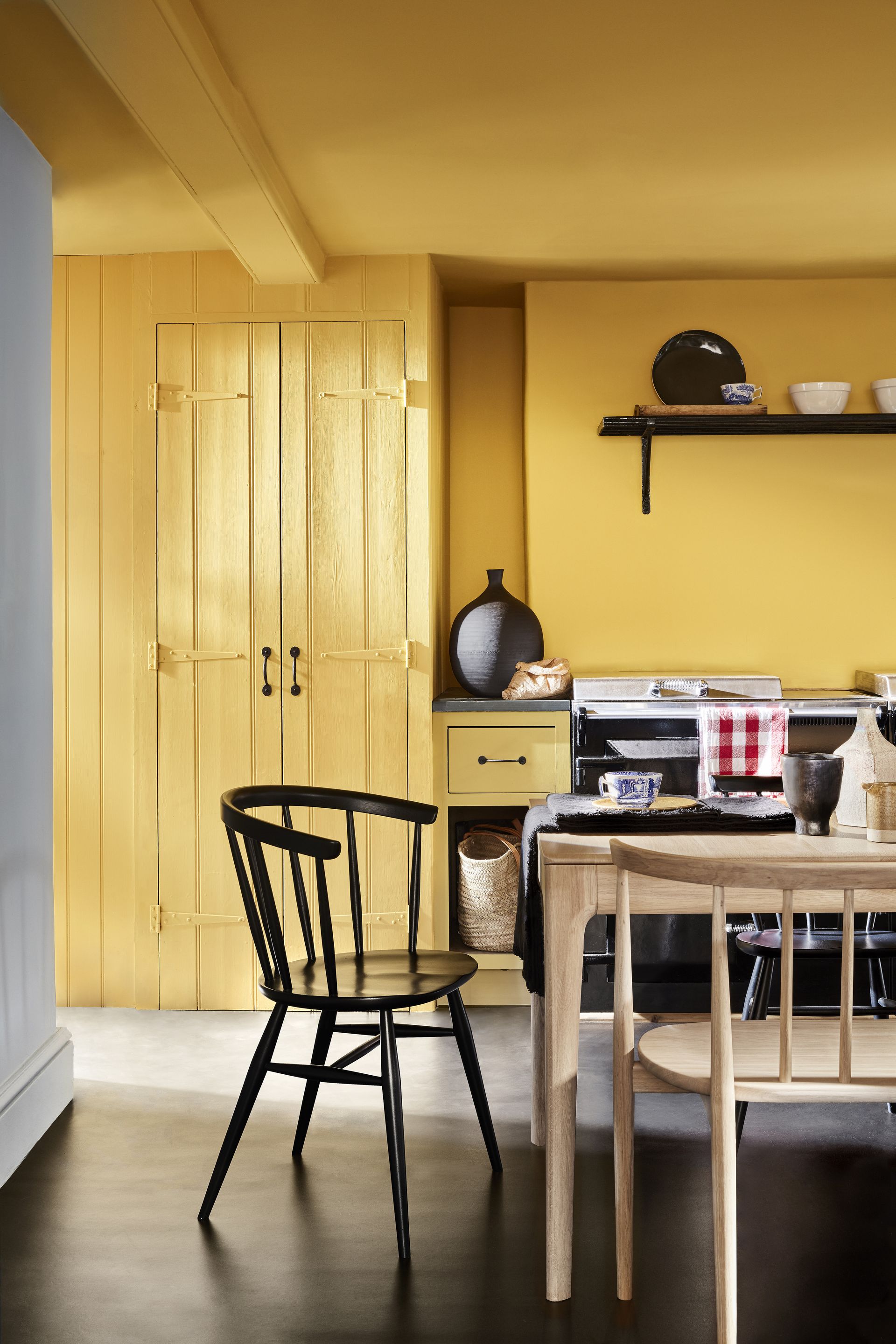
With yellows firmly on trend for 2023, pairing brighter tones of the color with black accents in a monochromatic style is a great way to embrace the look, and move it over to 2024.
'Consider orange and bright green when pairing sunlit yellow for interiors for a bit of a retro 1960’s vibe,' says Julia. 'Bright, happy and optimistic, sunlit yellow plays well with saturated colors and lots of bold pattern wallpaper like stripes and flowers. Popular in kitchens when plastic laminate counters and roll-out vinyl pattern floors were the norm, sunlit yellow was equally impactful then and right at home in kitchens now. Because it is so bright, start by adding touches to your space; maybe in accent colors like placemats, linen napkins and kitchen and barware. Start small and try a minimal amount to give it a test fit then add judiciously as you feel more comfortable in your space.'
18. Purple
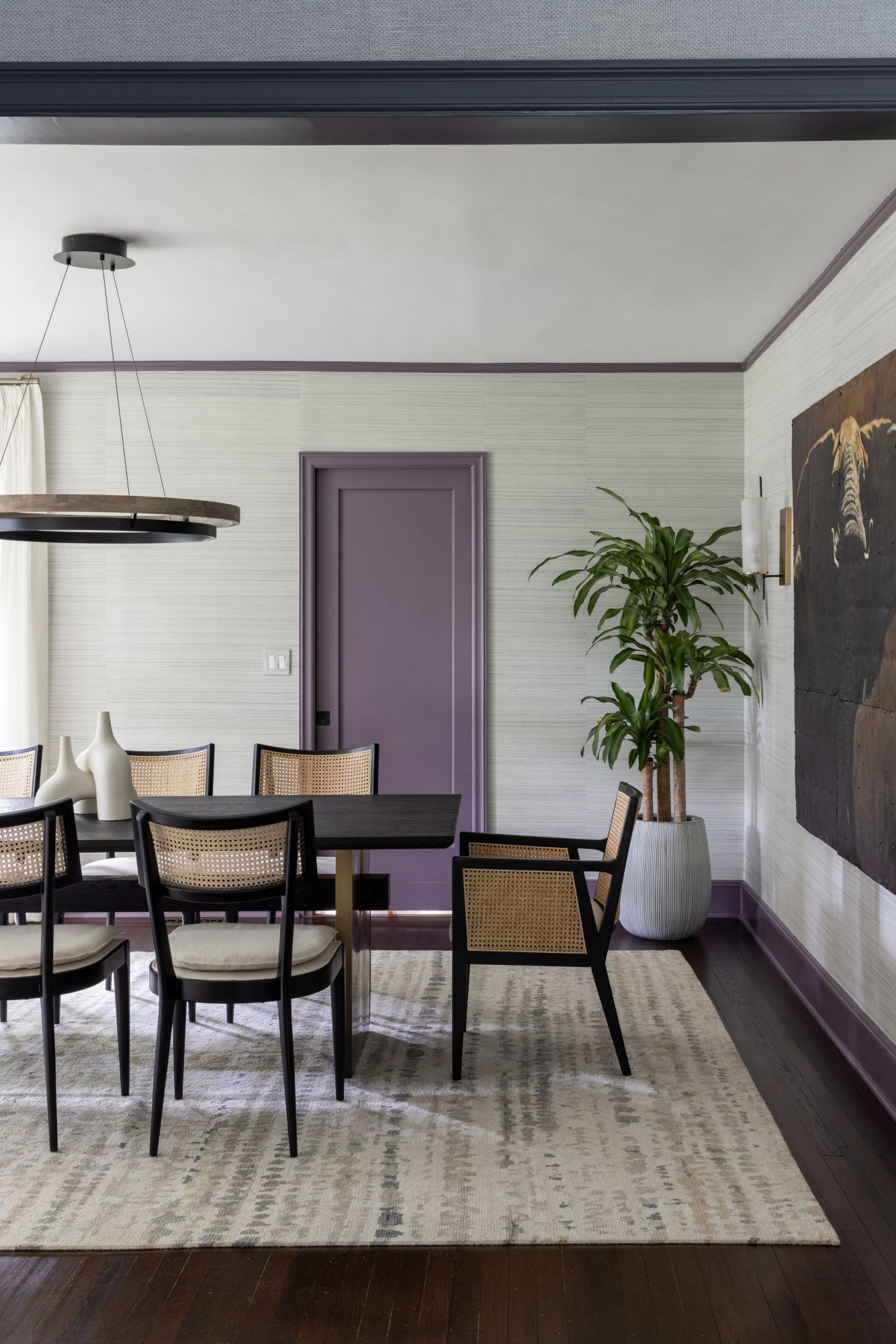
Dark and stormy is still up there when it comes to color trends. This time used
on staircases, feature windows or woodwork to bring elegant definition to a space. A deep plum or black with a red undertone makes for a warmer and more striking alternative to the popular deep charcoal greys and blue-blacks. It adds warmth to cooler palettes, and pairs beautifully with pink and nude tones.
'Purple is having a big moment right now, especially lighter shades such as lavender and lilac,' says Victoria Holly, principal and founder of Victoria Holly Interiors. 'It exudes calmness and luxury at the same time. Deeper shades such as eggplant or royal purple are rich with playful depth, creating a sense of luxury when used in textiles or on walls. The versatility of purple allows it to be paired with various colors too.'
19. Neutral stone hues
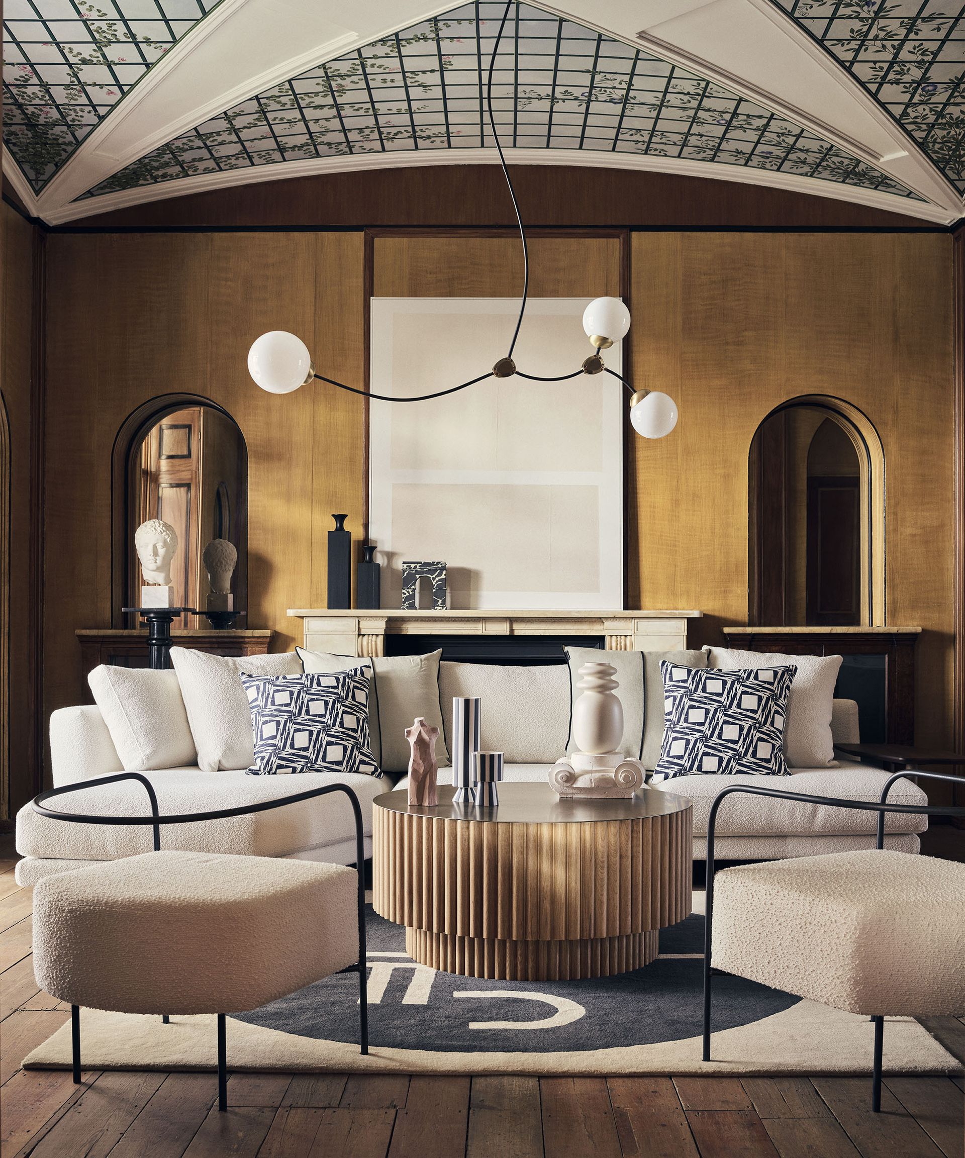
The neutral trend continues subtly away from cold greys and traditional creams, towards warmer neutral stone tones. For an earth tone living room or bedroom, consider colors such as dark brown, rust and sandy pink.
'Earthy stone hues evoke a sense of grounding and connection to nature, which is very big in the California look,' says Victoria. 'These tones are perfect for creating cozy and inviting interiors. For example, shades such as slate grey mimic the look of natural stone and work in both modern and industrial-inspired spaces. Sandstone and terracotta are also having a moment, bringing in warmth to interiors, especially in Mediterranean or rustic design themes. And lighter stone tones like travertine or limestone are used to brighten spaces with a sense of airiness.'
What were the most popular paint colors for 2023?
Amongst the popular paint colors of 2023 were sage green, pistachio, and burgundy. All colors, though different in depth and values helped create a soothing, calming and relaxing interior. These colors were also seen abundantly in the more minimalist interiors, as the world moved towards a restrained, subdued spaces.
What is the next color trend after grey?
While the jury is still out on that, judging by how minimaluxe has taken over homes this year, and with the love for minimalism rampant amongst homeowners, the warm beige seems to be the next big thing.
3 paint colors to give your home a refreshed look

Type: Water-based
Price: $44 for 1 quarter can

Type: Water-based paint
Price: $70 for 3.7 liters

Recommended Primer & Undercoat: White & Light Tones
Price: $40 for 3 liters
Be The First To Know
The Livingetc newsletter is your shortcut to the now and the next in home design. Subscribe today to receive a stunning free 200-page book of the best homes from around the world.
Design Writer, presenter, panel host, consultant and journalist Roddy Clarke is a regular in the pages of Livingetc. He also writes frequently for FT Weekend and Forbes. Based in London, and with a breadth of skills and hands on industry experience, Roddy now offers an exclusive interior styling and design service.
-
 The 12 Best Table Lamps for Reading —I'm a Certified Bookworm (and Shopping Expert)
When it comes to table lamps for reading, I don't mess around. If you're the same, this edit is for YOU (and your books, or course — and good recommendations?)
By Brigid Kennedy Published
-
 "It's Scandi Meets Californian-Cool" — The New Anthro Collab With Katie Hodges Hits Just the Right Style Note
The LA-based interior designer merges coastal cool with Scandinavian simplicity for a delightfully lived-in collection of elevated home furnishings
By Julia Demer Published
-
 Designers Love Beige Marble Bathroom Accessories — Here's Why, And How To Style The Trend At Home
Beige marble bathroom accessories are having a moment for those wanting to create an elegant, spa-like look at home. Here’s why, and how you can style them to get the look
By Raluca Racasan Published
-
 "Magnolia 2.0" is the New Color Trend That's Re-Imagining This Controversial Shade for 2024
The divisive shade is back and it’s much more sophisticated – here's how designers are using this warm, yellow-toned beige right now
By Ellen Finch Published
-
 5 Wallpapered Rooms we say Prove Vintage-Style Wallcoverings are Making a Comeback This Year
If you thought vintage style wallpaper was a thing of the past, here are 5 rooms to prove the opposite. Designers talk us through why it’s one of the most popular wall covering trends right now
By Raluca Racasan Published
-
 "Double Dishwasher" Kitchens are Going Viral — Here's Why Both Organizers and Designers Love Them
A professional organizer and kitchen designer give their thoughts on the trend for doubling up on dishwashers
By Luke Arthur Wells Published
-
 What Kind of Cabinet Pulls Should I Choose in 2024? An Expert Guide to the Big Trends in Hardware
These are the most stylish types of cabinet pulls for kitchens and built-ins this year, according to the experts we asked
By Oonagh Turner Published
-
 This 600-Year-Old Wall Decor is Having a Renaissance in our Homes — and These 5 Examples Look Seriously Modern
This style of wall decor might have a heritage spanning back to the 15th century, but these 5 examples prove that they can feel right for today's interiors, too
By Oonagh Turner Published
-
 7 Kitchen Storage Trends That Designers say are Best Avoided
There are plenty of storage trends that come and go in the kitchen, but which do we need to steer clear of to achieve the most efficient and beautiful kitchen?
By Portia Carroll Published
-
 5 Minimalist Murals That Prove This is the Coolest Wallpaper Trend of 2024
The minimalist mural wallpaper trend is taking off this year and we think it brings real elegance to the home
By Oonagh Turner Published
