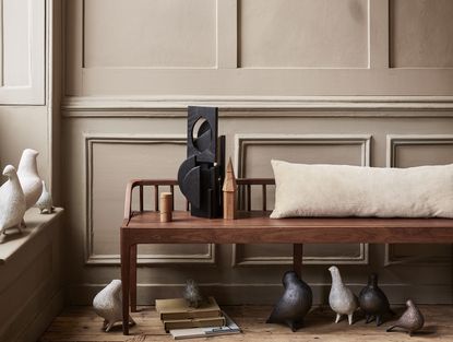
This new color trend was once seen as ugly, but designers now love it and we think you will, too
There's a new color trend taking over modern decor, and designers - and our editor - have fallen for with it


Brown may possibly be the most comforting color around. As the color of the earth beneath our feet, it's a grounding and solid hue reminiscent of nature. With this in mind, it's no wonder that it works so beautifully within our homes.
And according to interior designers, brown is the interior design trend of the moment. But banish thoughts of 1970s florals, where faded browns met primrose yellow and a yolky orange in a pop art-style print. No, this is brown 2.0, the most sophisticated color in your armory. Dare we say it...brown is the new neutral.
Think about it. Most of us will have unintentionally incorporated it into our homes somehow, usually through natural materials. Wood can come in a plethora of brown shades depending on the variety, and other fibers such as rattan or hessian offer lighter, more yellow-brown hues.
But whether you're after a neutral palette or keen to go bolder with a darker vibe, we've asked the experts for their tips on how to embrace this color trend.
In fact, we're going to convert you, even if you're ardently not a fan (currently). As the design world's favorite new netural, we've come to realise it works with everything - there are so many colors that go with brown. 'This is because browns are arrived at by mixing every color together, so you can literally "deconstruct" brown with the furnishing colors you choose,' explains Edward Bulmer, founder of Edward Bulmer Natural Paints.
'It’s fundamentally a neutral which makes it surprisingly easy to work with,' adds paint expert Annie Sloan. 'It can be used to create a comforting backdrop with more warmth than grey or white but less drama than black. You can then pair it with any other color.'
Although this might lead you to believe you can add brown to any room willy-nilly, it's not quite so simple. To get this color right, there are lots of tips that should be taken into consideration, and we've assembled them for you here.
Use brown with pops of color

At the mention of brown, your mind may automatically go to neutrals, but this needn't be the case. While strictly speaking it is a neutral, it pairs wonderfully with bright colors to make a bold statement.
For Annie, founder of Annie Sloane paints, one of her favorite color combinations is red and brown. 'It always looks so rich, so dignified, yet never austere or pompous,' she says. 'It's inviting - like climbing inside a box of sumptuously packaged chocolates and luxuriating there!'
To achieve this silky, sumptuous look, add splashes of red in your soft furnishings such as cushions or rugs. To achieve the dark and edgy look, you'll need to use richer shades like carmine and mahogany.
You could also use a brighter pop of color alongside brown. 'Unexpected additions of playful color – especially pale blues - will work wonders,' explains Annie. 'Use the same baby blue on furniture, photo frames, lamp bases and light shades for a remarkably holistic transformation which will give a much more expensive feel than the price of a tin of paint!'
Consider the room's natural lighting

The most important point to consider when it comes to using browns is tonality. Darker undertones could look too oppressive and gloomy, while lighter tones can be too drab. You might trust your eyes to pick the right shade for your room, but natural lighting plays a bigger role than you imagined.
Cassandra Ellis of Atelier Ellis explains that there are a two key takeaways when it comes to using brown in different lighting. 'A mid brown goes with a room that has small windows or not much natural light. Go all out with it - paint every surface, though go a little lighter on the ceiling. It's cosy - like the room is giving you a hug.'
'If you have lots of light, go as dark a brown as you want,' she continues. 'Take it up and over the ceiling. It works particularly well with dark blue.'
Our editor Pip Rich recently followed this advice, using Farrow and Ball's Cola to create a comforting snug. 'When I was talking to Cassandra about how brown gives you a hug I realised she was completely right. That sensibility she mentions embodies current living room trends, and that that was how I wanted my decor to make me feel.' He paired it with Farrow and Ball's Jitney - a lighter, sandier brown - on the ceiling, and - yes - a dark blue sofa.
If your room has no natural lighting at all, such as a basement, Edward Bulmer recommends darker tones and using the room for a relaxing escape. 'I tend to reserve the deepest hues to rooms that are usually artificially lit and probably used for relaxing or entertaining in,' he explains. 'They are fantastic at providing a sophisticated backdrop to art and colored furnishings.'
Edward has just launched his first online color and paint course with Create Academy where you can learn these expert nuances for yourself.
Use brown accents with furniture or woodwork

Brown shouldn't be limited to the walls or furniture - the power of a wooden door trim or window sill should not be underestimated. They can add depth and dimension to a room while enhancing your homes natural features.
However, you don't have to stick to these common areas to add brown accents. There are even more subtle ways you can dress your room with a host of natural materials. 'Begin with driftwood, polished mahogany, blonde oak, raffia, water hyacinth,' says Annie.
She continues: 'Notice how the colors make you feel. Move up to painting furniture and then, once you’re feeling more confident, consider large painting projects like kitchen cabinetry or walls.'
Joa Studholme, color curator at Farrow & Ball, also has some tips on using dark browns as a softer accent color than the popular grey shades. According to her, this is the new accent color of choice.
‘Where in the past people would have used the almost charcoal grey Farrow & Ball shade Railings, I'm seeing people use very, very dark browns instead,' she explains. 'These are just little bit warmer and softer, such as Farrow & Ball's Tanner's Brown.’
Joa suggests experimenting with these darker tones for an old-timey feel. ‘For me, it helps to achieve that Old World World aesthetic. It takes the modern edge off of the greys.'
Go earthy with neutrals

A neutral color scheme is a timeless look. For some inspiration, you need look no further than Scandinavian design, a region which undeniably does it best. Their hygge vibe is here to stay, and browns are essential to achieving it.
While we love the neutral aesthetic anywhere in the home, there are certain rooms where it makes more sense. 'For rooms we use while preparing for the day, for bed or for a meal I would go more towards the neutral end of the scale where they feel calm and natural,' explains Edward.
This comfort that the neutral palette instils is inextricably tied to our love of nature, so look to your outside surroundings for some tips on using brown. ‘Where houseplants and pared-back wood have been on the scene for a while, this season is taking it one step further with the use of minerals such as agate and earthy tones like walnut and sage,' says Martin Waller, founder of Andrew Martin.
To add a bit of contrast, Martin suggests using cool blues and golds, or rich textures like velvet.
Layer tones for a sophisticated look

Nothing exudes wealth and luxury like expertly layered brown tones. It evokes that old-money feel of as stately home and instantly makes you feel at ease. The color layering trend is simple in theory, but there's a bit more too it than just throwing any old brown shades together.
'When layering browns together be sure to include textures and organic materials – wood and glass give a chic nod to the 70s, yet still feel contemporary,' says Annie. 'Building an entire scheme from a spectrum of browns feels devastatingly lavish. Start with rich espresso browns and run the full gamut to soft putty shades, via red browns and light browns.'
'That creates a divinely cosy feeling – ideal in bedrooms, especially those with lots of natural light that need some character,' she adds.
Different tones could also be used on the walls and the surrounding woodwork. 'In the past, brown oil paint (shinier) was used on woodwork and often "below stairs" as it was practical and cost effective,' explains Edward. 'This aesthetic has translated "above stairs" in recent years and works in a modern way.'
You could layer an open-plan home by using a different brown tone from room to room. As Edward explains, 'hotels love this as all it takes is one can of touch up paint!'
Be The First To Know
The Livingetc newsletter is your shortcut to the now and the next in home design. Subscribe today to receive a stunning free 200-page book of the best homes from around the world.

Lilith Hudson is the News Editor at Livingetc, and an expert at decoding trends and reporting on them as they happen. Writing news, features, and explainers for our digital platform, she's the go-to person for all the latest micro-trends, interior hacks, and color inspiration you need in your home. Lilith discovered a love for lifestyle journalism during her BA in English and Philosophy at the University of Nottingham where she spent more time writing for her student magazine than she did studying. After graduating, she decided to take things a step further and now holds an MA in Magazine Journalism from City, University of London, with previous experience at the Saturday Times Magazine, Evening Standard, DJ Mag, and The Simple Things Magazine. At weekends you'll find her renovating a tiny one-up, one-down annex next to her Dad's holiday cottage in the Derbyshire dales where she applies all the latest design ideas she's picked up through the week.
-
 The 12 Best Table Lamps for Reading —I'm a Certified Bookworm (and Shopping Expert)
When it comes to table lamps for reading, I don't mess around. If you're the same, this edit is for YOU (and your books, or course — and good recommendations?)
By Brigid Kennedy Published
-
 "It's Scandi Meets Californian-Cool" — The New Anthro Collab With Katie Hodges Hits Just the Right Style Note
The LA-based interior designer merges coastal cool with Scandinavian simplicity for a delightfully lived-in collection of elevated home furnishings
By Julia Demer Published

