Before & After: See How A Property Evolved From Building Site To A Modern, Glamorous Home
A spacious and light-filled property was further transformed to incorporate more natural materials and pops of colour, resulting in a layered and glamorous home.

A modern house in Maryland got a complete transformation, with interior designer Zoe Feldman at the helm. The owners, a couple with their two children, fell in love with the property because of its location in a Potomac, a family friendly area. The scale of the home and open space plan fit their needs perfectly. The house was a lot larger than where they were living before, with 7,900 square feet of interior space, so they brought on Zoe Feldman to help them create a modern look that felt warm, colourful and inviting too.
Zoe and her team incorporated grey oak floors, blackened steel and expansive glass to warm the interior and to create a connection to the garden. Their primary objective was to make the space feel cosy without losing its modern edge. In order to add warmth to the white backdrop, they added simple, organic materials and finishes like woods. Pops of pattern, colour and metallics were incorporated in the artworks and accessories to add dimension and visual interest.
ENTRANCE – BEFORE
The designers opened up the spaces by installing large, steel-framed windows to flood the home with natural light.

See Also:Before & After: How This Family Home Got A Whole New Look With Just Accessories
ENTRANCE – PRE MOVE-IN
The designers kept things simple, focussing on lighting and accent colour, but leaving most walls white and laying down the same flooring throughout to create a continuous flow.

ENTRANCE – AFTER
The final look was achieved through accessorising and layering. Colour was added to the entrance hall by hanging framed blocks of colour above the sideboard / console, while rugs add texture and help to define the different areas.

The wood console table adds warmth and makes a striking statement with its jagged, three dimensional edging.

See Also:Before & After: How Architects Breathed New Life Into A Dated Victorian Property
DINING ROOM – PRE MOVE-IN
The dining room lighting was installed before anything else, hung to perfectly sit above the table.

DINING ROOM – AFTER
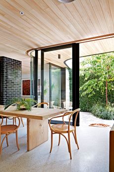
A rug and full length curtains soften this space and make it cosier, while cane dining chairs add natural texture.

See Also:Statement Dining Room Lighting
The dining room leads through to a darkened, walk-in bar area, perfect for entertaining in the evenings.


See Also:Cool and Stylish Home Bar Ideas
CORNER ROOM – BEFORE
The walls were ripped out entirely so that large steel framed windows could be installed, to make this a light and bright corner room.

CORNER ROOM – AFTER
With stone flooring, a stone fireplace, wood walls and a wood ceiling with ceiling fans, this corner room has an indoor-outdoor feel, and is separated from the main living room by concertina doors.

See Also:Before & After: Terraced House in Hackney Gets A Modern Make-Over
LIVING ROOM – BEFORE
A modern fireplace was installed in the main living room, which is just off the main hallway.

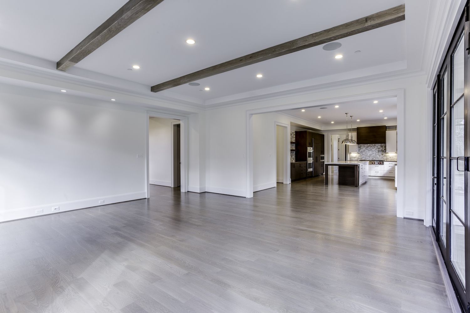
LIVING ROOM – PRE MOVE-IN
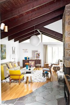
Large windows plus the concertina doors to the corner room all bathe this space in natural light. Wood beams add a rustic element.

See Also:Before & After: A dated family kitchen gets a fresh new look
LIVING ROOM – AFTER
A large area rug defines the space and adds cosy texture, while a U-shaped sofa and a classic Eames lounge chair all create an inviting, welcoming look.

A TV was wall-mounted above the fireplace.

The only pops of colour in this predominantly white space are the accent cushions on the sofa, and the upholstery on a pair of metallic chairs, which tie in with a framed green reindeer moss on the wall.


See Also:Explore An Incredible Open-Plan, Modern Family Home That Brings The Outside In
This space also flows into an informal dining area.

KITCHEN – BEFORE
The design team also installed a brand new kitchen with modern kitchen island and breakfast bar.

See Also:Before & After: An Old Monastery Ruin Is Transformed Into A Modern Family Home
KITCHEN – PRE-MOVE IN
The new kitchen features a blend of wood cabinetry and white cabinetry, with two low hanging pendant lights above the island adding a metallic touch.

A utility area was also added to the side of it, along with a downstairs loo.


KITCHEN – AFTER
Kitchen island stools add the finishing touch.

See Also:Striking And Stylish White Kitchen Ideas andWood Kitchen Ideas
DOWNSTAIRS LOO – PRE MOVE-IN
The design team installed a large marble basin in the downstairs powder room.

DOWNSTAIRS LOO – AFTER
A large framed black & white photograph offers the finishing touch.

See Also:Cloakroom And Powder Room Ideas
OFFICE – PRE MOVE-IN
The design team created a home office, with windows across all the walls to allow for lots of natural light. Spotlights were installed in the recessed ceiling, and plug sockets in the middle of the floor for under where the desk would go.

OFFICE – AFTER
The ceiling was then wallpapered, adding instant drama to this space, and the built-in cabinets were painted black.

See Also:Working From Home? Striking Home Office Ideas For A Stylish Study
Straight edged furniture and black accents give this office a decidedly masculine feel.

BEDROOM – BEFORE
The master bedroom was given new windows, flooring and lighting.

BEDROOM – PRE MOVE-IN
A grasscloth wallpaper was added to give this large bedroom a cosier, textured feel.

See Also:Bedroom Wallpaper Ideas
BEDROOM – AFTER
The bedroom is now an elegant, grown-up space.

A cosy seating area makes the most of the spacious room and adds a hotel-inspired touch.

See Also:Gorgeous Master Bedroom Ideas
LOFT – BEFORE
The designers thought the loft deserved a little drama.

LOFT – PRE MOVE-IN
They coated the walls in a deep, teal blue, which was taken right up the ceiling, creating a den-like feel.

See Also:These are the most popular paint colours of 2020
LOFT – AFTER
The loft is now a relaxed family space where the kids can play freely.

See Also:Wonderfully Fun Kids Play Room Ideas
Builder: Jeffco
Photography: Stacy Zarin Goldberg
Be The First To Know
The Livingetc newsletter is your shortcut to the now and the next in home design. Subscribe today to receive a stunning free 200-page book of the best homes from around the world.
Lotte is the Digital Editor for Livingetc, and has been with the website since its launch. She has a background in online journalism and writing for SEO, with previous editor roles at Good Living, Good Housekeeping, Country & Townhouse, and BBC Good Food among others, as well as her own successful interiors blog. When she's not busy writing or tracking analytics, she's doing up houses, two of which have features in interior design magazines. She's just finished doing up her house in Wimbledon, and is eyeing up Bath for her next project.
-
 These 12 Best Table Lamps for Your Desk — Perfect Glows for a Creative Home Office
The best table lamps for your desk is have a soft, targeted glow. Elevate your WFH set-up with these stylish picks endorsed by Style Editor Brigid Kennedy
By Brigid Kennedy Published
-
 The Nespresso VertuoPlus is 30% Off for President's Day, and it's Kim Kardashian's Coffee Maker of Choice
This sleek and stylish coffee maker was spotted in Kim's home bar, and you can currently save $60 if you buy yours from Amazon
By Lilith Hudson Published
-
 Tour a mid-century house in Philadelphia with a modern take on Mad Men style
This mid-century house in Philadelphia is a modern take on mid-century design and the perfect backdrop for this enviable collection of art and objects
By Livingetc Last updated
-
 This modern Edwardian house in Melbourne is small but mighty
It may be small, but thanks to its ingenious design, this Edwardian house in Melbourne makes family living a breeze
By Livingetc Last updated
-
 Old meets new in this apartment in New York's East Village - a former community centre built in 1860
The owner of this loft-style apartment in New York's East Village mixes ancient and modern with timeworn pieces, design classics and his own abstract art...
By Livingetc Last updated
-
 Explore this super-contemporary coastal house in Cornwall
This coastal house in Cornwall is all about drinking in the uninterrupted views of nature at its most raw, most pure…
By Livingetc Last updated
-
 Explore this spacious detached 1900s house in southeast London with stylish modern interiors
Edgy textures, luxe materials and a mix of vintage and bargain buys transformed a blank detached 1900s house in southeast London into a home full of personality.
By Livingetc Last updated
-
 This large house in west London is minimal yet playful
A firefighter’s pole in the kitchen and a slide down the stairs? This house in west London proves minimalism can also be fun.
By Livingetc Last updated
-
 Inside A Clever Garden Room That Doubles As A Chic Guest House
This striking garden room design incorporates a sleeping area, kitchenette, loo and shower, as well as plenty of storage space, making it ideal as both a self-contained guest house or a restful retreat to escape to.
By Lotte Brouwer Published
-
 This light and bright Victorian terrace in west London is relaxed yet stylish
This chic Victorian terrace in west London is full of clever ideas that allow it to evolve.
By Livingetc Last updated
