Take A Look At This Space-Saving, Futuristic and Dream-Like Apartment in Shanghai
Spread over just 667 square feet (62 square metres), this amazing family home has a dream-like quality...

PROPERTY
This modern home is proof that X+Living is among the most exciting design firms in the world right now comes in the form of this clever remodelling of a compact Shanghai apartment. This amazing project is, surprisingly, the result of a TV makeover. But this is no 'Changing Rooms' style quick fix. Instead, a cramped flat has been dramatically transformed into a futuristic dreamland, the vision of head designer Li Xiang.
The design is centred around an octagonal main living space, created by removing two partition walls and 'cutting' its corners. Now, the compact apartment has managed to squeeze in a stylish dining space, dressing room, piano room, as well as separate rooms for a boy and a girl, all in an aye-catching, stylish way.
Designer Li Xiang completely reconfigured and transformed the tiny space in order to meet the needs for two growing children, as well as a couple who love to socialise and entertain guests. She also challenged traditional home furnishings to create bespoke pieces that can be used to suit a variety of different purposes.

Read Also: The Surrealist Architecture Firm That's Turning Heads in China
LIVING ROOM
The main living space is centred around an octagonal living room, with views into four different corner spaces.

To achieve this, designer Li Xiang removed the original two partition walls in the living room, to create one large square. She then “cut” the four corners of the space, creating four smaller corner rooms, and connected them to the main living area with open arched doorways – thus offering vignettes into the pocket rooms.

Read Also:This modern attic re-design is full of stylish space saving ideas
Giving each room a different colour palette and identity breaks up the all-white scheme in the living room. By using her signature open arched doorways, the designer creates little vignettes into other spaces, creating a sense of communication between the various spaces.

This also means that the family can be doing their own thing in separate spaces, while still being able to chat and see each other.

The walls in between the arched doorways feature full length hidden cabinets, hiding away a kitchen freezer on one wall, living room storage on another, and even acting as the bedroom wardrobe on another wall.

Even the entrance into the living room has been maximised, with built-in shoe storage in the doorframe.
Read Also:Design Project: A Space-Saving House In Brixton
DINING AREA
The design isn't just of the walls and rooms, but the objects too; everything is made to fit perfectly.
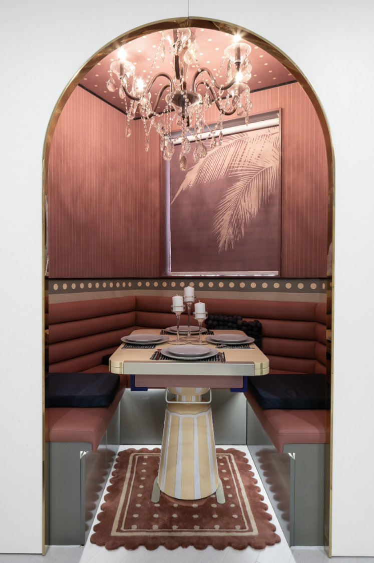
The banquette against the built-in wardrobes can be pulled to join up with the banquette in the dining booth, providing extra seating for dinner guests.

Read Also:7 Lessons In Space-Saving Design From A Tiny House On Wheels in Hawaii
The bespoke table extends too.

Similarly, the custom-made high-chair can either come apart as children's chairs for drawing, reading and playing, or stack on top of one another to create a highchair for the youngest child.

Read Also:Stylish Space-Saving Galley Kitchen Ideas
MASTER BEDROOM
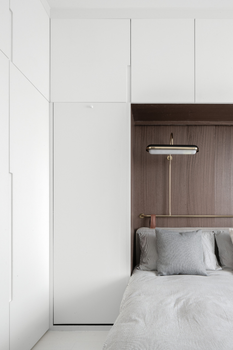
The clients, a couple who sacrificed a lot of storage space and aesthetics in this small apartment for their two children, have finally been given some respite with a private and stylish master bedroom.

The oblique corner of the master bedroom has become a private space for the parents to drink tea and chat, with a semi-circular table that can be pulled down from the wall.
Seamless storage frames the bed.
Read Also:Striking And Stylish Built-In Wardrobes Ideas
DRESSING ROOM
The designer also managed to squeeze in a dressing area, which leads to a small bathroom and a kitchen.

Read Also:Dressing Room Ideas
PIANO ROOM
The designer also responded to the children's need for space, transforming the corner staircase into a small study room for the children to practice the piano and read. The bespoke piano stool is inspired by the form of metronome.

Read Also:Design Project: A Playful House in Martha's Vineyard
ATTIC
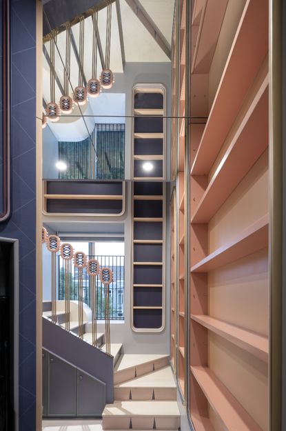
The staircase leading up to the children's rooms was given a playful design, zoning this area as part of the children's space.


A mirrored ceiling and a mirrored balustrade lends an imaginative dream-world touch.

Read Also:Wonderfully Fun Kids Play Room Ideas
Up the stairs is an attic space which is divided into a boy's room and a girl's room, providing separate spaces for the children to study, live and play.

The attic has it's own entryway / landing area (above), and a hall of built-in storage that leads through to the girl's room.

Read Also:Fun Ideas for Cool Kids' Bedrooms
GIRLS ROOM
The girl's room uses a soft pink palette and scalloped patterns, creating a delicate and whimsical room.

The bed 'pod' sits in an alcove and can be closed off from the rest of the space with a curtain.

Read Also:Girls' Bedroom Ideas
BOYS ROOM
The design for the boy's room was inspired by his favourite toy, a toy robot.

Read Also:Boys' bedroom ideas
The designer approached the robot theme with minimalist geometric design and line drawing.

Read Also:Stylish Homework Nooks & Home Offices For Kids
Be The First To Know
The Livingetc newsletter is your shortcut to the now and the next in home design. Subscribe today to receive a stunning free 200-page book of the best homes from around the world.
Lotte is the Digital Editor for Livingetc, and has been with the website since its launch. She has a background in online journalism and writing for SEO, with previous editor roles at Good Living, Good Housekeeping, Country & Townhouse, and BBC Good Food among others, as well as her own successful interiors blog. When she's not busy writing or tracking analytics, she's doing up houses, two of which have features in interior design magazines. She's just finished doing up her house in Wimbledon, and is eyeing up Bath for her next project.
-
 How to Thaw a Frozen Pipe — Learn Everything You Need to Know in 5 Minutes With This Guide
Winter storm caught you off guard? We asked an expert — just how do you thaw a frozen pipe?
By Hugh Metcalf Published
-
 The 12 Very Best Silk Bedding Pieces — As Our Style Editor Says: 'It's What Dreams Are Made Of!'
Slumber in lustrous luxury with the very best silk bedding sheets, duvets, pillowcases, and more — your sleep score will thank us later
By Julia Demer Published
-
 Tour a mid-century house in Philadelphia with a modern take on Mad Men style
This mid-century house in Philadelphia is a modern take on mid-century design and the perfect backdrop for this enviable collection of art and objects
By Livingetc Last updated
-
 This modern Edwardian house in Melbourne is small but mighty
It may be small, but thanks to its ingenious design, this Edwardian house in Melbourne makes family living a breeze
By Livingetc Last updated
-
 Old meets new in this apartment in New York's East Village - a former community centre built in 1860
The owner of this loft-style apartment in New York's East Village mixes ancient and modern with timeworn pieces, design classics and his own abstract art...
By Livingetc Last updated
-
 Explore this super-contemporary coastal house in Cornwall
This coastal house in Cornwall is all about drinking in the uninterrupted views of nature at its most raw, most pure…
By Livingetc Last updated
-
 Explore this spacious detached 1900s house in southeast London with stylish modern interiors
Edgy textures, luxe materials and a mix of vintage and bargain buys transformed a blank detached 1900s house in southeast London into a home full of personality.
By Livingetc Last updated
-
 This large house in west London is minimal yet playful
A firefighter’s pole in the kitchen and a slide down the stairs? This house in west London proves minimalism can also be fun.
By Livingetc Last updated
-
 Inside A Clever Garden Room That Doubles As A Chic Guest House
This striking garden room design incorporates a sleeping area, kitchenette, loo and shower, as well as plenty of storage space, making it ideal as both a self-contained guest house or a restful retreat to escape to.
By Lotte Brouwer Published
-
 This light and bright Victorian terrace in west London is relaxed yet stylish
This chic Victorian terrace in west London is full of clever ideas that allow it to evolve.
By Livingetc Last updated


