This Light And Airy Family Home In Islington Features An Unusual, Broken-Plan Layout
Half levels and mezzanine floors borrow light from a double-height space at this property's centre.

PROPERTY
A terraced modern home in Islington, London. When the owners bought it, it was dark and cluttered. They hired Amos Goldreich Architecture who transformed it into a sophisticated, light and spacious family home. The goal was to create a sense of comfort and ‘home’ for the young family of three, from bright, open areas, carefully arranged to maximise space, to refined materials and finishes which bring everything together. Amos Goldreich created a central double height space with half levels that look into it, thus maximising natural light, and built a side return and roof extension too, as well as extensive internal refurbishment.

DINING
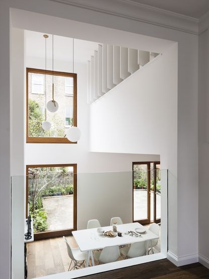
An open-plan kitchen, dining and living room sit on the ground and lower-ground floors. The spaces are arranged over an open series of half-levels, exploiting volume and light. Dining room visible from kitchen, as well as the playroom that sits on the mezzanine level, and the office that sits above the playroom, both looking down into this communal space.

Read Also:Design Project: A Modern Family Apartment In A Listed Building In Berlin
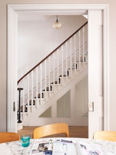
The dining room is clean and simple, with classic Eames chairs and a white palette.

Read Also:10 Interior Ideas To Steal From These Very Stylish Copenhagen Homes
KITCHEN
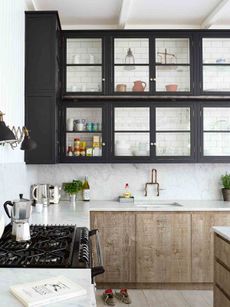
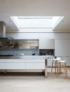
The double height dining area flows into a cosy blue kitchen, with sleek, handleless cabinetry.

Read Also:Gorgeous Blue Kitchen Ideas And Inspiration
Energy efficient features, including LED lighting and new plumbing with underfloor heating in the kitchen and dining area, also add aesthetic uniformity and reduce clutter.

Read Also:Modern Kitchen Islands
LIVING AREA
Removing the third bedroom at the first half-landing resulted in a study half the depth and a spacious living room.

Read Also:Explore Sandra Bullock’s Coastal Chic Home
KIDS' ROOM
The child's bedroom sits above the living room, on a mezzanine level that overlooks the dining space below. A raised, built-in bed plays on the multi-level theme.

Read Also:Wonderfully Fun Kids Play Room Ideas
There's plenty of storage to keep the room looking clear and clutter-free.

Read Also:Fun Ideas for Cool Kids' Bedrooms
STUDY
A compact study has an open window overlooking the dining room, with shutters that can be pulled shut.


Read Also:Stylish Study Ideas & Dreamy Home Offices
MASTER BEDROOM
Up a narrow set of stairs is the master bedroom, sitting at the top of the house.

All windows were replaced with double-glazed, timber windows. The selection of materials was kept to a minimum so that the house would feel 'streamlined' and not too busy. This restriction was echoed in the choice of colour palette to enhance the space in terms of size and fluidity.

Recessed shelves allow little pockets to display books and decorative items, and also act as space-saving bedside tables.

Storage is built-in, and recessed, freeing up floor space.

BATHROOM
The bathroom is the only room in the house that doesn't have oak flooring, instead featuring patterned porcelain tiles.

REAR
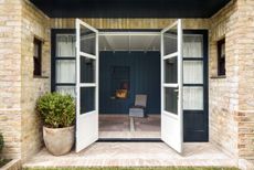
The kitchen and dining room open up into a terrace at the back of the house.

Photography: Rory Gardiner
Be The First To Know
The Livingetc newsletter is your shortcut to the now and the next in home design. Subscribe today to receive a stunning free 200-page book of the best homes from around the world.
Lotte is the Digital Editor for Livingetc, and has been with the website since its launch. She has a background in online journalism and writing for SEO, with previous editor roles at Good Living, Good Housekeeping, Country & Townhouse, and BBC Good Food among others, as well as her own successful interiors blog. When she's not busy writing or tracking analytics, she's doing up houses, two of which have features in interior design magazines. She's just finished doing up her house in Wimbledon, and is eyeing up Bath for her next project.
-
 These 12 Best Table Lamps for Your Desk — Perfect Glows for a Creative Home Office
The best table lamps for your desk is have a soft, targeted glow. Elevate your WFH set-up with these stylish picks endorsed by Style Editor Brigid Kennedy
By Brigid Kennedy Published
-
 The Nespresso VertuoPlus is 30% Off for President's Day, and it's Kim Kardashian's Coffee Maker of Choice
This sleek and stylish coffee maker was spotted in Kim's home bar, and you can currently save $60 if you buy yours from Amazon
By Lilith Hudson Published
-
 Tour a mid-century house in Philadelphia with a modern take on Mad Men style
This mid-century house in Philadelphia is a modern take on mid-century design and the perfect backdrop for this enviable collection of art and objects
By Livingetc Last updated
-
 This modern Edwardian house in Melbourne is small but mighty
It may be small, but thanks to its ingenious design, this Edwardian house in Melbourne makes family living a breeze
By Livingetc Last updated
-
 Old meets new in this apartment in New York's East Village - a former community centre built in 1860
The owner of this loft-style apartment in New York's East Village mixes ancient and modern with timeworn pieces, design classics and his own abstract art...
By Livingetc Last updated
-
 Explore this super-contemporary coastal house in Cornwall
This coastal house in Cornwall is all about drinking in the uninterrupted views of nature at its most raw, most pure…
By Livingetc Last updated
-
 Explore this spacious detached 1900s house in southeast London with stylish modern interiors
Edgy textures, luxe materials and a mix of vintage and bargain buys transformed a blank detached 1900s house in southeast London into a home full of personality.
By Livingetc Last updated
-
 This large house in west London is minimal yet playful
A firefighter’s pole in the kitchen and a slide down the stairs? This house in west London proves minimalism can also be fun.
By Livingetc Last updated
-
 Inside A Clever Garden Room That Doubles As A Chic Guest House
This striking garden room design incorporates a sleeping area, kitchenette, loo and shower, as well as plenty of storage space, making it ideal as both a self-contained guest house or a restful retreat to escape to.
By Lotte Brouwer Published
-
 This light and bright Victorian terrace in west London is relaxed yet stylish
This chic Victorian terrace in west London is full of clever ideas that allow it to evolve.
By Livingetc Last updated


