A Family Home In Highgate Has Been Reconfigured And Modernised
XUL Architects renovated this family home in London's Highgate, reconfiguring the formerly uncomfortable and unordered layout to create a modern family home that flows and is filled with light.


THE PROPERTY
A family home on Cromwell Avenue in Highgate had multiple circulation issues, with different levels and spaces flowing in an uncomfortably unordered manner. To turn it into a more practical modern home, the owners brought on North London based XUL Architecture to address these issues and to create a space which is usable, has a better circulation and is filled with light. The homeowner enlisted the services of a fabric consultant who chose fabrics for the rooms to add colour and warmth to this vibrant home. The interior design was originally conceived by Philip Lihou from Inner Space London.
See Also: Explore A Light And Airy Family Home In Islington, London
HALLWAY
Key to the refurbishment of this property was opening views from the front door through to the garden, drawing light in from both angles. XUL Architecture also opened up a skylight to flood the stairwell with more natural daylight.
The architects also closed up one of the entrances to the dining room, and replaced that doorway with handy hallway storage and a bench seat.

See Also:Chic Hallway Ideas That Make An Entrance
KITCHEN
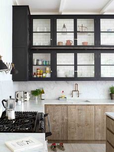
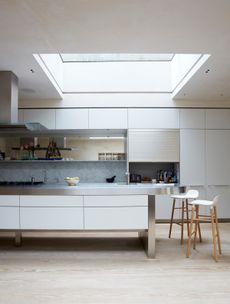
The kitchen flooring was created with polished concrete, which continues on the kitchen countertops.

Together with the grey cabinets, this took on an industrial look which was warmed up with the clever use of plywood, terracotta lamps and pots and decorated with greenery throughout.

See Also:Cool Black Kitchen Ideas
The room is filled with light from two sides and has a view to the front door.

FAMILY ROOM
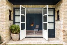
The kitchen flows into a relaxed family room which sits in a conservatory-style space.

See Also:Chic, Family-Friendly Design Ideas For Stylish Family Homes
Hanging plants add lots of greenery, giving this space a garden-like vibe.

See Also:Cool Ways To Bring The Outdoors In
DOWNSTAIRS LOO
The downstairs loo is a similarly inky colour, a textural wallpaper that was painted in Farrow & Ball's Inchyra.

See Also:Cloakroom And Powder Room Ideas
DINING AREA
A step up from the kitchen is a laid-back luxe dining room.

By opening up the walls from the kitchen and living room into the dining room allowed for the doorway from the hallway to be sealed off. This created more wall area to create a cosy dining room.

See Also:Laid-back Luxe Dining Room Ideas
Glassware and crockery is stored in the dining room, which also helps free up space in the kitchen.

LIVING ROOM
Restoring original features of the property was part of the brief to the architects. Reclaimed wood was used for the flooring within the refurbished living room.

See Also:Stylish White Living Room Ideas
The alcoves next to the mantel were undeep, so the bottom shelf comes out at an angle to create triangular storage.

A colourful Kilim-style flatweave rug adds colour to the living room, making it a more homely space.

STAIRCASE
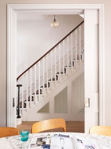
A signature to all XUL projects is to consider the three directions of light that can be channelled into the building; from above, back and front of a property. XUL opened up the plastic skylight above the stairwell and replaced with a contemporary glass alternative which now floods the space with light.

Bookshelves were also fitted into the stairwell, making a striking feature, adding colour and maximise space.

See Also:Stunning Statement Staircase Ideas
MUSIC ROOM
XUL spent many hours talking to the homeowner and discovered their love of cactus. This colour and shape were brought through to the design adding character and a homeliness that turned the house into a home.

The music room or “green room” as the owners refer to it has built-in storage which was already present in the house from a previous renovation.

See Also:These are the most popular paint colours of 2020
MASTER BEDROOM
The house was spread over three floors and after many discussions with the owners, the architects decided to relocate the master bedroom to the top floor and create a suite for them. This allowed for the middle floor to become bedrooms for the children and guests.

A curved arch framing the window breaks up the sloped ceiling and gives this room a softness.

See Also:Gorgeous Master Bedroom Ideas
MASTER BATHROOM
The master suite comprises of a bedroom, bathroom and walk-in wardrobe. The bathroom is accessed via the wardrobe so when the doors are closed it looks like typical wardrobe doors.

The master bathroom is definitely a highlight in this home, it is pretty much another hangout space.

See Also:30 stunning ensuite bathroom ideas
A wallpapered feature wall and daybed with coral print cushions add lots of fun colour to this inviting master bathroom. The wallpaper plays on the owners' love of cacti.

See Also:Bathrooms and Cloakroom Wallpaper Ideas
The bath takes central space under the dormer window and curved ceiling.

The bathroom has a steam shower in addition to a standard shower.


See Also:24 Stunning Wet Room Ideas andStunning Shower Room Ideas
KIDS BEDROOM
A large palm print paper makes a fun feature in one of the kids' rooms.

See Also:Bedroom Wallpaper Ideas
The bay window creates a perfect nook for doing homework.


See Also:Kids Office Ideas: Stylish Desk Areas & Homework Nooks For Kids
KIDS BATH
A couple of framed art prints add a pop of colour to the compact, minimalist bathroom.

Photography: Matt Clayton
Be The First To Know
The Livingetc newsletter is your shortcut to the now and the next in home design. Subscribe today to receive a stunning free 200-page book of the best homes from around the world.
Lotte is the Digital Editor for Livingetc, and has been with the website since its launch. She has a background in online journalism and writing for SEO, with previous editor roles at Good Living, Good Housekeeping, Country & Townhouse, and BBC Good Food among others, as well as her own successful interiors blog. When she's not busy writing or tracking analytics, she's doing up houses, two of which have features in interior design magazines. She's just finished doing up her house in Wimbledon, and is eyeing up Bath for her next project.
-
 What are the Most Comfortable Pillowcases? From Temperature Regulating to the Best for Your Skin
When you're looking for comfort in your pillowcases, material matters. These are the best you can buy
By Faaizah Shah Published
-
 5 Simple, but Genius Bathroom Layout Tricks That Will Make Your Space Work so Much Harder
Small switches to how you lay out your bathroom that help make the most of a small space
By Luke Arthur Wells Published
-
 Tour a mid-century house in Philadelphia with a modern take on Mad Men style
This mid-century house in Philadelphia is a modern take on mid-century design and the perfect backdrop for this enviable collection of art and objects
By Livingetc Last updated
-
 This modern Edwardian house in Melbourne is small but mighty
It may be small, but thanks to its ingenious design, this Edwardian house in Melbourne makes family living a breeze
By Livingetc Last updated
-
 Old meets new in this apartment in New York's East Village - a former community centre built in 1860
The owner of this loft-style apartment in New York's East Village mixes ancient and modern with timeworn pieces, design classics and his own abstract art...
By Livingetc Last updated
-
 Explore this super-contemporary coastal house in Cornwall
This coastal house in Cornwall is all about drinking in the uninterrupted views of nature at its most raw, most pure…
By Livingetc Last updated
-
 Explore this spacious detached 1900s house in southeast London with stylish modern interiors
Edgy textures, luxe materials and a mix of vintage and bargain buys transformed a blank detached 1900s house in southeast London into a home full of personality.
By Livingetc Last updated
-
 This large house in west London is minimal yet playful
A firefighter’s pole in the kitchen and a slide down the stairs? This house in west London proves minimalism can also be fun.
By Livingetc Last updated
-
 Inside A Clever Garden Room That Doubles As A Chic Guest House
This striking garden room design incorporates a sleeping area, kitchenette, loo and shower, as well as plenty of storage space, making it ideal as both a self-contained guest house or a restful retreat to escape to.
By Lotte Brouwer Published
-
 This light and bright Victorian terrace in west London is relaxed yet stylish
This chic Victorian terrace in west London is full of clever ideas that allow it to evolve.
By Livingetc Last updated
