See Inside A Light-Filled Family Home In London's Holland Park
Four flats have been knocked down to create one light and spacious family home in Holland Park.

PROPERTY
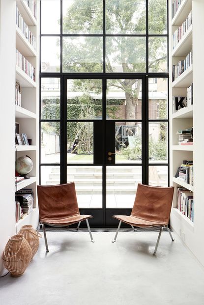
A newly renovated modern home for a family in West London. The owners wanted to re-build the original house, which was divided into four separate flats at the time, to join them together, plus expand the property by creating a large new basement. 23 Architecture + Guy Stansfeld Architects / 318 Studio were brought on to create a comfortable family home, to maximise available light and space and to accommodate an extensive art collection. Together they created a new basement and completely reworked the original staircase – pretty much nothing is left of the original layout.

HALLWAY
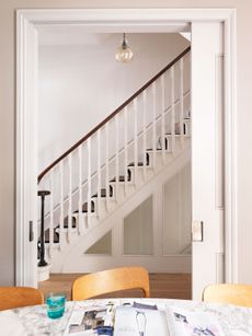
The staircase is a beautiful shape, and the hallway appears wide, light and spacious, owed in part to the Crittall partitions. The staircase is in fact very modest in size but the simple white sculptural shapes, huge window and skylight and the narrow double height volume all make it feel larger than it really is.

Read Also:Stunning Statement Staircase Ideas
LIVING AREA
The rooms are all simple rectangular spaces so the architects wanted the circulation spaces to be a bit softer and more organic.

On the raised ground floor level, the formal sitting room is the first space you see on entering the house. The more family-friendly spaces are downstairs on the lower-ground level.

Read Also:Design Project: A Light And Airy Family Home In Islington, London
FAMILY ROOM
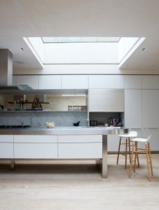
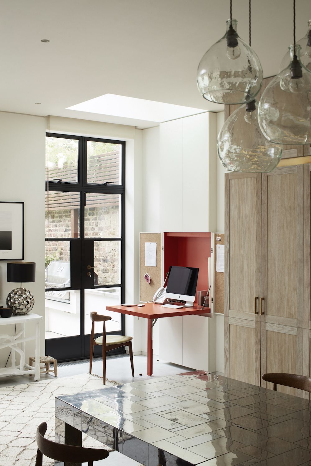
A large open-plan kitchen and dining area sit in the basement, with doors opening out into the garden. There's also a cosy nook for lounging, and a homework area with a pull-down desk.

The downstairs features more glass doors and partitions. The architects wanted to create a sense of openness throughout the house, in particular within and between the principal floors. There was some conflict between this desire and the need to create functional spaces that could be used separately and privately.

Read Also:Crittall-Style Doors, Windows And Room Dividers
Glazed partitions provided the best of both worlds creating separation but retaining the strong visual connections that the owners wanted.

The materials palette has been kept very simple. White walls, a mix of polished concrete and oak parquet on the floors, black Crittal windows and subtle details highlighted in brass.

Read Also:Cool Urban Outdoor Living Spaces: Garden, Patio And Roof Terrace Inspiration
The idea was to make calm, beautiful spaces and to let the owners’ collection of beautiful art and furniture shine.
Read Also:Stylish Homework Nooks & Home Offices For Kids
KITCHEN
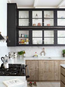
Wood kitchen cabinetry softens the modern look, and makes for a warm, cosy and inviting space.

Read Also:Modern Kitchen Island Ideas
Brass handles match the brass detailing on the floating shelf. Display items are simple and rustic, and create a balance of rustic and modern.

Read Also:Pantry Ideas: 20 Dreamy Kitchen Pantries
A metallic dining table adds interest, while the pull-down desk gives the room a welcome pop of colour.

Read Also:Stylish kitchen island pendant ideas
CLOAKROOM
The cloakroom features a burst of bright, zingy yellow, with foxed mirror panels.

Read Also;Cloakroom And Powder Room Ideas
BASEMENT
Storage has been created on every level. It has all been integrated in such a way as to minimise its visual impact and use ‘leftover’ space as much as possible.

Read Also:Gorgeous Wine Storage Ideas
The brief demanded a large art store which has been incorporated into the basement behind a huge ‘secret’ door.

Read Also:Stylish Basement Ideas
There's also a downstairs library room.

Read Also:BOOKCASES AND HOME LIBRARIES TO LUST OVER
MASTER BEDROOM
As avid art collectors, the owners already had a great eye for style and colour. The architects worked very closely together to ensure a seamless continuity between the architecture and interior design.

MASTER BATHROOM
An extra tall bathtub features in the master bathroom, and is deep enough to submerge you right to the shoulders.

Read Also:Chic Marble Bathroom Ideas
Brass accents warm up the cool marble.

GARDEN
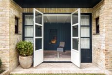
At the back of the house, Crittall windows stretch over the bottom two floors to maximise daylight.

Photography / Matt Clayton, @mattclaytonphoto
Be The First To Know
The Livingetc newsletter is your shortcut to the now and the next in home design. Subscribe today to receive a stunning free 200-page book of the best homes from around the world.
Lotte is the Digital Editor for Livingetc, and has been with the website since its launch. She has a background in online journalism and writing for SEO, with previous editor roles at Good Living, Good Housekeeping, Country & Townhouse, and BBC Good Food among others, as well as her own successful interiors blog. When she's not busy writing or tracking analytics, she's doing up houses, two of which have features in interior design magazines. She's just finished doing up her house in Wimbledon, and is eyeing up Bath for her next project.
-
 How to Thaw a Frozen Pipe — Learn Everything You Need to Know in 5 Minutes With This Guide
Winter storm caught you off guard? We asked an expert — just how do you thaw a frozen pipe?
By Hugh Metcalf Published
-
 The 12 Very Best Silk Bedding Pieces — As Our Style Editor Says: 'It's What Dreams Are Made Of!'
Slumber in lustrous luxury with the very best silk bedding sheets, duvets, pillowcases, and more — your sleep score will thank us later
By Julia Demer Published
-
 Tour a mid-century house in Philadelphia with a modern take on Mad Men style
This mid-century house in Philadelphia is a modern take on mid-century design and the perfect backdrop for this enviable collection of art and objects
By Livingetc Last updated
-
 This modern Edwardian house in Melbourne is small but mighty
It may be small, but thanks to its ingenious design, this Edwardian house in Melbourne makes family living a breeze
By Livingetc Last updated
-
 Old meets new in this apartment in New York's East Village - a former community centre built in 1860
The owner of this loft-style apartment in New York's East Village mixes ancient and modern with timeworn pieces, design classics and his own abstract art...
By Livingetc Last updated
-
 Explore this super-contemporary coastal house in Cornwall
This coastal house in Cornwall is all about drinking in the uninterrupted views of nature at its most raw, most pure…
By Livingetc Last updated
-
 Explore this spacious detached 1900s house in southeast London with stylish modern interiors
Edgy textures, luxe materials and a mix of vintage and bargain buys transformed a blank detached 1900s house in southeast London into a home full of personality.
By Livingetc Last updated
-
 This large house in west London is minimal yet playful
A firefighter’s pole in the kitchen and a slide down the stairs? This house in west London proves minimalism can also be fun.
By Livingetc Last updated
-
 Inside A Clever Garden Room That Doubles As A Chic Guest House
This striking garden room design incorporates a sleeping area, kitchenette, loo and shower, as well as plenty of storage space, making it ideal as both a self-contained guest house or a restful retreat to escape to.
By Lotte Brouwer Published
-
 This light and bright Victorian terrace in west London is relaxed yet stylish
This chic Victorian terrace in west London is full of clever ideas that allow it to evolve.
By Livingetc Last updated
