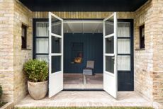
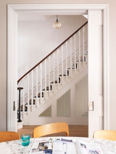
Take a leaf out of this modern Victorian terrace renovation – it boasts bags of built-in storage
A skinny side return opened the way for this stylish storage solution
THE PROPERTY
A Victorian terraced house in Finsbury Park that became a modern home with a new side extension, and ground floor reconfiguration and refurbishment, created for a family of three. The design is by Amos Goldreich Architecture and the owner's brief was to enlarge the kitchen with a side extension and make more space on the ground floor with efficient storage throughout.
The extension is finished in brick, which complements the London stock brick of the existing house.

Read Also: A Victorian Terrace in London With A Modern Rear Extension
KITCHEN-DINER
A large, frameless glass window, which acts as a window seat internally, gives views to the garden from the new light-filled side extension and kitchen.

The side extension is formed by resting structural timber fins, externally clad in zinc, onto the brick party wall. A large roof light brings daylight into the kitchen and improves connections between the spaces linking the front living room with the rear garden.

Read Also: cool and clever kitchen extension ideas
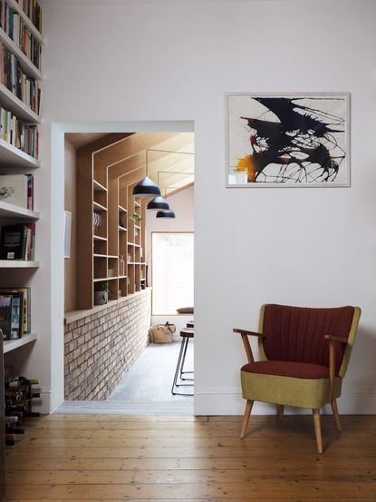
The design team cleverly utilised the space to create shelving that's decorative and practical. The family use it to store their glassware and to display plants and other knick-knacks.

Read also: London's best extensions.
LED lighting and new plumbing with underfloor heating in the kitchen and dining area are energy efficient features that add aesthetic uniformity and reduce clutter.
Metal wall racks and meat hooks are a simple way to hang pots, pans and other kitchen accessories, so they are where you need them. There's no need to rummage around in the back of a cupboard.

Read Also:Calming Wood Kitchen Ideas
An IKEA kitchen has been modified and finished with plywood fronts and painted in a bold shade of blue, with a bespoke kitchen island design (above). A new guest WC was added behind the kitchen.
The red wall creates a vivid contrast between the upper and lower kitchen units.

Read Also:Gorgeous Blue Kitchen Ideas And Inspiration
LIVING ROOM
A concealed wardrobe was built into the wall of the living room to provide storage for coats and shoes, another way to keep clutter at bay. The warm tones of the original floorboards provides a visual link with exposed brick and bare timber in the kitchen.

Project design by: Amos Goldreich Architecture
See more clever Design Projects and Modern Homes here.
Be The First To Know
The Livingetc newsletter is your shortcut to the now and the next in home design. Subscribe today to receive a stunning free 200-page book of the best homes from around the world.
Jacky Parker is a London-based freelance journalist and content creator, specialising in interiors, travel and food. From buying guides and real home case studies to shopping and news pages, she produces a wide range of features for national magazines and SEO content for websites
A long-time contributor to Livingetc, as a member of the team, she regularly reports on the latest trends, speaking to experts and discovering the latest tips. Jacky has also written for other publications such as Homes and Gardens, Ideal Home, Red, Grand Designs, Sunday Times Style and AD, Country Homes and Interiors and ELLE Decoration.
-
 The 12 Best Table Lamps for Reading —I'm a Certified Bookworm (and Shopping Expert)
When it comes to table lamps for reading, I don't mess around. If you're the same, this edit is for YOU (and your books, or course — and good recommendations?)
By Brigid Kennedy Published
-
 "It's Scandi Meets Californian-Cool" — The New Anthro Collab With Katie Hodges Hits Just the Right Style Note
The LA-based interior designer merges coastal cool with Scandinavian simplicity for a delightfully lived-in collection of elevated home furnishings
By Julia Demer Published
-
 Tour a mid-century house in Philadelphia with a modern take on Mad Men style
This mid-century house in Philadelphia is a modern take on mid-century design and the perfect backdrop for this enviable collection of art and objects
By Livingetc Last updated
-
 This modern Edwardian house in Melbourne is small but mighty
It may be small, but thanks to its ingenious design, this Edwardian house in Melbourne makes family living a breeze
By Livingetc Last updated
-
 Old meets new in this apartment in New York's East Village - a former community centre built in 1860
The owner of this loft-style apartment in New York's East Village mixes ancient and modern with timeworn pieces, design classics and his own abstract art...
By Livingetc Last updated
-
 Explore this super-contemporary coastal house in Cornwall
This coastal house in Cornwall is all about drinking in the uninterrupted views of nature at its most raw, most pure…
By Livingetc Last updated
-
 Explore this spacious detached 1900s house in southeast London with stylish modern interiors
Edgy textures, luxe materials and a mix of vintage and bargain buys transformed a blank detached 1900s house in southeast London into a home full of personality.
By Livingetc Last updated
-
 This large house in west London is minimal yet playful
A firefighter’s pole in the kitchen and a slide down the stairs? This house in west London proves minimalism can also be fun.
By Livingetc Last updated
-
 Inside A Clever Garden Room That Doubles As A Chic Guest House
This striking garden room design incorporates a sleeping area, kitchenette, loo and shower, as well as plenty of storage space, making it ideal as both a self-contained guest house or a restful retreat to escape to.
By Lotte Brouwer Published
-
 This light and bright Victorian terrace in west London is relaxed yet stylish
This chic Victorian terrace in west London is full of clever ideas that allow it to evolve.
By Livingetc Last updated
