The best kitchen extensions - an inspiration guide to how to make the most of your home
The best kitchen extensions can be life enhancing - with this expert information you can make sure yours improves your home
The best kitchen extensions change everything about your home. They give you more space for cooking, more for dining, more for simply living. Rather than incur expensive moving costs and stamp duty fees, the popular solution is to use the cash to max-out the space your home already has with a kitchen extension.
Those with a side return - generally the norm in Victorian and other period properties - can make use of this slim and often barely used alley to double the size of a small kitchen and incorporate a sociable dining area or even a work space.
Extending just a metre into your garden can bring huge returns in terms of interior spatial advantages and a free-flowing layout.
The addition of floor-to-ceiling glazing and sliding glass doors will instantly connect your home and garden, allowing you to enjoy the outside all year round, even if it's from the comfort of a warm kitchen diner inside. Roof lights will flood previously dark rooms with natural light, providing a gravitational pull to once dingy spaces.
But what to go for? Before appointing an architect and racking up fees, it's worth gathering some ideas about what you do and don't like. The architect will have ideas of their own and may steer you in another direction but it's worth honing in on your preferences first.
Once you sit down with them, you can discuss the various options and they will be able to advise what's feasible and what's not, the costs involved, and deal with any planning and party wall applications on your behalf.
So first decide what you're drawn to. Do you like the look of crittal-style windows, bifold or sliding doors? Would you prefer your kitchen island to face out to the garden or parallel with a bank of cabinets across the side wall?
If you're using an interior designer or a high-end kitchen company, it's highly advisable to bring them in at the early stages, so they can work with your architect with regard to where to place roof lights, waste points and other practicalities in tandem with the aesthetics. It's far more costly to have to move things once they are in place or to discover you can't have the layout you want because it's too late to move the drain.
With that in mind, we've selected some of the best kitchen extensions we've seen to give you some food for thought.

Designed by Suzy Hoodless
This kitchen extension makes the most of the side return and is flooded with light from the French doors and roof light. Interior designer, Suzy Hoodless, has created a seamless connection between indoors and out with the use of plants, natural timber and floral curtains.
PARALLEL LINES

Positioning the kitchen island parallel to the windows and glass doors ensures a great view of the garden.
GRID LINES

Crittall-style doors, a swing arm lamp and wire chairs give this all white kitchen a graphic edge.

This kitchen can take dark and moody tones on the walls and ceiling without it feeling oppressive due to the installation of the roof light.
IN THE FRAME

Black accessories complement the dark frames of the floor-to-ceiling glass doors.
READER'S CORNER

This kitchen extension incorporates not only a dining area, but a bright reading nook.
A GOOD ANGLE

High ceilings and roof lights in the pitched roof allow this kitchen to take dark tones and still feel airy and bright.
OPEN SESAME

In order to maintain a strong connection between the home and garden, full height sliding pocket doors were added that dock within a cork wall.
FULL WIDTH

This kitchen extension is thoroughly modern, while still complementing the original Victorian terrace bones.
UPSIDE DOWN

This kitchen extension is actually upstairs on the top floor. Up here, flow-through spaces, natural tones and contemporary art keep things open and easy. Everywhere in this home, materials are seen at their simplest and best – from the pitted surface of Victorian brickwork to the sections of smooth concrete in the dining area. This space leads on to a roof terrace. Frondy plants and large-scale glazing add to the feeling of openness. The dining table was repainted to give it a crisp, dark silhouette.
Get the look: Dining table, Ikea. CH36 dining chairs, Hans J Wegner for Carl Hansen & Søn at The Conran Shop. Pendant, Cox & Cox
JUNGLE FEVER

Garden views are uninterrupted thanks to the floor to ceiling windows.
Get the look: Table, Cattelan Italia. Chairs, Camerich. Murano pendants, 1stdibs. Tree, The White Company. Baubles, Habitat.
TALL STOREY

The kitchen at the back of this house enjoyed less than impressive views outside. Working with Daniel Adeshile at Ade Architecture, the owners extended the space and raised its floor level, so that it now flows onto a terraced seating area. A study on the floor above was sacrificed to create the soaring ceiling height. The result is a dramatic room which feels part-New York loft, thanks to exposed brickwork and steel windows, and part-English stately home kitchen.
Get the look: The marble for the worktops came from Marble City. The moulded plywood chairs are by Eames for Herman Miller, bought in the US. The island is painted in Off-Black eggshell by Farrow & Ball. The Heidi stools are by Sebastian Wrong for Established & Sons.
A GOOD FIT

The kitchen extension was designed and built by the owners’ design and build studio Freeman & Whitehouse. Because the neighbouring property overlooks the house, the plans for the kitchen extension had to change quite a few times. The couple consulted with their architect and structural engineer on the planning and kitchen extension build before designing all of the fitted furniture, from the storage through to the kitchen.
Get the look: The cabinetry is painted in BTWN Dog & Wolf architects eggshell, by Paint & Paper Library. For similar flooring, try The New & Reclaimed Flooring Company. Pamono has vintage dining tables like this.
TOUCH OF LUXE

This kitchen wasn’t always so light-filled – originally, there was just a tiny door and two small windows overlooking another wall, which blocked any view of the outside. Knocking the wall down and replacing it with floor-to-ceiling Crittall windows opening on to a newly landscaped garden literally doubled the sense of space. The interior was designed by Peter Mikic.
Get the look: The kitchen surfaces are in Arabescato Paonazzo marble. The Seventies bar stools are by American designer Warren Bacon. This is the Cross Cable customised ceiling light by David Weeks Studio.
WORK AND PLAY

When Sebastian, managing partner of design firm Minale + Mann, reworked this townhouse, he decided to honour its late Victorian roots – while stirring in a generous handful of industrial grit for good measure. Warehouse lighting, stark tones, brass, free-flowing art and roughed-up textures lighten charcoal-grey rooms – it’s a compelling remix. This kitchen is designed to work hard – with loads of storage and a fierce gas hob for stir-fries – but it can play hard too. There is ample room for the children’s toys at the garden end of the room.
Get the look: The kitchen, custom-made by Minale + Mann, features a Carrara marble island, Leicht units, Buster + Punch handles, a Quooker tap and a Smeg cooker. The porcelain tableware is by Sophie Conran for Portmeirion at John Lewis. For a similar copper jug, try Stelton.
WELL CONNECTED

SMOKE AND MIRRORS

Handleless cupboards and a discreet extractor hidden within the island enhance its clean look. Its mirrored skirting creates the impression of floating units and along with the oversized floor tiles, increases the feeling of space.
Get the look: The kitchen units are from the Handleless range from Online Kitchen Store. The worktop is Corian. These are Hardcore tiles by Bedrock Tiles.
LUXE LOOKS

An image found on Pinterest inspired the kitchen. Throughout, the owners have created champagne looks with a Babycham budget – the kitchen was an inexpensive design supplied by their builder, but teamed with marble worktops and a gorgeous weathered bronze tap.
Get the look: This is Alno cabinetry. The tap is by Barber Wilsons & Co. The work surface was made from marble supplied by Rossi Stone Surfaces. The industrial-style pendant is from Soda. The stools were painted in Little Greene’s Basalt intelligent eggshell.
SOCIABLE SPACE

An old, plonked-on conservatory was torn down and architect Richard Webb created a kitchen-diner extension that both blends into the Victorian structure and is doused in light – an essential for communal, relaxed living. This light, open and comfortable area is where the family can enjoy what they love doing best – getting together to cook, eat and socialise. They love the dining table as it can seat 14 people.
Get the look The table is surrounded by Hans Wegner’s Wishbone chairs from Skandium. The Murano glass light, right, is from thefrenchhouse.co.uk. For similar, try 1stdibs.com. The polished-concrete floor is by Steyson Granolithic Contractors.
ROOM WITH A VIEW

One major factor these owners had to overcome was siting the new kitchen extension at the back of the building so that it didn’t overlook any of the neighbouring gardens. Now, when you’re in the kitchen, you look over their garden instead. The island unit was designed by the owner, who is a builder, and has a composite-stone worktop, all beautifully bookmarked, as if it were made of solid marble.
Get the look: The bespoke cabinetry is by Lee Redmond Interiors. The appliances are by Gaggenau. The professional tap is by Hansgrohe. This is a CDA ceiling extractor. The Angel cushion and the Concrete candle holders on the island are from Graham and Green.
A CLEAR CHOICE

Suspended glass-sided staircase are ideal for adding a modern twist to period properties. Here, the slender gaps in the wood risers let slivers of sunlight shine through, creating a feeling of lightness and space.
Get the look: The kitchen is by Smallbone and is painted in Farrow & Ball’s Light Blue estate eggshell. These are Tom Dixon’s Beat pendants. The floor tiles are from European Heritage.
OPEN HOUSE

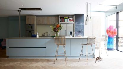
The interiors are by Alex and Mathew Orme at Space+Matter, who took care of everything from the planning and building to the sourcing. Mathew oversaw structural issues, while Alex took charge of decoration. Alex’s brief was to steer clear of anything fusty and to inject more life and daring into the house. The kitchen provides everything a family could want in one space – an eating, relaxing and socialising zone that leads through to the garden beyond.
Get the look: The cabinetry and worktops are from Roundhouse. These are Midas bar stools from Rockett St George. The Amp pendants by Simon Legald for Normann Copenhagen are from nest.co.uk. The oak herringbone flooring is from Siberian Floors. This is the Psychedelic Cactus coat stand by Paul Smith for Gufram.
GLASS ACT

The owners created a great feeling of space by knocking through partition walls and a side return to make a series of open living areas connected via discreet glass panels and parquet floors that flow effortlessly together. These then allow the eye to travel uninterrupted from the front of the house to the back and out into the garden.
Get the Look: The kitchen to the left is Bulthaup cabinetry. The herringbone flooring is from Cheville Parquet.
CALIFORNIA OR CLAPHAM?

The creative vision behind this marriage of English formality and Stateside cool was architect Andy Martin. The owners of this London home wanted a Malibu beach house vibe. Andy’s solution was to extend out while also digging down into what had been ‘a dingy cellar, with barely enough space to stand up in’ to create a generous space fit for family life.
Get the look: The kitchen is bespoke through Andy Martin with a worktop by Diespeker & Co. The pendant light is also by Andy Martin. The Déjà-vu stools are by Naoto Fukasawa for Magis at Viaduct.
GORGEOUSLY GLACIAL

The owners embarked on a large-scale refresh, which included knocking through two internal walls and extending to create a big kitchen-diner, which flows around the corner into a family room. The kitchen cabinetry, painted in Farrow & Ball’s Down Pipe and gleaming with marble and mirror, was a key piece. Rather than heading to the usual suspects, the designer went to a small local company, as the craftsmanship and the price were way better. An oversized skylight over the island lets in maximum light.
Get the look: This is a Woodwork Kitchens of Southborough kitchen, painted in Farrow & Ball’s Down Pipe. Find the Optic Flora pendants at Rothschild & Bickers. The flooring is from Timbered. The faux-flowers and vase are by Abigail Ahern.
NEW HEIGHTS

Extra supports had to go in so that the kitchen roof could be opened up and toppling walls strengthened. This drove up the build spend but the owners knew it was worth it. They chose the blackest floor they could find, rejecting most of the builder’s samples for being too brown and ‘suburban’. The simple kitchen from a no-frills supplier is ‘luxed up’ with marble worktops. There are no wall-mounted units as the owner wanted the kitchen to feel like a lovely room you would want to spend time in.
Get the look: The cabinetry is by Howdens. The metro tiles are by Walls and Floors.
LIGHTEN UP

Glazing above and around the kitchen extension makes the most of available light, with the open feel enhanced by clever structural techniques that remove the need for supporting pillars. The kitchen cabinetry is ice-white and simple, with all the textural impact emanating from a splash back of rich copper and the glass pendant.
Get the look: The kitchen is by Goldman & Rankin. Metal Sheets can supply a burnished-copper splashback. The mixer tap is by Vigo. This is the Diner 125 pendant by Davey Lighting at Original BTC. The Industrial leather bar stools are from Rockett St George. This is the Dot vase by House Doctor at Lef Living.
See more modern kitchen ideas
Be The First To Know
The Livingetc newsletter is your shortcut to the now and the next in home design. Subscribe today to receive a stunning free 200-page book of the best homes from around the world.
Jacky Parker is a London-based freelance journalist and content creator, specialising in interiors, travel and food. From buying guides and real home case studies to shopping and news pages, she produces a wide range of features for national magazines and SEO content for websites
A long-time contributor to Livingetc, as a member of the team, she regularly reports on the latest trends, speaking to experts and discovering the latest tips. Jacky has also written for other publications such as Homes and Gardens, Ideal Home, Red, Grand Designs, Sunday Times Style and AD, Country Homes and Interiors and ELLE Decoration.
-
 The 12 Best Table Lamps for Reading —I'm a Certified Bookworm (and Shopping Expert)
When it comes to table lamps for reading, I don't mess around. If you're the same, this edit is for YOU (and your books, or course — and good recommendations?)
By Brigid Kennedy Published
-
 "It's Scandi Meets Californian-Cool" — The New Anthro Collab With Katie Hodges Hits Just the Right Style Note
The LA-based interior designer merges coastal cool with Scandinavian simplicity for a delightfully lived-in collection of elevated home furnishings
By Julia Demer Published
-
 25 bathroom trends for 2024 - from the color to the quick buy that is making a big design splash this year
The bathroom trends for 2024 include the warmth of honeyed tones to the quick storage fix everyone needs now. Design experts explain how to use these new ideas in your own space
By Pip Rich Last updated
-
 Design-forward living room ideas to give your home a refresh
Living room ideas from our favorite homes, filled with designs and trends to inspire
By Amy Moorea Wong Last updated
-
 Bathroom tile ideas – 23 creative ways with color, pattern and installations
Use these bathroom tile ideas to add texture, pattern and even a touch of glamor to this very important room
By Hebe Hatton Last updated
-
 16 living room wallpaper ideas that'll convince you patterned wallcoverings are the way to go
These brilliant living room wallpaper ideas offer up inspiration for how to apply print, pattern and texture to different areas of your scheme
By Hugh Metcalf Published
-
 Crittall-style doors – 20 ideas that prove this timeless trend is here to stay
Fall for the charm of crittall-style doors, windows and room dividers all over again with our gallery of the best ideas
By Lotte Brouwer Published
-
 Florist Angela Maynard on how to care for dried flowers and how to style them in a modern home
Knowing how to care for dried flowers means you can have stylish arrangements that last for years. Author and florist Angela Maynard shares her tips
By Angela Maynard Last updated
-
 15 cozy living room ideas – how to create a stylish den-like space in your home
These cozy living room ideas are sure to make you want to curl up, surrounded with throws and cushions, no matter what the time of year
By Hebe Hatton Last updated
-
 Bathroom wall tile ideas – from bold and bright to subtle and sleek
Bathroom wall tile ideas are what give your bathroom personality, adding color, texture and depth – here are our favorite looks
By Hebe Hatton Last updated
