Small IKEA kitchens can be perfectly formed if you know these 10 designer secrets to getting them right
Tight on space? Let these small IKEA kitchen ideas prove what fabulous things you can do with limited square footage
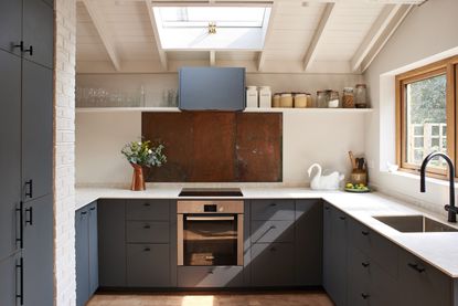

IKEA and small spaces are synonymous. They produce some of the best, most ingenious small space solutions out there, and that's why they are such a great place to start if you are designing a smaller kitchen. IKEA know what they are doing when it comes to squeezing a stylish kitchen into a tiny space.
When square footage is limited, it can make designing a kitchen that both looks fabulous and is also uber functional a bit tricky. But with IKEA kitchens you know you'll have the functional side covered from the off – their cabinet systems are used by so many small space dwellers for a reason. And the looking fabulous side can be so easily achieved too, especially with there now being so many options that make it really simple to inject some unique style into an IKEA kitchen (no matter how small).
With some help from the experts, we've rounded up 10 designer-approved small IKEA kitchens that are filled with ways to get the most out of an IKEA kitchen design. Whether that be switching out the handles for something more to your tastes, or using the IKEA systems as a base to create a totally customing looking kitchen.
10 tricks to get Small IKEA kitchens right
1. Keep it simple with plywood custom fronts
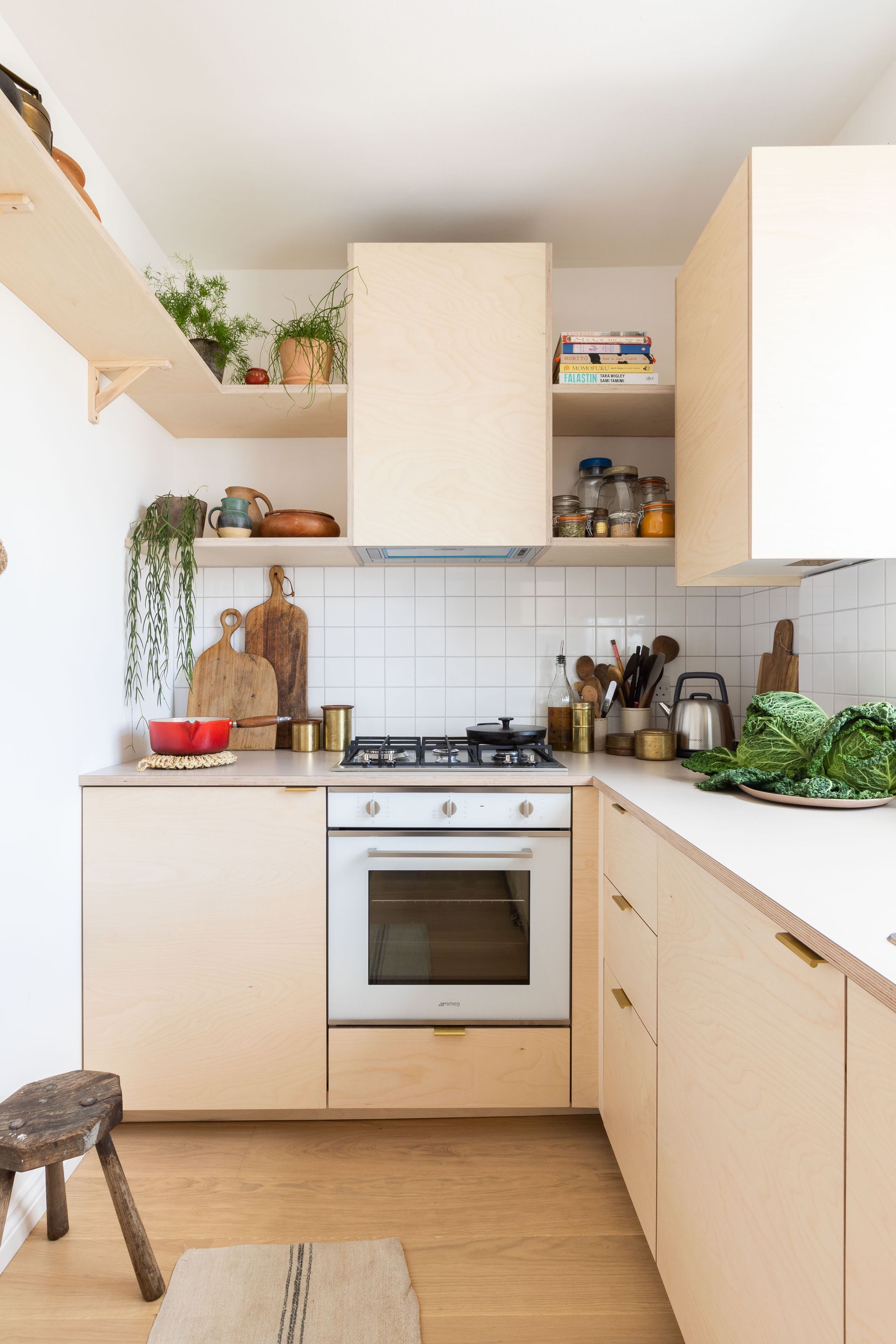
The IKEA kitchen systems are faultless, it why they are so loved the world over. However, if you want to create an IKEA kitchen that, well, doesn't look like an IKEA kitchen, opting for custom doors is an easy and affordable way to do so. You get all the benefits of IKEA's clever small kitchen storage solutions, but a space that perfectly suits your style.
There are so many companies out there now that make gorgeous door fronts (and more) that fit IKEA carcasses (a.k.a the base units). 'IKEA kitchens are well designed and have great functionality. Their kitchen storage organizers and accessories are carefully considered, allowing you to adapt the kitchen to your needs, making cooking and mealtimes more efficient,' explains Anne Clouston of Plykea, a company that make plywood doors for IKEA cabinets.
'By combining an IKEA kitchen with Plykea fronts, there are so many possible combinations (from natural wood veneers through to calm tones and Formica brights) to create a kitchen that will be uniquely yours. The end result is a kitchen with the functionality of IKEA combined with beautiful exposed birch ply edges, elevating the off-the-peg units.'
'This ply kitchen is our collaboration with author and food columnist Meera Sodha. Featuring birch plywood fronts, a Formica Oyster Grey worktop, and brass edge pull handles. For a clean, slab front aesthetic the wall units feature our invisi-pull doors. The extractor is encased in birch plywood to declutter the small space and the internal drawers have birch ply to match, to further elevate the IKEA kitchen cabinets,' adds Anne.
Meera adds her top tip for anyone designing a small kitchen is deep shelving – 'Having shelves as deep as the extractor fan (around 15in deep) is a wonderful thing because I can fit anything on them from pots and pans to platters, tins, jars, cookbooks, and plants,' she explains.
2. Go full height in a small IKEA kitchen
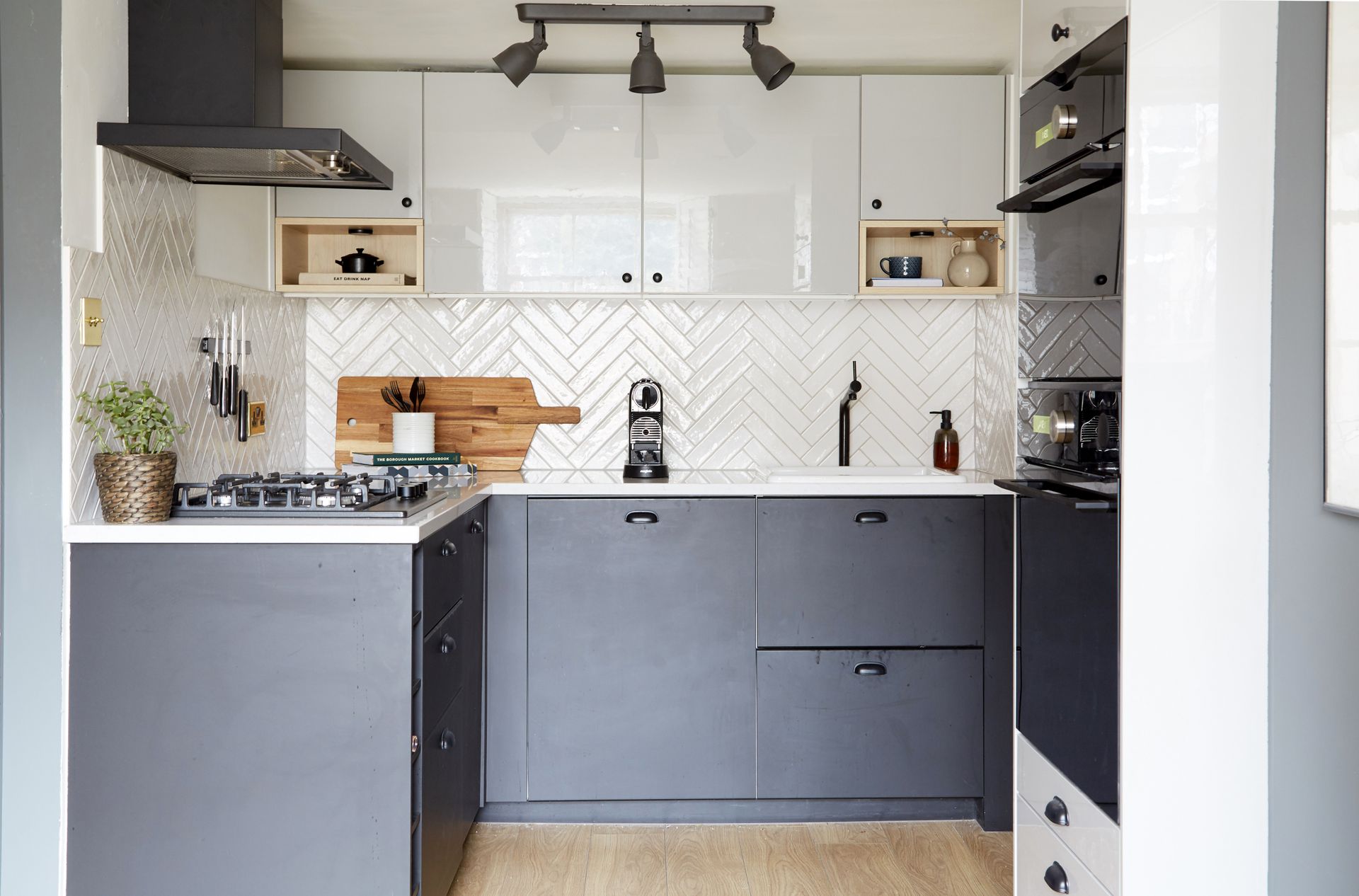
This is something we are constantly recommending when it comes to small kitchen design – if you are adding wall cabinets take them all the way up to the ceiling. As Athina Bluff designer and CEO of Topology Interiors (and once owner of this beautiful IKEA kitchen) says, 'Always go full height, right up to the ceiling no matter what your ceiling height is. This draws the eye upwards and makes the space feel bigger than it is, whilst also maximizing every nook and cranny at the same time. I'd also try and create a sense of openness so it's not all solid cabinetry – this could be breaking up cabinets with shelving, glass-fronted cabinet, or open shelving like I've done here.'
'This is the IKEA KUNGSBACKA range. I chose it because I wanted something simple, modern, and sleek. I loved the idea of a black kitchen but was worried in a small space it would feel really small, so I opted for lighter grey upper cabinets to break up all the black. I also chose open shelving on either side for a bit of symmetry and 'openess' so it wasn't all one solid block of cabinetry.' she continues.
Athina's top tip for making an IKEA kitchen feel more high-end is to mix and match – stick to IKEA for the base but add in smaller elements from elsewhere. 'I would always source the splashback from somewhere else. In this kitchen, I chose tiles from an external tile supplier which meant the overall look didn't look totally IKEA. Additionally, you could consider sourcing handles from a more premium brand. I also chose a quartz worktop from an external supplier so again I got a premium look.'
3. Or ditch the wall cabinets all together

It's a bit of a luxury to totally forgo wall cabinets, but if you are clever with storage elsewhere, sticking to just floor units can open up a space. In this IKEA kitchen, the units do all the work, freeing up the wall for a long shelf that can provide some extra storage but also a place to inject some personality with styling and decor. Also, note the kitchen shelving is above eye level, so it still has that effect we talked of earlier, drawing the eye up and alluding to more height.
'A run of eye-level cupboards can make the space feel smaller and be a bit overpowering so, if you have high ceilings, consider a run of two smaller cupboards stacked to utilize the height of the space and add interest. Incorporating some open shelving will also help to break up the walls and provide a place to display your favorite pieces.' suggests Dave Young, founder of Husk kitchens.
We also love the simplicity of this small IKEA kitchen, and how it combines the sleek, high-gloss VOXTORP fronts with lots of rustic textures and casually curated decor. In small kitchens often this is the best approach, choose a simple IKEA kitchen to be the backdrop for your decor so the room doesn't feel overly cluttered.
4. Maximize storage tricks that come with an IKEA kitchen

IKEA knows storage, it's why it's the go-to when designing small spaces, you can really get the most out of your dimensions. And there are so many ingenious kitchen storage solutions in all of IKEA's series that will help even the tiniest of kitchens be both practical and pretty.
This industrial kitchen was designed by HUSK and Sinclair Studios, using IKEA cabinets as the base and adding custom doors and handles. It's not the hugest kitchen in the world but with the help of a generous mix of IKEA storage solutions, there's a place for everything so the open storage can be reserved for the purely aesthetical.
'The key to designing a small kitchen is to maximize storage whilst maintaining the feeling of space,' explains Dave. 'We recommend utilizing all IKEA’s storage tricks, such as pull-out larder shelves, retractable bins, and deep drawers to make the most of every inch.'
'And if you have the room we recommend adding custom-building some storage around the units to make use of every corner. For example, at the end of a run of units there may be space for vertical wine storage or a book nook,' adds Dave.
5. Add warmth with wooden door fronts

Wooden kitchen cabinets are a great choice whatever your style, they are going to bring in warmth and texture and they are totally timeless. IKEA offer plenty of really affordable veneer fronts, perfect if you are on a budget, but if you are after something with a bit more weight and longevity, consider custom wooden doors.
In this gorgeous French kitchen of Riverside House (check out the rest of the property it's full of inspiration) the IKEA ENHET system was used and then custom oak doors added to fit the modern rustic feel. A custom cement worktop and brass splashback take this IKEA kitchen to new levels and work perfectly to contrast the original flooring and features throughout the rest of the space.
6. Keep the color palette light and bright

It's design 101 that lighter colors work best in smaller spaces. Now, while there are exceptions to this rule, the best small kitchen colors tend to be on the paler side – whites, creams, light greys, pastels, will all keep the space feeling open and full of light.
The cute bijoux kitchen owned by Magda Kucharska of @love_lives_here fits snuggly into a narrow galley of an open-plan space. 'Our kitchen is long but narrow (only 8ft). It's also north-west facing which means it's pretty dark and shaded most of the day – that's why from the first moment I knew I need to use a lighter color palette to brighten up and optically enlarge a space.' explains Magda.
'I chose off-white IKEA BODBYN cabinets and solid oak worktops to add some warmth and coziness. Over the years I saw many BODBYN kitchens on Instagram and Pinterest but no two were ever the same. Although it's a popular choice it's really easy to add some personality. One of the best and easiest solutions (practical and stylish at the same time) are open shelves filled with favorite bits and bobs – pretty glassware, dishes, storage jars, plants or artwork.'
'I always care about details like these – and I'm not just talking about typically decorative objects like serving boards or plant pots but also about things of everyday use, from mixing bowls to tea towels. Every detail matters and helps me create a soothing and harmonious space.'
7. Stick to just one wall of cabinetry
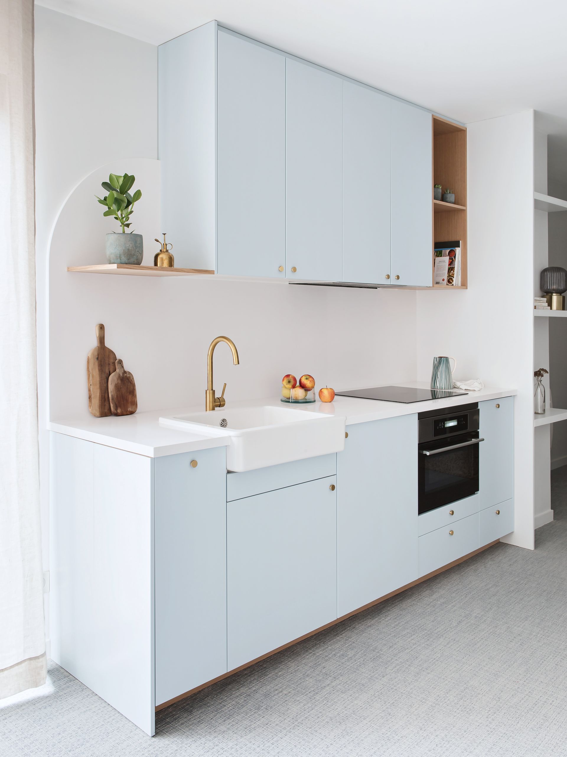
A single galley is an ideal small kitchen layout. Keeping everything on one wall can really open up your space, giving you room for a dining table or a breakfast bar, or just more floor space to move around in. But when you are limiting everything to one wall to need to be super savvy with storage. As we've said plenty of times, a cleverly planned IKEA base will do most of the work for you, but also make sure you go full height with your cabinets too.
And we know we don't often follow design rules to a tee, but this layout in a small space tends to work better with lighter colors. Ones that almost blend into the wall rather than add a dark, light-sapping wall of cabinets. This small IKEA kitchen is by Plum Living and was built into a rental for under €2,000! It's a METOD base combined with pastel blue custom fronts that work perfectly in this small but characterful apartment.
8. Don't over complicate the design

How dreamy is this cream kitchen? Again it's the perfect example of how an IKEA base can be completely upgraded using custom doors and more unique elements – in this case, the gorgeous green marble countertop. Save on the units, splash out on something stunning.
The custom doors are Fronteriors, a company that uses IKEA frames to create beautiful, high-end kitchens. When it comes to designing a kitchen that's on the smaller side, Fronteriors co-founder Kathryn Hawkes, recommends keeping it simple. 'Don’t overcomplicate your IKEA kitchen design. Try to keep it visually neat, simple and where possible, symmetrical. Pay attention to the mix of widths on your door and drawer units, aiming to use as many like-sized frames as possible.'
'IKEA offers so many options for maximizing storage space so pay attention to your personal requirements when selecting the internal components for the IKEA cabinets. They have a solution for almost everything on your kitchen wishlist.' And Kathryn recommends making use of IKEA's kitchen planner too, in order to experiment with different designs and layouts and get your storage spot on. 'It's a user-friendly tool that anyone can use. Familiarise yourself with it and explore your options before just settling for the recommendations their design team might suggest.'
9. Squeeze in a portable island for flexibility

Okay, so maybe you won't be able to fit a full-sized kitchen island but a compact portable kitchen island is a clever way you squeeze in that extra surface and storage space. This is the IKEA BEKVÄM, and while we have seen so many ingenious hacks to give this versatile piece a new look, we kind of love the simplicity of the bare birch wood. Oh, and it's on wheels so you can move it around your kitchen as and when it's needed so it never feels too permanent or solid within the layout.
The kitchen itself is the STENSUND in beige, perfect for a country kitchen feel but works well with some more contemporary pieces too. The creamy hue works well in a small kitchen too, adding all that openness and light that white cabinetry would but with some added warmth.
10. Create a place for everything with a pantry

A pantry sounds like something reserved only for large kitchens, but they can be such a huge asset to a smaller space. We aren't talking about something huge and walk-in, but an area that can house all the clutter and large appliances will really free up space in the rest of the kitchen – even if it means giving up some square footage.
There are plenty of amazing IKEA pantry hacks, to help you add something that looks really bespoke. The team at Holte say they often use an IKEA PAX wardrobe as a base for a more affordable, built-in pantry and there are some really chic freestanding options that you can upcycle too.
'If you have the luxury of designing from scratch, try to portion off an area for a pantry or larder storage area that can be jammed full of 'stuff' and then hidden away behind doors. Anything to maximize storage and leave work surfaces clear.' suggests Fiona Ginnett, founder of Holte.
'This kitchen combines an IKEA base with Holte fronts and the pantry was actually created using offcuts. 'Minimizing wastage was paramount. Offcuts from the fronts were used for the larder shelving, the shelves in the kitchen run were offcuts from the worktop and the Belfast sink was salvaged locally.' adds Fiona. 'The design process focused on what the client truly needed in their kitchen, careful not to overfill the space with unnecessary storage options and luxuries. The result, a well-stocked, accessible larder.'
How can you make a small IKEA kitchen look good?
It's so easy to make a small IKEA kitchen look good. It will depend on your style, but what we always think elevates a small kitchen really easily is open shelving. It gives you a spot to add in some decor and personality – prints, plants, books, and mix in some kitchen items too to make it functional like your prettiest crockery and jars of dried goods.
If you are designing from scratch, we couldn't recommend custom fronts enough. They are far more affordable and give you that high-end bespoke look, while still getting all the benefits of an IKEA system.
'If you're designing a small kitchen, we would splurge on the countertop and backsplash. You probably won't need much of it, and it will help make the kitchen appear much more expensive,' suggest Jen and Mar of Interior Fox. Or for a smaller tweak, switch out your hardware to make your IKEA kitchen more unique.
What's the best layout for a small IKEA kitchen?
The best layout for a small IKEA kitchen will come down to your space and how you like to use it. But as a general rule, when designing a kitchen layout we still like to go by the old tried and tested triangle rule, or the 'golden triangle as it's also known.
It's based around the idea that all the three 'zones' you most use are within close proximity of each other so you can easily and quickly move around the space as you cook. So in a modern kitchen, those zones tend to be the fridge, the cooker, and the sink. If you are looking for a place to start with layout, plan out those three things first. Then you'll want to add in storage and large appliance where it makes sense.
Make sure you make full use of the IKEA kitchen planner. You can plan your layout based on your dimension and get free advice from experts too.
Be The First To Know
The Livingetc newsletter is your shortcut to the now and the next in home design. Subscribe today to receive a stunning free 200-page book of the best homes from around the world.
Hebe is the Digital Editor of Livingetc; she has a background in lifestyle and interior journalism and a passion for renovating small spaces. You'll usually find her attempting DIY, whether it's spray painting her whole kitchen, don't try that at home, or ever changing the wallpaper in her hallway. Livingetc has been such a huge inspiration and has influenced Hebe's style since she moved into her first rental and finally had a small amount of control over the decor and now loves being able to help others make decisions when decorating their own homes. Last year she moved from renting to owning her first teeny tiny Edwardian flat in London with her whippet Willow (who yes she chose to match her interiors...) and is already on the lookout for her next project.
-
 How to Make a White Bathroom Feel Warm — 5 Tricks Designers Use For a Cozier and More Restful Spaces
Give your all-white bathroom a glow-up with these tips for bringing warmth to the space
By Oonagh Turner Published
-
 5 Habits to Adopt That Will Make Your Home Smell Good All the Time — 'Add Them to Your Routine Today!'
Incorporating these tricks into your maintenance routine will keep every corner of your home smelling fresh and welcoming
By Katie Baxter Published
