Kitchen shelving ideas – 10 looks that balance form and function
The best kitchen shelving ideas add character and style as well as storage, here are our favorite looks to inspire...


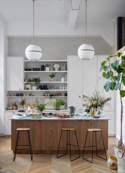
Kitchen shelving ideas are some of the most stylish and most simple ways to add color, texture, and personality into a room that is often such a practical space. Kitchens are the hardest working rooms in our homes, they are where we cook, eat, socialize, and even work, so adding decor that is purely just that is a bit of a luxury. But shelving, shelving can be both practical and decorative. You can use them to store your (most aesthetically pleasing) crockery and glassware but also add in books, prints, houseplants, etc.
Now for anyone who has attempted it will know, styling a shelf, not to mention choosing the most effective place to hang them, what size, style, number to go for, isn't the most straightforward job, there's an art to it. Especially when it comes to kitchen shelving as you always have to be getting that balance of form and function right.
So to help you get your kitchen storage right, from how to curate what you display to the practical side of adding shelves, we've gathered all our favorite looks and expert advice.
1. Consider the practicalities of kitchen shelving
No matter how decorative your shelving is going to be, you need to plan in where you are going to position them. As we've said practicalities need to come first in a kitchen so ensure your shelving isn't going to protrude into the room too much, be too high to use effective, or too low it's a hazard. And you need to ensure what you are displaying makes sense for how you use the space.
As Emma Deterding founder of Kelling Designs says, 'The trend for open shelving in the kitchen continues to prove popular, providing a less formal option for kitchen storage. That being said, there are a few things you need to consider and do in order to make this work in your own home, without making your kitchen look cluttered.'
'Whether you have open shelving or glass-fronted cabinets, you need to keep them clean, clear, and organized. If you're looking to display your best glassware, china, or tableware, then be sure to clear through everything you have and only display your best and favorite pieces. Not only will this allow your personality to shine through, but you can introduce color and pattern through the pieces you show off. If, like me, you collect teacups and coffee mugs, then displaying your best pieces on the shelving will allow you to show off your prized collections.'
'If, however, you're looking to be more practical, then placing your most used kitchen items to keep them within arms reach is ideal – just cut the numbers down to exactly what you need to keep it clean and clutter-free. Another practical way to make the most of open shelving is to use them as an open-view pantry. Use beautiful glass jars to store items like rice, pulses, tea bags, etc, and stack them on the shelving to create a 'chef's kitchen' feel at home, keep everything within arms reach, easy to access and see.'
2. Switch wall cabinets for shelving

The classic kitchen layout tends to involve both wall cabinets and floor cabinets, but when space is tight in a small kitchen or if you want to create a more open and airy space, forgo the wall cabinets and instead opt for shelving.
Shelving reduces the visual bulk in the room and allows for light to flow through the space, making a kitchen feel larger. And while you may have to get a bit more creative with your displays, if you choose deep shelves and take them all the way up to the ceiling you can fit in just as much as you would with cabinetry.
See how in the small kitchen everyday items like plates, mugs, even the coffee maker all of a sudden become decoration, adding shapes and texture to the room just as prints or plants would. Also, note how no space is wasted here, the shelves are positioned as soon as the backsplash ends to really maximize that wall space.
And if you have to, 'narrow down your dishware collection.' advises Daniel Bowler, Director for Eggersmann. 'While an open shelf probably won’t hold your entire stock of plates and bowls, it can be a handy way to keep your favorites or those that are most used within easy reach.'
3. Use kitchen shelving to add character and texture to a small space

How gorgeous is this little rustic kitchen designed (and owned) by Dee Murphy? The zellige tiles, the adorable deep green stove, and the main focus, the floating shelf. The reason this space gets it so spot-on is the real mix of heights, shapes, and textures. There are no clear lines to guide the eye, no symmetry, no pattern, making you really drawn to the display – irregularity is key to good shelving ideas.
Dee explains, 'I wanted to do something fun and add more shine to one side of my space with a brass shelf over the green stove. I love art and collectibles in a kitchen, and although it can sometimes be controversial on Instagram, this shelf is one of the happiest and most loved spots in my home. And yes… I do actually cook.'
'On the flip side, I went for something a bit more functional with a built-in for more storage, and glass doors to view my pretty dishes. Most of the kitchen is a variation of cool colors (grey and white), so the dark walnut breaks up the room, provides warmth and texture.'
4. Create a balance between form and function

This wooden kitchen is the perfect example of how kitchen shelving should work, a mix of both handy extra storage and the perfect spot for adding some character to your kitchen. Bottom shelf purely practical, top shelf purely decorative. It's all about balance.
'I love open shelves in the kitchen with everything behind closed doors shelves are such a good way to inject personality into this room.' explains Abigail Ahern. 'Stack bowls and plates with other items to mix things up. Grab a plant, some cookbooks, vases, candlesticks - decorative accents in other words that add visual interest. Reign in the color palette and decant decant decant. I have seeds, grains, and coffee all decanted into glass jars and it looks fab.'
5. Opt for open backed shelving in a small kitchen

Not all kitchen shelving needs to be wall-mounted. In this sleek white kitchen design by Borisoff Design Studio, the walls are kept clean and bare, and instead, this stunning gold unit comes from the ceiling. 'Adding simple metal hanging shelving over any sink area, maximizes space and provides a beautiful styling opportunity while allowing light to still pass through.' explains Lauren Borisoff.
It's designs like these that work so well in small spaces where adding anything to the walls is only going to make the space feel cluttered and claustrophic. We've also seen shelving similar used as a room divider in an open plan kitchen or floating over a kitchen island.
6. Keep it simple with a single long shelf

This is a kitchen trend we are seeing so much at the moment, simple, understated but really effective. A single floating shelf running the length of one wall. In this kitchen, the shelf blends so seamlessly into the backsplash, it takes the concept of a floating shelf to a whole new level, the objects look almost to be suspended on the wall. It's such a clever way to add a shelf and create that perfect spot for decor, without very obviously breaking up the wall.
7. Use kitchen shelving to zone a space

Whether you want to create a pantry like space with shelving covered in glass jars of pasta, a mini living room with shelving covered in books and a cozy armchair beneath, or as can be found in this kitchen, a cute coffee station, with shelving covered in cups – shelves, can give a room definition. It can create mini rooms within your room, with different functions. It's a great trick for open plan kitchens in particular where space is aplenty but you want to room to be multifunctional.
Daniel Bowler's advice is to carefully 'think about placement – open shelving above a sink is great for relieving clutter in this area, or perhaps utilize a corner of the kitchen near the kettle to create a coffee bar effect. Consider which area of the kitchen would most benefit from additional storage and work from there.'
8. Go floor to ceiling and turn shelving into a feature wall

Treat shelving almost like a kitchen wallpaper, go floor to ceiling and fill them with a real mix of items that are going to add all the color and texture to the room. We love this really uncurated look, with the overflow of books, the jars in all different shapes and sizes, and then the shelf of mugs and cake stands that add just a small amount of that much-needed negative space. It feels very homely and effortless but not too cluttered.
If you like the effect of this look but want to take a more minimalist approach, pick a cohesive color scheme of just one or two colors for a similarly laid-back look that's just slightly more paired back.
9. Light up your shelving effectively

Kitchen lighting is such a key part of an overall kitchen design and should be considered with every choice you are making from layouts to colors. How your shelving will affect your lighting and how you might want to light your shelving should be considered too. As designer Benji Lewis says 'Lighting is paramount in the kitchen, so position light fittings accordingly so that they throw good illumination onto your shelving and you can find things easily.'
And ensure your shelving does block lighting or cast strange shadows. LED strips can work really nicely to make shelving more of a feature, and if your shelving sits above a worktop LED lights could also provide task lighting as well as illuminating your shelves.
10. Blend kitchen shelving into the walls

Painting shelving so that it blends into your kitchen walls is a great option if you want to add storage but don't want your shelves to become too much of a focal point of the room.
See how in this yellow kitchen by deVOL, there is so much going on in terms of lovely rustic decor, having stand-out shelving might tip the style from being elegantly eclectic into too busy. So painting the shelves that same fabulous mustard yellow allows for that extra surface space for adding decor but without the visual bulk.
How should you style a kitchen shelf?
When styling a kitchen shelf, Samantha Wilson, designer and founder of Collection Noir recommends to first 'assess the space you want to style. How many shelves are there and are they at different heights and widths? This is your starting point and will give you the best idea of the potential objects, shapes, and sizes you may want to use.'
'You most likely already have a style and color scheme going on, so the next step is gathering all the objects, accessories and personal mementos you may want to feature. Try to be creative so you have a variation of sizes, shapes and textures.'
Layering is key, even if you are using your kitchen shelving purely for practical reasons you want it to look nice, have depth and interest. 'Look out for the balance between the positioning of the larger objects and make sure one area isn't too heavy. Pay attention to the harmony between the colors in your books and accessories - you may notice areas that need swapping around slightly so keep tweaking as you go!' is Sam's advice.
'Now that you have a strong base, start adding in the smaller pieces to fill out the gaps. Remember, the purpose of your shelf is to display and not to just store, so keep the smaller items to a minimum to avoid cluttering.'
Should you need suggestions on where to buy kitchen storage for your shelves, then don't miss our kitchen organizers guide. We've listed plenty of solutions when it comes to storing your packaged goods and dried foods — in style and on display.
Be The First To Know
The Livingetc newsletter is your shortcut to the now and the next in home design. Subscribe today to receive a stunning free 200-page book of the best homes from around the world.
Hebe is the Digital Editor of Livingetc; she has a background in lifestyle and interior journalism and a passion for renovating small spaces. You'll usually find her attempting DIY, whether it's spray painting her whole kitchen, don't try that at home, or ever changing the wallpaper in her hallway. Livingetc has been such a huge inspiration and has influenced Hebe's style since she moved into her first rental and finally had a small amount of control over the decor and now loves being able to help others make decisions when decorating their own homes. Last year she moved from renting to owning her first teeny tiny Edwardian flat in London with her whippet Willow (who yes she chose to match her interiors...) and is already on the lookout for her next project.
-
 The 12 Best Table Lamps for Reading —I'm a Certified Bookworm (and Shopping Expert)
When it comes to table lamps for reading, I don't mess around. If you're the same, this edit is for YOU (and your books, or course — and good recommendations?)
By Brigid Kennedy Published
-
 "It's Scandi Meets Californian-Cool" — The New Anthro Collab With Katie Hodges Hits Just the Right Style Note
The LA-based interior designer merges coastal cool with Scandinavian simplicity for a delightfully lived-in collection of elevated home furnishings
By Julia Demer Published

