Small kitchen layout ideas - 10 clever designs to make the most of space
Got a compact kitchen? We've spoken to the experts to find small kitchen layout ideas to make even the tiniest of kitchens work
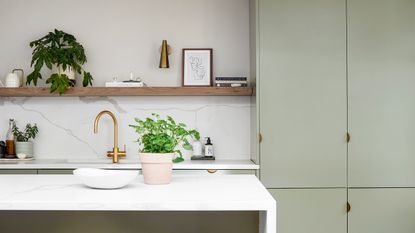

Clever, well-thought-out small kitchen layout ideas are key to designing a space that's functional, stylish, and really maximizes the room you have to work with. Deciding on a layout is one of the first steps when it comes to planning your kitchen, so it's worth considering all your options before you start getting into the (admitted more fun) color schemes, cabinet styles etc.
Now, while you might think when it comes to a small space, your options when it comes to layout are fairly limited, but actually, there are so many creative ways to make use of space. So we've pulled all our favorite small kitchen ideas and designs together, plus spoken to kitchen experts to get the best advice when it comes to choosing a layout for your space...
The best small kitchen layouts
We demand a lot of our kitchens every day, and smaller spaces often need to work harder for us. They should be robust, and most importantly, easy to navigate. ‘This is where the working triangle comes in, with sink, cooking, and fridge zones all in relatively close proximity,’ explains Matt Baker, Designer at Harvey Jones. ‘There should be a good-sized worktop run for preparation, preferably next to or opposite the hob zone.’
Multifunctional elements are key to a successful small kitchen layout design – whether it be an oven that doubles as a microwave, or, an L-shaped worktop that can be used as a breakfast bar. Bringing a designer on board early on in your planning process will be beneficial to your kitchen ideas, as they can advise on how to best to optimize your space. A plus side of small kitchens is you can often choose made-to-measure storage or high-quality materials that will stand the test of time, without completely blowing the budget. ‘Longevity is a priority for a new kitchen,’ says Ben Burbidge, Managing Director, Kitchen Makers. ‘So you need to ensure your chosen design and colors are styles that will not only work for you but that you will love to live with for many years.’
1. Consider the kitchen triangle rule

Kitchen designed by Beata Heuman
Most of us, we are sure, have heard of the kitchen triangle rule, or the 'golden triangle' as it's sometimes called. And while it may have its roots in the 1940s, the idea of designing a kitchen floorplan that makes it super easy to move from the most important aspects of the room, definitely is something to be considered in 2021 too, especially when space is tight.
In brief, the triangle rule is based on the sink, fridge, and cooker all being in relatively close proximity. 'When presented with a challenging space it is essential that the layout is carefully considered to make sure every inch of the kitchen is utilized. The age old advice that says to think of the fridge, oven and sink as points on a triangle and ensure the distance between each is not too limited holds true even in small or awkward spaces.' explains Ben Burbidge, Managing Director of Kitchen Makers.
'Innovative storage solutions will allow you to fully utilize your kitchen. Configure your storage around this triangle by allocating space to plates and glasses around your sink or dishwasher and keeping food storage away from hot appliances such as ovens and hobs; a space that best suits cooking utensils, pans and oven trays.'
2. Maximize the amount of units with a U shaped small kitchen
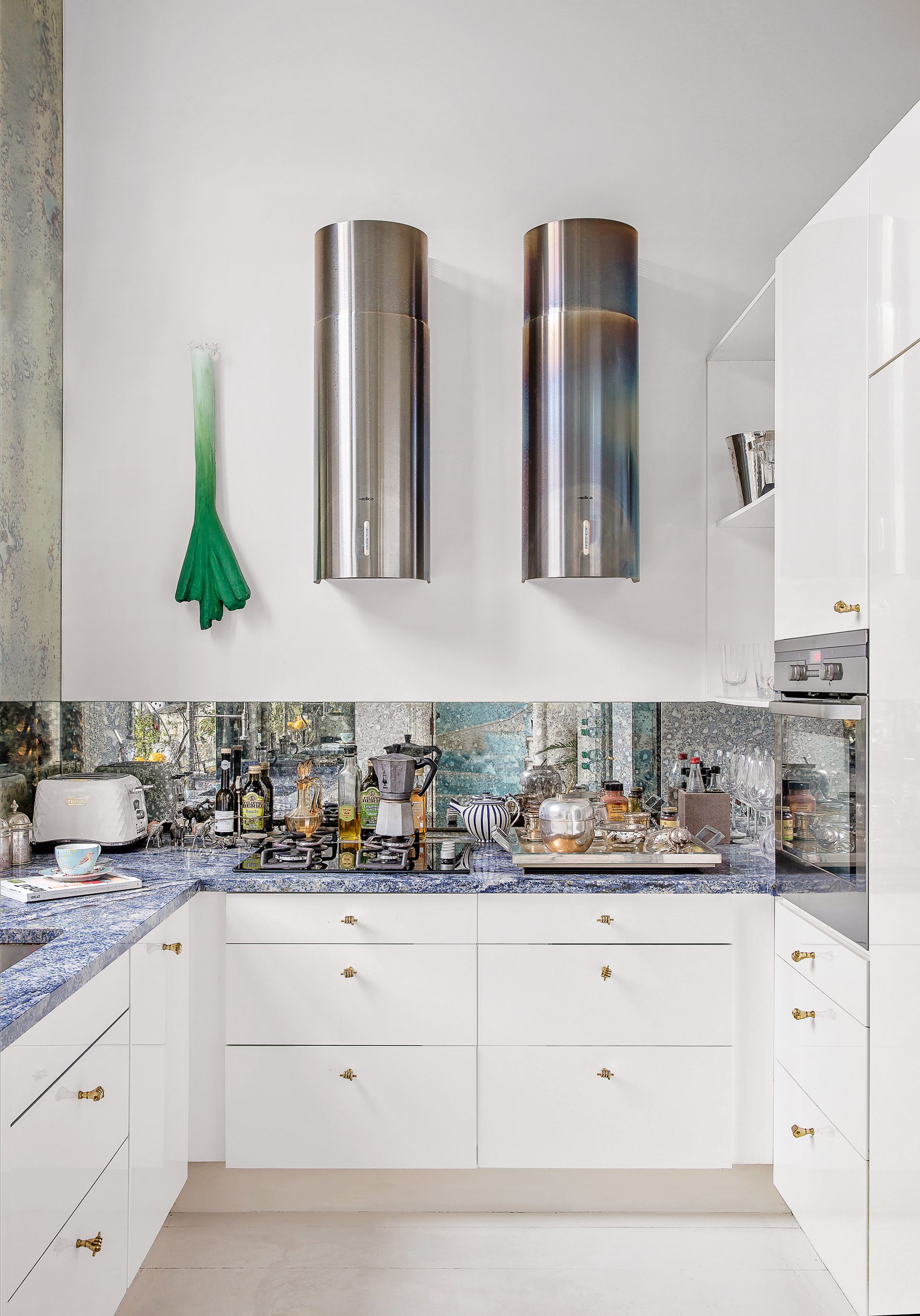
U-shaped kitchens tend to be kitchens without islands, are one of the most popular small kitchen layout ideas for a reason, they really maximize on space and are perfect if you need plenty of cupboard room and surface areas.
The key to making this look work in a small space, however, is not to crowd the room, opting for a U-shaped design and then filling all the walls with cabinets can feel claustrophobic. So instead leave at least one wall free, and then make the most of space by going floor to ceiling on another wall. As this small kitchen proves, this can look far more elegant than just having a bank of cabinets floating in the middle of the wall with all that wasted space above and below.
3. Keep wall cabinets narrow

This kitchen designed by Beata Heuman really is a lesson in small space design. The fact that it's open on one side does slightly distract from the small scale, but look closely, and my gosh that's a small kitchen. But for what it lacks in square footage it more than makes up for in style – the deep olive greens, the slab marble splashback, and those gorgeous curves going on. But it's a practical space too, where everything has its place.
What we are taking away from this kitchen is that wall cabinets don't have to mirror floor cabinets in their depth. In a kitchen of this size bringing a wall cabinet all the way out into the room would make the space so small and cramped, so instead, go for wall cabinets that are half the depth of those on the base. It's something that can work with any layout, giving extra storage without encroaching on the room.
4. Go for a double galley layout in a narrow kitchen
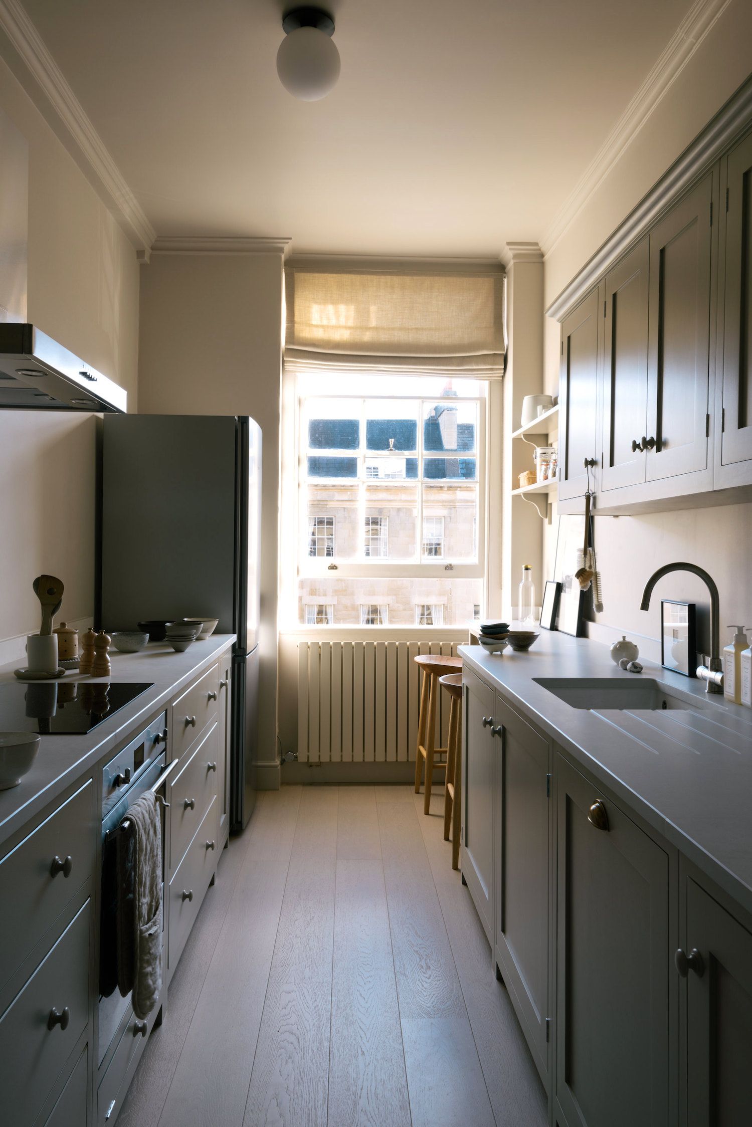
If you are dealing with a narrow kitchen, the best way to go to make the most of your space is a double galley layout. This way you make efficient use of both sides but it doesn't feel too boxy as a U-shaped layout would in a space of this size. In fact, leaving one wall free from cabinets can keep a kitchen feeling open and light – especially if one wall has a window as in this deVOL kitchen.
And note that at the end of the bank of cabinetry, the worktop narrows and seamlessly becomes a small breakfast bar, providing the perfect spot to perch with a coffee and the paper in the morning. Plus it means the layout opens out a bit when it reaches the window so you don't have that awkward problem of having to bring the work surfaces out under the window, throwing off the symmetry.
5. Opt for a narrow kitchen island
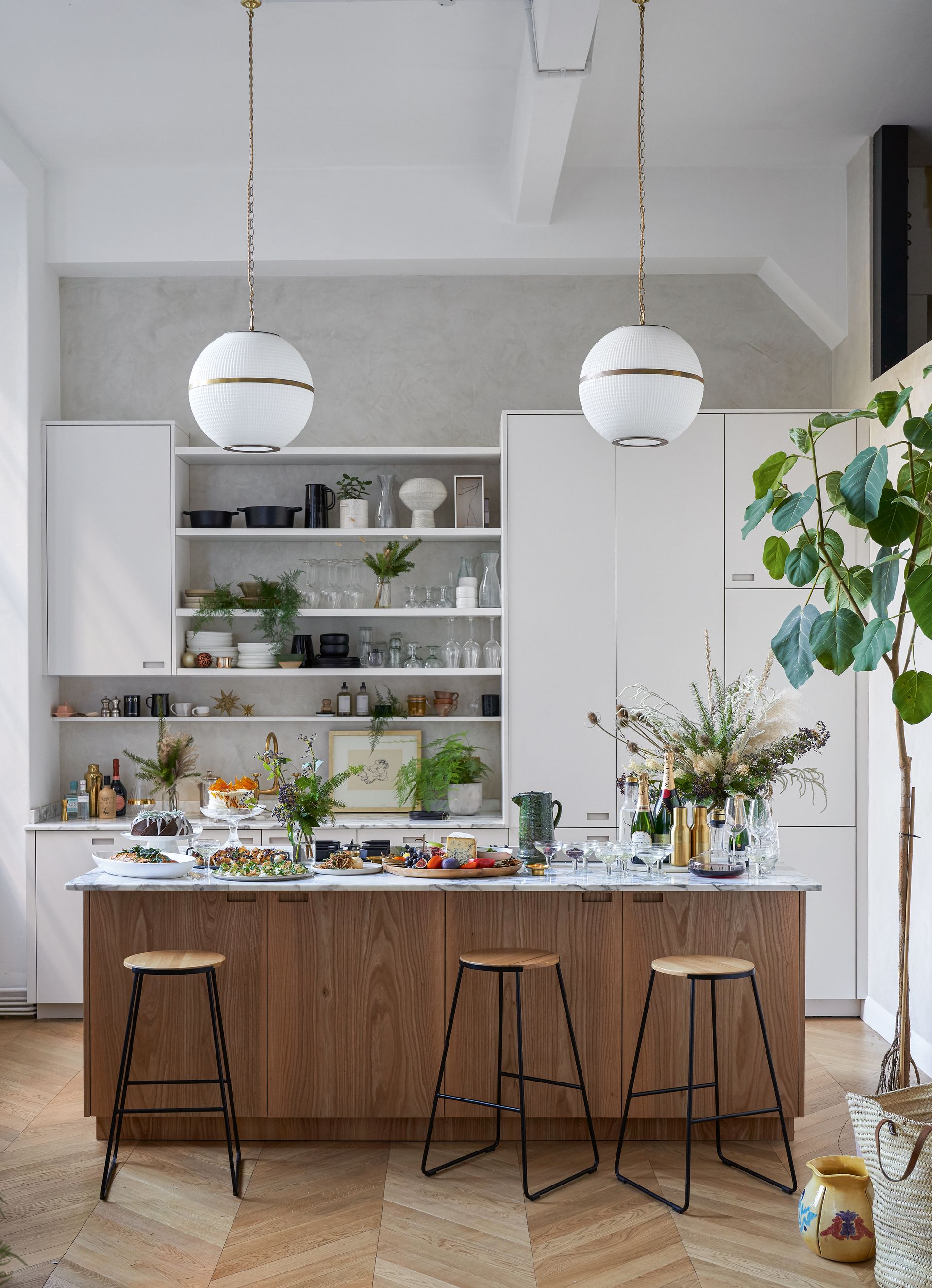
Kitchen island ideas may seem reserved for spacious kitchens with acres of space to play with, but they shouldn't be drawn out as part of a small kitchen layout. We have seen plenty of examples of an island working in the tiniest of spaces and in fact can often make a small kitchen feel more open.
The key is to always ensure you have enough space around the island so that it becomes an asset rather than an impracticality. You should have at least a 100cm clear walkway between the island and the wall or cabinets. In a small space, this will probably mean your island will be quite narrow, but so long as it's at least a meter wide and makes sense for the way you use and move around your kitchen we say it's worth it. An island can add extra storage, extra surface space for prep and is just a nice space to have in your kitchen to socialize around.
No room for a kitchen island? Consider something more flexible like a butcher's block, which you can get away with being much smaller and it can move around the space as and when you need it.
6. Ditch wall cabinets for open shelving
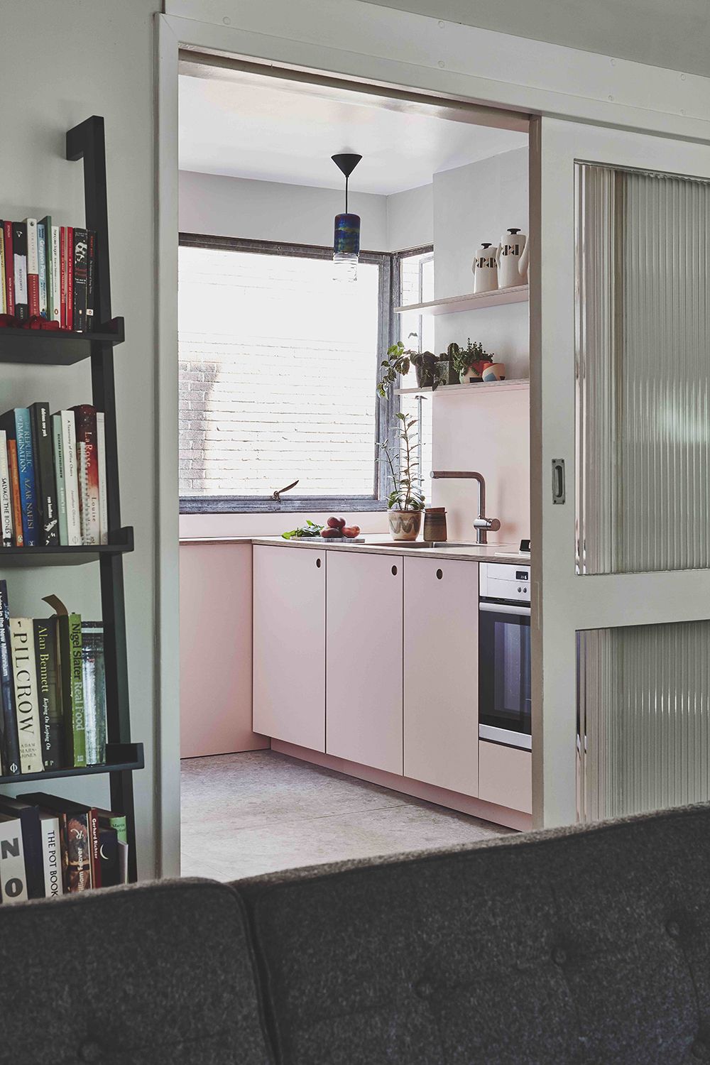
If you are really tight on space, ditching the wall cabinets is a simple layout idea that's going to make your kitchen feel much bigger. It's also a way you can switch up the layout and feel of a current kitchen without having to totally remodel. If you've inherited a kitchen you don't mind the style of but the wall cabinets are just making the space feel claustrophobic, get them off the walls, re-plaster, and replace them with some lovely wall tiles, and simple open shelving that you can use as both storage and decor.
7. Bring in freestanding pieces for a flexible layout

Freestanding furniture can be such an asset in a small kitchen – a butcher's block, a sideboard, a vintage trolley, they add storage and surface space but they all add personal style and create a relaxed feel to a kitchen, breaking away from the rigid layout of just banks of cabinets.
'Additional storage and surface space is high on everyone’s wish lists at the moment. We have had more and more customers asking for islands to be incorporated into their kitchen design, somewhere they can cook, eat, work and gather, as well as additional cabinetry and cupboards.' says Stephanie Nix, Kitchen Designer at Neptune.
'Including a freestanding unit is the perfect solution if you have less room to play with as they provide room for storage meaning you can keep the little bits and pieces out of sight. Ensuring that you have enough floor space in your kitchen is important so as not to feel crowded or cluttered, so being able to move your units to your desired position will help in creating a dynamic space, no matter how big or small.'
8. Add a peninsular breakfast bar

This look works really well in open-plan kitchens, where you might have to share your cooking space with say a living room or a dining room, but they are also a nice alternative to an island that might be easier to work into your small kitchen.
Unlike an island, a peninsular doesn't float in the center of the room, it's connected to the wall but still provides that lovely sociable space in a kitchen, just as an island would. Plus if you include a slight overhang in your design it can double up as a breakfast bar too.
9. Open up the room with a single galley layout
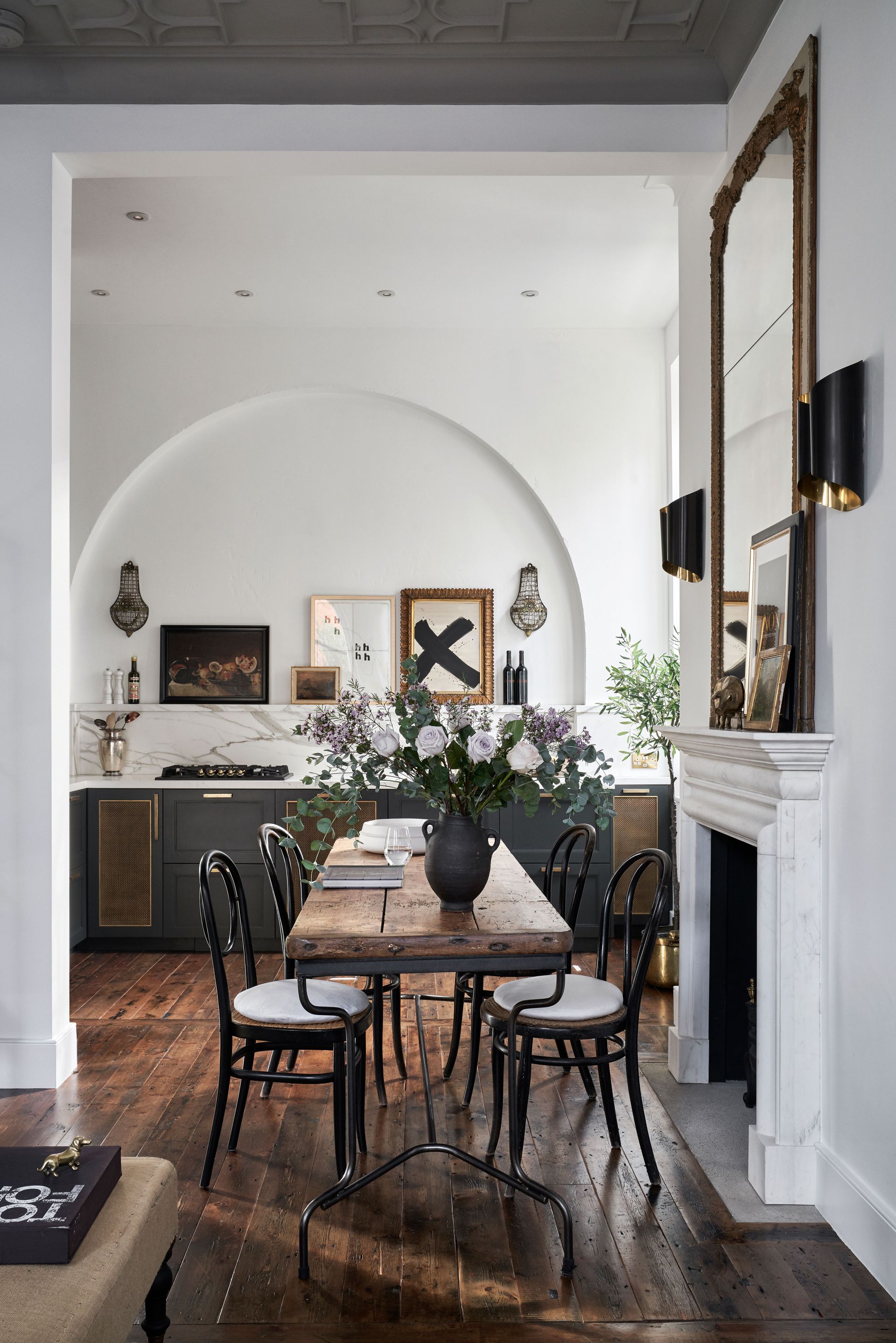
Think traditional galley layout, but just down one wall. This again is a layout that works really well if you're kitchen is part of a larger room, as it keeps the space open and easy to move around, nothing gets cut into or blocked off. However, when you are limiting your kitchen to just one wall, every inch really does have to count.
'Creating a bank of cabinetry along one wall is a great way of streamlining and opening up the space.' says Ben Burbidge. 'Tall wall units are particularly suited to galley style kitchens as using this space ensures the area feels less cramped than if filled with larder style dressers.'
And if floor-to-ceiling cabinetry isn't your style, take inspiration from this kitchen – and just ensure you are really maximizing your storage with deep drawers, cabinets designed for specific items and built-in appliances so everything looks seamless.
10. Add floor to ceiling units into your small kitchen layout

As we've mentioned many a time now, often with small kitchen layouts, the classic combo of wall and floor cabinets doesn't work. That gap in between makes the space feel smaller and cramped. However, we definitely aren't against going floor to ceiling with a selection of units. This eradicates that wasteful gap and provides so much extra storage so you can ditch the wrap-around wall cabinets.
'Keep clutter to the minimum by using clever storage solutions. If the space allows, always try and integrate a tall larder type full height cabinet.' says Jayne Everett Design Director at Naked Kitchens. 'It's amazing how much storage this gives you and it really doesn't need to be very wide. Even a 300 wide cabinet gives huge amounts of floor-to-ceiling storage. Using every last inch of space is essential and this can be achieved by using bespoke cabinet sizes.'
How can you plan a small kitchen layout?
If you are remodeling from scratch a kitchen designer or architect can help you create the best plan for your specific space. However, if you are just in the planning stages and want some options, there are some great apps out there that can help you test out different configurations. Or just go old school with a pencil and some graph paper.
What shape is most efficient in a small kitchen?
The most efficient shape for a small kitchen really will depend on the shape and size of your kitchen. But for narrow kitchens, for example, a double galley or a single wall of units usually makes sense as it maximizes space without creating that boxy feel.
For kitchens that are more open, a U-shaped layout is ideal as it allows for plenty of storage space and countertop space, just be wary of adding too many wall cabinets, as we have warned, mirroring the base cabinets on the walls can really shrink a room.
Be The First To Know
The Livingetc newsletter is your shortcut to the now and the next in home design. Subscribe today to receive a stunning free 200-page book of the best homes from around the world.
Hebe is the Digital Editor of Livingetc; she has a background in lifestyle and interior journalism and a passion for renovating small spaces. You'll usually find her attempting DIY, whether it's spray painting her whole kitchen, don't try that at home, or ever changing the wallpaper in her hallway. Livingetc has been such a huge inspiration and has influenced Hebe's style since she moved into her first rental and finally had a small amount of control over the decor and now loves being able to help others make decisions when decorating their own homes. Last year she moved from renting to owning her first teeny tiny Edwardian flat in London with her whippet Willow (who yes she chose to match her interiors...) and is already on the lookout for her next project.
-
 The 12 Best Table Lamps for Reading —I'm a Certified Bookworm (and Shopping Expert)
When it comes to table lamps for reading, I don't mess around. If you're the same, this edit is for YOU (and your books, or course — and good recommendations?)
By Brigid Kennedy Published
-
 "It's Scandi Meets Californian-Cool" — The New Anthro Collab With Katie Hodges Hits Just the Right Style Note
The LA-based interior designer merges coastal cool with Scandinavian simplicity for a delightfully lived-in collection of elevated home furnishings
By Julia Demer Published
-
 25 bathroom trends for 2024 - from the color to the quick buy that is making a big design splash this year
The bathroom trends for 2024 include the warmth of honeyed tones to the quick storage fix everyone needs now. Design experts explain how to use these new ideas in your own space
By Pip Rich Last updated
-
 Design-forward living room ideas to give your home a refresh
Living room ideas from our favorite homes, filled with designs and trends to inspire
By Amy Moorea Wong Last updated
-
 Bathroom tile ideas – 23 creative ways with color, pattern and installations
Use these bathroom tile ideas to add texture, pattern and even a touch of glamor to this very important room
By Hebe Hatton Last updated
-
 16 living room wallpaper ideas that'll convince you patterned wallcoverings are the way to go
These brilliant living room wallpaper ideas offer up inspiration for how to apply print, pattern and texture to different areas of your scheme
By Hugh Metcalf Published
-
 Crittall-style doors – 20 ideas that prove this timeless trend is here to stay
Fall for the charm of crittall-style doors, windows and room dividers all over again with our gallery of the best ideas
By Lotte Brouwer Published
-
 Florist Angela Maynard on how to care for dried flowers and how to style them in a modern home
Knowing how to care for dried flowers means you can have stylish arrangements that last for years. Author and florist Angela Maynard shares her tips
By Angela Maynard Last updated
-
 15 cozy living room ideas – how to create a stylish den-like space in your home
These cozy living room ideas are sure to make you want to curl up, surrounded with throws and cushions, no matter what the time of year
By Hebe Hatton Last updated
-
 Bathroom wall tile ideas – from bold and bright to subtle and sleek
Bathroom wall tile ideas are what give your bathroom personality, adding color, texture and depth – here are our favorite looks
By Hebe Hatton Last updated

