This restored Victorian home in Stoke Newington features a fresh, industrial scheme and modern extensions
This Victorian home feels fresh and modern, thanks to new extensions, lots of sky lights, an industrial-inspired interior scheme and a balanced colour palette of dark accent colours against a white backdrop...


The Property
This restored Victorian home feels fresh and modern, thanks to new extensions, lots of sky lights, an industrial-inspired interior scheme and a balanced colour palette of dark accent colours against a white backdrop.
The modern home is on Allerton Road in London's Stoke Newington area, and the project involved a complete refurbishment, a new kitchen extension, new bathrooms and new windows in the existing loft conversion. Then, as building work began, the owners found themselves expecting their third son, so the couple decided to bring architecture studio Sadie Snelson Architects and interior designer Sarah Ellison of Frank & Faber on board.
“Comfortable family home” were the words at the top of the owners' list in their brief to Sarah. She achieved this with an open-plan kitchen, a spacious double reception room with plenty of space for playing (and within eyesight of the kitchen), and fun kids' rooms. A luxurious master suite with a dressing room offers a restorative retreat from busy family life.
Hallway
The first thing you notice when stepping into this home is the striking hallway floor, which features geometric tiles but placed in an unexpected and asymmetric way.
Like any project, there was a set budget, so Sarah Ellison's job was to suggest where to spend and where to save to meet the figure. Good quality worktops and lighting, for example, can make all the difference to a room, whereas it may be possible to buy more economical cupboard carcasses which aren’t on show, or to buy high street floor tiles but lay them in an interesting pattern to make them stand out.

The original staircase was given a fresh and modern look with a coat of black gloss paint.

See Also: This colourful family home in Bristol gives period features a modern update
Kitchen
The goal for the ground floor was to be able to have the whole family round, so Sarah Ellison was asked to create a relaxed, open scheme where everyone would feel welcome. The owners also wanted some interest and warmth, and particularly liked mid-century styles and industrial looks.
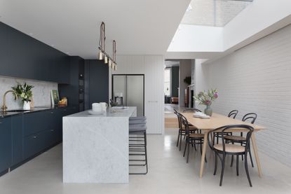
Picking up on the industrial vibe in the kitchen, a polished concrete floor and painted brick wall creates a simple backdrop to dark-painted, clean-lined cabinetry.

The effect is enlivened with brass handles, a striking brass panel below the modern kitchen island and classic marble surfaces.


The kitchen island also incorporates a breakfast bar area that can seat three, and industrial inspired kitchen island pendants.

This room is now filled with so much natural light that the design is all about bringing character and warmth into the space. The strong colour and mix of textures, from the grained finish of the painted cabinets to the brick wall, add plenty of definition and interest.
The navy blue kitchen incorporates lots of smart, fitted kitchen storage too.

See Also: See how a detached Edwardian home in Buckinghamshire has been renovated and extended for modern life
Double reception room
The same palette of dark colour and brass detailing, balanced with marble and white, continues throughout the house. Not only does this help create a sense of flow and unity, it also creates a warm, cosseting feel in each room.

Painted wood shutters add period character to the middle reception room, while a Serge Mouille wall light and modern rug add a fresh, modern contrast.

There are mid century modern furniture pieces dotted around too, as requested by the homeowners.

Injections of accent colours in each room help to brighten the mood and add personality.
"We love the feeling of space and the way the house works so well with three young boys, but we also like the sense of individuality – it feels very relaxed", says the owner.


“I realised that there was no way that I could manage looking after two children, being pregnant with a third, working full time and choosing everything needed for the house on my own,” the homeowner tells us. “I met Sarah, really liked her style and felt that we would get a far nicer result to the project by working with a professional. I’m so glad we made that choice, because trying to tackle everything for a whole house would have been completely overwhelming; there are so many decisions to be made and Sarah made the all whole process easy and enjoyable.”
See Also: Open plan living is a breeze in this flexible family home
Powder room
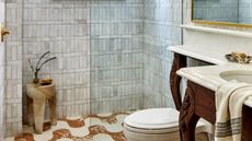
The hallway floor tiles continue into a downstairs powder room. tongue and groove panelling give this space a warm, cosy look, while brass bathroom lighting and a rectangular basin create a very modern look.

Master bedroom
The master bedroom has a distinctly sultry vibe, owed to the dark bedroom scheme.

Wall lights on either side of the bed are a clean, cable-free and space-saving bedroom lighting idea. The dark grey bedroom wallpaper has a grasscloth effect, adding lots of chic and grown-up texture. A velvet upholstered headboard adds further texture to the space.

Behind the bed area is a walk-in dressing room. A pair of sky lights make this space light and bright, despite the dark colour scheme.

See Also: Look Around This Relaxed, Colourful Family Home On Shelter Island, New York
Master bathroom
The geometric tile theme continues in the master bathroom, where the tile colours are complimented by navy tongue and groove panelling, cream walls and marble countertops.

A simple, white hexagon tile with a point dipped in colour is all it takes to create this fun triangular pattern on the bathroom floor tiles.

For a luxe look, the marble countertop continues onto a splash-back and wraps around the side too.

Kids' bathroom
Meanwhile the kids' ensuite bathroom packs in a lot of chic design too – from the dark bathroom tiles in the shower to the modern bathroom lighting and the brass taps and details.


Kids' bedroom
A sharing bedroom has a band of navy blue paint wrapped around it, with twin beds with a zingy yellow frame giving the space a sunny contrast.


See Also: See Inside A Light-Filled Family Home In London's Holland Park
Be The First To Know
The Livingetc newsletter is your shortcut to the now and the next in home design. Subscribe today to receive a stunning free 200-page book of the best homes from around the world.
Lotte is the Digital Editor for Livingetc, and has been with the website since its launch. She has a background in online journalism and writing for SEO, with previous editor roles at Good Living, Good Housekeeping, Country & Townhouse, and BBC Good Food among others, as well as her own successful interiors blog. When she's not busy writing or tracking analytics, she's doing up houses, two of which have features in interior design magazines. She's just finished doing up her house in Wimbledon, and is eyeing up Bath for her next project.
-
 What are the Most Comfortable Pillowcases? From Temperature Regulating to the Best for Your Skin
When you're looking for comfort in your pillowcases, material matters. These are the best you can buy
By Faaizah Shah Published
-
 5 Simple, but Genius Bathroom Layout Tricks That Will Make Your Space Work so Much Harder
Small switches to how you lay out your bathroom that help make the most of a small space
By Luke Arthur Wells Published

