A minimalist house that's full of color? This home re-writes the rules, and we love it
Minimalism evolves once again in this richly colored home which shows how to be curated yet still full of personality
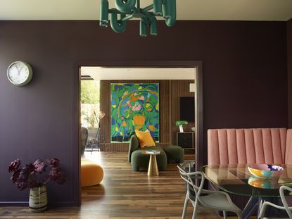
To a contemporary house on the edge of a village in rural Kent, England, a short drive from the coast, where a family holiday home is blurs the boundaries of minimalist and maximalist design. The two-storey house has a large entrance hall, a kitchen with breakfast banquette area, a dining room, and a living room. Upstairs there’s a master suite with dressing room, a guest suite and three further bedrooms – one used as a playroom – plus a family bathroom.
On first glance, this modern home looks like an exuberant playground of design. Bright colors, contemporary shapes, modern art. But look closer and you'll notice that the decor follows minimalist principles of curation, space, reduction, quality and calm. It just so happens to have been done in bright shades.
In terms of the look, interior designer Charlotte Beevor was keen to find the sweet spot between homeowner Monica Gibb’s love of rustic modern farmhouse and Scandinavian design vibes, and her partner Simon Lamb’s more colorful and architectural style. ‘Fusing the differing tastes of a couple is one of my specialities,’ says Charlotte. What scored highly with the whole family was their love of snuggling down together to watch TV or a movie, ‘They like sharing the same space, either as a family or with friends, so we decided to open up the two living rooms into one super-sized space.’
You don’t have to choose between a functional family home and a high-design house, with the right furniture and materials, you can have both
Charlotte Beevor
Living room
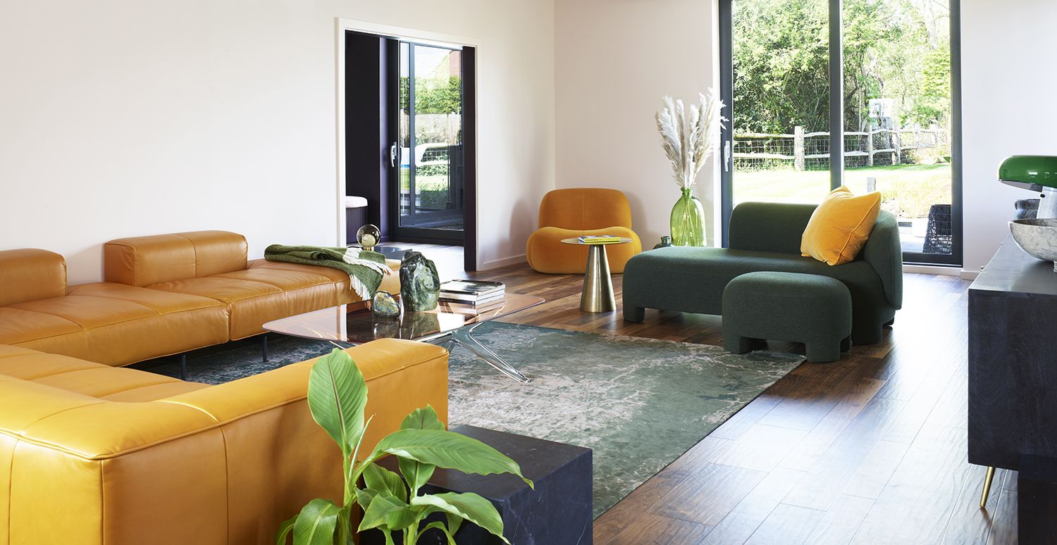
In the main family area, yellow and gold seem to take center stage. But notice how there is nothing more here than you need - it's actually a pared back minimalist living room. Proof, yet again, that minimalism can mean color.
Here there’s a huge, low-slung and seriously comfortable sofa, as well as a chaise longue and reading chair, perfectly positioned to create versatile options, ‘It works as one big social space, or Monica can be hanging out on the chaise, chatting to Simon who’s preparing dinner at the kitchen island, while their son is gaming,’ Charlotte explains.
She worked hard to source furniture that’s supremely comfortable, as well as visually stunning, ‘With the right colour on the walls and an amazing sculptural piece of furniture, you’re going to elevate any room.’
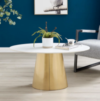
Lomba Ethelsville Frame Coffee Table, Wayfair
The conical shape of the table's central pillar gives it a hint of an Art Deco flavor. And being one leg instead of four keeps the clean lines and air flowing through the room.
Breakfast area
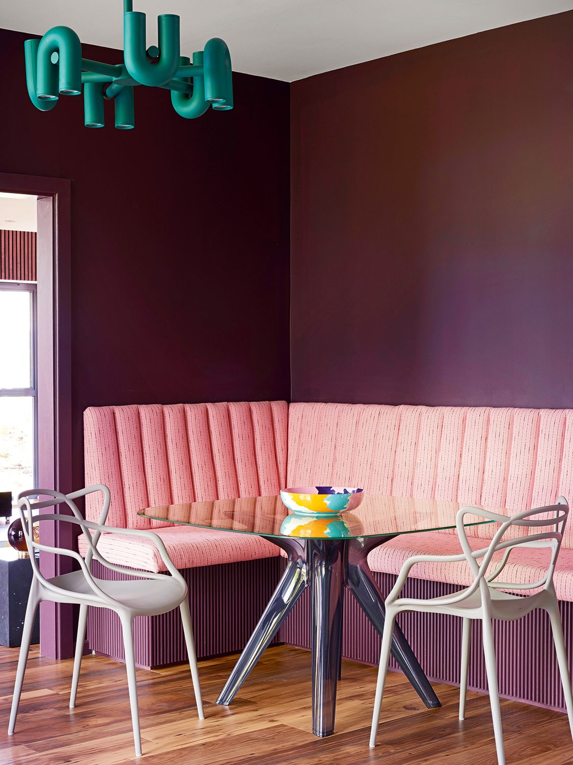
Charlotte created an extra-deep breakfast banquette with fluted edging designed to look as if it is floating, then had it upholstered with a luxurious fabric to create a talking point. ‘My background is in textiles so I’m all about using interesting, high quality fabrics,’ Charlotte says.
Kitchen
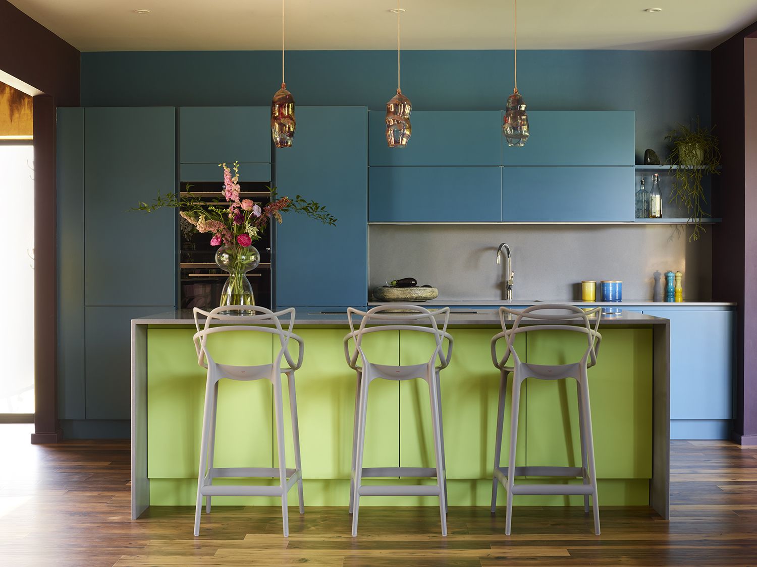
Again, this colorful space is actually - deceptively - a minimalist kitchen. There is nothing extra here, no handles or unecessary embellishements. Just bright shades that highlight the clean lines.
In fact, Charlotte transformed the existing modern kitchen by color-blocking with paint, using a teal for the cabinets that flows onto the wall behind for maximum impact, and a contrasting lime green on the island.
Over the kitchen island she has hung a trio of colorful hand blown glass pendants. ‘The way they glow up is beautiful, they create a special atmosphere when people are hanging out around the island,' Charlotte says.
Dining area
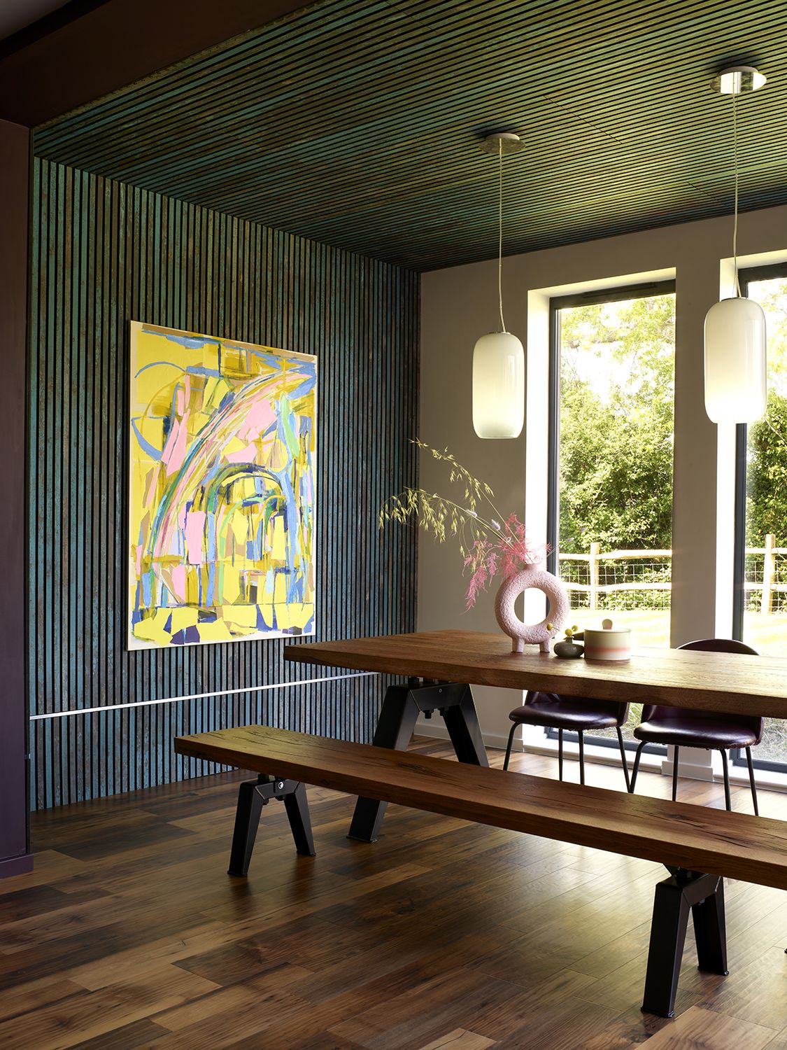
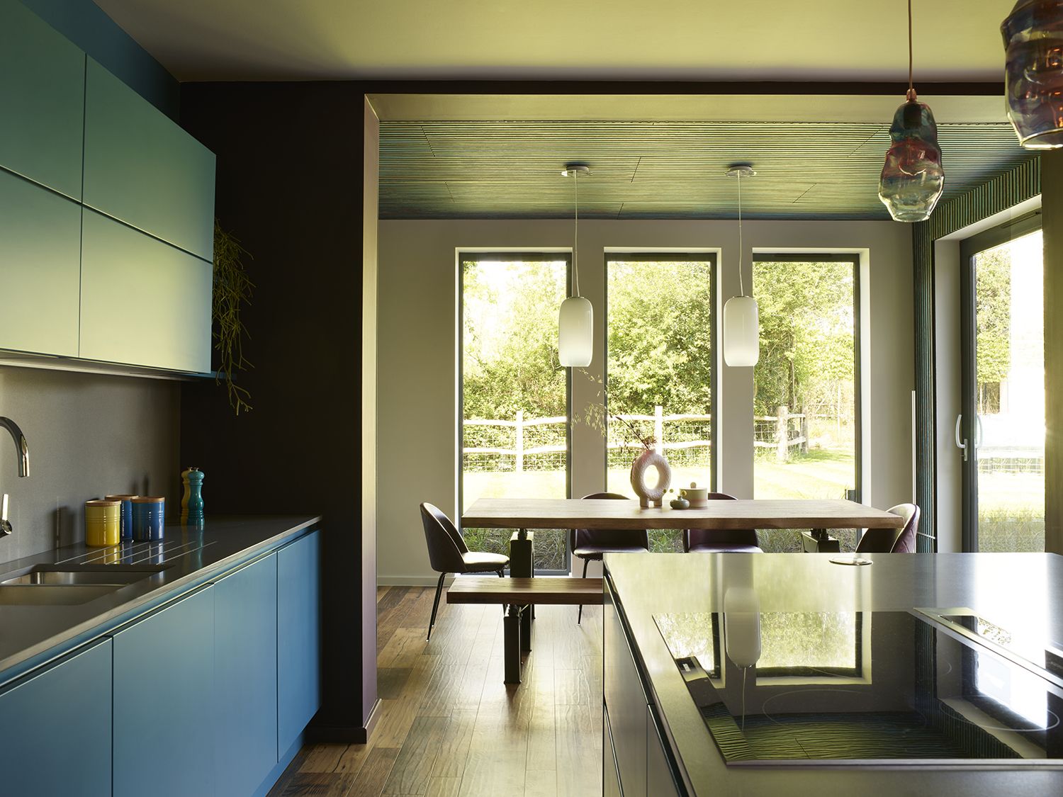
Inspired by the owners’ favourite weekend getaways, Charlotte wrapped this dining room space in colored cladding for a contemporary log cabin effect. This creates an element of texture in this calmingly minimal space which doesn't detract from the view.
Charlotte worked hard to source furniture that’s supremely comfortable, as well as visually stunning, ‘With the right colour on the walls and an amazing sculptural piece of furniture, you’re going to elevate any room.’
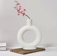
Ceramic vase, Amazon
The modern shape of this white vase allows the light and air to travel through the middle. This means you can have an interesting decorative element that doesn't obstruct the feeling of space.
Corridor
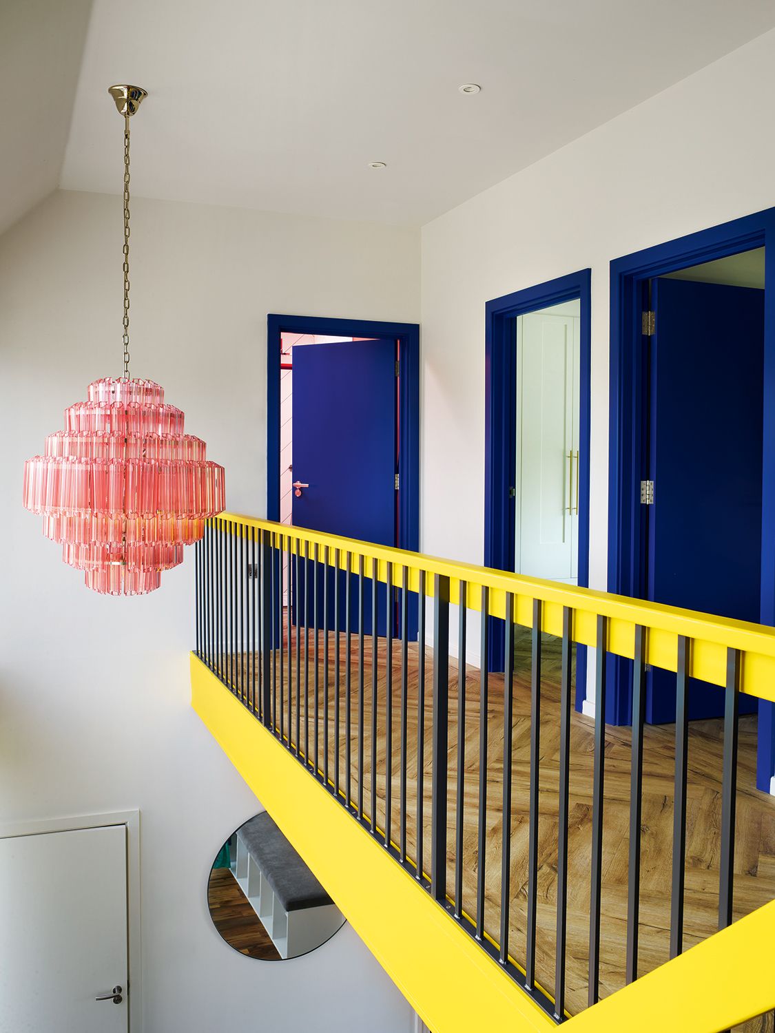
Color is a lifelong passion for Charlotte. For her, the key to working with big, bold colors like these is a process of careful curation, considering each space in turn and how it relates to the neighbouring rooms.
Simon, meanwhile, has a love of lighting so Charlotte found many feature pieces, including the pink glass chandelier hanging in the double-height entryway. ‘In front of a wall of glass, it sets the tone as soon as you turn onto the driveway,’ says Charlotte.
Bedroom
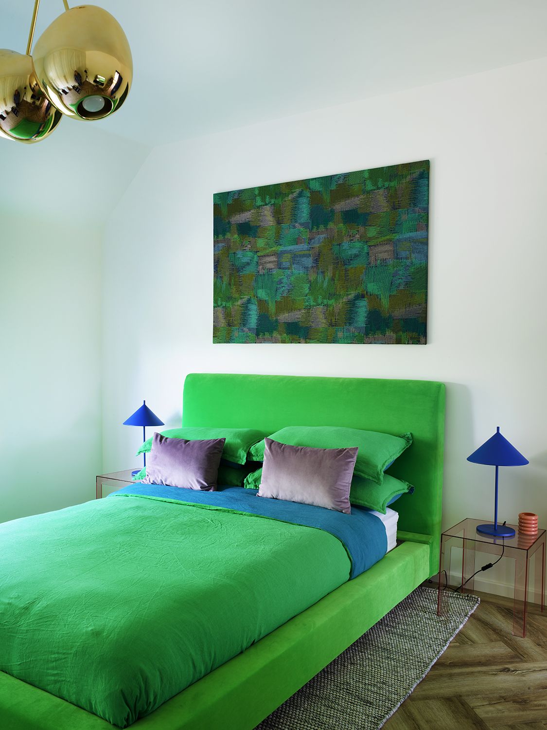
Charlotte reupholstered the bed and placed it on blocks to give it more height in this high-ceilinged modern bedroom.
Walls and ceiling in Wimborne White by Farrow & Ball.
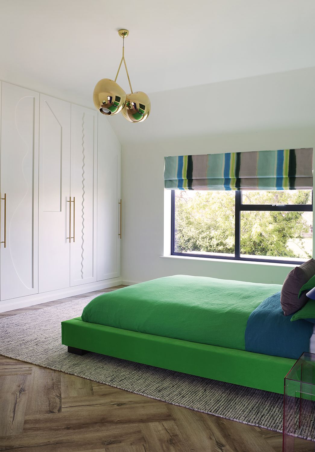
The scalloped edges of the millwork are another way decoration has been added subtly, in a way that doesn't overpower. This home is a shining example of what minimalism means and how it is evolving to incorporate more personality than ever before.
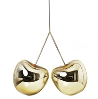
Cherry ceiling light, Amara
Quirky, fun and full of personality, this cherry lamp also comes in silver, pink, red or black. Its smooth, rounded metallic gleam has a hint of Jeff Koons.
Be The First To Know
The Livingetc newsletter is your shortcut to the now and the next in home design. Subscribe today to receive a stunning free 200-page book of the best homes from around the world.
Kate Jacobs is a renowned interiors and design journalist, who has written for The Guardian, The Telegraph, The Times, Architectural Digest, ELLE Decoration, Wallpaper, Livingetc and World of Interiors. She is based in South East London, UK, and has a tendency towards minimalist color palettes.
-
 The 12 Best Table Lamps for Reading —I'm a Certified Bookworm (and Shopping Expert)
When it comes to table lamps for reading, I don't mess around. If you're the same, this edit is for YOU (and your books, or course — and good recommendations?)
By Brigid Kennedy Published
-
 "It's Scandi Meets Californian-Cool" — The New Anthro Collab With Katie Hodges Hits Just the Right Style Note
The LA-based interior designer merges coastal cool with Scandinavian simplicity for a delightfully lived-in collection of elevated home furnishings
By Julia Demer Published
