10 beautifully minimalist kitchens that will make you want to hide the microwave for good
Calm, considered and blissfully clutter-free, these minimalist kitchens whisper rather than shout. Ten designers talk us through it

When it comes to minimalist kitchens, ‘less is more’ might be the original mantra, but we'd like to wave the flag for 'everything in its right place'.
As the modern heart of the home, the kitchen is often a magnet for the happy paraphernalia of everyday life – but our resolute quest for clutter-free surfaces can distract from a simple principle. If you start with a brilliantly functional and calm space, perhaps the rest is more likely to fall into place.
We've selected 10 top kitchen projects, all that celebrate minimalism in interior design in their own way – and all supremely liveable.
10 minimalist kitchen ideas
So how do the pros capture the 'calm' bit? 'We feel the key to subdued spaces are fewer material choices, muted colours, a softness to textures and the use of natural materials,' says Benjamin Shields of design firm Dreamer Lab, who also suggests illuminating it all with soft lighting.
Here's what our other experts think.
1. Try a tonal palette

If you skip the coldest whites and glossy finishes, a well-judged palette of neutrals will feel anything but clinical. Just ask the Scandinavians, who design their minimalist houses to combat long, dark winters.
Let us steer you towards this kitchen designed by Studio Author, which sees snow outside for several months of the year. 'It's a study in subtle finishes,' says Jayme Million, one of the firm's founding partners. 'We accented the custom glass base cabinets with warm oak and tactile kitchen countertops.'
Bulky upper cabinets were never in the conversation. 'The adjacent concealed pantry holds the fridges and food storage, allowing us to eliminate the need for any cabinet towers or uppers. It creates a clean and quiet look.'
2. Defer to a striking view

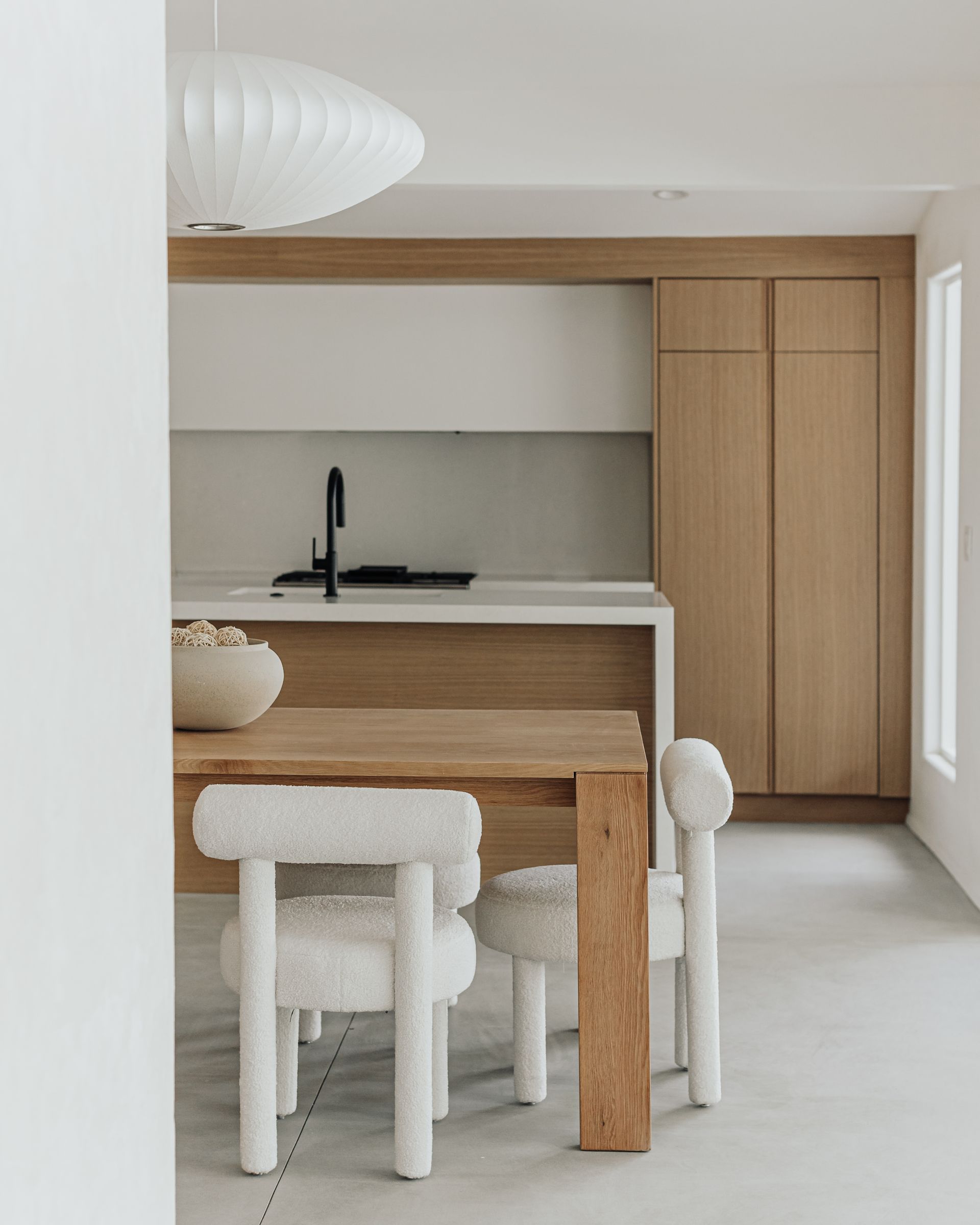
'When we design spaces we often look to capture what we call 'single transformative moments', and this kitchen window is certainly one of those moments,' says Noah Walker of his design for this Los Angeles home, which faces a grove of melaleuca trees.
That glorious green outlook is the natural star of this space, so it made sense to install a sleek wood kitchen that wouldn't compete for attention. With the same wood extended up to the ceiling, the cabinetry all but disappears into the wall - something we're seeing a lot of in architecture trends. "We worked to keep the 'kitchen' parts of the kitchen to a visual minimum, hiding the fridges, the extractor and the pantry door. It allows the space to feel more universal and simple."
3. Call on natural materials

We've lived with these materials for millennia, so it's little wonder that the human brain registers wood, stone and natural plasters as particularly liveable – never mind the longevity factor. Just like in a minimalist living room, a visible grain or textured clay can do wonders to warm up the place.
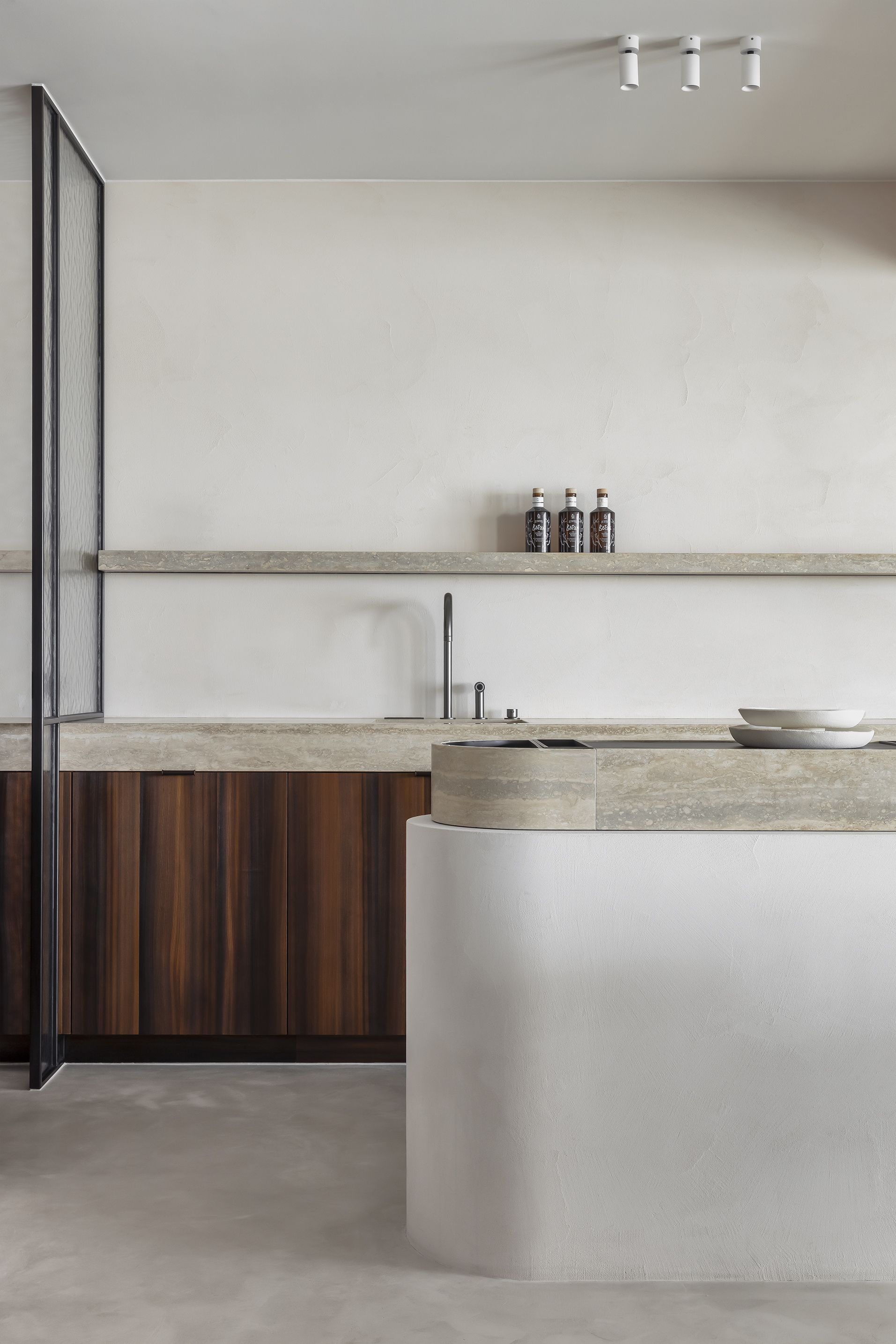
Tasked with decorating apartments for a pair of siblings, Dries De Malsche created two same-but-different kitchens with just this in mind. 'Both spaces use a soft natural stone as a base in the kitchen,' says the designer. 'There's a neutral uniform natural plaster on all floors and walls, complemented with a warmer smoked, brushed larch wood for the brother's apartment.'
4. Use pastels as a neutral

If you're wondering 'how do I make my kitchen minimalist' and are wary of too much white, then all is not lost If you're not a dyed-in-the-wool purist, you'd do well to take a cue from Jordan Cluroe and Russell Whitehead of 2LG Studio, who live with their 'Rise' kitchen design for John Lewis of Hungerford.
The barely-there pastel shades feel fresh and contemporary, thanks to those modish curved, clean lines – but look carefully and you'll realise the duo have performed a brilliant disappearing act in this subtly pink kitchen. 'To achieve a fully minimalist look everything must have its place. Every inch of the arched cabinetry is used, and everything hidden away – there are no handles even on the fridge. This allows you to play with texture within the space.'
5. Lower the contrast

There's a lot of confusion around contrasting colors and materials – we blame muddled teachings on color theory in art class – but the general consensus among designers is to dial it down for a restful result. That means considering how a stone and a plaster might sit side-by-side: are they natural bedfellows, or do you find your eye drawn to the boundary?
Studio DIAA principal Suzanne Stefan talks in terms of the "quiet" of a space - a principle that can easily be applied to minimalist bathrooms, too. Combining wood and stainless steel in the kitchen of her own floating home in Seattle's Portage Bay, she looked toward 'finishes that had a tonal relationship or ones that could be placed in adjacency and would allow for the eye to move more freely.'
6. Don't discount metallics

Benjamin Shields of Dreamer Lab might recommend fewer materials, but that doesn't mean they should be middle-of-the-road. For this impactful kitchen project, the client was keen to use brass in reference to 'an older era of rustic accommodation,' he explains. 'It gives a subtle feeling of craft to the space.'
The stained black timber joinery not only contains the metal but grounds too, acting as a brilliant foil to the light-catching brass kitchen countertop and backsplash. 'Soft lighting can also be important for calmness,' adds Shields. 'With the large roof eaves, most of the light is reflected rather than direct, which gives a lovely quality to the space.'
7. Look to the landscape

A minimalist approach means something a little different to every designer, but for for Lilianna Kim, it's all about 'an experience without any unnecessary distractions' – which also means honing in on the best bits.
In this Palm Springs project, she says, that's 'the beauty of the surrounding desert. The use of natural stones and materials throughout bring a balance between the interior and the surroundings, which creates a calm and cohesive feel.' Few of us live among such dramatic scenery, but there's something to be said for looking to the landscape for materials and subtleties in shades, whether that's a stretch of sand or patch of moss.
8. Pick a practical material

Here's a kitchen that's earned a double take. So well hidden are the usual kitchen components that you'd be forgiven for mistaking that monolithic island for part of a high-end spa – before you spot the kitchen sink.
'The client wanted a space that was incredibly durable and retained its sculptural quality even with extreme everyday use,' says Noa Santos, founder of NAINOA.
The solution? 'We covered nearly all surfaces in a highly durable plaster, reducing seams to a minimum, and hid all kitchen clutter behind closed storage. When in use, the clients are free to make a happy mess. And when they’re done, clean-up is quick and easy.'
9. Consider restful color

Call it duck egg or a muted cornflower – either way, we suspect this glorious grey-blue kitchen color scheme could catch the eye of even the most ardent colorphobe.
It's the work of designer Marie Deroudilhe, who took inspiration from the mood of a French country house for its 'graphic tiles, pale pastel tones and large countertops'. The finished space offers a calm canvas for a row of vibrant prints hung above storage with recessed handles.
"Our client, a well-known photography expert and curator, organized the hanging of her collection once the project was settled," explains Deroudilhe. "This amazing colorful series of original Man Ray prints found its perfect setting above the line of tall cabinets."
10. Keep wellness in mind

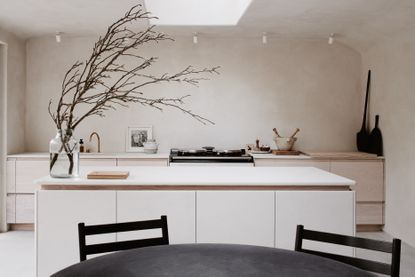
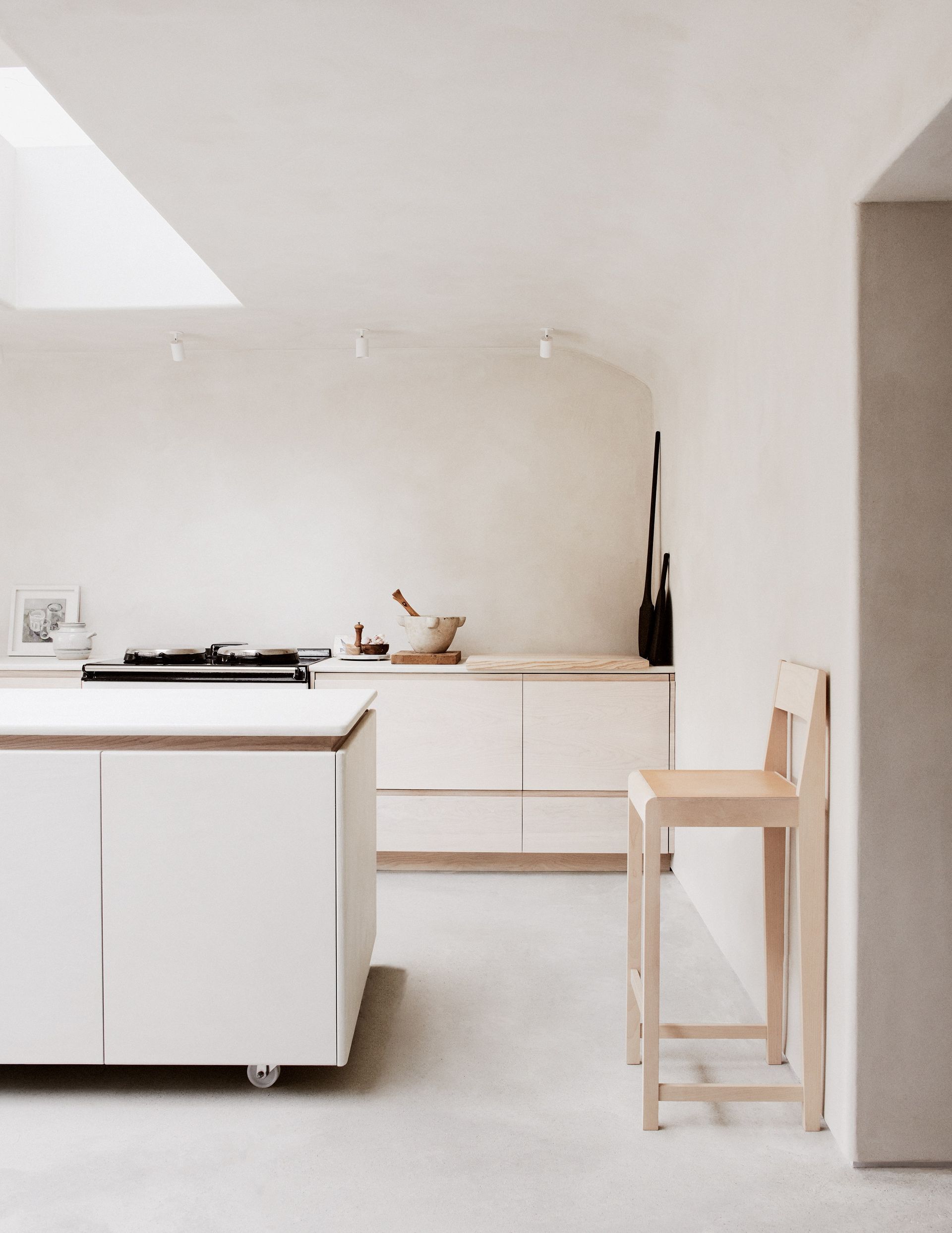
'Sometimes the most crucial aspects of a well-functioning space are not on display,' says designer Louisa Grey, whose north London townhouse has all sorts of tricks up its sleeve – not least the cocooning kitchen downstairs, designed with a nod to happy Puglian holidays.
She'd imagined 'creating the healthiest kitchen imaginable' but wasn't willing to compromise on aesthetics. 'We’ve used clay on the walls of the kitchen and throughout the lower ground floor as it regulates humidity, which is essential to eliminating black mold.' The modern AGA is powered by renewable energy, while birch plywood and ash for the cabinetry are locally sourced. 'Natural resources harvested directly from the earth ground us in nature for a calmer environment, improving concentration and providing stress reduction.'
Be The First To Know
The Livingetc newsletter is your shortcut to the now and the next in home design. Subscribe today to receive a stunning free 200-page book of the best homes from around the world.
Cat Olley is a British design and lifestyle journalist, editor and copywriter. Formerly on the features team at ELLE Decoration, she has written for The Guardian, The Modern House, Evening Standard Homes & Property, Inigo and John Lewis at Home. She specializes in the latest trends and ideas happening in the design world, and is our go-to for aesthetically-led pieces.
-
 These 12 Best Table Lamps for Your Desk — Perfect Glows for a Creative Home Office
The best table lamps for your desk is have a soft, targeted glow. Elevate your WFH set-up with these stylish picks endorsed by Style Editor Brigid Kennedy
By Brigid Kennedy Published
-
 The Nespresso VertuoPlus is 30% Off for President's Day, and it's Kim Kardashian's Coffee Maker of Choice
This sleek and stylish coffee maker was spotted in Kim's home bar, and you can currently save $60 if you buy yours from Amazon
By Lilith Hudson Published

