Just looking at the world's best minimalist living rooms will relax you no end
The best minimalist living rooms are warm, relaxing and full of personality - even if they're relatively empty of stuff. Designers explain how to get them right

The minimalist living room is undoubtedly the hardest working space of a pared-back home - it’s expected to absorb the comings and goings of daily life, all without so much as a book out of place. Any disruption to those beautiful clean lines is going to bring out even the calmest of us in clutter-anxiety. But how to build functionality around the empty spaces of the open-plan aesthetic? How to make an austere space feel warm and welcoming? And how to avoid breaking up that rectilinear form whilst making sure your home actually works?
When it comes to the interior design of the space, it’s all a question of balance, says Abi Amor of the multidisciplinary design practice HollandGreen. “As designers, when we think of minimalism, we think of the balance between pared-back beauty and functionality; what is aesthetically pleasing, and what you need.”
The world's best minimalist living rooms
1. CONCEAL ALL SERVICES TO LEAVE WALLS NAKED

If you’re a minimalism purist, any unnecessary mark on an interior landscape is considered a blot. Electrical sockets? Banish them. Ditto light switches, TV points and radiators. Even a conventional window, essentially a hole in the wall, breaks up the purity. At this house, with all the functionality concealed within the concrete bench and living room flooring, what you are left with is the beauty of barefaced concrete - on the floor, walls and ceiling. With an array of secret plug sockets, light switches and a TV point all positioned out of sight, literally the only function the walls are seemingly tasked with is keeping out the elements. Well, and to inspire awe.
“Being surrounded by the look and touch of real materials, rather than decorated surfaces, gives a totally different appearance,” says Andy Groarke, co-founder of Carmody Groarke, the architectural practice behind the design. “You feel much more connected to the substance. The craftsmanship and appearance at close quarters makes this room much more characterful than if it were painted plaster. It’s a work of art that the contractors achieved.”
Oh and in case you’re wondering, that incredible leather sofa is by Living Divani.
2. BRING BALANCE AND ORDER WITH RECTILINEAR FORMS

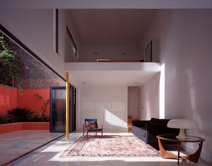
You don’t actually have to spend a fortune on designer sofas and custom glazing in order to honor minimalist principles (tempting as it is). Giving a sense of structure and balance can be achieved with the simplest of materials - here, with a living room rug, a table, and some books, and an ample supply of right angles.
“Here, everything was lined up, everything was balanced. There was a sense of order to the space - and that brings peace and tranquility,” explains Michael Tarring of the architecture practice Cassell Tarring. “It makes the space very understandable, and very, very structured,”. When one’s surroundings make sense visually, says Michael, it enables the beholder to feel comfortable: “Bring order to the structure, pare things back so it’s just the pure form with nothing overpowering, and it brings a feeling of comfort.”
3. LAYER WHITE ON WHITE FOR A BLANK CANVAS

With functionality being a key tenet of minimalist decor, it’s worth taking a moment to contemplate what function you actually want for your living room. If you want to de-stress and truly relax there (and who doesn’t?), you might want to consider the mind-emptying powers of white on white. “The layers of white color and texture here create an atmosphere of peacefulness and expanse,” explains Christopher Cooke, Director of Interior Design at the award-winning design practice HollandGreen. “A room like this can be great for truly relaxing and clearing your mind.”
It is also, literally, a carte blanche, “a brilliant canvas which you can adapt and add light touches to over time; it can evolve in style and taste as you do,” adds Abi. It means that this already timeless design can easily be updated with, say, a large piece of art, “which can both instantly change a space but also compliment the minimalist feel,” she says.
4. BANISH CLUTTER WITH INBUILT STORAGE

The question that crops up with any discussion of minimalism is usually around practicality - ie, where is all the stuff supposed to live? Architect Luke Tozer, director of Pitman Tozer, has created a minimalistic virtue out of his living room storage, with its clean, symmetrical lines serving as a backdrop.
“It’s equidistant from both walls, and the top right corner is actually a dummy door because of the staircase behind it.” The door furniture has been minimized, with Luke using either push-latch hinges or small round pull handles on the doors. “Storage needs to be easy to access so that it’s both easy to get things out or to put them away.”
Luke used the same principle for storage throughout his home: “I use the parts of the house where there isn’t natural light - so I design away from the windows and push the storage onto the back wall of a room so that it forms part of the architecture.”
5. BLEND INDOORS AND OUTDOORS WITH FLOOR-TO-CEILING GLAZING

Natural living rooms require a lot of daylight, arguably the best asset available to those of a minimalist persuasion. At this country retreat in Somerset, England, the owner and architect Rebecca Dyer used frameless floor-to-ceiling glazing because, she says, “It visually declutters the view by seamlessly uniting the beauty of the natural landscape with the house interior.” It also makes an interior space appear bigger, she adds, “by visually extending the interior floor plane to the external decking and the landscape beyond”.
Here, Rebecca used full-height frameless structural glazing with large aluminum sliding doors and glass-to-glass corner details, which, she says, “work to bring the outside in”. Rebecca explains that the architectural form of the house was inspired by the natural landscape setting of the site - thus, with her design she sought to optimize the sense of “free-flowing space and light” by opting for natural materials and color palette, which “reinforced a sense of harmony and connection with the yard.”
6. SCALE UP THE FURNITURE WITH EXTRA LONG SOFAS

Before commissioning these two bespoke minimalist couches for a private client’s house in East Hampton, New York, the renowned American architect Audrey Matlock looked at “maybe a thousand others”. She was after something, she says, that was low-backed (so as not to obscure the art or the nature outside), that was extremely comfortable but without any superfluous decorative detail, “and with those long clean lines and long clean cushions - it was very hard to find”.
But with these custom sofas, “They’re so big, they’re almost part of the architecture,” she says. “It’s a very big room, as are the contemporary artworks - I wanted something that had scale that wouldn't look puny; I wanted them to possess the room like the art did.” After all, the larger the living room furniture, the fewer pieces are needed.
7. SOFTEN THE SPACE WITH A FLOATING BURNER

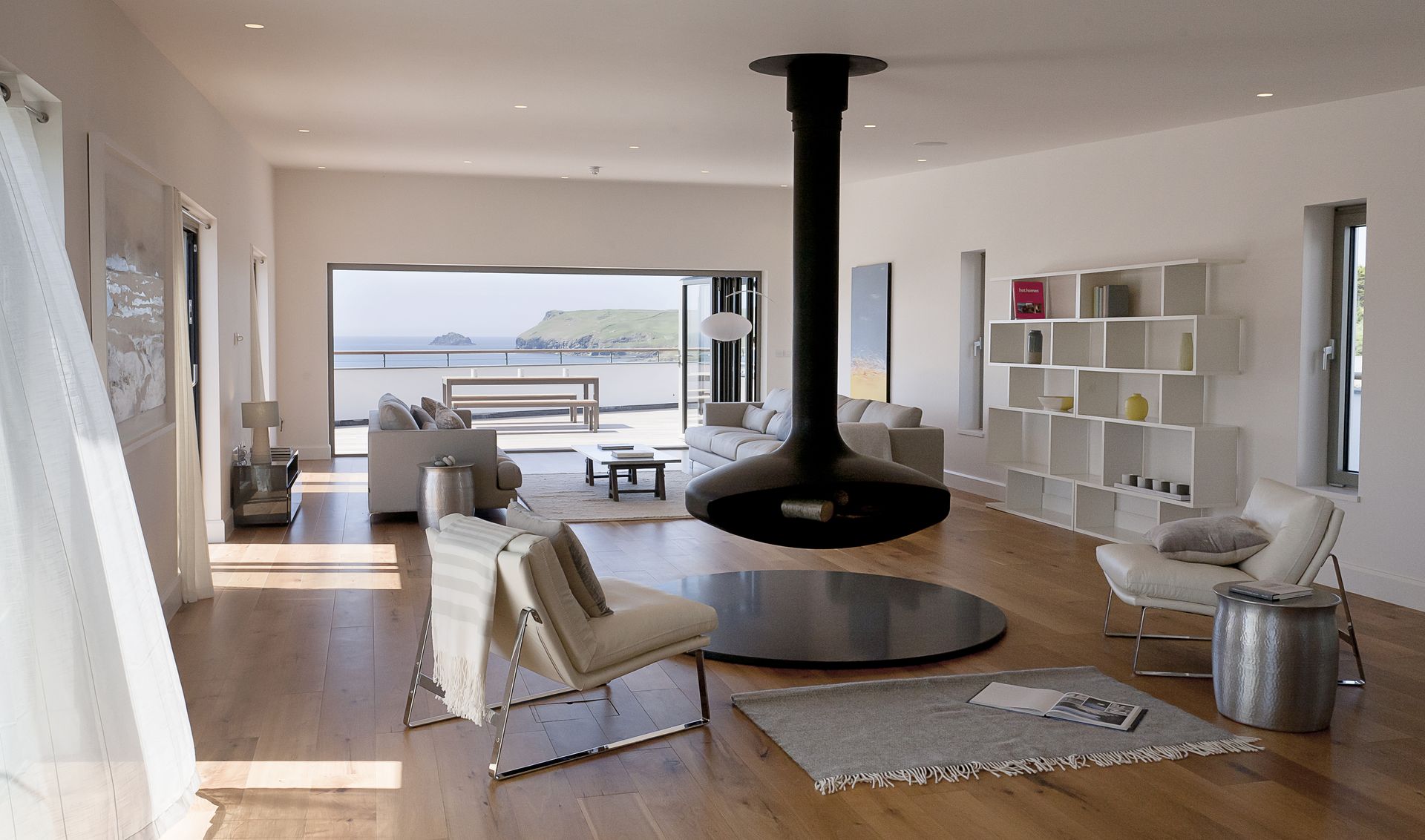
How to counter minimalism’s critics who argue that, with all that white, with all those sharp corners, with all those rough-hewn materials, the aesthetic can come over a little cold? The answer, says Michael Tarring, co-founder of the award-winning architecture practice Cassell Tarring, is a wood burner - specifically, a curvaceous one that is suspended from the ceiling. For a luxury coastal project, the firm wanted to bring in a focal point to the living room which, says its Michael Tarring, “wouldn’t detract from the overall quality of space”. It also, he adds, provides a sense of intimacy, and really gives you a feeling of coziness - but you're also still in a large open-plan space.”
For the project, they settled on Gyrofocus’s 360-degree rotating, cantilevered wood burner, because, says Michael, “It has a dramatic feeling to it whilst giving a complete sense of openness at all times.” Because it floats over the floor, there’s no ground-level clutter to disrupt the eye. Also, says Michael, “it maximizes the view from every aspect of the room - and with minimalist architecture, the view is the feature.”
8. EMBED FURNITURE INTO THE ARCHITECTURE

Minimalism requires space to breathe. And if space is limited, you have to create the illusion of space - here with a purpose-built floating bench, which does away with the messy detail of furniture legs which would otherwise clutter the space. “The dimensions were constrained by planning - both spatially and aesthetically,” explains the architect John Proctor of Proctor & Shaw.
So in order to keep the space clean and simple, John created a built-in bench: “If you didn’t do it, you need space for chairs to be pulled out - dimensionally it would start to be challenged. Here, it can just be about clean lines and simple forms.”
Although bespoke joinery can be expensive, if you can make it multifunctional, it will earn its keep. John added quite a few services - for example, storage, lighting and the underfloor heating manifold - into the bench. “We could do away with the radiator. Building the bench ticked a lot of boxes.”
9. MAX OUT THE NATURAL LIGHT

There’s nothing quite like an abundance of natural light for letting your raw materials sing. In this high-end private house designed by the award-winning architectural practice Carmody Groarke, the nine-meter windows are three storeys high. “The daylight renders the materials - here, beautiful Danish red brickwork, a white Travertine stone floor, dark fumed oak, a bronze fireplace - almost sculptural,” explains Andy Groarke, co-founder.
Of course, as well as letting light in, glass also allows us to see out: “There was an incredible view and depth of field outside into the woods, and the client really wanted to see the full height of the trees in the garden,” adds Andy. “There’s a certain rhythm to the window that is a composition of the total space.”
Be The First To Know
The Livingetc newsletter is your shortcut to the now and the next in home design. Subscribe today to receive a stunning free 200-page book of the best homes from around the world.
Fleur Britten is a well-respected journalist who for years was the Senior Features Editor at Sunday Times Style. She is known as one of the smartest lifestyle journalists around, revered for being able to decode trends and report on new zeitgeists as they happen. She now writes for the Telegraph, Livingetc, Vogue, The Times, Harper's Bazaar and the Guardian.
-
 The 12 Best Table Lamps for Reading —I'm a Certified Bookworm (and Shopping Expert)
When it comes to table lamps for reading, I don't mess around. If you're the same, this edit is for YOU (and your books, or course — and good recommendations?)
By Brigid Kennedy Published
-
 "It's Scandi Meets Californian-Cool" — The New Anthro Collab With Katie Hodges Hits Just the Right Style Note
The LA-based interior designer merges coastal cool with Scandinavian simplicity for a delightfully lived-in collection of elevated home furnishings
By Julia Demer Published

