How to design a timeless kitchen - 9 ways experts create spaces that look fresh for years
Knowing how to design a timeless kitchen will stop you making costly mistakes and give you a home you'll love forever
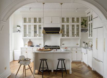
With the environment high on the agenda, and building costs shooting through the roof, people are reconsidering their desire for their kitchen to be bang on-trend. It’s far smarter these days to design for longevity, with a timeless kitchen - it can still nod to the trends with its accessories.
So what are the key considerations for planning a timeless yet modern kitchen, and in what order should they come? 'We talk a lot about kitchen trends, and I often see shapes and colors come and go,' says Livingetc's editor Pip Rich. 'But of course, a kitchen needs to be long lasting, as it's definitely not something you'll change every season. Thankfully, picking the materials and finishes carefully means it's easy to design a space that keeps on looking current, and if you take the best of the trends (like incorporating a wet bar, perhaps) then it'll be a room you love for years.'
Here’s our guide to designing a modern yet classic space that will maximize its freshness.
How to design a timeless kitchen
1. DRAW UP YOUR WANT-LIST
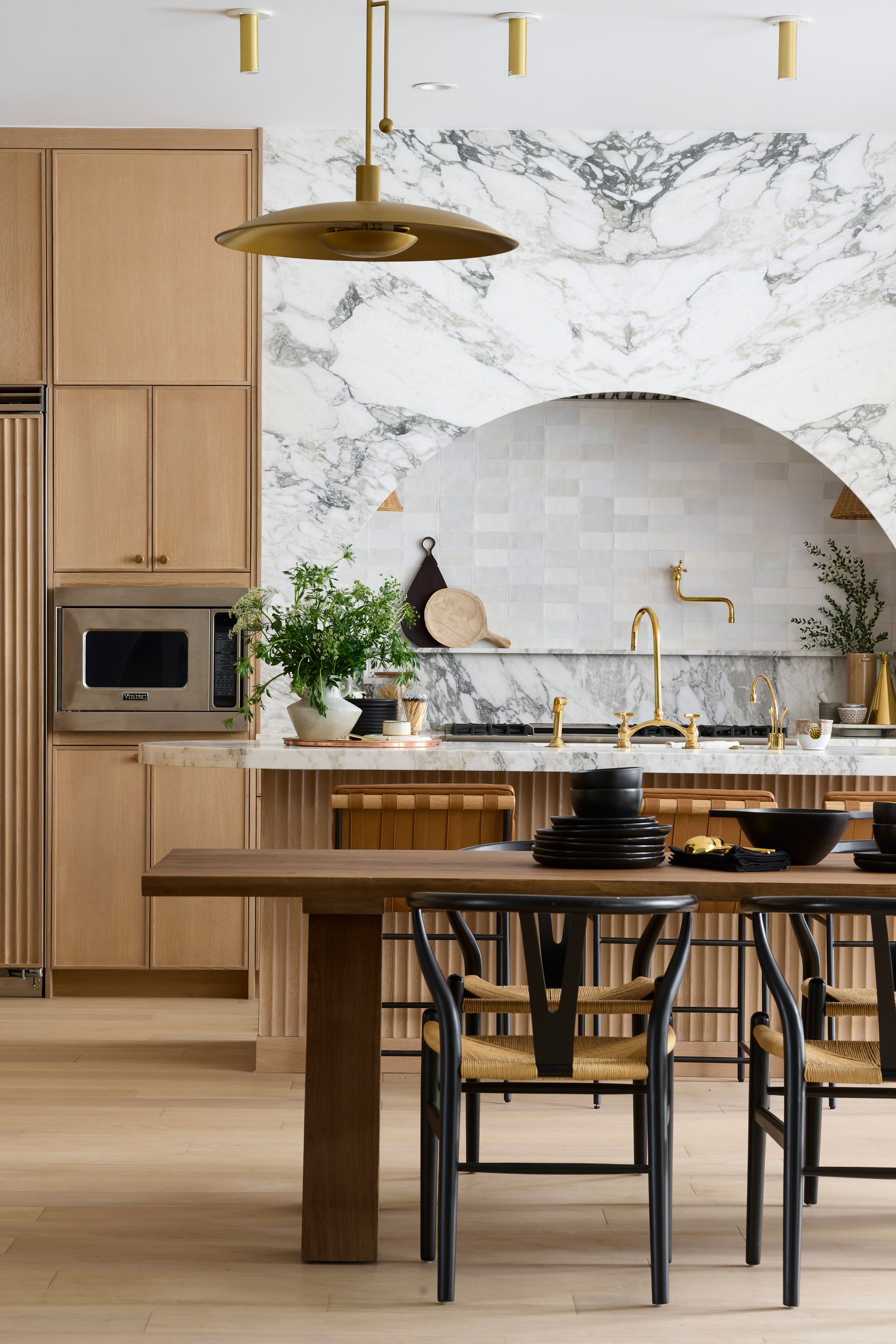
Arguably the most fun part of a project, this is where you get to dream up your timeless kitchen, without actually spending any money. “Start by opening your eyes and imagination to everything,” advises Merlin Wright, design director at Plain English Design. “Start collecting Instagram and Pinterest images, cut pages out of magazines, and see what floats to the surface - keep boiling it down and you’ll find the same handful of images will appeal.” It might be a detail like waterfall countertops or it could be a color that starts to emerge.
2. Focus on the future
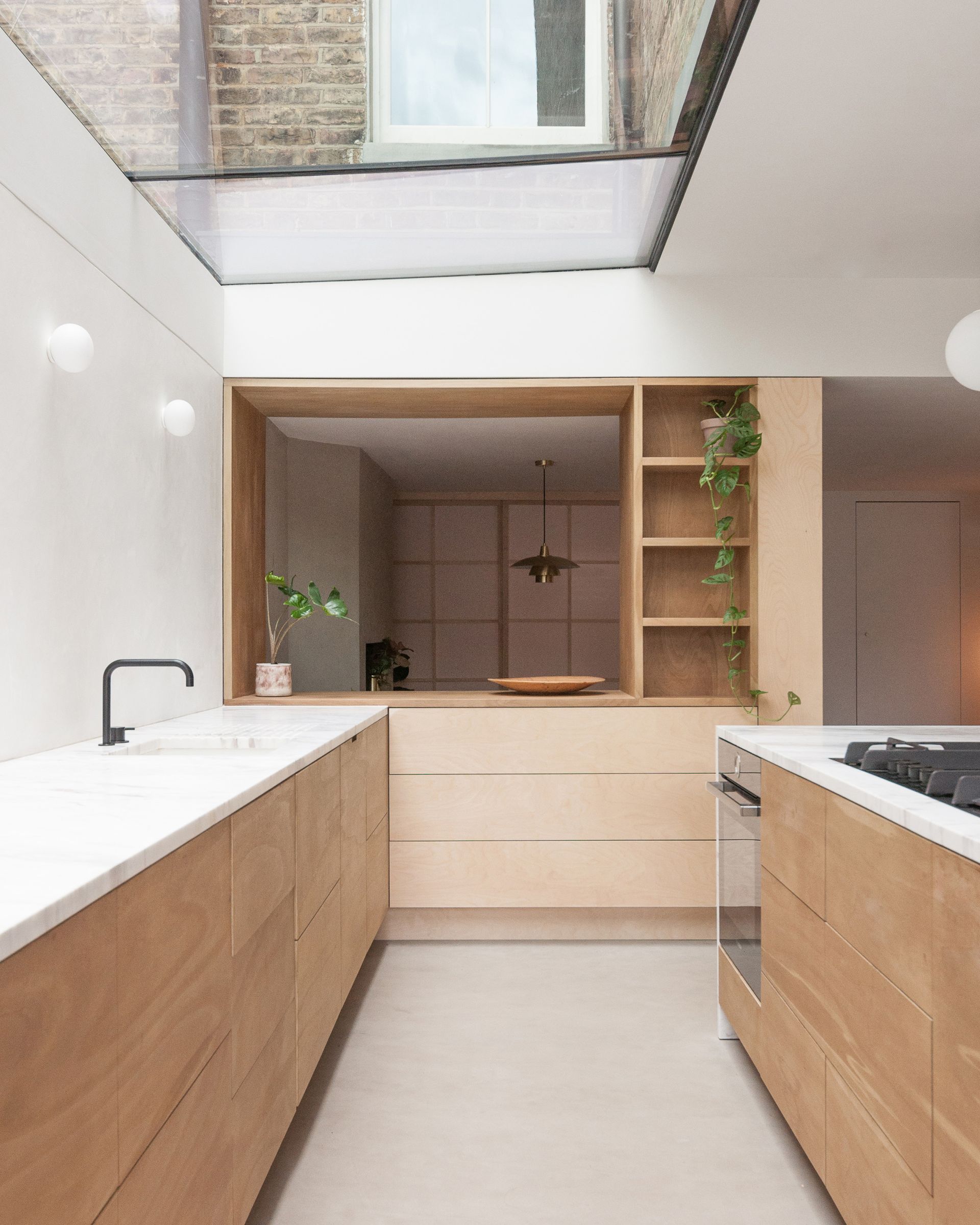
To ensure longevity, you’ll need to “think beyond your immediate needs”, advises the architect Alan Drumm, founder of the kitchen design consultancy Uncommon Projects. For example, will you still be able to use an eye-height oven when you’re old, “or should it be located below the kitchen counter?” He also cautions against fads: “Often, we don’t even realize we’re buying into one - try and remember that you may not feel the same way in five years’ time.” Merlin draws the analogy of fashion classics - jeans, a cashmere jumper, a white tee: “They’re not fashionable, but they go with everything, and you can update them with accessories.”
And heed Merlin’s key tip for couples: “Everyone should be in agreement - work out where the common ground is.”
3. Choose appliances carefully
Before planning the kitchen layout, you need to work out what appliances you need to allow for, as well as your storage requirements, says Alan, “and build your project around that”. Think carefully about what functionality you really need - for example, people with high-spec ovens often only use a small percentage of their capability.
4. Get the storage just right

The easiest way to feel like you've outgrown a kitchen is for it to not have the right kitchen storage. As soon as the cupboards are full or the counter is over-crowded, it'll feel like anything but a timeless space.
Alan from Uncommon Projects advises creating a diverse offering, of shelves, cabinets and drawers, but focussing mostly on drawers so that your bits and pieces are readily accessible. And shallow cupboards are preferable to deep ones, says Alan, otherwise “you lose stuff at the back.”
5. Follow modern thinking on layouts

This is the time for thinking flow, proportion and symmetry. Even for a small kitchen layout, Merlin recommends “method acting” how you’re going to live in the space: “We actually mock it up with boxes, or by cutting out the shapes in paper on the floor. It really pays to work out how the space is going to be divided.” Get the layout wrong, he adds, “and you’ll be unhappy with the result and will want to change it”. But it’s not just about practicality, he adds: “There has to be an emotional quality; it needs to feel like a happy place to be in.”
“Don’t assume the ‘envelope’ you have is right,” adds Alan. “We always tell customers the architecture of the room needs to be right first - then the furniture will flow.” The old idea of the working triangle - ie. the sink, fridge and stove all in close proximity - is deemed less relevant these days. “We’d say the most important relationship is between the sink, waste and dishwasher,” says Alan, “and that your fridge is equally accessible from the dining room or area and the kitchen.”
In addition, hobs and ovens don’t need to be close together, he says: “People very rarely go between the two.” And how's this for revolutionary? Given that we now spend more time at the hob than the sink, he adds, it’s perhaps the hob that should get the window view.
6. Use materials that age well

Fashionable materials can really date a kitchen - just think how cherry, maple and ash are all associated with the 1980s and 1990s, says Merlin. But if you go with choices that purposefully age well then you are future-proofing an aesthetic which will only get better with time.
“Choose noble materials - oak, natural stone, brass, iron, leather” - which, he says, all take on character with use and are much less likely to look unfashionable in the future.
7. Don't have polished surfaces

The gleam - or lack of it - is just as important as the material, Merlin advises. “Use a honed finish - satin not polished - on stone, as the polished aesthetic shows flaws more readily,” he says.
By going matte, your counter is less likely to rile you by showing up streaks, stains or imperfections that happen over time.
8. Mix and match handles

As for hardware (handles, knobs and hinges), it’s less critical that they’re timeless, he says: “This can be easily changed, and, like buttons on a coat, can completely transform the character of the joinery.”
There’s of course a cost-benefit analysis to be done here. “Materials that last a long time cost more,” observes Alan. “But laminate worktops are not going to last the course.” He advises investing in stone or Corian worktops that transcend countertop trends and never go out of style, as well as avoiding cheap cabinetry carcasses.
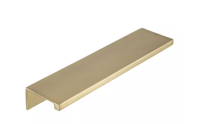
Sumner Street Ethan handle, Target
Easy to update, a kitchen handle is a simple way to make a kitchen feel timeless, evolving the space and making it work as your tastes change. This brass handle feels very right for now.
9. Use color sparingly

We’re back to the fun part again. Or are we? “I’ve been designing kitchens for about 12 years,” says Alan, “and the kitchen colors we always come back to are black, grey and white. It creates a very easy background to everything else that’s happening.”
If you want a pink kitchen, say, or yellow, consider painting it on the walls rather than investing in on-trend cabinetry, he advises. “Walls are easy to repaint if you change your mind.” However, if you do want to experiment with a more adventurous color, Merlin recommends first painting big swatches on lining paper, “and sitting in the kitchen at different times of day - it’s incredible how different light changes the tone.”
It’s also important to remember how much the addition of another color - for example, with a red sofa - can affect the composition, he adds. He advises looking at the color formulas of well-known art: “The artist has sat there and worked it all out. If it’s a pleasing picture, that’s a good color recipe.” You could also consider introducing the “risky” color with a painting, says Merlin, “or a salad bowl, or inside a cupboard, like a Paul Smith suit lining”. Who said you can’t have fun with color in a kitchen?
Be The First To Know
The Livingetc newsletter is your shortcut to the now and the next in home design. Subscribe today to receive a stunning free 200-page book of the best homes from around the world.
Fleur Britten is a well-respected journalist who for years was the Senior Features Editor at Sunday Times Style. She is known as one of the smartest lifestyle journalists around, revered for being able to decode trends and report on new zeitgeists as they happen. She now writes for the Telegraph, Livingetc, Vogue, The Times, Harper's Bazaar and the Guardian.
-
 How to Make a White Bathroom Feel Warm — 5 Tricks Designers Use For a Cozier and More Restful Spaces
Give your all-white bathroom a glow-up with these tips for bringing warmth to the space
By Oonagh Turner Published
-
 5 Habits to Adopt That Will Make Your Home Smell Good All the Time — 'Add Them to Your Routine Today!'
Incorporating these tricks into your maintenance routine will keep every corner of your home smelling fresh and welcoming
By Katie Baxter Published
