9 of the most stylish wet bar ideas that will make your cocktail parties unmissable
These awe-inspiring wet bar ideas will make your home entertaining set-up the highlight of your home
Being able to host your friends at your own home bar - where you get to choose the music, the crowd, and of course the decor - is a luxury that is surprisingly doable. Of course Covid launched “The Big Night In” from a standing start, but for something really sophisticated, a wet bar is what’s needed - ie, with a plumbed-in prep sink, enabling drinks to be served more speedily and mess to be tidied up more effectively.
This means more of an endeavour to install, so why not go all-out and give your cocktail bar a statement interior design scheme that guests will love to gather around?
Here are some of our favorite interior-designed wet bars to inspire your own project.
9 stylish wet bar ideas for your home
1. Add drama with an built-in bar
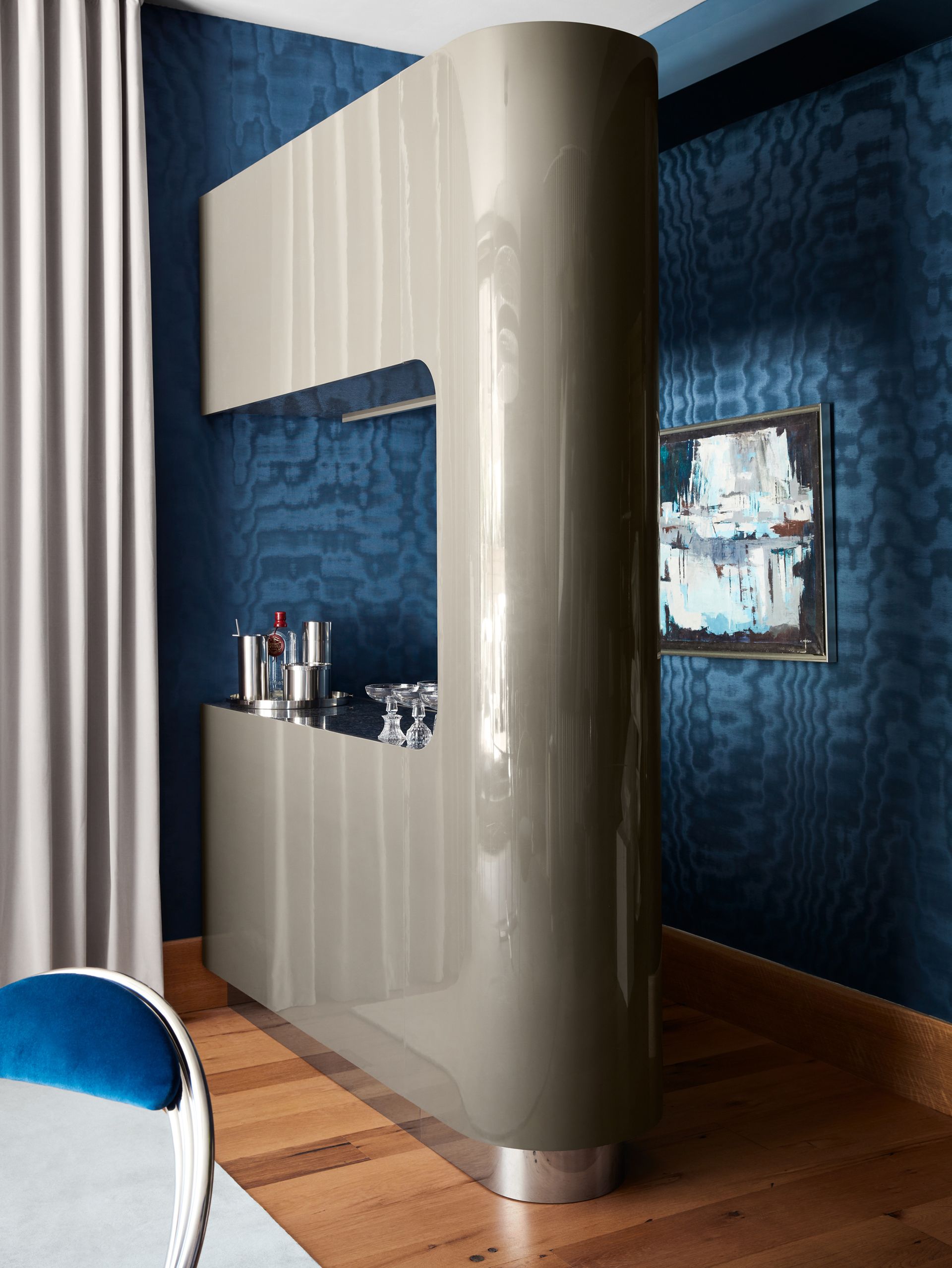
'You can’t call it entertaining unless you’re prepared to create an atmosphere,' says the renowned British product designer Lee Broom. To do that, there 'needs to be a sprinkle of drama'. For Lee, that meant sourcing an original 1970s room divider from the late, great American interiors designer Steve Chase’s own home in Laguna Beach, California, which he converted into a cocktail bar. Due to its size, it had to have it craned up to the rooftop of Lee's New York City apartment block. 'It was quite a moment to see this bar swinging in the sky,' he says. Drama indeed.
'The 1970s was a time for entertaining at home,' Lee adds - 'similarly to recent times.' Lee suggests hunting around vintage stores that specialize in mid-century and 1970s furniture, as freestanding bars are still in plentiful supply. 'I’d also suggest modernizing the bar by adding a freezer or a fridge component so that you can make it a real workable item as well as a beautiful addition to your home.'
2. Take inspiration from the Art Deco period

'The Savoy Cocktail Book, The Great Gatsby, The Belle Epoque… Art Deco shouts ‘cocktail hour’,' says the South African interior designer Hubert Zandberg. Not only does the era conjure the perfect bar atmosphere - think elegance, sophistication and prosperity, and the good times of the Roaring Twenties - it also lends itself to being contemporised, says Hubert. 'The strictness of it, the monochrome tones, and the clear, confident architectural lines all create a very nice, solid framework on which you can hang decoration and mix other eras - for example, modernism, cubism, even brutalism.'
What better theme, then, for the fashion creative Deborah Brett’s glamorous wet bar in her west London townhouse? Here Hubert designed patterned rosewood paneling, hung a beautiful repro Art Deco light and wallpapered the ceiling with a geometric monochrome print. Symmetry and simplicity keep it classy, but, he adds, 'I love a bit of kitsch in the bar too.' Although Deco is starting to become antique, it’s still affordable, he notes: 'It was the start of mass production - there were whole cinemas and department stores, each using 200 of those lights - Art Deco is the pop art of design.' Failing that, he adds, 'You can find fantastic reproductions.'
3. Add sparkle with mirrors

Mirrors and bars go together like the best alcoholic double acts. 'Mirrors are traditionally used in bars to increase the sense of space and make the area appear more generous (more bottles!),' says the British architect Mark Pinney of Mark Pinney Associates, who designed this wet bar in a loft-style apartment in Soho, London. 'And as a backdrop it allows the crystal and glass bottles to sparkle as the light bounces around. It is simultaneously welcoming and sophisticated.'
Mark set this mirrored bar into a niche off the dining room. 'Reminiscent of a hotel bar, it is lined with polished, mirrored stainless steel to the frame and plinth, while a Sub Zero fridge and Ice Maker have been fitted behind cabinetry of mirrored glass,' he adds. A honed Nero St Laurent marble worktop and brushed nickel fixtures add sophistication.
4. Bring the outside in
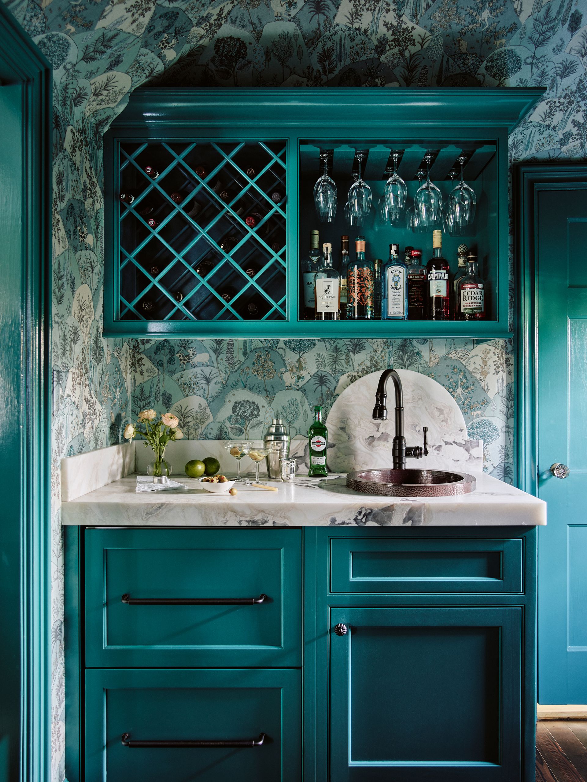
If enjoying a cocktail in the garden is not a possibility, why not just borrow from nature’s relaxing qualities? The award-winning interior designer Vani Sayeed, principal of the Massachusetts-based Vani Sayeed Studios, wanted to create a space that had 'a certain wow factor', she explains, and the inspiration for that was the view through the window - the client’s beautiful grounds of their 1926 Tudor-style home. 'We wanted to bring the outside indoors - the winters in the greater Boston area are harsh and long, so we wanted to create that sense of a lush garden [that could] be enjoyed all year long.'
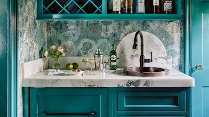
'The key to a seamless design,' says Vani, 'was to panel the refrigerator drawers' (the lower drawer is programmed to chill beer, the top for wine). In addition, the cabinets have a high-gloss finish (using Benjamin Moore's Largo Teal paint) so that light is reflected and the space appears larger. The whole room is wrapped in “Aravali” wallpaper by Osborne & Little ('a lovely mountain scene which speaks to the hilltop location,' says Vani), with this wallpaper idea creating a jewelry box-like effect.
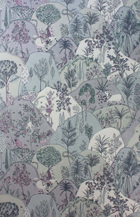
Aravali Wallpaper in Lilac by Matthew Williamson for Osborne & Little, Burke Decor
Illustrated rolling hills and forests give this wallpaper print a natural, yet elevated feel.
5. Hide your bar behind doors

Sometimes, having one’s extensive liquor collection out on display is not always welcome or appropriate - maybe you’re hosting a kids’ party, a meeting, or maybe you’re just hungover and can’t face tidying up from the night before. Being able to close the doors on your home bar will give much more flexibility in how you use your space - and even where you put it. You could even put a bar in a living room, for example.
And whether you go for a Dutch door, bifold doors, sliding doors, roller shutters, or even an elegant velvet curtain, there are plenty of options. In this house overlooking the Chesapeake Bay in Maryland, the award-winning architect Devin Kimmel housed the bar in the main living area. 'The neutral palette was selected so that when closed, the bar area wouldn't compete visually with the stone fireplace surround that is adjacent to it.'
Key to getting the look right, says Devin, is that when the bar is fully open, the doors need to be out of sight, 'to give it a built-in look, rather than just a cabinet with the doors open.' He also recommends glass shelves in order to allow light to filter through to display the spirits, as well as 'keeping the back wall dark to allow the bottles to shine.'
6. Go rustic to escape the hustle bustle
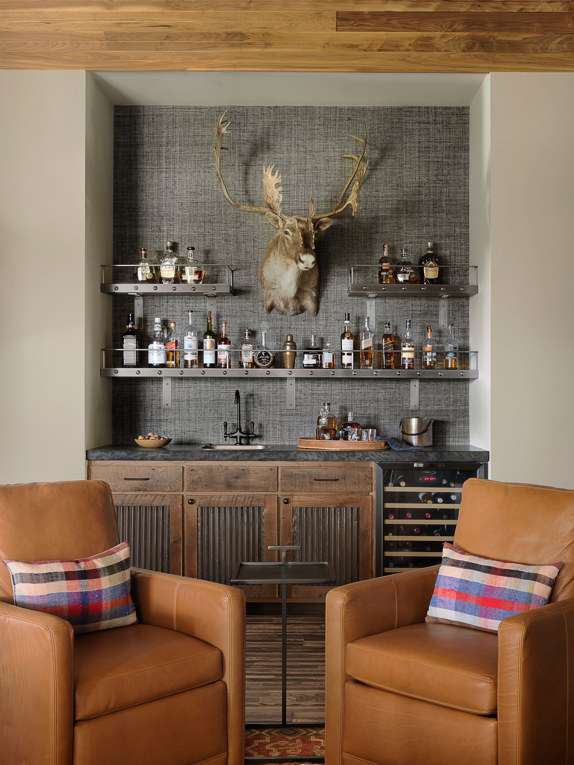
Although this cabin happens to be in the middle of nowhere, such isolation is not a requisite for a modern rustic theme - wherever it is, the natural vibe will still lend a sense of respite from the daily grind. Using reclaimed walnut from a local farm, mid-century furniture, a hammered copper sink and a Philip Jeffries grasscloth wallcovering, the Missouri-based interior design firm ADJ Interiors has created a 'cozy and relaxing getaway from the hustle and bustle of the city,' says its designer Meagan Cooperman. 'We selected raw elements local to the area, as well as an earth-toned palette that resembled the land it is built on.'
There’s also a distinctly male edge to the bar, its liquor ledges having been custom-made by a local metal worker from riveted stainless steel gunmetal, while the dark concrete counter top features a raw, rugged edge, and the cabinetry features galvanized tin inserts. 'The owner of the cabin wanted this to be the ultimate place for himself and his friends to relax after a day of hunting or fishing,' says Meagan. 'The aesthetics were always meant to be masculine and rich.' Softer elements, such as leather seating and a woven tray, as well as an assortment of bourbons, add to the cabin decor and are intended to 'draw the guests in so that they feel comfortable enough to make themselves a cocktail,' she adds.
7. Blend your bar seamlessly

When space is tight, what you don’t want to do is draw the eye to difference, which will make it seem only smaller. In this corner of a modern kitchen in Los Angeles, the interior designer Caren Rideau, author and founder of Kitchen Design Group, integrated the “sommelier” bar into the kitchen design, using a bespoke paint and matching cabinetry to unite the space.
'This bar was an important feature for the owners because they do a lot of entertaining and have a wine group,' Caren explains. 'They wanted the bar - which features a wine fridge and plenty of storage for glasses and decanters - to be accessible from the kitchen and to be close to the dining area.' She added a rolling ladder so that they could take full advantage of the floor-to-ceiling storage; it also adds a lovely design detail.
8. Install saloon-style bar seating

There’s nothing quite like the feeling of being perched at a bar, marvelling at all the alcoholic options ahead of you. It’s communal, it’s casual and it’s unavoidably relaxing. In this home bar in a contemporary-luxe farmhouse in Waterberg, South Africa, that feeling is made all the more tranquil with the use of beautiful kiaat wood (a local hardwood), which has been carved into angular stools to echo the shape of the bar. The neat line of bespoke, hand-turned pendants also compliment those sharp lines.
'The form of the bar and stools expresses a simple minimalist enthusiasm for the intrinsic quality of this natural wood,' explains Nick Plewman, founder of Nick Plewman Architects, who along with Fox Browne Creative designed the house. 'The architecture tries to facilitate a natural and casual relaxation,' he adds. 'We wanted to create a modern farmhouse feel that is understated and timeless; that doesn't shout or impose itself but rather drapes itself around its owners like a well-worn farm coat.'
9. Tuck it into a niche

If you’re after something a little more discreet, consider locating your bar in an existing cubbyhole or walk-in within your living space. This tiny bar sits just off the dining room: 'a perfect place for a bar,' says the interior designer Rittika Chokhany, founder of the Mumbai-based design consultancy Ariyona Interior. The open doorway gives easy access to the bar, while the newly installed wooden partition to its left enabled the L-shaped bar counter to be brought right up to the partition: 'It’s great for hiding the mess behind,' she explains.
Given the tiny space, Rittika kept the bar design very simple and functional, and emphasised the straight, clean lines. She used mirrors on the walls above the counter, and glass shutters on the cabinets in order to give a clear view of the mirrors behind them. The mirrors serve 'both as a counter backsplash and to make that little corner look much bigger than it actually is.'
What should I include in a wet bar?
The London-based South African designer Hubert Zandberg recommends opting for integrated appliances, 'so you can add your own frontage and they don’t actually look like appliances.' It’s key to get the equipment right, too. 'You need the right basin, tap, wine fridge, ice maker, etc,' he says. 'It’s got to be practical.'
When it comes to getting the design right, Hubert advises sticking to four key elements: the front of the cupboards, the worktop, the shelves and the wall behind them. 'If it’s more than that, then it becomes a mess.' Home bars require a certain simplicity, he explains, 'in order to allow you to add all the fun stuff - the shakers, the bottles, the glasses.'
Be The First To Know
The Livingetc newsletter is your shortcut to the now and the next in home design. Subscribe today to receive a stunning free 200-page book of the best homes from around the world.
Fleur Britten is a well-respected journalist who for years was the Senior Features Editor at Sunday Times Style. She is known as one of the smartest lifestyle journalists around, revered for being able to decode trends and report on new zeitgeists as they happen. She now writes for the Telegraph, Livingetc, Vogue, The Times, Harper's Bazaar and the Guardian.
-
 The 12 Best Table Lamps for Reading —I'm a Certified Bookworm (and Shopping Expert)
When it comes to table lamps for reading, I don't mess around. If you're the same, this edit is for YOU (and your books, or course — and good recommendations?)
By Brigid Kennedy Published
-
 "It's Scandi Meets Californian-Cool" — The New Anthro Collab With Katie Hodges Hits Just the Right Style Note
The LA-based interior designer merges coastal cool with Scandinavian simplicity for a delightfully lived-in collection of elevated home furnishings
By Julia Demer Published
