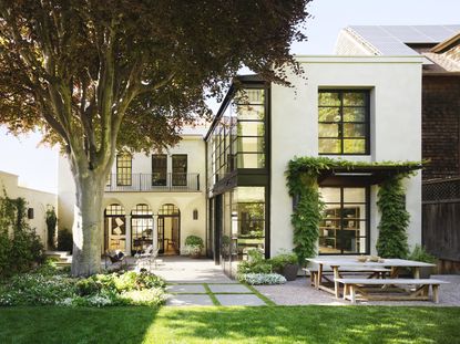
Explore a light-filled San Francisco family home with monochrome interiors and lush gardens
This stunning San Francisco family home ticks all our boxes...


The property
This striking, light-filled San Francisco family home is located in the fashionable Pacific Heights area. The modern house – an Edwardian-style property built in 1925 – had been relatively untouched over the years and was due for a complete overhaul. The owners brought on Walker Warner Architects, interior designer Redmond Aldrich and garden landscapers Scott Lawrence Landscape Architecture to transform it into the stunning family home it is today.
See Also: See inside this colourful, contemporary home in the heart of San Francisco

Exterior
Originally built in the 1920s, the renovation of this historic Italian Renaissance style home was a delicate balance between preserving its historical character while leaning forward to respond to a more contemporary way of living.
To bring the building up to earthquake code, the home had to be taken down to the studs and the foundation reinforced with steel. With San Francisco having strict historic preservation regulations, it was essential to preserve the look and feel of the public facades of the building.
Decorative wooden cornices and columns were replaced with custom fibreglass reproductions, recreating the original architectural details.

Entrance
The front door pushes open into a generous hallway with a modern sweeping staircase taking centre stage.


Living room
The interiors feature a monochrome colour palette, arched doorways, and steel-framed doors and windows that open out to lush, landscaped gardens.


See Also: This chic family home in Dallas is packed with bold design and modern art
Kitchen
The modern kitchen is the heart of the home and features a modern kitchen island, white kitchen cabinetry, a lounge area and informal dining space.

Walker Warner Architects opened the house up, creating a better connection between rooms and adding more windows and doors to connect to the adjoining gardens.


The architects added a new two-storey rear extension which floods the new rooms with natural light and connects to the vibrant garden.


Dining room
The formal dining room also features the same black and white colour palette, softened by the arched doorways leading outside.


The dining room was given a Mid-Century Modern inspired look.

Staircase
The new staircase features a sky light which floods the stairwell with natural daylight.

The wide treads and curved corners give the staircase a soft, relaxed look.

Master bedroom
The master bedroom features a neutral colour palette and a patterned but muted bedroom wallpaper.

Floor-to-ceiling windows frame views over the Cedar Tree and manicured gardens.


A polished dressing room space leads through to the ensuite bathroom.


Childrens' bedroom
A sharing bedroom was set up for the kids, featuring twin beds with built-in bench seating at the foot.

Roof terrace
The best views are seen from the roof terrace and adjoining sun room.


Garden
But the most-used outdoor space is of course the stunning garden, with the century old Copper Beech tree as a front and centre focal point.


See Also: This Sonoma farmhouse has a warming summer style that lasts all year
Be The First To Know
The Livingetc newsletter is your shortcut to the now and the next in home design. Subscribe today to receive a stunning free 200-page book of the best homes from around the world.
Lotte is the Digital Editor for Livingetc, and has been with the website since its launch. She has a background in online journalism and writing for SEO, with previous editor roles at Good Living, Good Housekeeping, Country & Townhouse, and BBC Good Food among others, as well as her own successful interiors blog. When she's not busy writing or tracking analytics, she's doing up houses, two of which have features in interior design magazines. She's just finished doing up her house in Wimbledon, and is eyeing up Bath for her next project.
-
 The 12 Best Table Lamps for Reading —I'm a Certified Bookworm (and Shopping Expert)
When it comes to table lamps for reading, I don't mess around. If you're the same, this edit is for YOU (and your books, or course — and good recommendations?)
By Brigid Kennedy Published
-
 "It's Scandi Meets Californian-Cool" — The New Anthro Collab With Katie Hodges Hits Just the Right Style Note
The LA-based interior designer merges coastal cool with Scandinavian simplicity for a delightfully lived-in collection of elevated home furnishings
By Julia Demer Published

