See inside this colourful, contemporary home in the heart of San Francisco
This modern home in San Francisco embraces the abstract, the playful, and the unexpected with grid wallpaper, floral textiles, modern art and bold pops of colour


The Property
This modern home in San Francisco is a 1200 square foot Edwardian property that embraces the abstract, the playful, and the unexpected. With grid wallpaper, floral textiles, modern art with pops of colour peppered through the home, the home is a jewel box in the heart of the city.
The first time homeowner wanted something that she could move into right away but also make her own. Previously a completely blank canvas, she brought on Regan Baker Design to create a fun and uplifting scheme.
Regan Baker upgraded plumbing fixtures, lighting and flooring, added fun new wallpaper and sourced furniture and accessories throughout to create a space that feels contemporary, playful and dynamic.
Living room
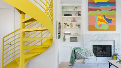
The living room is punctuated with a vibrant yellow modern staircase.

- Read Also: This 19th century brownstone townhouse in New York features a refreshingly modern interior
Regan repainted the existing spiral staircase a sunny yellow shade. The staircase serves a sculptural focal point in the space and also complements the painting over the fireplace.
The staircase leads up to the master bedroom on the second floor.

Regan selected some playful upholstery patterns, including the side chair, custom throw pillows and the custom floor poufs finished with neon piping.

To ground the bold colour scheme, the designers incorporated a range of subtle textures and organic elements such as the travertine surface of the coffee table and and the soft, woven texture of the grey-blue rug.

The arched wall sconce provides soft lighting over the sofa, and serves as a sculptural element that moves the eye.

kitchen
The existing kitchen was a blank canvas with neutral and expected cabinetry and finishes. Regan brought a modern feel to the white kitchen cabinetry by upgrading the builder grade stainless steel hardware to modern white wood handles.

Regan Baker also swapped out the existing grey tile backsplash for a clean, white tile, installed in a stacked orientation, continuing the same grid motif she used in the rest of the home (including the office wallpaper, dining chair upholstery, and master bedroom wallpaper).

Dining room
The dining room features a playful mix of colour, pattern and texture. A modern coloured glass pendant provides a sculptural element in the space, while mix-and-match seating introduces a range of colour through different upholstery fabrics and materials.
A built-in bench not only provides a flexible amount of seating, but offers tucked away storage for dinnerware, napkins and accessories, making the most of the limited square footage.

Stools provide optional extra seating when entertaining. When not in use, they easily stow away under a nearby console.

Home office
The home office was designed by the homeowner — she loves design and wanted a project of her own.
A built-in style desk spans one side of the room to optimise the space, providing both an extended work surface and concealed storage space underneath.

Grid wallpaper brings the linear motif into this room. A deep green velvet sofa introduces contrasts and pulls colours from the edgy photographic art.

The modern, minimalistic wall light provides lighting over the sofa, and fits in with the other lighting choices throughout the home (exposed frosted bulbs, and an emphasis on line and geometry).
It's a beautiful, modern space that works well with the other themes and art in the home.

Guest bathroom
To provide contrast with the bright white walls in the home’s larger rooms, Regan Baker used wallpaper in the more intimate spaces, like this guest bathroom.
A monochromatic, green palette keeps this space feeling calm and unified — floor tiles and accessories draw on the shades of teal found in the delicate floral wallpaper.

The modern profile of the pedestal sink recalls some of the sculptural, contemporary accessories used in the home’s other spaces.
The rounded, pill-shaped light fixture also draws on contemporary design elements, a nod to other pieces in the home like the arched sconce in the living room.
Master bedroom
The master bedroom was the biggest transformation. The designers removed the previous awkward built in cabinetry, bumped out a wall for a pocket door connecting to the ensuite bathroom, and added a shoe closet. They also flattened the bedroom ceiling.
The homeowner chose the bedroom curtain fabric, then the rest of the room was built around this fabric choice.

The ceiling slopes in the corner, so the designers had to think through this when installing the recessed ceiling track.
The bedroom boasts panoramic views of the San Francisco hills. The room gets lots of natural light, so the floor-to-ceiling curtains are layered so they can create complete darkness.

The room also has a sloped ceiling on the opposite side, where built-in bedroom storage runs the length of the wall, making the most of the shorter ceiling height in that area. Originally this storage space was accessible via one small door, but Regan Baker created wall-to-wall doors to make this easily accessible on a daily basis.

Regan also incorporated a vanity area behind one of these doors, that tucks away out of sight when the doors are closed.

The wallpaper is a subtle, pale blue grid that has a graph paper feel. It provides additional interest, but the scale keeps this calming and understated—the perfect foundation for layering additional colour and pattern through bedding and drapery that mixes pattern and scale.

Ensuite bathroom
The ensuite bathroom previously had neutral, builder grade finishes. So Regan created a big impact in the space by replacing the tile with a mint-green and white square tile installed in a checkered pattern, tying in with the grid patterns in the rest of the home. The tile pattern continues onto the floor to make the most of this smaller room, and create even more of a statement.

The new vanity mixes materials—white drawer fronts contrast with exposed wood edges, emphasising the lines and geometry of the piece. Cut-out drawer pulls add additional modern appeal.
The mirror extends as far as possible from wall to tile, and from the vanity to the ceiling, creating the illusion of space. Bathroom lighting installed directly on the mirror appear to float in mid-air, creating an airy, open feel, in spite of the room’s small scale.
Terrace
A terrace provides the perfect spot to relax and enjoy the San Francisco views.

Contractor: Lee & Co.
Be The First To Know
The Livingetc newsletter is your shortcut to the now and the next in home design. Subscribe today to receive a stunning free 200-page book of the best homes from around the world.
Lotte is the Digital Editor for Livingetc, and has been with the website since its launch. She has a background in online journalism and writing for SEO, with previous editor roles at Good Living, Good Housekeeping, Country & Townhouse, and BBC Good Food among others, as well as her own successful interiors blog. When she's not busy writing or tracking analytics, she's doing up houses, two of which have features in interior design magazines. She's just finished doing up her house in Wimbledon, and is eyeing up Bath for her next project.
-
 The 12 Very Best Silk Bedding Pieces — As Our Style Editor Says: 'It's What Dreams Are Made Of!'
Slumber in lustrous luxury with the very best silk bedding sheets, duvets, pillowcases, and more — your sleep score will thank us later
By Julia Demer Published
-
 The 12 Best Wayfair Table Lamps Are All Under $200 — And Our Style Editor Wants The Lot
These 12 best Wayfair table lamps are the perfect excuse to get a head start on your President's Day sale shopping. With discounts up to 78% off
By Julia Demer Published

