Before and After: A tired Californian home was made lighter, airier and given the most beautiful wood kitchen island
The before and after of this home in California is almost impossible to understand, as it's transformed with more light, space and transitional-style


It's not always easy to look at the bare bones of a house - and a tired, dated and faded house at that - and imagine how it can be breathed back to life.
Yet this traditional English style home in Atherton, California, needed just that amount of vision, that belief that something could be done. The problem was the house was not a total wreck, which almost makes it harder. The kitchen was functional - it just had a floral pelmet over the windows and an uninspiring oak island. The staircase was grand, or at least it would have been, once, but its constant corners and hard edges were formal and uninviting. Could this space really become a shining example of the best in transitional style?
In the hands of Feldman Architecture in collaboration with BAMO on interior design, the answer is, of course, yes. Read on to be inspired by the knowledge that no space is too tricky to handle.
The kitchen, before

The original kitchen came with all the trappings of a home last decorated in the 1980s. A shiplap ceiling, a large kitchen island made of oak, frilly curtains along the top of the window. With its dark flooring and heavy iron lighting the space just read a little dingy.
The kitchen, after

It's hard to imagine it as the same space. In this light-filled modern kitchen, full-height glass doors fold open to a new southern backyard and outdoor living area. It's the height of modern Californian living, and allows you to wander between indoors and out with no boundaries at all. It's almost as if the kitchen itself is outdoors, shaded by a custom trellis.

Living room, before

Everything about the way the living room was decorated seemed oppressive. The panelled ceiling, the large curtains, the dark wood furniture. Even the living room layout seems designed to make you feel hemmed in.
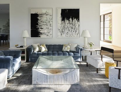
The living room, after

For the remodel of the now transitional-style living room, it benefits from the same glass doors as the kitchen, flooding the space with light. As ever with transitional style the trick to blending eras and is to keep to a relatively neutral color palette - the blues, greys and just a hint of mustard work because they don't detract from the beauty of the ashy wood ceiling.


The staircase, before

In true Hollywood regency style the original staircase was ornate, heavy, imposing. Its dark wood stair rail clashed with the off-white painted banister. At right angles, the blocky turns of the steps seems uninviting.
The staircase, after

A new, light-filled entry and expanded stair is the heart of the 8,183-square-foot house and one of the primary sources of daylight. The graceful curves of the staircase create a sensation of floating and eliminates the need for landings between levels. The three-story shape of the stair hall is mirrored by an elliptical skylight supporting a multi-tiered, custom chandelier and mimicking the cascading movement of the daylight above.
The patio, before

The covered patio next to the kitchen wasn't technically bad. It just wasn't somewhere that invited you to linger. The dull grey walls were uninspiring, especially when paired with the slate grey floors.
The patio, after

Collaborating with the landscape architect, the design team worked to visually and spatially connect the pool and backyard to the main house, thoughtfully integrating intimate outdoor living spaces into the grounds. Each interior space opens towards an exterior marker or romantic moment, creating a site-sensitive renovation that celebrates its surroundings.
The exterior, before

Here you would say there was nothing wrong with the design. The pool is large, the water shimmering, and the exterior of the house looks well kept. Right?

Yet removing the pillars, getting rid of the classic English-style tropes and replacing them with clean lines and a large lawn suddenly makes the pool seem even more impressive.

See more work from Feldman Architecture.
Be The First To Know
The Livingetc newsletter is your shortcut to the now and the next in home design. Subscribe today to receive a stunning free 200-page book of the best homes from around the world.

The editor of Livingetc, Pip Rich (formerly Pip McCormac) is a lifestyle journalist of almost 20 years experience working for some of the UK's biggest titles. As well as holding staff positions at Sunday Times Style, Red and Grazia he has written for the Guardian, The Telegraph, The Times and ES Magazine. The host of Livingetc's podcast Home Truths, Pip has also published three books - his most recent, A New Leaf, was released in December 2021 and is about the homes of architects who have filled their spaces with houseplants. He has recently moved out of London - and a home that ELLE Decoration called one of the ten best small spaces in the world - to start a new renovation project in Somerset.
-
 These 12 Best Table Lamps for Your Desk — Perfect Glows for a Creative Home Office
The best table lamps for your desk is have a soft, targeted glow. Elevate your WFH set-up with these stylish picks endorsed by Style Editor Brigid Kennedy
By Brigid Kennedy Published
-
 The Nespresso VertuoPlus is 30% Off for President's Day, and it's Kim Kardashian's Coffee Maker of Choice
This sleek and stylish coffee maker was spotted in Kim's home bar, and you can currently save $60 if you buy yours from Amazon
By Lilith Hudson Published

