Transitional style is taking over interior design – top designers on 11 ways to capture the calm and collected look
Transitional style finds common ground between contemporary and classic interiors through a seamless mix of furniture and deco

What is transitional design, to the uninitiated? If your preferred style is a little bit classic and contemporary all at once, you’re likely a fan of this unquestionably popular interior trend without even knowing it.
“Transitional design is about blending a traditional aesthetic with modernist sensibilities,” says Los Angeles interior designer Stefani Stein. “Allowing the two styles to combine effortlessly is about balance.”
Effortless is the operative word: transitional spaces tend to prioritize comfort. The typical palette is neutral and light without much tension between contrasting styles; elements of traditional interior design (like curvy furnishing) and contemporary design (like right angles) sit comfortably with one another (like the best of both worlds).
The result is sophisticated and fresh – old soul with a youthful spine – and notably relaxed. “So many of our clients are drawn to this aesthetic because, when it’s done well, it is comfortable, approachable, easily edited and updated over time,” says Joe McGuier, a principal at Brooklyn’s JAM.
As far as styles go, transitional design is more relaxed than rigorous. But a few guiding principles will put you safely at home with this layered aesthetic.
1. Embrace a neutral color scheme

Don’t expect any jolts of color – transitional interiors lean heavily on neutral color schemes. Softer hues like creams, whites, beiges, taupes are applied across furniture and decor to create clean, calm, and collected environments. This is where the approach is similar to minimalism.
“Keeping a neutral base lends to a softer feel and allows easy layers to be mixed in throughout,” says Marianne Brown, owner and principal designer of Salt Lake City’s W Design Collective. “We often find a lot of organic textures and mixe
2. Create visual interest with mixed textures

Room by Betsy Brown Interior Design
With so much talk of light and neutral palettes, you’d be right to worry about creating an altogether vanilla space. But one way to infuse visual interest while decorating with neutrals is to incorporate an array of texture: tactile materials in solid colors like boucle upholstery, linen drapes, or other soft accents (like a knitted throw or a velvet accent pillow).
For a transitional-style living room can also apply this same concept with finishes, too, so long as they are subdued and varied. “Where materiality is concerned, variety is better,” says Stefani Stein. “I gravitate towards woods in natural finishes, such as oak or walnut. Try mixing these materials with marble and linen. Avoid using the same finish throughout; it can feel a bit one note.”
3. Pair two different styles of furniture together

The most basic formula for transitional design is simple: combine furniture from two different eras. “If you purchase a table that feels more traditional, find items with cleaner or more simplistic lines to pair with it,” says Marianne Brown of Salt Lake City’s W Design Collective. “If you find a table that is all wood, find painted or upholstered dining chairs to pair with it.”
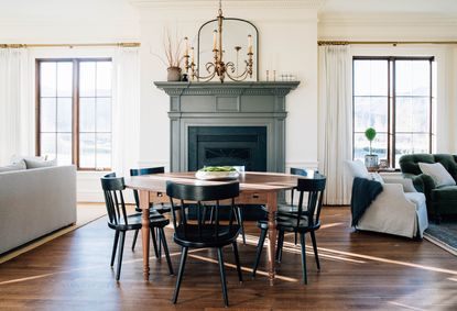
In the historic home above, mid-century dining chairs, painted black, bring a modernist accent that balances out a hefty wood table with traditional rounded legs. It's a perfect transitional-style dining room. It's here you can see the similarities with the disciplines of the modern farmhouse movement. “Mixing contrasting pieces, traditional/vintage feel with modern/clean lines, helped us achieve that balance without the space feeling too traditional on one hand, or too modern on the other,” adds Brown.
4. Play with lines and silhouettes

Room by Betsy Brown Interior Design
As with rhythm in interior design, to find the right synergy between disparate styles, pay attention to lines and silhouettes. “Transitional design is all about the seamless balance between the traditional and the modern,” says Alicia Murphy, noting that ornate detailing found in classic design is usually ‘cleaned up’ in transitional interiors.
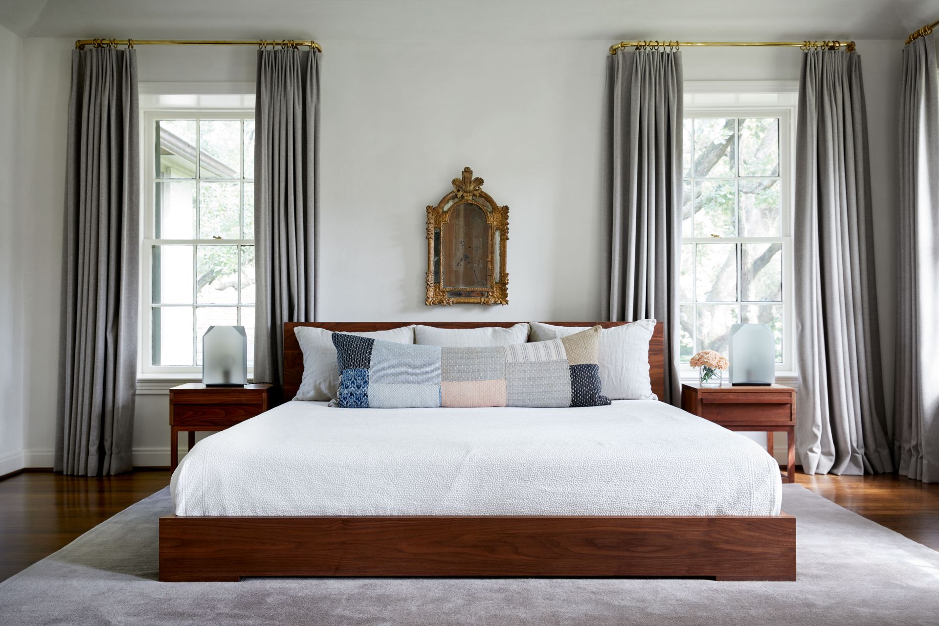
This is most pronounced in furnishing, as rounder shapes and silhouettes found in traditional design (like turned legs and arched backs) mingle with the clean lines of modern furniture design (like crisp edges and simple shapes). Together, they soften and straighten each other out, creating a warm and timeless look – it’s important to have a balance of both to create a seamless connection between both looks. A very calm take on eclectic style, as seen here in this transitional-style bedroom.
5. Less is definitely more

We know what you’re thinking: combining several interior styles in one space sounds an awful lot like eclectic style. But if there’s one trick that keeps transitional spaces in check, maintaining a certain level of minimalism offers the right balance. Think Scandinavian design as you keep your decor spare offers a clean slate as you bridge the gap between old and new styles.
“It is important not to over-accessorize with this look,” says interior designer Stefani Stein. “Thoughtful layers and a less-is-more approach is best when thinking about pillows and accessories.”
6. A solid rug creates a soft and balanced base

Design by Meg Lonergan
An easy way to anchor your space in a simple, solid palette is to zero in on items with the most surface area – and there’s likely no bigger item in your space than an area rug. “A darker solid colored rug always creates a great foundation,” says Houston-based interior designer Meg Lonergan.
Covering your floor with a monochrome rug, or even a rug with a more subtle pattern, will give you a clean canvas for other items, like in the bedroom above. “In this bedroom we laid a charcoal mohair rug down and layered it with a paler gray wool draperies, we stuck with the same color family but different tones of the same color to create harmony,” says Lonergan, noting that a playful patterned pillow added just the right amount of personality.
7. Create balance with neutral classics

While you can pair accent pieces from different design eras, you can also reimagine timeless pieces with modern (read: neutral!) upholstery and finishes. “Classic pieces in neutrals are a great foundation for transitional design” says Houston interior designer Meg Lonergan. In this way, neutral finishes can simplify traditional details and silhouettes that otherwise might stick out.
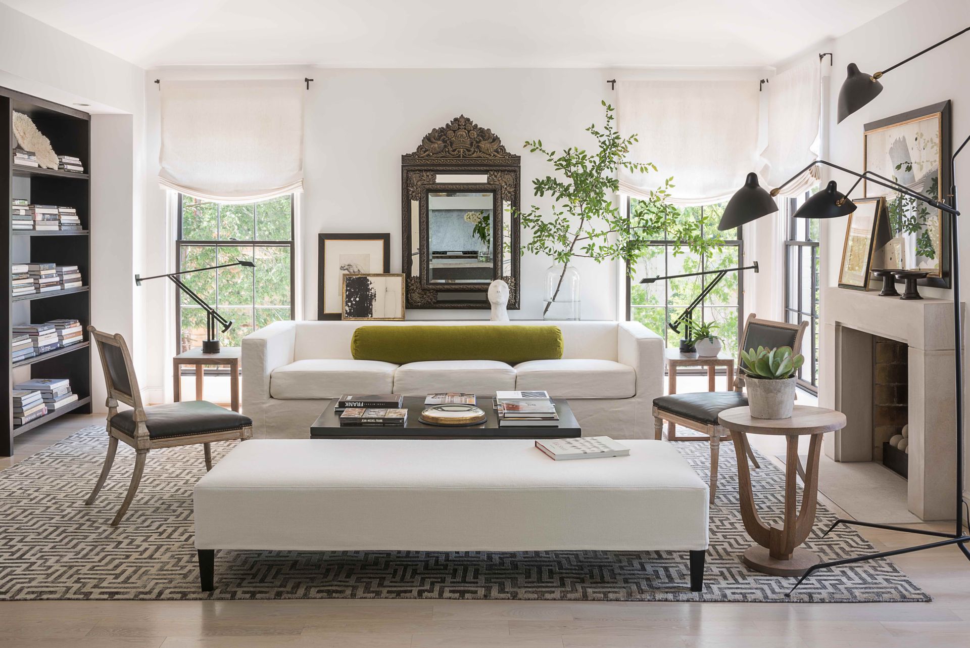
In the above living room, neutral classics work together to form a subtle palette. “The flax linen slipcovered sofa with clean straight lines and the lucite and glass simple coffee table are classics that will never date or go out of style,” says Lonergan. “It's easy to layer with color and pattern on simple larger pieces. Pillows, lampshades, art and accessories are easy ways to change the look of a space. Invest in classics is the most important lesson!”
8. Pick muted and subdued hues

While we often see transitional style interiors in neutral palettes, a gentle use of color goes a long way. “Colors can work nicely with transitional design – it isn’t just about neutrals,” says Stefani Stein. “However, the color palette should be tonal, muted or more subdued; avoid bright pops or overly cheerful hues.”
When in doubt, Stein recommends sticking to subtle colors inspired by nature, like the ‘blue-grey’ of a foggy sky, or the ‘dusty green’ of garden herbs. “Using color in balance is also important,” adds Stein. “Ground any colored moments with natural woods, and earthy neutrals like oatmeal, camel or tan.”
9. Let a contemporary fixture light the way

Design by Alicia Murphy
Especially when designing a space with historic architectural features (like an original fireplace, or classic millwork), you can look to contemporary fixtures to lighten the mood and decor.
In the interior above, Amagansett-based interior designer Alicia Murphy balanced out a Federal-style mantel and table with a modern chandelier made by Apparatus. “I think this balance is best achieved when the lights have modern forms but traditional materials – think clean lined sconces in Antiqued brass,” says Murphy. “I always think to myself – what would have been in this house historically and then how do I take that item and make it have clean lines.”
10. Think about your architecture, too

If your home’s base layer leans classic (from exposed beams to traditional wood floors and crown molding) you have plenty of latitude to incorporate clean, modern detailing (from neutral painted millwork to furniture with seriously crisp lines).
The above transitional-style kitchen, located within a reimagined farmhouse, modern lines balance out more the home’s historic bones. “With a project like this, we always start with proportions and materials that are rooted in traditional design and then layer in modern detailing with a restrained approach,” says Joe McGuier of Brooklyn’s JAM. “We used richly textured hand-hewn beams, stone, and chevron floors in a traditional way, which allowed us to make the cabinetry and detailing of the overall room crisp and minimal.”
11. Avoid pieces that are too classic or contemporary, period

Of course, while you can balance two pieces of decor from extreme ends of the spectrum, it’s best to pick items with more common ground. "I would steer clear of anything that leans so strongly into a specific style that it looks out of place paired with pieces from other periods,” says Martha Mulholland. “A heavily carved and gilded rococo console may only mix well with a brightly colored Memphis Milano lamp at the hands of a seasoned decorator who has an adept ability to juxtapose periods.”
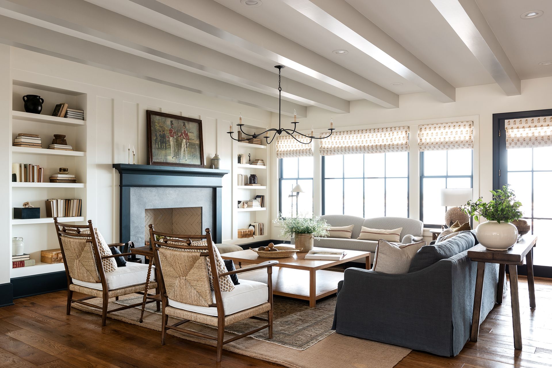
In the collected, easy going living room above, a range of styles share the same space without getting singled out. "In this space we mixed traditional furniture with clean lined transitional pieces,” says Marianne Brown of W Design Collective. “We kept things balanced stylistically, which keeps the space from pulling too far one way or the other."
Be The First To Know
The Livingetc newsletter is your shortcut to the now and the next in home design. Subscribe today to receive a stunning free 200-page book of the best homes from around the world.
Keith Flanagan is a New York based journalist specialising in design, food and travel. He has been an editor at Time Out New York, and has written for such publications as Architectural Digest, Conde Nast Traveller, Food 52 and USA Today. He regularly contributes to Livingetc, reporting on design trends and offering insight from the biggest names in the US. His intelligent approach to interiors also sees him as an expert in explaining the different disciplines in design.
-
 These 12 Best Table Lamps for Your Desk — Perfect Glows for a Creative Home Office
The best table lamps for your desk is have a soft, targeted glow. Elevate your WFH set-up with these stylish picks endorsed by Style Editor Brigid Kennedy
By Brigid Kennedy Published
-
 The Nespresso VertuoPlus is 30% Off for President's Day, and it's Kim Kardashian's Coffee Maker of Choice
This sleek and stylish coffee maker was spotted in Kim's home bar, and you can currently save $60 if you buy yours from Amazon
By Lilith Hudson Published

