7 tiled kitchen islands that are so much smarter than marble (but you've got to get the grouting right)
Tiled countertops have been slowly resurfacing (*coughs*) over the last few years. But could the kitchen island provide the ultimate compromise?

The kitchen island is still very much top of most peoples' wishlists – provided you've got the cash and square footage to spare. But designers are slowly reinventing it, seeking ways an island might better serve us, from casters and space-smart rounded edges to modish materials.
And kitchen island materials are changing, too. Marble is becoming less the obvious choice. Few ideas feel as right for now as the tiled kitchen island, once retro showpiece and now firmly back in the design zeitgeist. There's an inherent modernity to that rigid grid, and endless color, size and texture options for when a metro tile won't cut it.
With high-contrast grouting, it feels graphic and slightly 1970s; with glossy Zellige tiles as sleek as any slab of terrazzo.
We've already seen a wave of tiled countertops, but with it a chorus of concern about the practical bits, from stained grout to (horror) cracked or chipped tiles. Perhaps the kitchen island could be the perfect compromise – a secondary prep space that doubles as desk and dining table, sequestered from the danger of the splatter-zone.
Here are seven kitchen projects where designers took the plunge.
1. Follow form

Free from the conditions of exacting clients, it's always worth watching what designers do in their own homes. 'Even as a child I was drawn to American kitchens seen in movies with tiled benchtops,' says architect Scott Weston, founder of Sydney-based Scott Weston Architecture Design.
He chose architect-favorite DTILE, a system made up of three-dimensional components he says allow for a 'purity' of form. 'The advantage is that it uses prefabricated parts – a standard tile, curved and bullnose pieces. You don’t have to cut the tiles to fit, as you base the design on the system. It's simpler for the tiler.'
Slimmer tiles were selected to emphasise the legs and a commercial epoxy grout specified for mould resistance and the prevention of staining.
Weston went for a grey lilac called 'Plum' in his own home, and has been won over by the possibilities he can present to clients. 'Creatively using a tile color or pattern provides unique design solutions to our clients’ homes, rather than sticking to the same old formulaic system of specifying marble or quartz.'
2. Call on color

Will it be a modern wash of matt kitchen island color, or an artisanal, perfectly-imperfect take on the trend? The tile's implicit uniformity – it all comes down to those clean lines and repeated shapes – mean you might be able to go a little bolder than you usually would without hint of overwhelm.
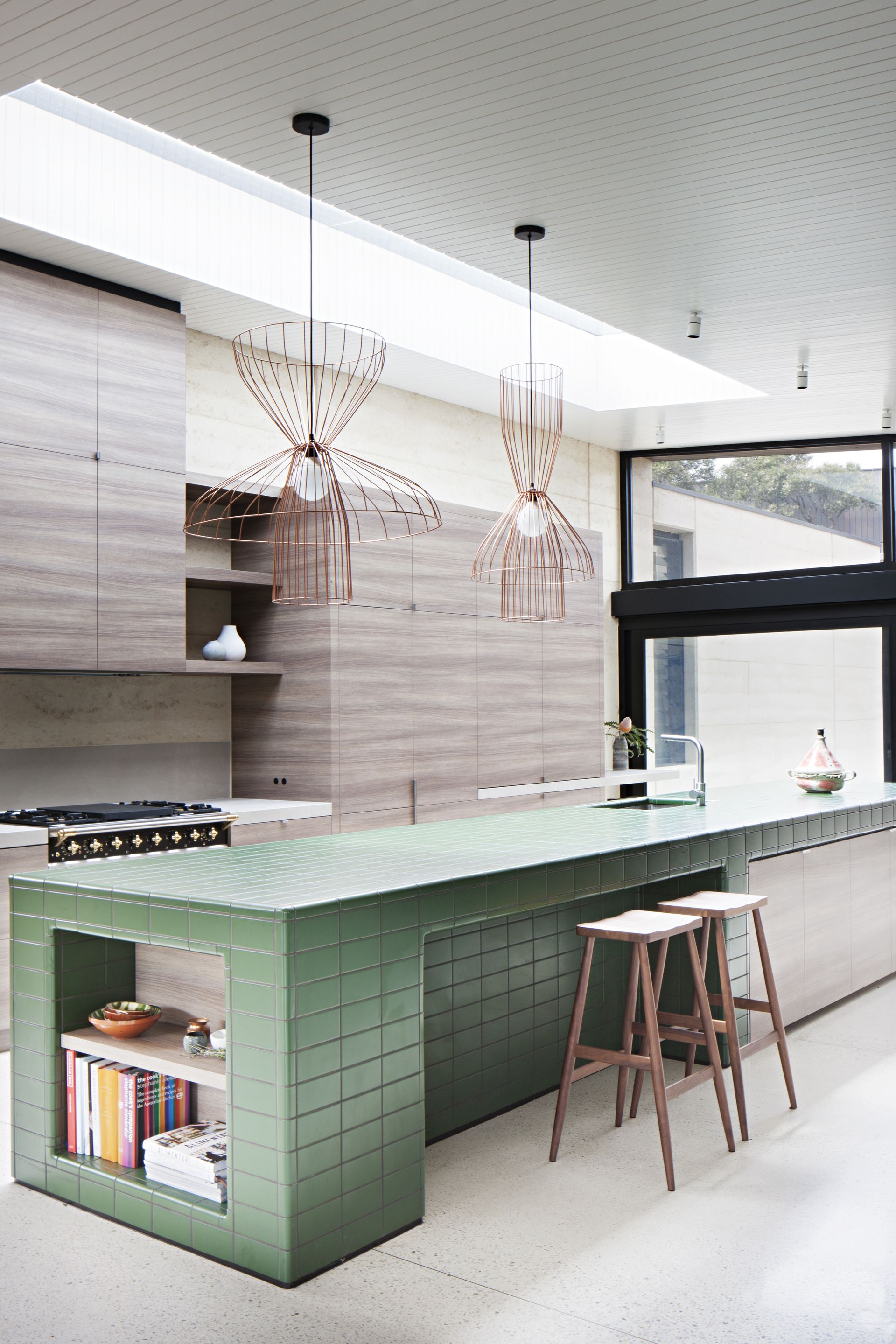
'This house in beachside Australia is set amongst the coastal vegetation, which has green, silver, and sandy tones,' explains Kathryn Robson, a principal at Robson Rak Architects. 'Our intention with the green bench top was to connect the internal detailing to the color and textures of the external landscape. Our client was a little taken aback by the suggestion of a fully tiled bench but put great trust and faith in our vision.'
'The tiles are Italian and used commercially in kitchens, science labs and bathrooms, so we knew they would be durable and robust.' She too espouses the merits of epoxy grout. 'No need to worry about dirt or discoloration!'
3. Consider usage

For those with limited floor space – or lingering grout-related doubts – this graphic kitchen table in the 19th century home of the New Orleans-based designer and muralist Liz Kamarul is a smart twist on the tiled island.
Visually it lands somewhere between the two, with all the impact of an island without the requisite hard work – just the thing if you're in no great need of extra surface space. And at bar-stool height it feels perfectly pitched for socialising.
'My husband and I made the table,' explains Liz Kamarul. 'It's a great statement piece and works well as an accent in the kitchen. It's not the primary prep surface so it stays relatively clean and easy to wipe up.'
While the practicalities of a tiled kitchen island depend on a precise combination of tile size, grout and sealant, it's a smart compromise for those worried about the wear of daily use.
4. Play with scale

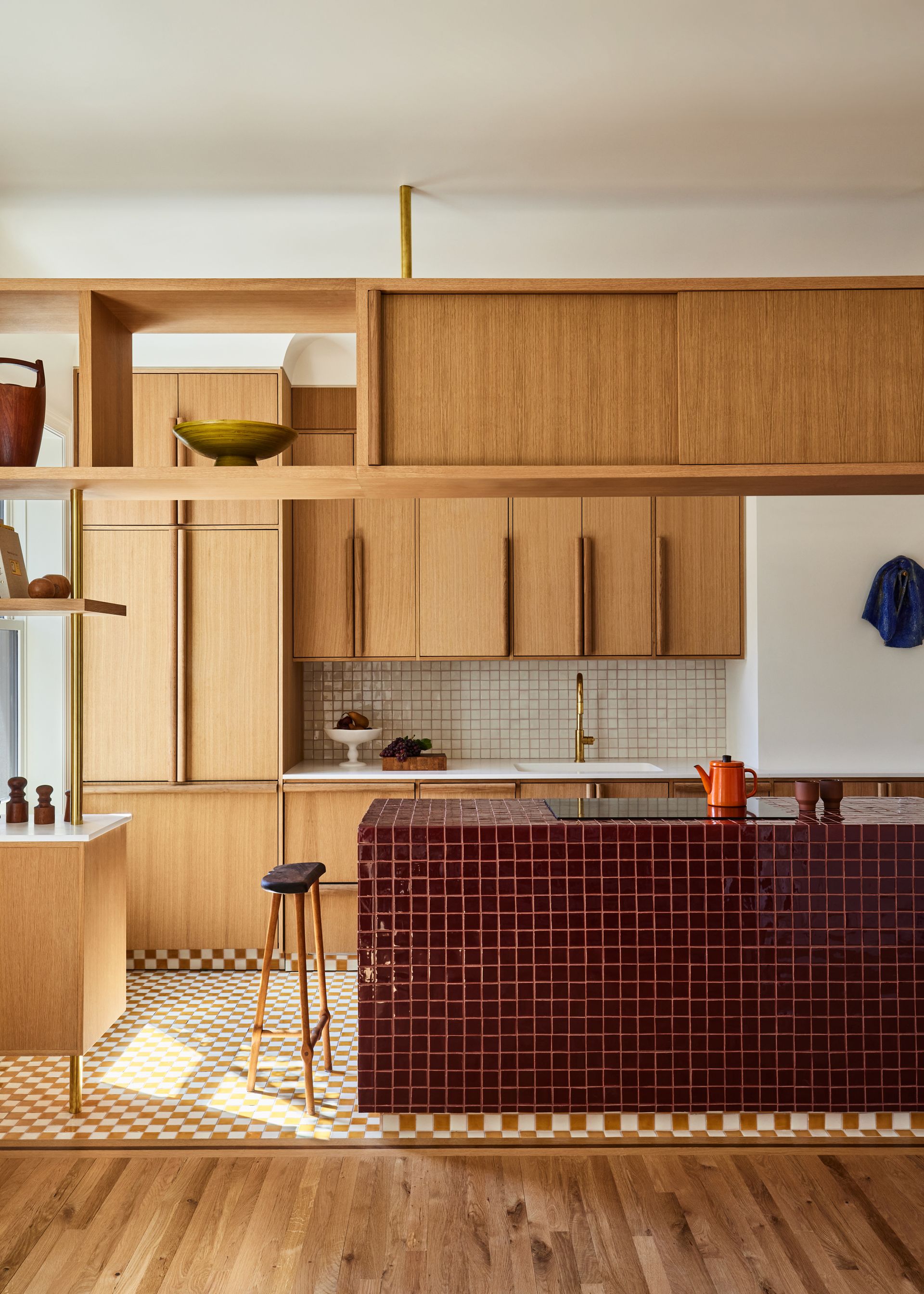
A far cry from the uniform white square, New York-based GRT Architects utilised a close grid of glossy oxblood tiles to clad the kitchen island in an East Village project characterised by bespoke oak cabinetry.
Encouraged by clients who 'loved exploring the unexpected', the result is particularly sophisticated – and all without the cost and ultra-luxe connotations of a weighty stone. The depth of color grounds the structure, while the gloss, texture and cantilevered effect help to counter its solidity.
Note how the two-inch handmade tiles reflect the scale of the flooring, which creates an interesting transition at the base of the island. Both create a kind of barrier, emphasising that visual boundary between the kitchen and the dining area.
5. Frame shelving

Smartly designed to store books between ply dividers, the island in this London family kitchen by Nimtim Architects is far from monolithic. The grid tiles function as a frame for the kitchen shelving, and at the same time bring structure to the backsplash and cabinetry beyond.
'The architecture is simple and modest in terms of scale and material, which is reflected in the choice of a simple white ceramic tile that defines the kitchen island and worktop, set against the rich hue of natural ply doors for the kitchen and joinery,' say founders Tim O'Callaghan and Nimi Attanayake.
With two young children around, marble might have felt exclusive – not to mention heavy and impractical. 'These simple materials provided a playful and suitably robust backdrop to family life. The choice of a dark grout in this project is key!'
6. Think beyond ceramic

Designer Rhonda Drakeford had to do a little persuading on this London project. 'I designed this residential kitchen for two professional chefs who had originally requested a cast concrete island,' explains the Studio Rhonda founder, who then introduced the idea of using pigmented concrete tiles 'as a more playful and lightweight solution – important for a kitchen above ground floor – which they loved!'
The timber base structure, she says, was meticulously constructed and measured so that the tiles could be used as whole 4 inches squares. 'It forms a strong, gridded pattern that references the urban location of the property, and its views of the adjacent tower blocks.'
The eye is drawn to that one-two hit of grey and sunny yellow, but its chalky finish has been carefully prepped for the pros: 'The surface of the tiles, and the contrasting colored grout has been lacquered with a sealant that helps keep everything clean and avoids stains.'
7. Try 'ghost' grouting

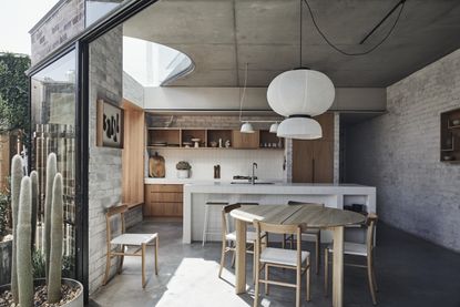
For the eponymous founder of Andrew Burges Architects, a tiled surface is an ambiguous one, at once domestic and faintly industrial. 'We were particularly interested in the ground level of this house reading as being outside – as a continuous garden. So materials that might typically be used outside were employed internally.'
Similarly appealing was the way that white tiles evoke a wide range of cultural references, from civic buildings to the butchers. 'For some, the utopian grid of Superstudio might come to mind,' Burges suggests. Here a simple white grout was selected, softening the effect of the grid and providing a counterpoint to the high-contrast, graphic take on the trend.
He describes the result as a 'utilitarian sculpture', free from the constraints of something like stone, which comes out of the quarry as an enormous singular slab. 'A simple tile was more in line with the modest atmosphere we were aiming to create,' he adds.
Be The First To Know
The Livingetc newsletter is your shortcut to the now and the next in home design. Subscribe today to receive a stunning free 200-page book of the best homes from around the world.
Cat Olley is a British design and lifestyle journalist, editor and copywriter. Formerly on the features team at ELLE Decoration, she has written for The Guardian, The Modern House, Evening Standard Homes & Property, Inigo and John Lewis at Home. She specializes in the latest trends and ideas happening in the design world, and is our go-to for aesthetically-led pieces.
-
 How to Thaw a Frozen Pipe — Learn Everything You Need to Know in 5 Minutes With This Guide
Winter storm caught you off guard? We asked an expert — just how do you thaw a frozen pipe?
By Hugh Metcalf Published
-
 The 12 Very Best Silk Bedding Pieces — As Our Style Editor Says: 'It's What Dreams Are Made Of!'
Slumber in lustrous luxury with the very best silk bedding sheets, duvets, pillowcases, and more — your sleep score will thank us later
By Julia Demer Published

