5 things minimalists do to add texture to a room - 'it makes all the difference'
Texture is the essential piece of the puzzle for a minimalist design scheme – here are 5 designer-recommended ways to incorporate it into your space


There’s a fine line between a cool but inviting minimalist scheme and a cold, sparse space – and that line, interior designers will tell you, is texture. In a room where decoration is limited, furniture choice understated and color palette restrained, a color palette is limited and furniture choice is understated, the materials and finishes you use carry a lot of weight.
Of course, paying attention to these details is par for the course in modern interior design of any kind – it’s just that a successful application of minimalism relies even more heavily on texture used well. ‘In essence, texture is the silent conductor orchestrating a symphony of simplicity,’ says Sabra Ballon, founder and principal designer at San Francisco-based boutique design firm ballonSTUDIO. ‘In a minimalist setting, where there's a risk of sterility, it breathes life into the design. It's the difference between a flat image and a rich, three-dimensional experience.’
So how exactly should texture be introduced into a minimalist scheme? We spoke to interior designers to get their tips.
How to add texture to a minimalist room
First off, the key to introducing texture is in the mix. ‘It's important when designing a minimalist space to use a variety of different textures in your scheme to keep the space from feeling flat – literally and figuratively!’ says Louisville-based interior designer Bethany Adams. ‘When a room is mainly one color, your eye will be drawn to the subtle differences in texture – that's what makes a simple space interesting.’
To get started, Bethany has some materials she turns to more than others. ‘Try mixing a tweed or boucle with velvet, silk, or linen,’ she recommends. ‘Mix in leather (or faux leather if you prefer), wood tones, and always one metal.’
1. Look to the walls

While patterned wallcoverings and mixed colors don’t lend themselves to minimalist schemes, there’s a wealth of options when it comes to wall finishes that offer texture for a similarly interesting – but much more understated – look. ‘Texture on walls can be introduced subtly and tastefully,’ says Susie Atkinson, the London-based founder and creative director of Studio Atkinson. ‘Consider options like textured paint or wallpaper with a subtle pattern such as a natural seagrass.’
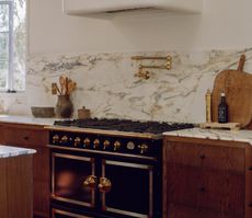
Costa Mesa interior designer Lindye Galloway favors wood or plaster in a minimalist scheme. ‘You can truly change the tone of the space by adding reeded wood, white oak panels, or raked plaster,’ she says. Meanwhile, Artem Kropovinsky, co-founder of New York design studio Arsight, recommends hand-trowelled finishes: ‘They whisper luxury without being overly verbose.’
Consider panelling, stone or tiling to add depth and character without overwhelming the space, adds Susie. ‘These textures provide a sense of balance, infusing warmth and interest into the minimalist environment, making it visually engaging and inviting, as well as helping acoustically.’
2. Go high-pile and layered underfoot

A well-chosen carpet or a few minimalist rugs will do a lot of the legwork when it comes to adding texture to a pared-back room. ‘Rugs and carpets play an important role in minimalist design by introducing texture and warmth,’ says Katie Lion, senior interior designer at London's Kitesgrove. ‘They provide a visual contrast against smooth surfaces and add depth to the space. Subtle colour variations and high-quality materials like wool or silk convey elegance while maintaining the minimalist aesthetic.’
Many of the designers we spoke to recommended tapping into the trend for high-pile textures here. ‘Rugs are a fantastic opportunity to play with texture,’ says Sabra Ballon of ballonSTUDIO. ‘Consider a plush, high-pile rug for a cozy corner or a low-pile, patterned rug to introduce visual interest. The key is to maintain simplicity – less is more.’
A layered look can work well for rugs if you opt for more muted designs. ‘Try a durable wool rug in a simple colorway placed over a sisal or jute rug,’ recommends Jenny Williamson, chief creative officer and principal designer at West Rose Design. She also advocates for a neutral, herringbone-patterned carpet – '[it will] add subtle textural interest to the floor without causing visual “noise”.’

Size: 9'10" x 12'
Material: Hand-carded, pot-dyed Afghan wool
3. Mix and match your furniture choices

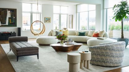
In a rented home, bringing texture in through your furniture choices is the most effective approach for a minimalist look. Do away with matchy-matchy pieces, though, and enjoy the wealth of material options available. ‘Wood adds warmth, travertine and marble introduce a touch of luxury, while steel provides a sleek, modern edge,’ says Sabra Ballon. ‘Balance is key; mix materials judiciously to create a harmonious composition.’
Textured furniture is perfect for bringing in a softer layer. ‘I love to incorporate sofas in heavy linens or accent chairs in a boucle fabric,’ says Lindye Galloway. Laetitia Laurent, founder and principal designer of Laure Nell Interiors in Boca Raton, Florida, turns to another fabric for a slightly more luxe look: ‘Boucle had a huge moment last year, and I think it's now the turn of velvet to shine,’ she says.
Meanwhile, metal accents introduce high shine, and can help to add warmth or coolness as you desire. Explore them along with other ‘hard’ materials as accents in your scheme. ‘I'd suggest exploring charred wood for its rich story or fluted glass, which offers a soft distortion,’ says Artem Kropovinsky. ‘For metals, instead of the usual chrome, use the timeless charm of brushed bronze.’
And finally, don’t skip on stone – including marble or our new favorite, limestone. ‘Travertine is an incredibly versatile and cost-effective material that can easily enhance the textural complexity of a space,’ says Los Angeles interior designer Tanya Stone. ‘It's easy to maintain and adds depth to a minimalist design effortlessly.’
4. Bring in textiles at every opportunity

While textiles in a minimalist scheme should be fairly muted, you should introduce them wherever possible: a simple Roman blind instead of a bare window, for example, or a couple of scatter cushions on a pristine white boucle sofa, will do wonders for the overall feel of the room. ‘Textiles should echo the theme of restraint,’ says Sabra Ballon. ‘Stick to neutral tones and simple patterns, and consider linen or cotton for a light, airy feel. Throws and cushions, when chosen thoughtfully, can be the perfect punctuation marks in a minimalist narrative.’
It’s these smaller touches that can boost the sensory appeal of a minimalist space, too. ‘Textiles in minimalism should evoke emotion through touch,’ explains Artem Kropovinsky. ‘Linens and raw silks, for instance, provide a juxtaposition of rugged elegance against the crispness of the minimalist space.’ Consider flowing linen curtains in a minimalist scheme as the finishing touch that adds another luxe layer to the space.

Price: $170
Material: 85% cotton, 15% polyester; filling: 100% feather
5. Add considered accents with accessories

The final layer of a minimalist scheme is the accessories and objets you add as finishing touches. As well as drawing attention to negative space – another key element of interior design, and particularly minimalist interior design – a vase, candleholder or mirror can introduce textures you might not have brought in elsewhere, for example gloss or metallics.
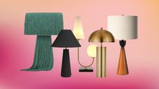
Lighting, too, is often overlooked. ‘Pendant lights with textured shades or fixtures crafted from interesting materials can be sculptural additions,’ says Sabra Ballon. ‘Additionally, don't forget about greenery. The texture of plants introduces a refreshing organic element, enhancing the overall design.’
These might also be where you add those small accent colors – black, for example, never goes amiss in even a minimalist scheme. ‘Monochromatic color schemes need texture to help delineate each piece of furniture or architectural detail,’ says Simon Temprell, interior design lead at Neptune. ‘It is important to incorporate a little bit of contrast to break the monotony, such as black iron side tables, black-framed artwork, or bronze light fixtures.’

Price: $398
Dimensions: 62"H, 30.25" diameter
Be The First To Know
The Livingetc newsletter is your shortcut to the now and the next in home design. Subscribe today to receive a stunning free 200-page book of the best homes from around the world.

Ellen is deputy editor of Livingetc magazine. She cut her teeth working for sister publication Real Homes, starting as features editor before becoming deputy editor. There, she enjoyed taking a peek inside beautiful homes and discovered a love for design and architecture that eventually led her here. She has also written for other titles including Homes & Gardens and Gardeningetc. While she gets ready to buy a house of her own, she takes inspiration from the works of some of her favourite architects and tastemakers. She has a particular passion for green design and enjoys shopping small, local and second-hand where she can.
-
 The 12 Best Wayfair Table Lamps Are All Under $200 — And Our Style Editor Wants The Lot
These 12 best Wayfair table lamps are the perfect excuse to get a head start on your President's Day sale shopping. With discounts up to 78% off
By Julia Demer Published
-
 Kitchen Utensils Worth Keeping vs the Ones Just Taking up Space — 'It's the Secret to Decluttering Drawers'
Declutter and organize your kitchen cabinets and drawers with these expert-approved tips
By Ottilie Blackhall Published

