Negative Space in Interior Design — Mastering this Interior Design Tick is the Secret to Better, Uncluttered Rooms
Sometimes you need to leave space free from decor to give your scheme breathing room. But how do you get the balance right to make it look purposeful?


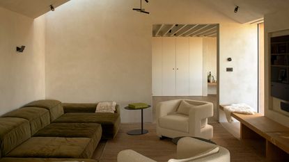
When designing a home, most people focus on how they can fill the space; a logical response, particularly when dealing with the empty carcass of a house you’ve just moved into or had refurbished. Once the furniture and carpentry are in, you start to focus on the gaping holes of blank space on your walls and ponder how you can fill them. However, filling every nook and cranny with a design element is one of the most common design mistakes. We often think we need a magnificent work of art or an oversized mirror to create impact, but blank space is just as -if not more- impactful.
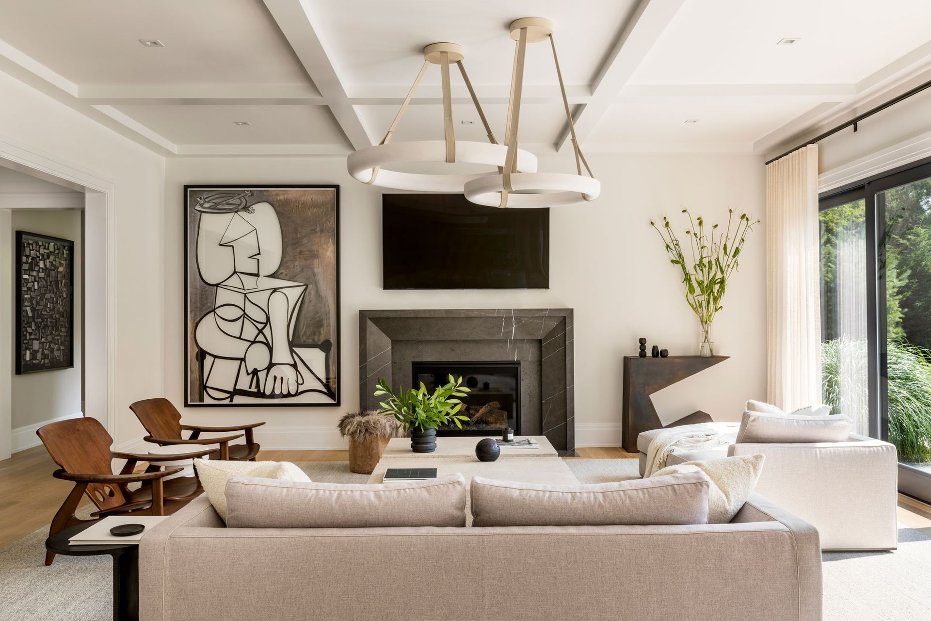
Balance is the key to any successful composition, whether in art, photography, stage design, architecture, or - in our case - interior design. It’s about the dialogue between the positive space (that which is occupied by furniture and decor) and the negative space (the unoccupied walls and floors) that subtly dictate how we navigate and feel in a space. Too much of one or the other will overwhelm the eye or fail to stimulate it entirely.
It’s just as important to plan the negative space as much as the active. So, how do we strike a balance between what is and what isn’t? What is negative space, and how can we wield it successfully to make it feel intentional? And how do we decipher which walls to leave blank and which would be enhanced by a work of art? We turned to the experts for answers.
What is negative space?
‘Negative space is the empty space around a subject,’ says Peter Spalding, interior designer and chief creative officer of Daniel House Club. ‘In the case of a room, it’s the empty wall space around a piece of art, sculpture, or furniture.’
To further understand the concept, think of negative space as a new paragraph in a piece of text. Every new paragraph breaks up the narrative into digestible chunks, allowing the reader to rest their eyes, digest the content, and take a quick breather. Imagine reading a whole book or article with just one extremely long paragraph; it would be exhausting, intimidating, and overwhelming. The same applies to interior design; our eyes need negative space to be able to rest and refocus. When implemented successfully, negative space can make other design elements pop or create a sense of visual harmony.

How do you make negative space feel deliberate?
There’s a big difference between negative space that looks intentional and empty space that feels as if it has been forgotten or neglected. The key word here is intention. The way you make negative space look deliberate is by making it deliberate. In other words, you shouldn’t leave your walls blank unless you have a reason to do so, as your intention will show.
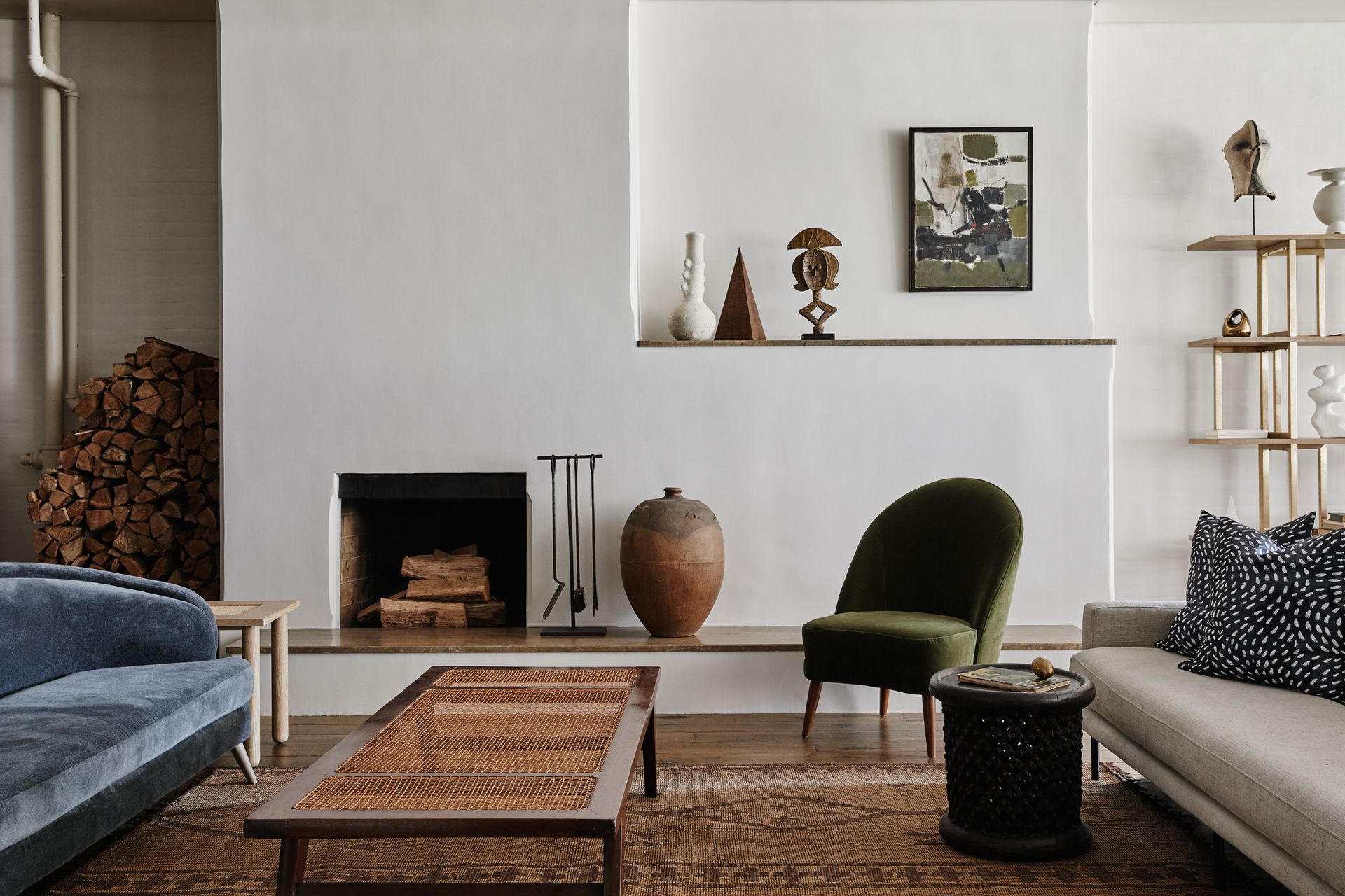
One way Peter makes negative space feel intentional is by isolating a small painting on a wall, drawing the viewer towards it for closer inspection. ‘There’s a great sense of dynamism here,’ explains Peter. ‘Often, the art is called upon to make a huge initial impact, but in this case, the emptiness of the space around the artwork causes you to wonder what little work was lucky enough to deserve all this empty space. The effect is lost completely, though, if the piece turns out to be nothing special,’ he adds.

David Knowles, creative director of art consultancy firm Artelier, agrees. ‘When selecting artwork, it's important to consider how it will be viewed. For instance, if it will be displayed above a living room sofa, it needs to have a significant impact from a distance,’ he says. A piece displayed in a transitional space, such as a corridor or entranceway, should be visually appealing both from a distance and up close. ‘The element of performative art can be achieved by having the viewer initially drawn to the piece from a distance, only to find resolution upon closer examination,’ adds David.
To help you identify which walls should be left blank and which would be enhanced by a work of art, think about what the artwork will anchor. ‘Art floating on its own is usually less successful than art that’s engaged,’ in which case the wall may be better left alone. ‘Can the art connect your eye visually from the top of your sofa to the bottom of your crown molding? If so, you’ve just inflated the impact of that seating group,’ says Peter. ‘Ask yourself: “What lines in my room need connecting in order for the space to make an impact?” Squinting can help you distill and simplify shapes in a room; you want to see big, strong, unified silhouettes when you squint.’
What other rules for hanging art do I need to consider?
The ideal location for a work of art depends on the utilization of the space and lighting conditions. Spaces that receive intense sunlight are unsuitable for most works of art. ‘Unless the artwork is durable and rustic, it is not advisable to display it in such spaces,’ says David. ‘In this case, one should respond creatively to the space by considering a variety of mediums and shapes, including suspensions, wall installations, and sculptures, rather than just framed pieces.’
‘The principle of “less is more” should be applied when displaying artwork,’ continues David. Rather than covering all four walls, he recommends using only one or two walls and focusing on selecting high-quality pieces. ‘Since artwork can be an expensive investment, it should not be used as a filler but should be strategically placed to maximize its impact,’ he says. When identifying a place for artwork, the negative space around it should be given as much attention as the piece itself. ‘The artwork should be visible from different angles, both in passing and when sitting down,’ says David. ‘If there is enough space, multiple artworks can be displayed to create a relationship between the pieces and tell a story. Though, breathing space should be allowed between the pieces to avoid a cluttered look.’
David also suggests paying attention to how high to hang artwork above furniture. ‘This should be determined by both the dynamic of the space and the artwork itself,’ he says. ‘For simple, sculptural, or conceptual shapes, it may be effective to hang them higher or from a distance. However, intricately detailed and delicate artwork that warrants closer examination should be hung at an average head height for optimal viewing.’
Be The First To Know
The Livingetc newsletter is your shortcut to the now and the next in home design. Subscribe today to receive a stunning free 200-page book of the best homes from around the world.

Sophie is a home interiors writer and all-around design aficionado. With a degree in History of Art and Spanish, she has a keen interest in the influence of art, history, and culture in design. Having lived in Buenos Aires for five years, Sophie is an experienced communicator in both English and Spanish with a professional background in public relations and marketing. Sophie is also an interior design student at KLC, paving the way to tell stories through interiors that inspire, serve and create experiences worth remembering. Sophie currently writes for Livingetc, Better Homes & Gardens, and Foter Magazine.
-
 How to Make a White Bathroom Feel Warm — 5 Tricks Designers Use For a Cozier and More Restful Spaces
Give your all-white bathroom a glow-up with these tips for bringing warmth to the space
By Oonagh Turner Published
-
 5 Habits to Adopt That Will Make Your Home Smell Good All the Time — 'Add Them to Your Routine Today!'
Incorporating these tricks into your maintenance routine will keep every corner of your home smelling fresh and welcoming
By Katie Baxter Published

