10 incredible split-level kitchen islands that prove this design trend the best way to have it all
Who needs a dining table when a split level kitchen island can do it all? We've hand-picked ten ingenious projects from top designers, all with their own take on the trend
There are some interior decisions that inspire fierce debate and others that are something of a universal aspiration. We say a kitchen island is the latter – anyone who can fit one in almost definitely has done.
And yet not all modern kitchen islands are created equal. We've spotted an interior design trend among top architects and designers for a split level approach, where varying heights (and often materials) are favored over one monolithic unit. These tend to fall into one of two camps – there is the two tier countertop, which can be a rather smart way to conceal your cooking prep from the rest of the room, or the eat-at-the-bar style peninsula, where a dining surface is designed as an extension of the island itself.
As these beautifully-executed projects prove, both approaches can maximise space, functionality and visual interest without feeling remotely clunky. When there's an interior designer, there's a way.
10 perfect split-level kitchen island ideas
1. Create a broken plan feel

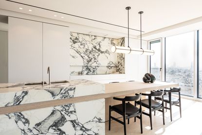
There's a seamless transition between the two tiers of this kitchen island by Mark Williams Design, much like the way a countertop might be smoothly extended up the wall to create a backsplash.
'When we tore down the wall between a narrow galley kitchen and the dining room in this high-rise Atlanta flat, we wanted to suggest division between the kitchen and dining functions without a physical barrier,' he explains. 'By dividing the island into two heights, one for cooking and one for dining, one understands the suggestion that parts of the space are for gathering, while other areas are for working.'
In that sense, the split level island acts as a stand-in for the wall, while offering a far gentler boundary. 'By making the whole space as beautiful as the adjacent living spaces, the kitchen doesn’t feel out of place in this open plan home,' he adds.
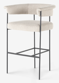
Kyleigh bar stool, Lulu and Georgia
This could actually be the perfect bar stool - rounded, padded, comfortable. Perfect for a minimalist kitchen which you still want to feel welcoming.
2. Contrast materials
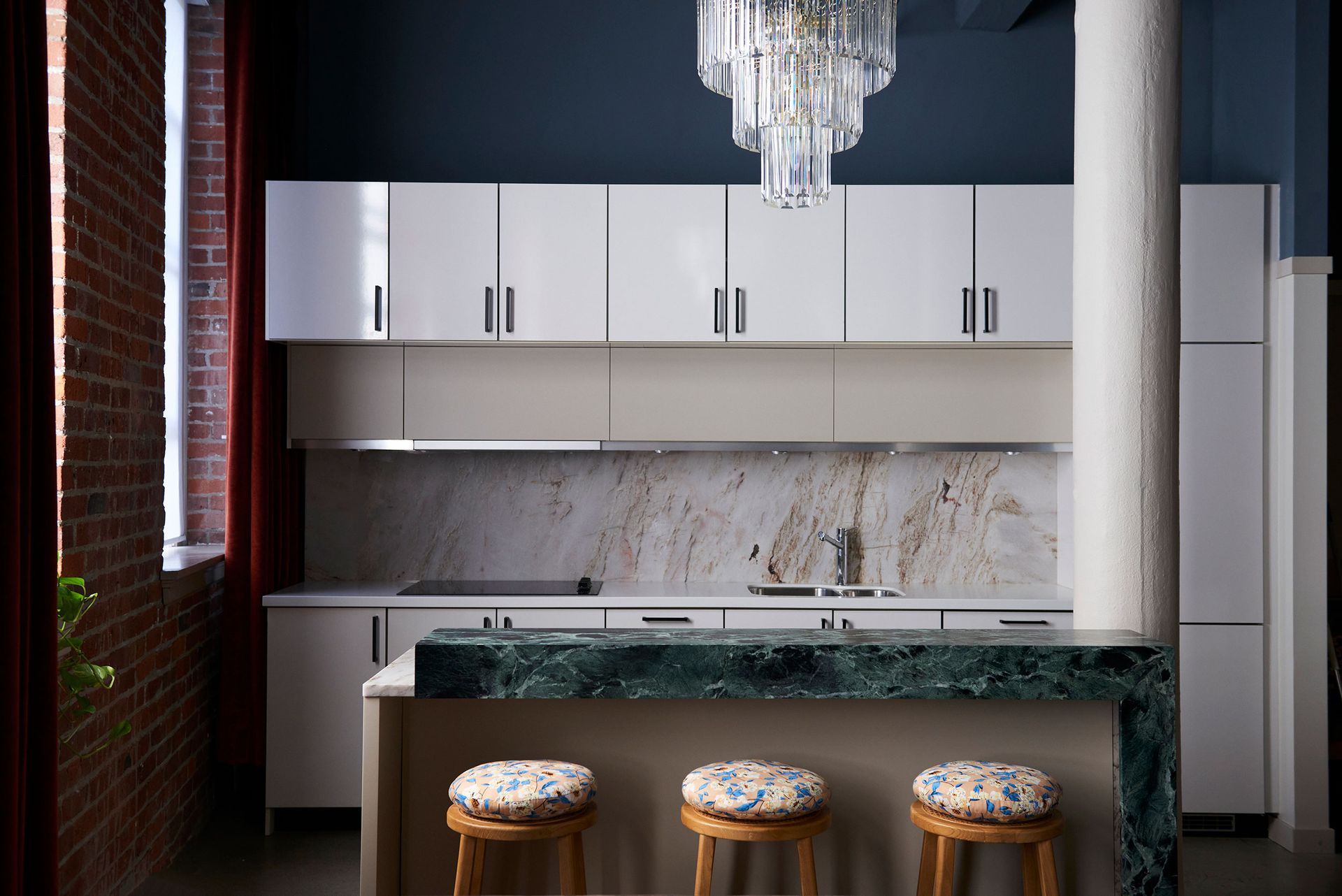
Why not mirror a shift in height with a change of material? 'We love the visual impact and playful you get from mixing the two stones here,' says Studio Roslyn co-founder Jessica MacDonald of the kitchen in this loft project.
As a hard-working (and high traffic) element of the space, the island had to tick the practical boxes, too. 'From a functional perspective, this works great for our client who loves hosting. The lower portion of the counter serves as a work slash prep area, while the upper section of the counter serves as the serving or presentational area of the counter.'
There's no hard and fast about which tier of a split level island should be higher – and you'll spot a real mix among these projects – but this approach works well to hide the prep area from an open plan home. Naturally, that gorgeous green stone (seen a lot in current countertop trends) is given the high ground here.
3. Stick to a simple palette
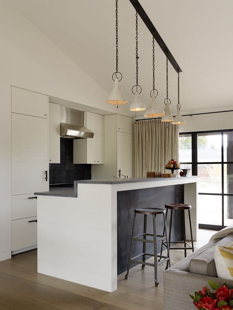
Don't underestimate the way a kitchen island can draw people in – whether you want a witness to your cooking or not. 'In the kitchen, the island is designed as a place where people can gather,' says San Francisco designer Jay Jeffers.
In this Napa Valley home, he plumped for what he calls a 'bumped-up counter' that could facilitate plenty of socialising but screen the action from the rest of the living space.
As a split will layer in another level of detail in a busy space, a simple palette can provide a kind of visual balm. Jeffers has opted for a pared-back blend of wood kitchen cabinets and counters made from concrete, which is then smartly repeated for the base of the island. There are no monolithic slabs of marble here, so it's a great reference for those after a more understated take on the look.
4. Don't discount a big drop
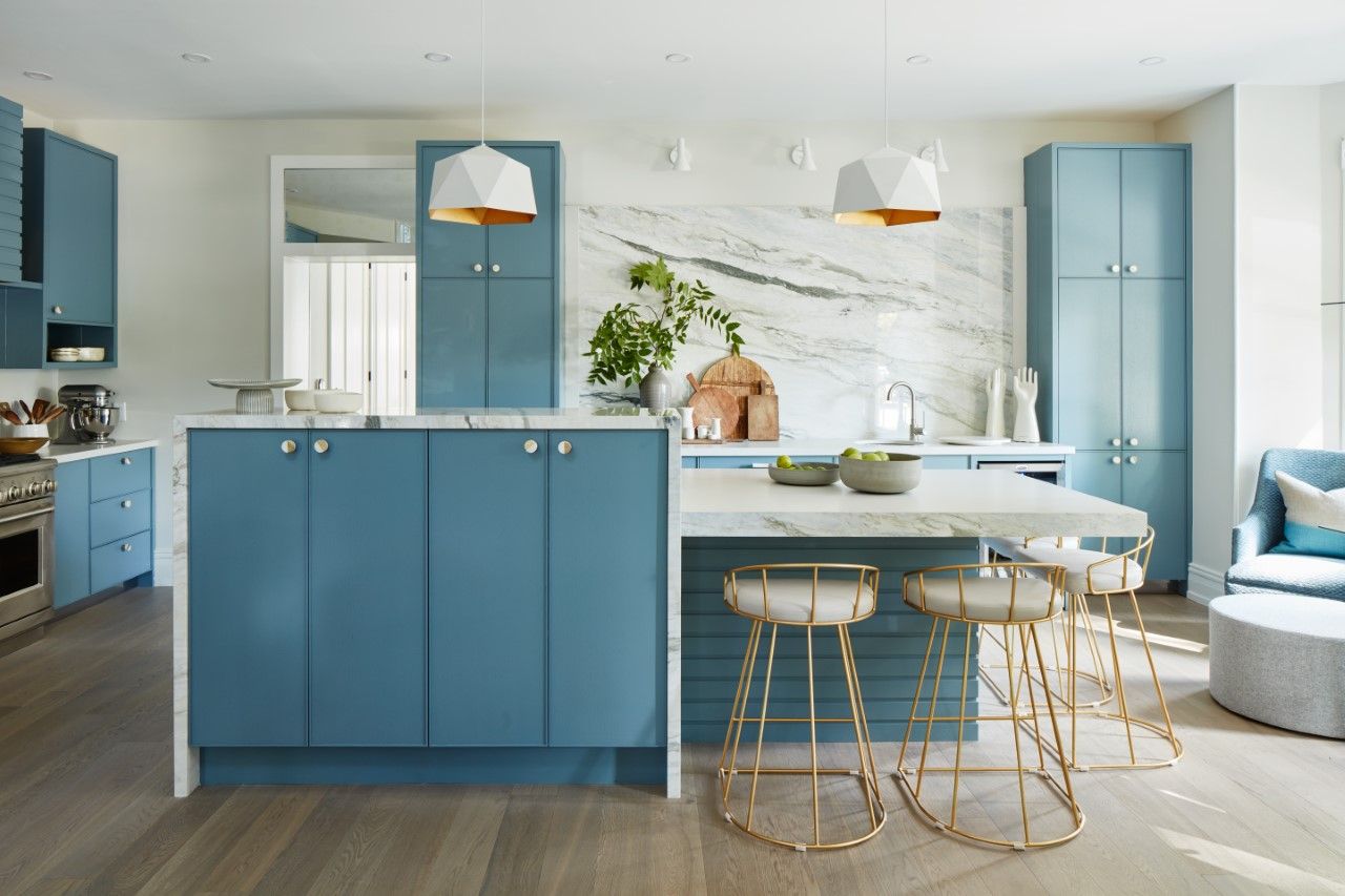
Perhaps there's a point where a split level design simply becomes a connected kitchen island and dining table. If it weren't for the consistency of materials, this zingy blue design by Sarah Richardson Design might be headed in that direction. Instead, the mitred-on marble, which is wrapped around the counter in a waterfall style, gives it all a real sense of cohesion.
The reality is that the height at which most of us will want to cook and prep is considerably different to the ideal height dining, so Richardson's clever approach saves her clients from perching precariously on lofty bar stools (and you'll find far more seating options with these dimensions).
The way the taller element of the two tier island maximises storage space is also not to be sniffed at – we say you can never have too much.
5. Make space for a multi-side style
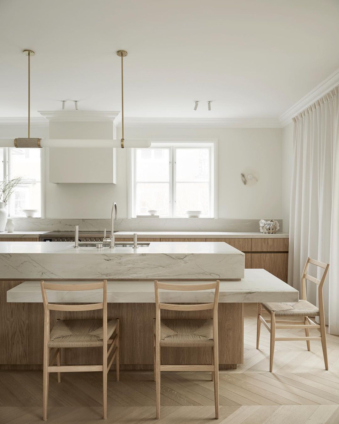
How's this for a high impact take on the trend? By appearing to sandwich a layer of white quartzite into the island's oak base, AOJN Interiors have magicked a generous dining zone from nowhere. 'By creating these different volumes, the kitchen island itself becomes a multi-functional space that also allows for social interaction, which suits this family of four perfectly,' says co-founders Alexandra Ogonowski and Jesper Nyborg.
Though you'll need the square footage around an island to opt for a similar wraparound design, it's hard to beat for both beauty and utility. 'We wanted to create a dynamic kitchen island that almost appears as a stacking of sculptural stone elements, and where each side of the island is viewed differently. Compared to a traditional kitchen, it could be perceived more as a functional sculpture and less as an island.'
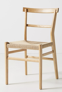
Oak farmhouse dining chair, Anthropologie
With its mid-century-style legs and modern farmhouse kitchen oak finish this chair blends the two looks well, adding a softness to the modernity of a marble counter.
6. Avoid harsh task lighting
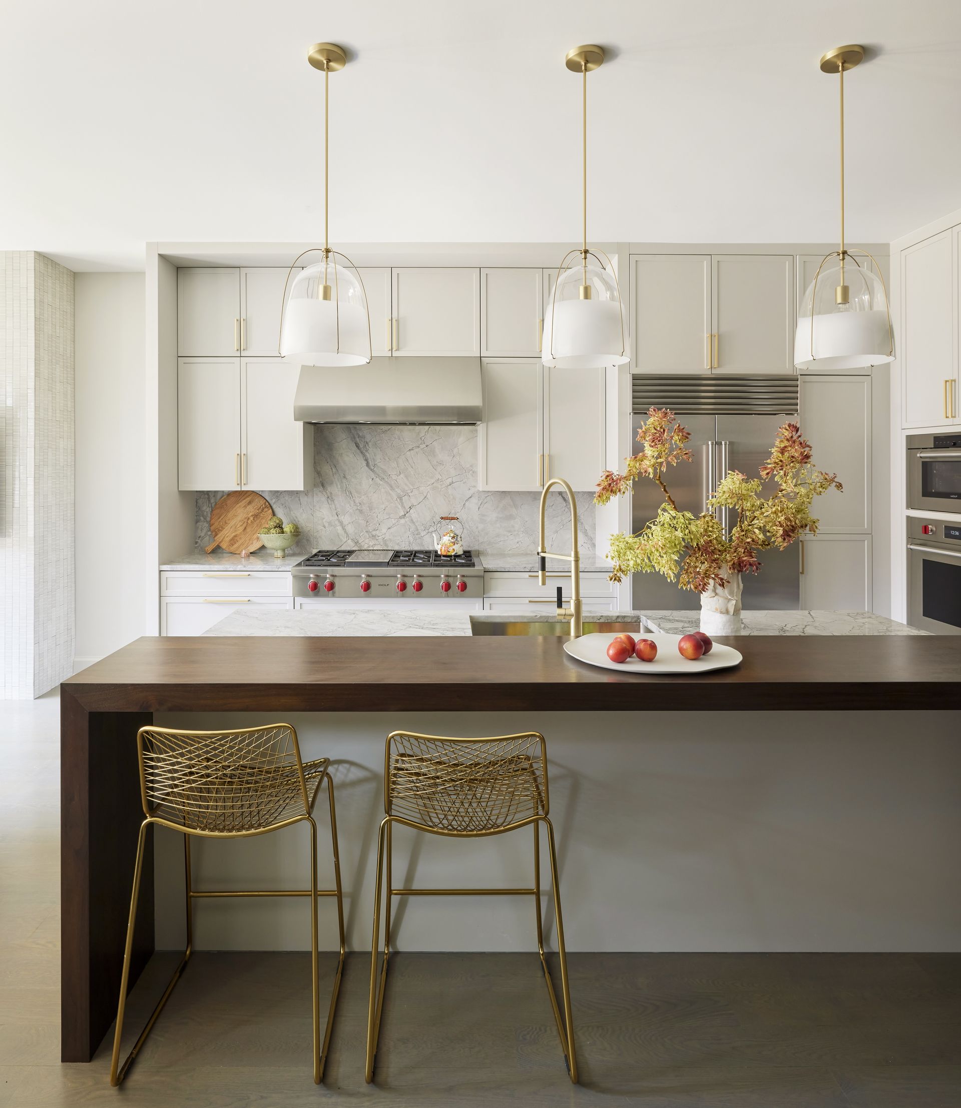
If not for the way this walnut dining bar interacts with the wider kitchen island (and that extra elevation) this Chicago project by Studio Gild traditional dining table set up. That's partially thanks to a trio of pendants, bought from Rejuvenation, which mirror the way softer lighting might hang over a long table.
Whereas an island purely for prep might be arranged strategically under a spotlight – in the same way you would direct lights concealed in kitchen cabinets onto the counter surface below – it's worth considering the eating experience when illuminating a split level island. Decorative kitchen lighting also helps blur the boundary between kitchen and dining, much in the same way as the split level island itself.
7. Be exacting about dimensions
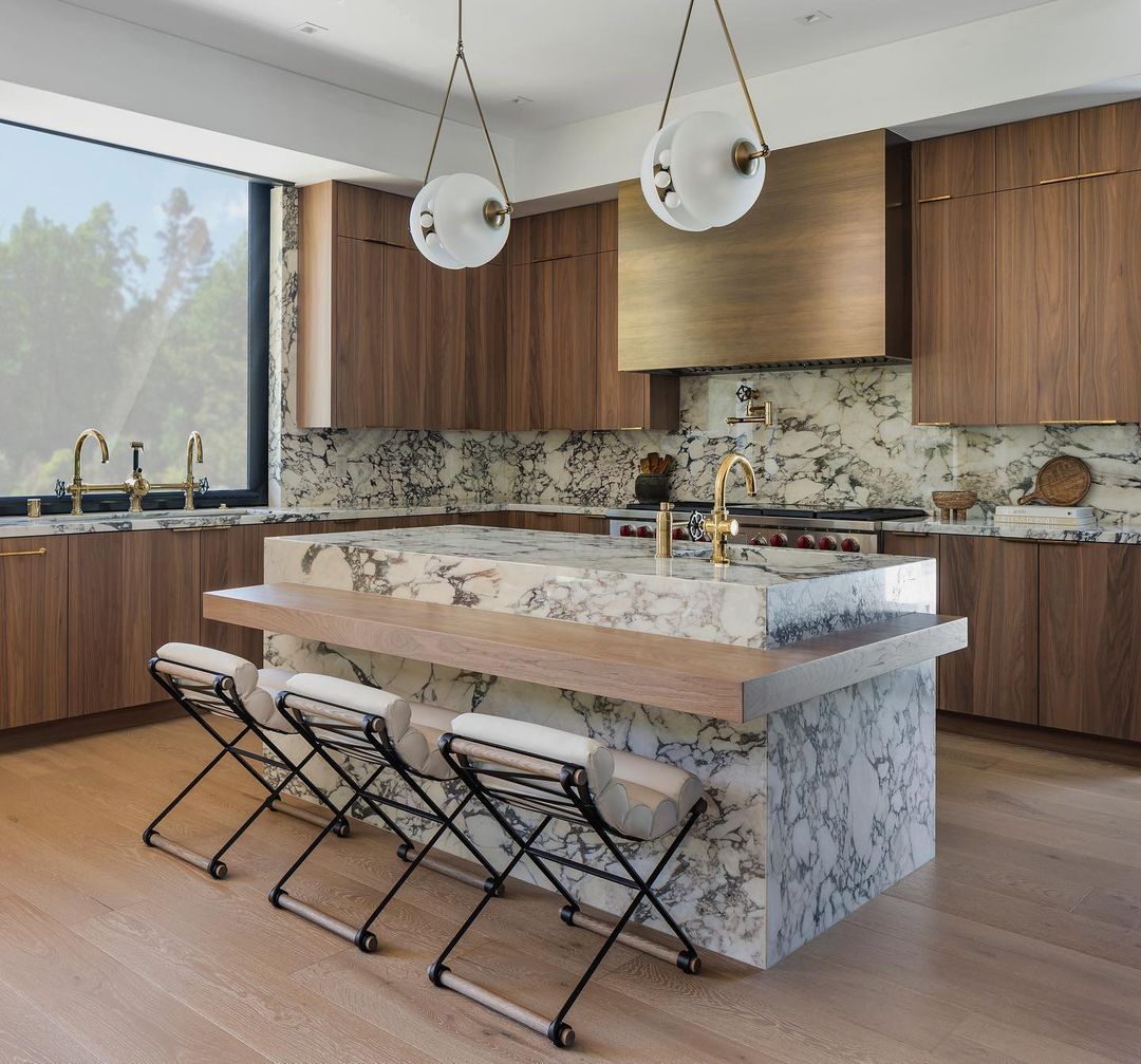
As a split level island is already doing a dual job, it seems fitting that this veined marble waterfall countertop style by Ryan Saghian was designed with compromise in mind. 'The client wanted her kids to sit at dining table height and not at counter height. I had to come up with a way to give her island seating, but not have them sit so high,' explains the Los Angeles-based designer.
'We thought this was a creative way to give her kids the height that they wanted, but still be part of the island unit.'
It's important to remember that you might have all manner of guests keen to take a pew in the kitchen, so Saghian's approach is a smart and inclusive one. It reiterates the idea that every inch matters here – make sure that the prep area of the island is at a comfortable height (often the same as your other counters) and that the dining experience feels natural.
8. Work with your layout

With a pantry at one end and a lower dining area at the other, this design by Kirsten Johnstone Architecture is about as far from a basic prep bench as it gets. It's also a lesson in designing around the dimensions and needs of an existing space – a standalone dining table at the end of the island would interrupt the natural flow of this room, with its multiple entry and exit points.
Note the unusual way the main island and bench intercept here, creating a cabinet at the centre of the set up – an inventive idea that requires exacting execution. A neutral palette and simple bar lighting overhead tempers the joinery detail.
9. Maximise horizontal space
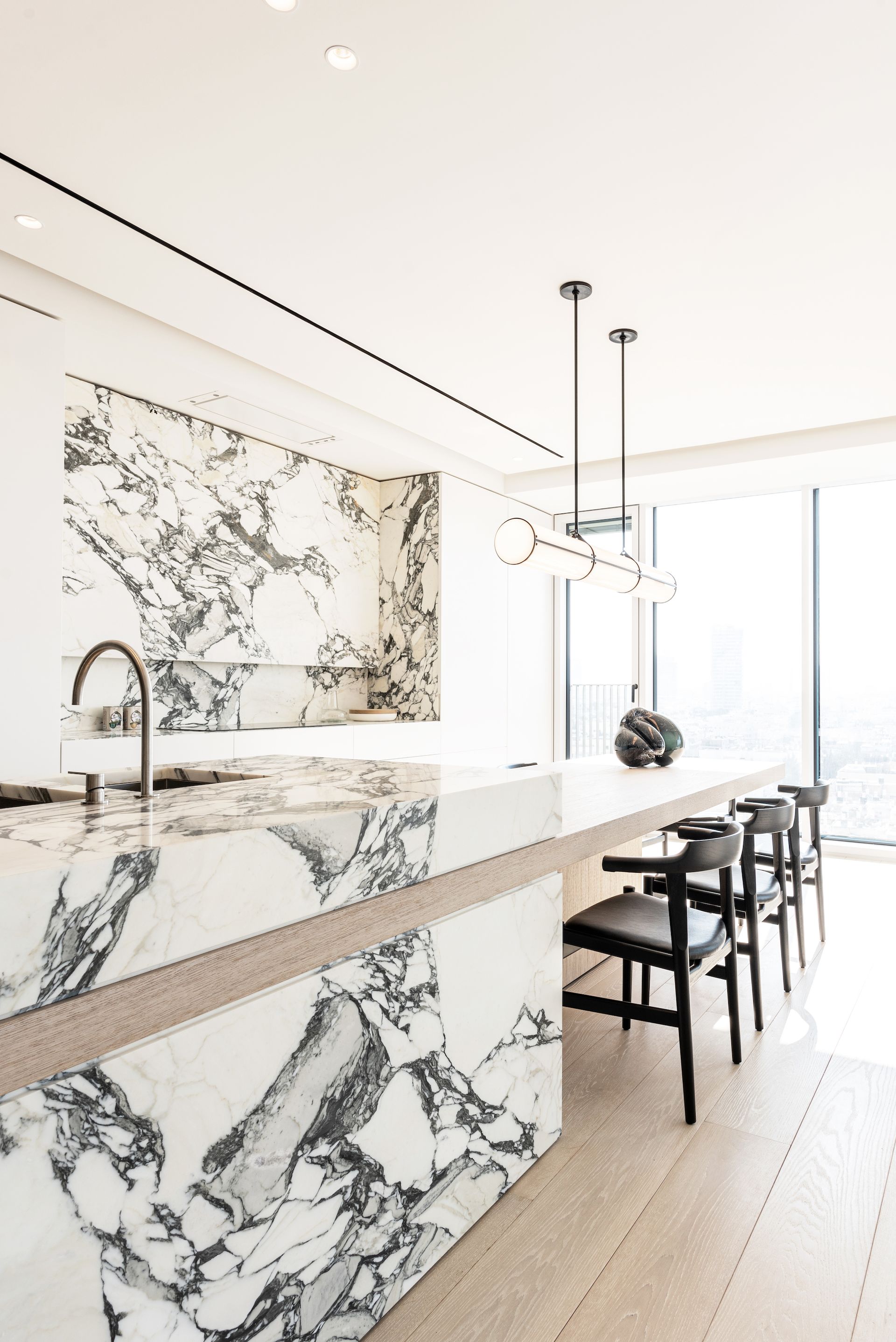
Antwerp and New York-based architect Dieter Vander Velpen maximised the width of this airy apartment by extending a plank of white oak through this sensational Arabesco marble island. 'We wanted to maintain an open floor plan for the main living spaces and combine many different functions, which is why we combined the kitchen island and dining table.'
'The goal was for this island to be the jewel piece of the open living space, where our signature of combining natural materials in an elegant way would take center stage. The veins in the stone continue across the different drawer fronts and onto the countertop of the island.'
This is no simple show piece, however. 'In the marble kitchen island there is countertop space and a sink, as well as a built-in dishwasher behind a marble front.'
10. Go low for a loungey vibe
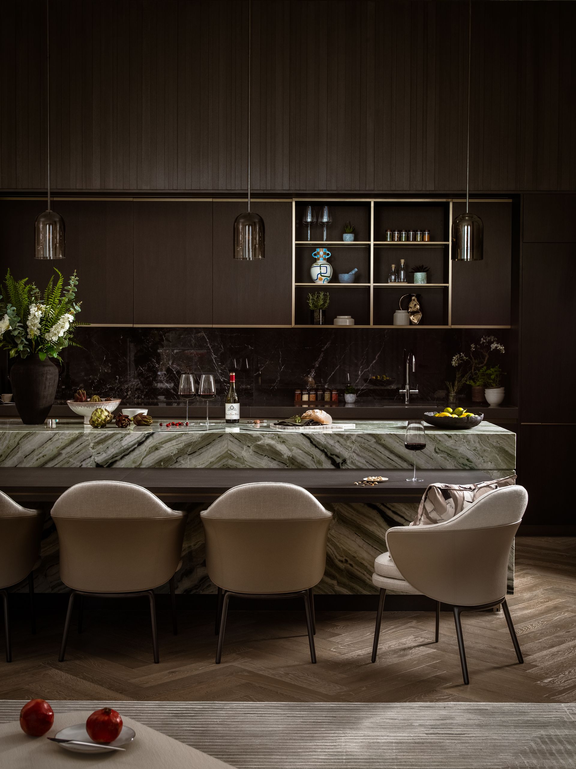
Anyone who has eaten at the bar of a buzzy restaurant knows you don't actually need all that much space for a dinner plate and a glass of wine – so you might be surprised by where you can squeeze in a second tier. With its bar-style dining ledge that stretches almost the length of the veined marble island, this slimline, cantilevered take on the trend by Elicyon feels particularly grown-up.
It's also gratifyingly low, which has allowed for a row of lounge chairs where most islands would require something with a little less back support. This is a sophisticated space with plenty of luxe materials (not to mention all the obligatory hard surfaces that come with a kitchen) so swapping out the bar stools for something a little softer has made all the difference – it's given this interior a clubby, louche feel.
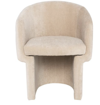
Claire bistro chair, Kathy Kuo Home
This smart cream chair works in a lounge setting, its curves inviting you to settle in.
Be The First To Know
The Livingetc newsletter is your shortcut to the now and the next in home design. Subscribe today to receive a stunning free 200-page book of the best homes from around the world.
Cat Olley is a British design and lifestyle journalist, editor and copywriter. Formerly on the features team at ELLE Decoration, she has written for The Guardian, The Modern House, Evening Standard Homes & Property, Inigo and John Lewis at Home. She specializes in the latest trends and ideas happening in the design world, and is our go-to for aesthetically-led pieces.
-
 The 12 Best Table Lamps for Reading —I'm a Certified Bookworm (and Shopping Expert)
When it comes to table lamps for reading, I don't mess around. If you're the same, this edit is for YOU (and your books, or course — and good recommendations?)
By Brigid Kennedy Published
-
 "It's Scandi Meets Californian-Cool" — The New Anthro Collab With Katie Hodges Hits Just the Right Style Note
The LA-based interior designer merges coastal cool with Scandinavian simplicity for a delightfully lived-in collection of elevated home furnishings
By Julia Demer Published

