5 paint colors that will make you calmer - designers agree on these soothing shades
Who doesn't want their home to feel calmer? And color is the easiest way to change the feel of your home, here are the shades to pick for more relaxing vibes
Without stating the obvious, the spaces we surround ourselves with have a big impact on how we feel. And while we are often filled with joy by a couch we carefully chose or a new rug that's completed the room, it's the color scheme that can have the biggest impact on our moods.
So having a bit of an understanding of how different colors affect your mental state means you can decorate your home in ways that will not only dictate how they look but how they feel. When we think about the feeling we want our rooms to induce, vibes that come to mind are inviting, serene, calming. We want to feel our shoulders drop when we walk into our relaxing spaces like bedrooms and living rooms.
We asked designers and color experts what paint ideas and color schemes are most likely to give us those zen-like feelings and how we can bring things hues into our rooms. No surprise here, a lot of these shades are soft, gentle, inspired by nature, and can be really easy colors to bring into your scheme.
1. Sage Green
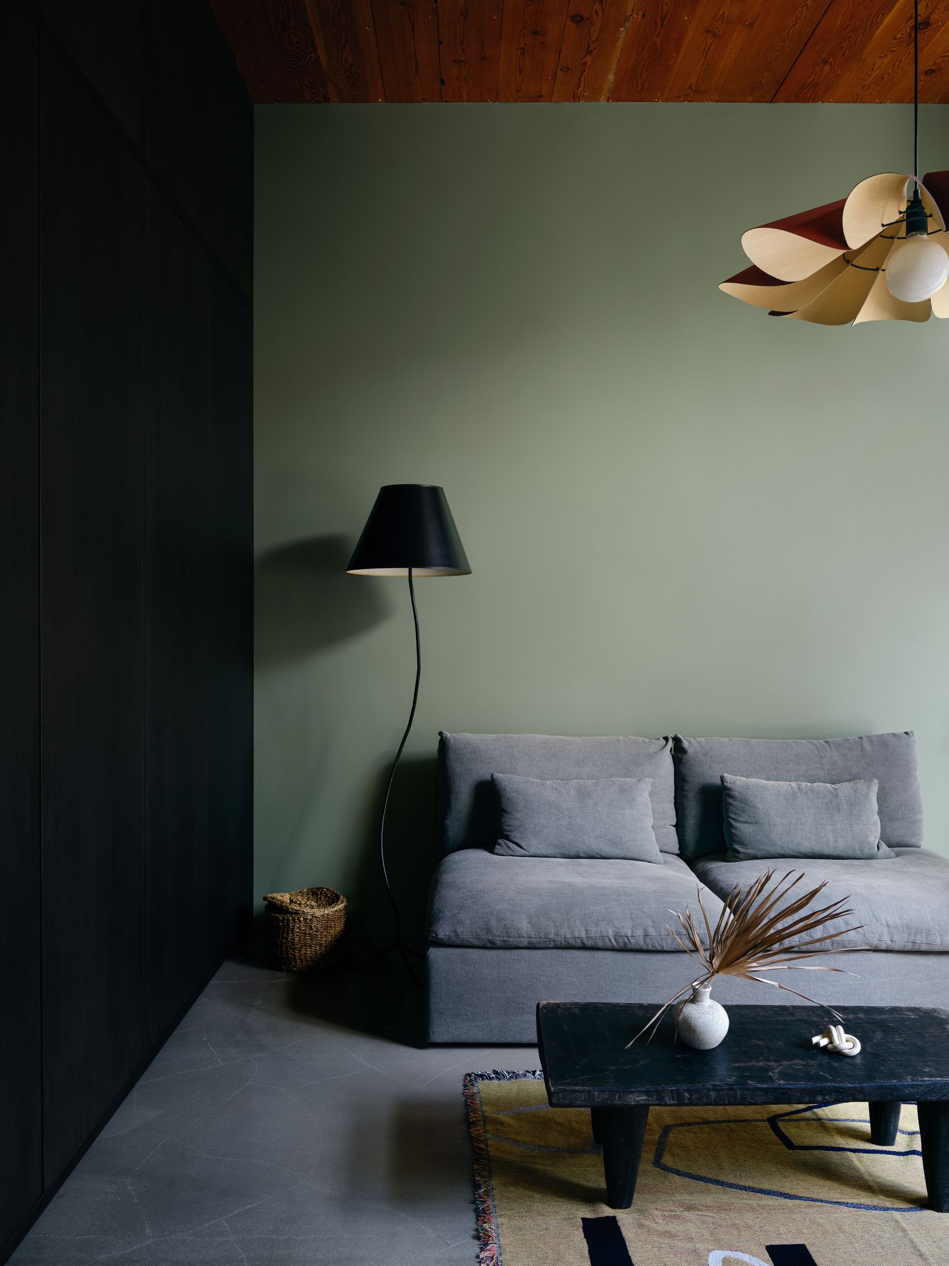
Green is known the world over for its relaxing, zen-like qualities. Why do you think you feel so relaxed in nature? The calming effects of the outdoors, and being surrounded by such a calming color. Luckily, it's also a really easy shade to bring into your home because there are so many variations to suit any style. And so many colors that go with green.
'I believe the best way to create a calming space is by using colors inspired by nature. Research shows that looking at nature scenes reduces stress and boosts positive feelings,' explains designer Jennifer Davis. 'Soft greens, gentle blues, and earthy neutrals, like those found in the outdoors, have a calming effect on our minds. They remind us of peaceful forests, calm waters, and clear skies, making them the perfect color palette for a calm and relaxed environment.'
And it's those soft, sagier greens that are big in color trends, as well as being incredibly calming, so it's this take on green we would recommend bringing into your home right now. 'Green is the ‘ultimate’ color group that color psychologists always suggest imbue calm but at which end of the color family? I would recommend look to soft, mid-greens and something a little more nuanced, almost drab, will feel incredibly restful,' suggests Charlotte Cosby, Creative Director at Farrow & Ball.
These more mute greens can be a bit 'drab' actually, they can be a bit almost too gentle. Which is why you want to pair sage green with some tonal layers and textures, maybe a few darker shades, too to create just a small amount of contrast. As Kathy Kuo suggests, 'I always love a mix of sage green and warm neutrals when it comes to creating a calming space. I find that color combinations that are inspired by the beauty of the natural world really add serenity and peace to just about any interior design motif.'
2. Earthy tones

Calming colors seem to fall into two camps. You've got the very light, pastel, nature-inspired hues that pretty much everyone is going to find calming, but at the other end of the color spectrum, there are also darker, moodier hues that can feel equally calming.
'It's vital to remember that personal preference plays a significant role, and the most calming environment is one that makes you feel most at ease. For example, I find calm in environments with rich tones and colorful layers, while other prefer whites and neutrals,' explains designer Kati Curtis. So how colors make you feel is very personal, all our color associations will be different, hence why these cocooning earthy shades can be very calming for the right home.
Brittany Wurzak Hakimfar, lead designer at Far Studios, says that 'Earthy color tones will always make a home feel more calming - browns and creams and all the in-between colors do a great job at achieving a calm environment.' There is something very comforting about these warm darker shades, the way they create these cocoon-like spaces. These colors work best if you really commit to them. See how in this dining room, the soft brown shade is taken over the ceiling too and the whole scheme draws on those dark, warm, natural hues.
3. Soft pinks
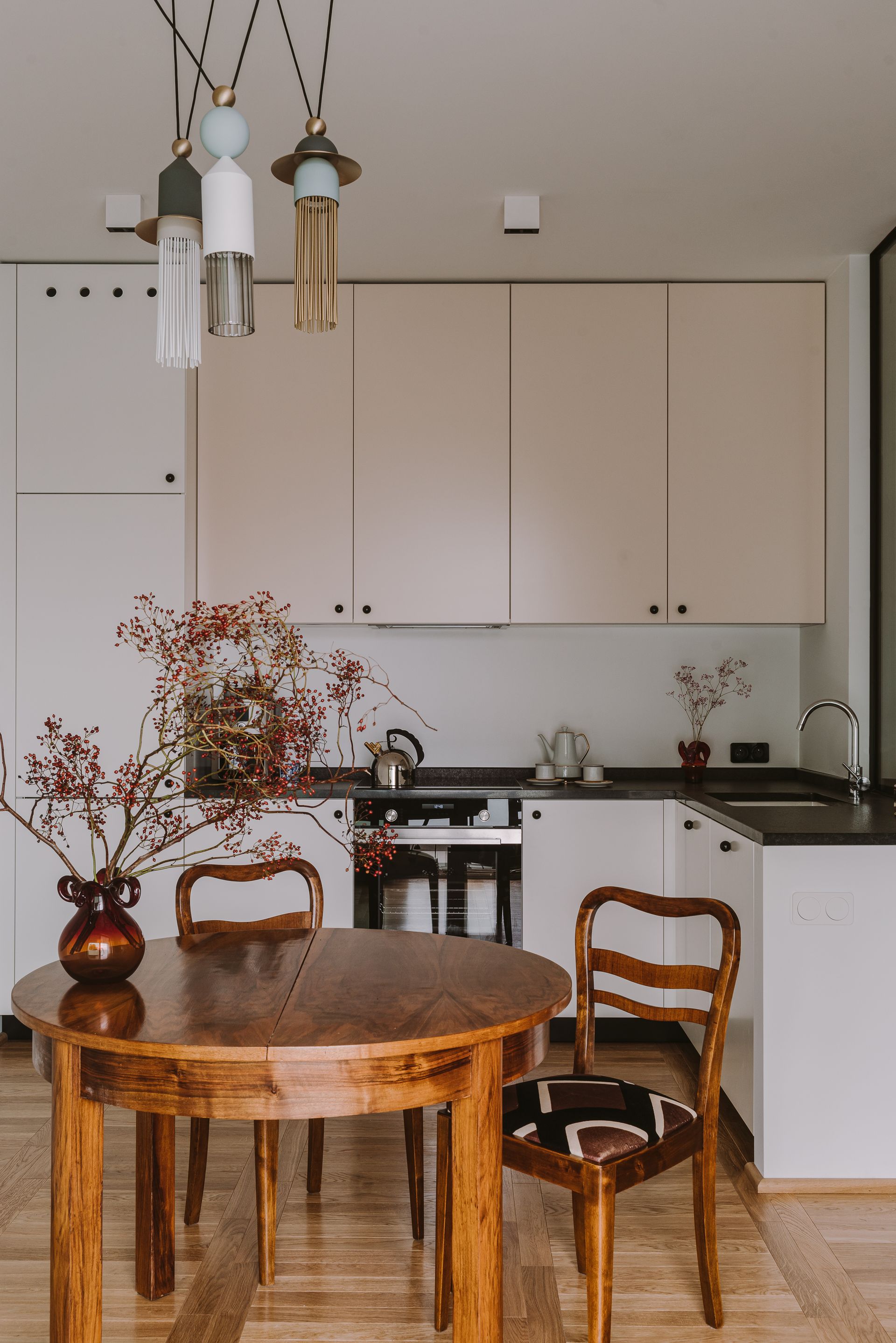
'Pinks rule for calm,' says Caroline. 'Not the current zeitgeist of Barbie pink but much more delicate, ethereal notes of earthy pinks. These colours have been doing the rounds for a few years now and for good reason. Consider them as a neutral and they will layer with almost any color they will work in any room in your home, from the most flattering bathroom color to an elegant living room to a warm-blushed hallway – these colors will always make a room feel calmer.'
Designer Sara Story agrees that pink is the perfect shade to create a calming atmosphere, 'Farrow and Ball's Calamine is the perfect shade of pink for me. It is incredibly calming yet, for a pink, really chic. You can pair it with graphite greys for a little edge or oatmeal-like neutrals for a very flattering and peaceful interior.'
Bringing in some pink, whether it's on your walls or your cabinets, is an easy way to make your kitchen feel more relaxing. And this pink kitchen designed by Colombe , makes the case that pink needn't be saccharine or overly girlish, in this space it feels chic and modern, almost like a neutral with a bit more excitement.
4. Warm neutrals

Decorating with neutrals can create incredibly calming spaces. As designer Artem Kropovinsky says, 'The shades are the perfect backdrop for relaxation. Their neutrality offers a break from visual noise.' However, they can also fall flat, and appear quite stark and uninviting. So the key is to keep to the lighter, warmer side of neutrals and layer them together for rooms that are relaxing but still have some depth and interest.
This neutral living room is the perfect example. The warm white walls are always going to give a relaxed, laid-back feeling to a room, but they are then warmed up slightly with layers of soft beiges, sandy hues, and natural textures.
When creating an analogous scheme (a palette of colors made up of shades that are close together on the color wheel) like this one, you do want to be wary of undertones. Just make sure you keep it warm, pick neutrals that have a pink or yellow tone to them. If you throw in a steely grey, for example, it will feel off and contrast with all those soft shades going on. Order swatches – always – see how the colors look together in your space too and neutrals can totally change under different lights.
5. Light blues

Blues, much like greens, are always going to make a home feel calm. Again, it's a shade you find a lot in nature and is a very restful and restorative shade. Color psychology expert, Michelle Lewis explains that 'Blue is proven to reduce heart rate, blood pressure and even pupil dilation. It causes more introspection, deep thinking, and a very strong feeling of calm. Some people are known to even fall asleep faster in a blue environment, so is the color to bring into your home to make it more relaxing.'
Blues, much like greens, are always going to make a home feel calm. Again, it's a shade you find a lot in nature and is a very restful and restorative shade.'Blue is typically a safe color, as there’s rarely anybody that hates the color,' explains Joshua Smith. 'Same with white and other neutrals. I often suggest that we look to Mother Nature for palette inspiration. Many people often feel most peaceful in moments like the top of a hike, lounging on the beach, or watching a magnificent sunset.'
'These types of moments clue designers into the color palettes that speak to you and will be beneficial to include in your home in order to evoke those feel-good hormones. Even a personality trait like your favorite season can hint at your preference of a warm or cool palette,' he adds.
But you want to avoid going overboard with any colors that have a high saturation, as these are going to have the opposite effect and can make you feel stressed. So when choosing blues, go soft and light.
Pastel blue may sound a bit too sweet, but it can work if you ground it with some darker hues. Dark woods can work beautifully with light blue or lean into the playfulness of this shade and pair with touches of other primary hues – just take cue from this chic and colorful living room and add in plenty of white too.
Be The First To Know
The Livingetc newsletter is your shortcut to the now and the next in home design. Subscribe today to receive a stunning free 200-page book of the best homes from around the world.
Hebe is the Digital Editor of Livingetc; she has a background in lifestyle and interior journalism and a passion for renovating small spaces. You'll usually find her attempting DIY, whether it's spray painting her whole kitchen, don't try that at home, or ever changing the wallpaper in her hallway. Livingetc has been such a huge inspiration and has influenced Hebe's style since she moved into her first rental and finally had a small amount of control over the decor and now loves being able to help others make decisions when decorating their own homes. Last year she moved from renting to owning her first teeny tiny Edwardian flat in London with her whippet Willow (who yes she chose to match her interiors...) and is already on the lookout for her next project.
-
 These 12 Best Table Lamps for Your Desk — Perfect Glows for a Creative Home Office
The best table lamps for your desk is have a soft, targeted glow. Elevate your WFH set-up with these stylish picks endorsed by Style Editor Brigid Kennedy
By Brigid Kennedy Published
-
 The Nespresso VertuoPlus is 30% Off for President's Day, and it's Kim Kardashian's Coffee Maker of Choice
This sleek and stylish coffee maker was spotted in Kim's home bar, and you can currently save $60 if you buy yours from Amazon
By Lilith Hudson Published
