8 neutral paint colors for kitchens that prove these tones are anything but basic
These spaces prove that neutral paint colors for kitchen can be endlessly versatile
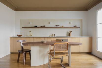

Using only neutral paint colors for kitchens might sound a little dull, but there are plenty of ways to make them feel impactful – you just need to choose the right tone and the right finish in the right kitchen.
Classic neutrals, for some, just mean whites, beiges and greys, but that limited concept of neutrals is a thing of the past in today's design world. Neutrals is a term that's become broader and more inclusive, and they can really vary from those often-considered light hues to even deep, dark tones.
'When it comes to paint, the term 'neutral' has evolved and now goes far beyond just white and beige, with many other hues such as muted greys being considered neutral,' says Emma Deterding, founder of Kelling Designs. 'A kitchen is a place where functionality and utility are key, but there's no reason why it can't be stylish and beautiful too.'
To understand the role neutrals can play in a modern kitchen, we asked the experts for their advice. They suggested these eight contemporary hues for your walls, cabinetry and more.

Aditi is a homes writer and editor with several years of experience. Her articles, backed by expert insights, offer suggestions aimed at helping readers make the best home design choices. For this article, she spoke to designers to understand the best neutral paint colors for kitchen.
8 neutral paint colors for kitchen
Before painting your kitchen walls, it is always advisable to first make a mood board for the kitchen remodel. 'Depending on your preference, neutrals are usually versatile meaning they can be paired with almost anything,' says Ann Marie Cousins, founder of AMC Design. 'From a neutral wall color to pared-back kitchen cabinetry, neutrals look great alongside brighter hues.'
'If you’re opting for muted cabinets, for example, pair it with warmer, earthier walls or even worktops to avoid your kitchen looking too clinical,' Ann adds. 'This will help elevate your kitchen and stop it from looking flat.'
1. Warm grey
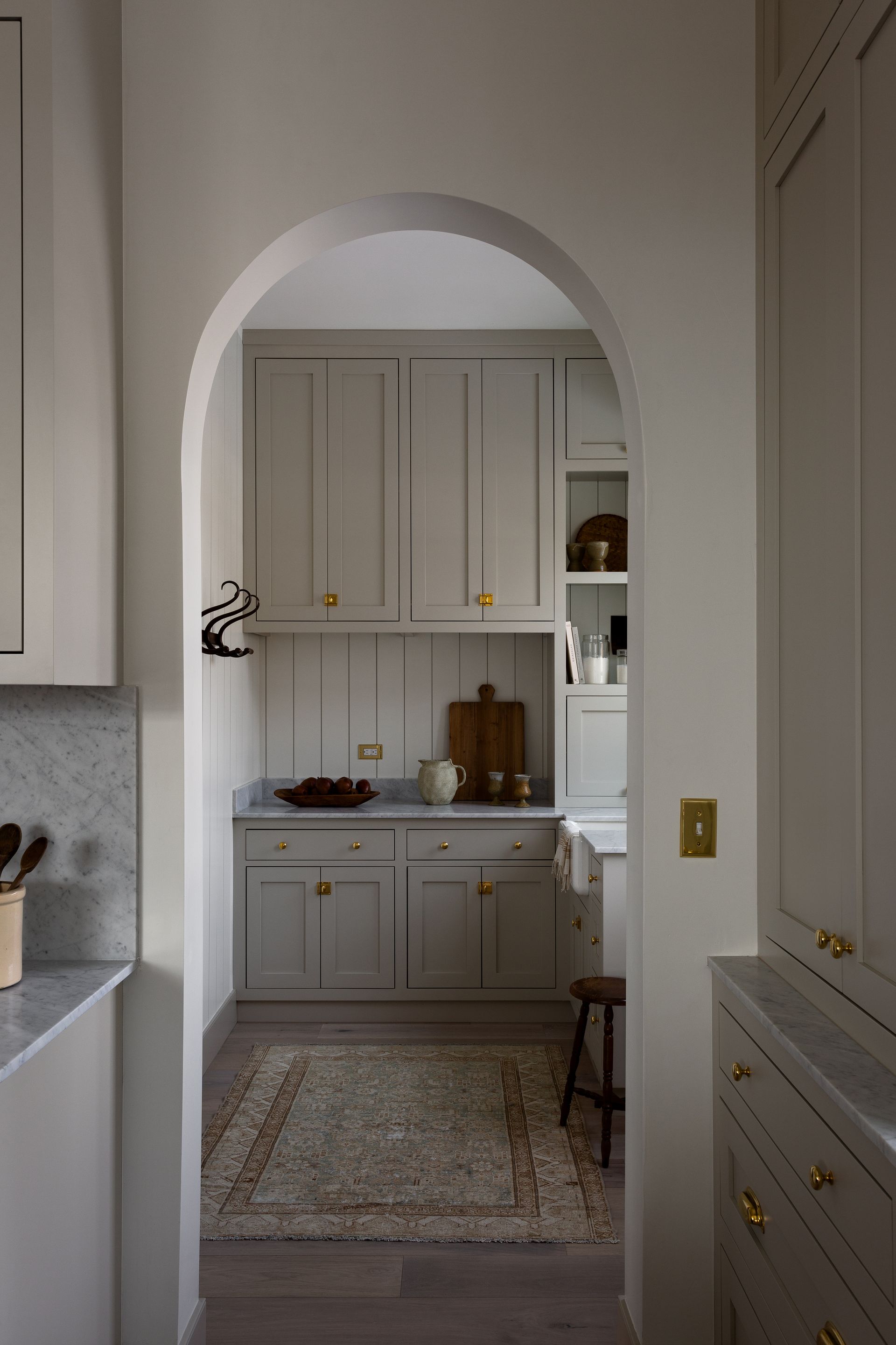
Grey might not be at the height of its popularity right now, but it's far to say it remains one of the most in-demand neutrals. This hue has continued to be a popular tone for decades and is often picked for spaces such as the dining or living room as an accent color or for accessories.
Grey kitchens can appear austere and chilly compared to its warmer neutral counterparts, beige and tan. For a modern look, the trick is to choose a grey that has a warmer undertone. These will pair well with wood and give your space a cheery look year-round, even when it's overcast and the skies are grey.
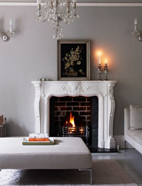
Pavilion Gray, Farrow & Ball
This classic mid-grey has subtle blue undertones and adds a contemporary touch and sense of spaciousness. Whether on walls or joinery, this hue works perfectly well in all instances.
2. Limewashed taupe
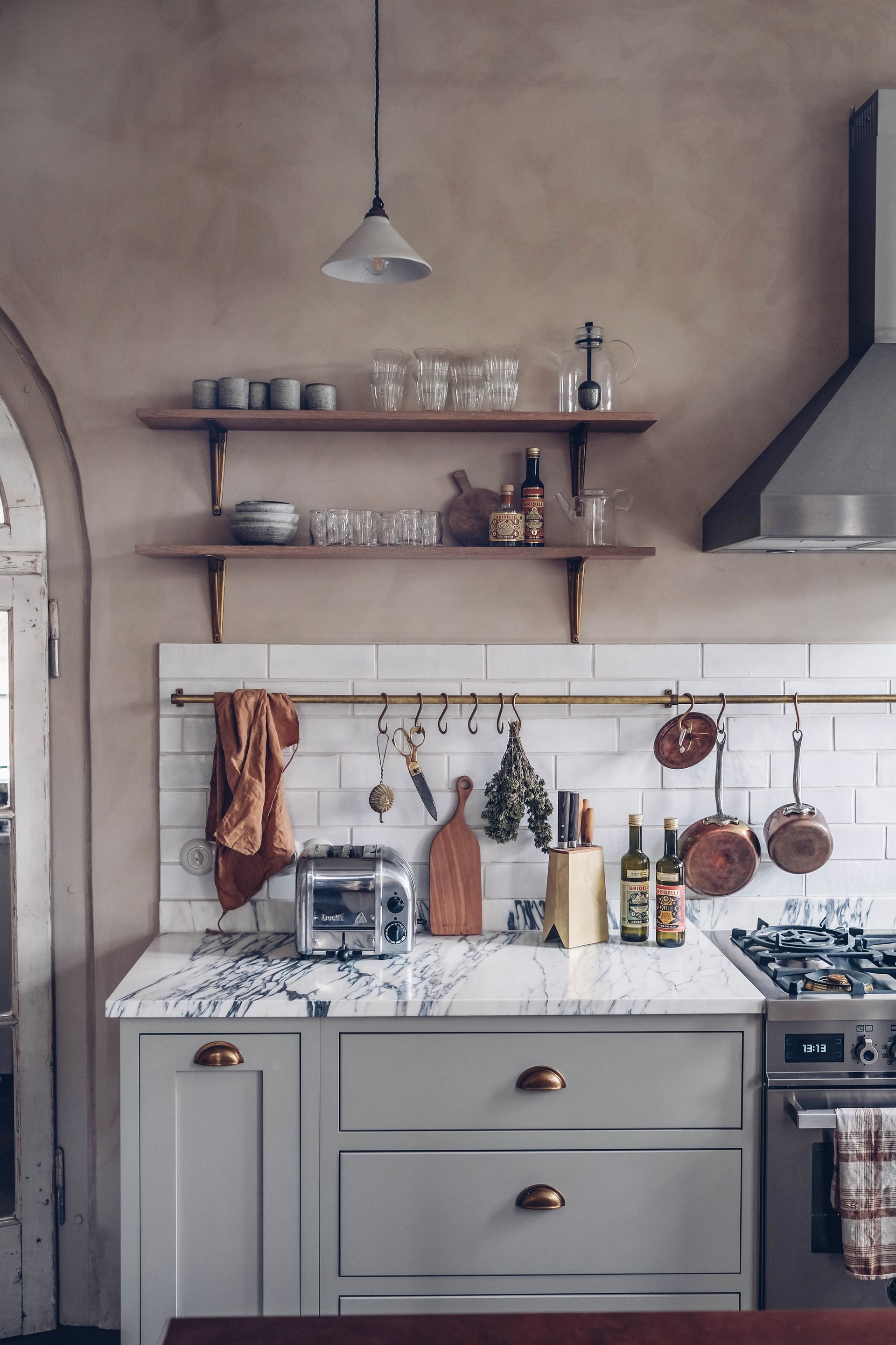
Taupe combines the contemporary sophistication of grey with the earthy qualities of beige for the best of both worlds. Depending on the light, it can sometimes look like a warm grey or a cool beige - but regardless, this hue is both an organic and elegant alternative to whites.
'A neutral kitchen works well in any home, but I’d advise steering clear of white as this can make the kitchen feel cold and unwelcoming,' says Juliette Thomas, founder of Juliettes Interiors. 'Shades like taupe are much more welcoming, especially when paired with wood or quartz worktops and gold or brushed brass hardware, creating a modern yet inviting space.'
One popular way to embrace this kitchen color scheme is by choosing a textural finish. A limewash paint gives movement and tactility to the walls; you will be able to see the brush strokes and imperfections, which truly give the space a unique character.
3. Sophisticated off-white
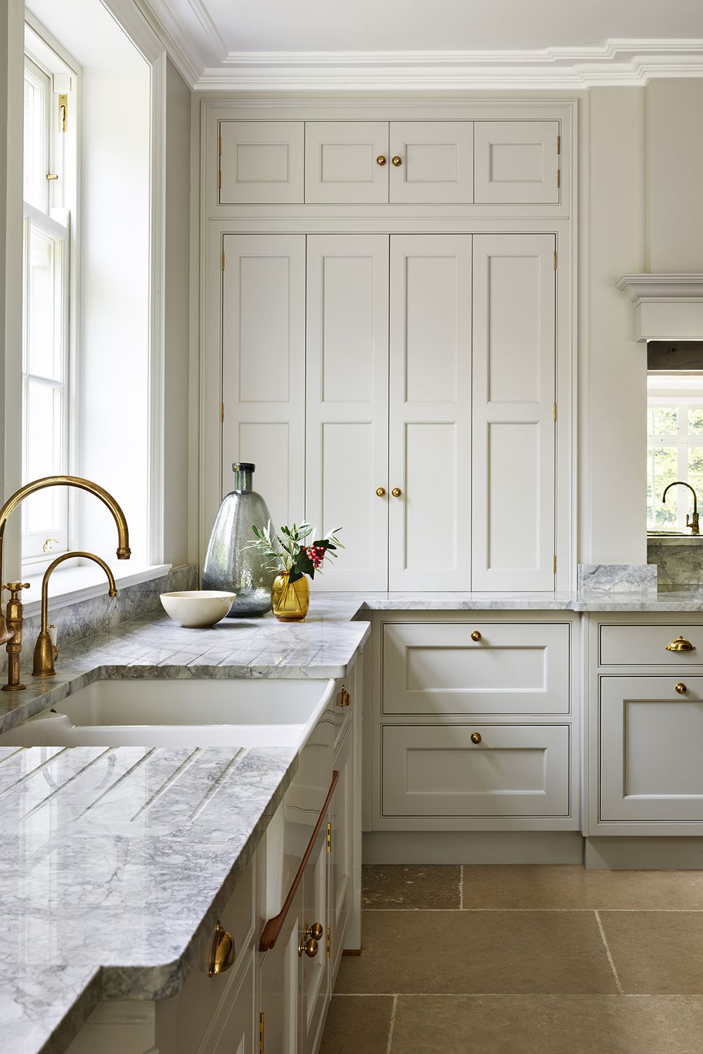
Pure white kitchens can often feel plain, drab and cold. An off-white, however, has a lot more substance, while not veering too far to the warm or cool side.
One way to choose the right off-white in the kitchen is by taking cues from the existing furnishings or materials. Look at the flooring, the trims, or the curtains, and coordinate a flow from one surface to another.
'For a classic, neutral feel, shades of off-white will work best,' says Emma from Kelling Designs. 'This classic neutral will allow your kitchen cabinetry and accessories to make more of a statement. I like to use a warm shade of off-white for the kitchen, as it allows me to bring in color through the cabinetry and other key pieces. It creates a timeless and classic backdrop for the kitchen, whilst bringing in warmth.'
'The beauty of choosing a neutral base color for your kitchen is that it will work with almost everything, giving you more options when picking your appliances, cupboard doors, and accessories,' says Chelsea Clark, head of the brand at Lust Home. 'An off-white is often a great way to make a smaller space, feel bigger.'
4. Muted green
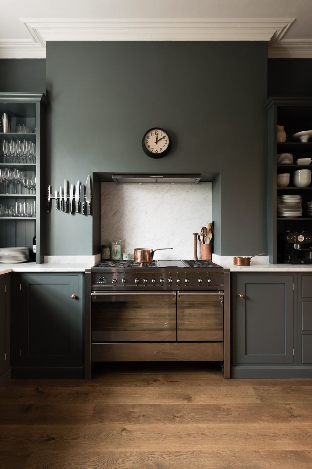
This shade of dark, muted green is one of the new neutrals we keep talking about - an easy-to-adopt hue that can be used in combination with lots of other colors and finishes.
'Colors like green and pale blue are all being considered neutral colors today,' says Kelling. 'Greys, greens, or blues create a strong and stylish base for your kitchen that will allow you to cook in a space that's welcoming and inspiring too.'
Dark green kitchens may be associated with traditional designs, but it can give the room a contemporary appeal if you choose to paint the walls and the cabinets the same hue, color drenching the space. A matt paint finish will also add a modern flair to the room.
If you feel your kitchen's walls and dark cabinetry are becoming too overwhelming, then consider matching it with a pale or wooden floor. The result? A naturally brighter room that can take the cabinets’ dark tones.
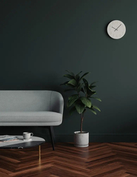
Green 06 Matt from Lick
This darker-than-dark green paint creates depth, drama and decadence in an interior. Its smooth matt finish is such that its look isn't spoilt by unwanted glare.
5. Pitch black
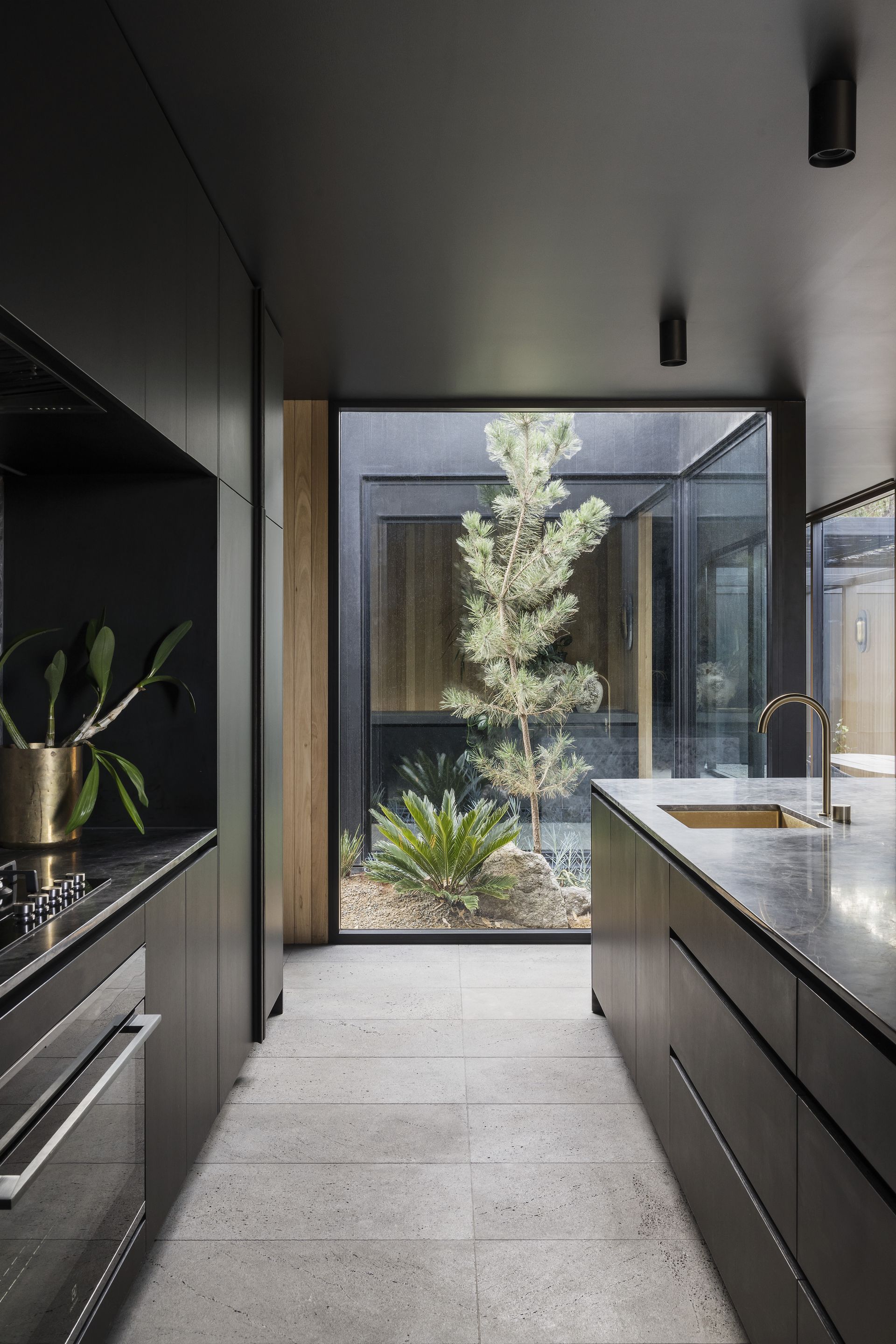
It may be incredibly imposing and statement-making, but black can be considered a neutral, too. Black kitchens look classic and can create a crisp, dramatic and elegant look.
‘While it may darken the interior, black walls act as a great backdrop to other aspects of the rooms you want to highlight, whether it’s corners or an architectural feature,' John Ashton of paint brand Albany. 'Although it can feel daunting, black is a versatile choice that can feel cozy or modern.’
Another great idea is to consider a black and white kitchen, which too looks versatile and eye-catching. Think of a wonderful pairing of black walls with white counters. 'If yours is a small kitchen, embrace a clean white color scheme to open up a space, then use accents of black on paneling, trim, or a linear divider to make a real statement,' says Helen Shaw, director at Benjamin Moore. 'If it's a more industrial feel you want, you could layer the scheme with black brassware and darker grey accents to create a sleek look.'
6. Light pink
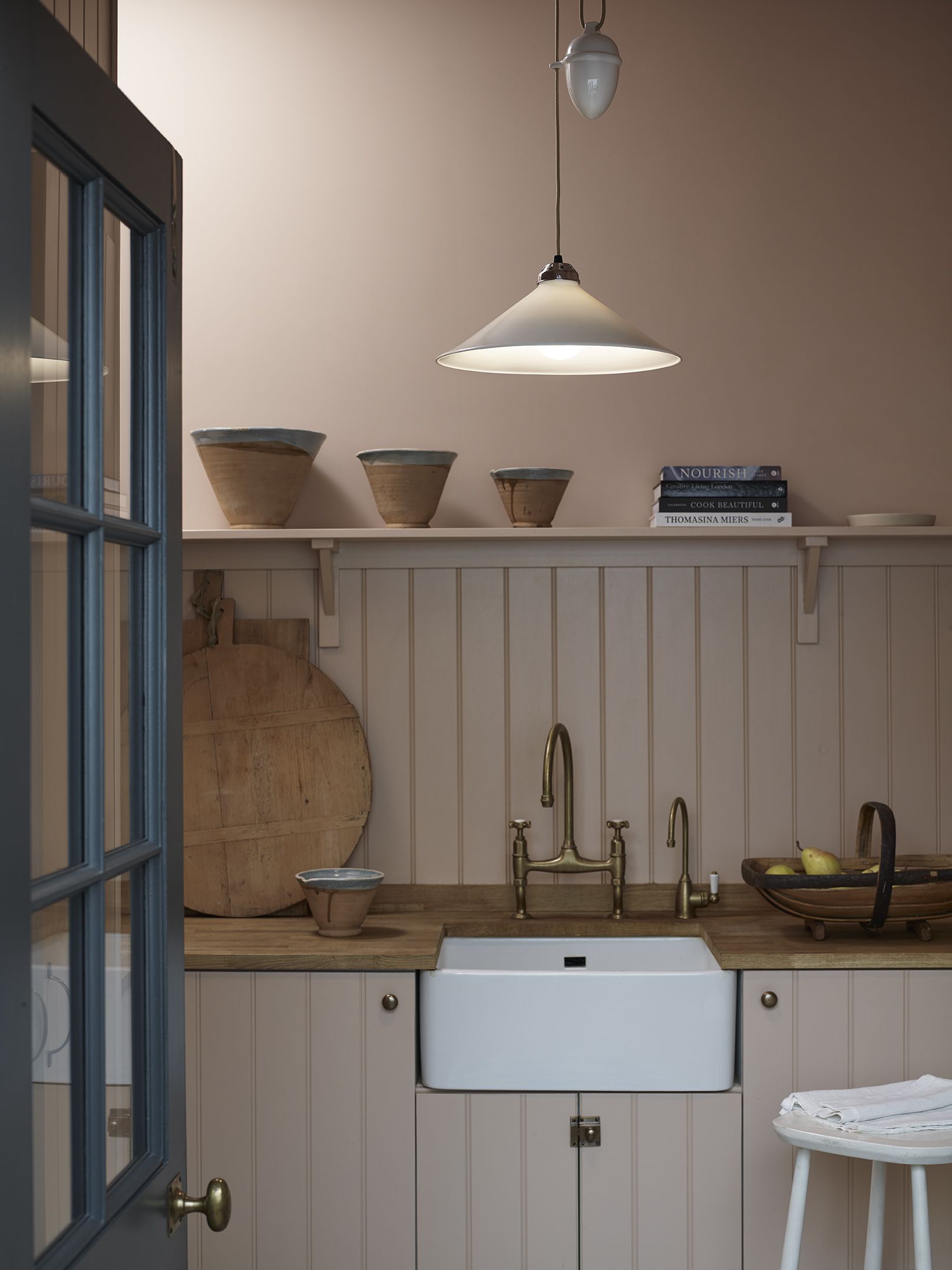
A pink kitchen can look calming and elegant, while also being surprisingly versatile.
Neutral-adjacent pinks come in lots of forms - soft pink, pastel, pink with a yellow undertone, or with a grey undertone. Whatever the mood you want to create, choose a tone that feels subtle, yet statement-making.
'If you're looking for something utterly soft and forgiving, a good choice could be Setting Plasterr,' says Patrick O’Donnell, a color consultant for Farrow & Ball. 'Consider this shade a neutral – the gentle brown notes will flatter your complexion and make you positively glow with good health. It will also add warmth to those trickier spaces that feel starved of natural light.'
7. Terracotta is the new neutral
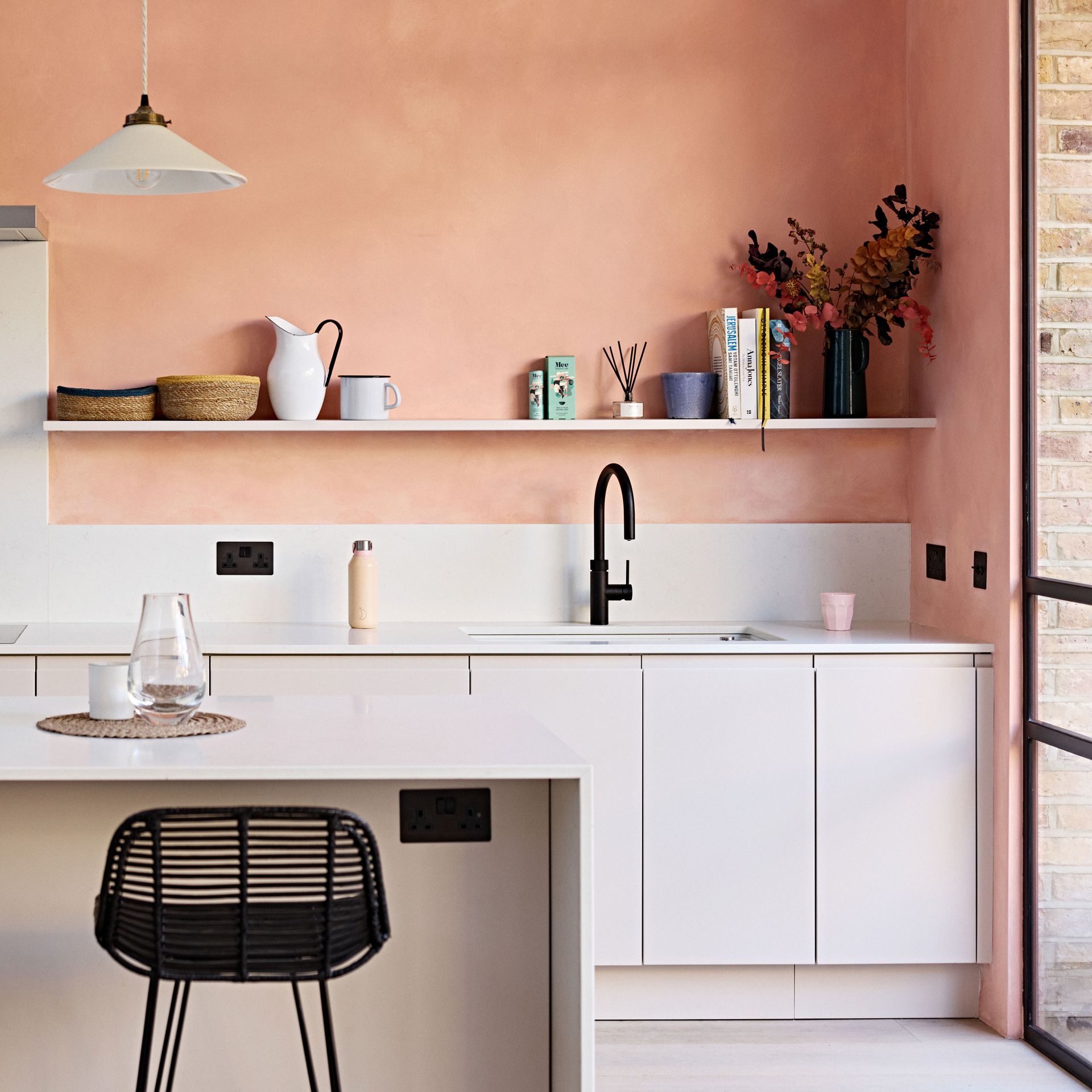
Terracotta is an ancient color originally derived from clays and minerals. While this was extensively used in ancient art, it still finds relevance in modern interiors. For a pleasing two-tone kitchen, use this hue with warm whites or yellows; even the entire spectrum of fall colors will go with terracotta.
'This hue is confident and charismatic; it can also feel rich and sensuous,' says Helen. 'On the earthy end of the spectrum, the muted rusty tones emerge, and can evoke an easy-going, inviting vibe that blends beautifully with brown, taupe, and wood.'
'The tone can swing towards the sun-baked brick and cooler towards crimson-kissed violets, providing a muted quality that brings depth and elegance,' says Helen. 'Consider adding a rich, bold paint color such as maroon to create an instant character.'
8. Calm powder blue
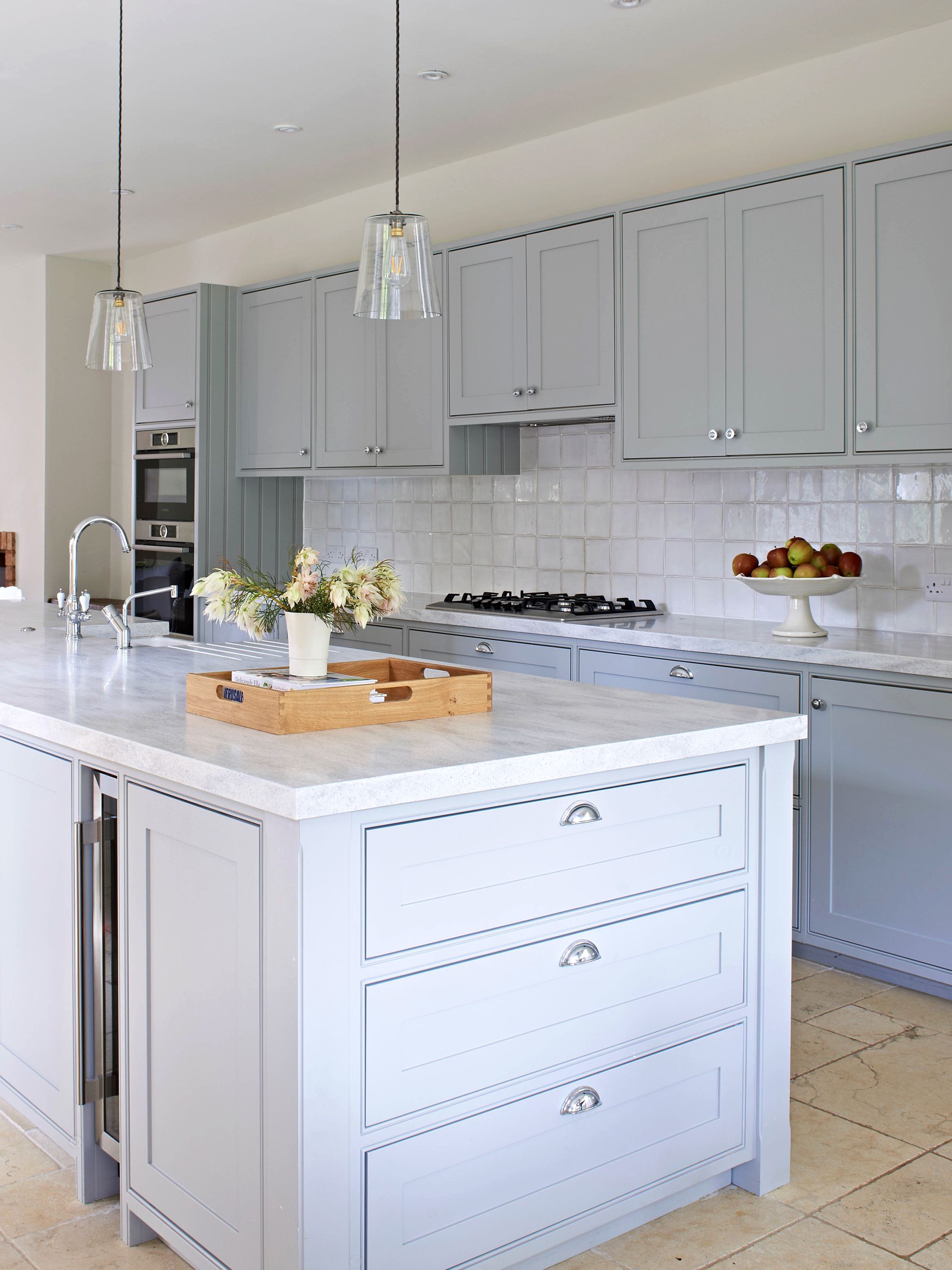
Powder blue or light blue kitchen is one of the most classic tones for this space. It is calming and easy on the eyes and reminds one of a spring sky and clear seas. On walls, this hue has a softening effect, which makes it a popular choice for kitchens and even bathrooms. Although it's rare in modern design, a light blue can be used as a neutral backdrop for eclectic, mid-century-inspired, and modern designs.
Blue is a great choice in kitchens that have wood floors or countertops because it acts as a contrast to its warm tones. This hue pairs beautifully with yellow, grey, beige, and other deeper, darker tones of blue.
Be The First To Know
The Livingetc newsletter is your shortcut to the now and the next in home design. Subscribe today to receive a stunning free 200-page book of the best homes from around the world.
Aditi Sharma Maheshwari is an architecture and design journalist with over 10 years of experience. She's worked at some of the leading media houses in India such as Elle Decor, Houzz and Architectural Digest (Condé Nast). Till recently, she was a freelance writer for publications such as Architectural Digest US, House Beautiful, Stir World, Beautiful Homes India among others. In her spare time, she volunteers at animal shelters and other rescue organizations.
-
 The 12 Best Table Lamps for Reading —I'm a Certified Bookworm (and Shopping Expert)
When it comes to table lamps for reading, I don't mess around. If you're the same, this edit is for YOU (and your books, or course — and good recommendations?)
By Brigid Kennedy Published
-
 "It's Scandi Meets Californian-Cool" — The New Anthro Collab With Katie Hodges Hits Just the Right Style Note
The LA-based interior designer merges coastal cool with Scandinavian simplicity for a delightfully lived-in collection of elevated home furnishings
By Julia Demer Published
