14 kitchens without wall cabinets that mean more light, less bulkiness and just as much storage
Whether you are tight on space, or just want to keep your kitchen light and open, ditching wall cabinets is a trend to embrace
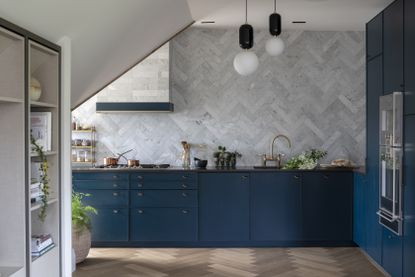

It's the nature of the job that we should constantly be looking at interior design trends – spotting upcoming shapes, textures, colors, patterns, etc. So recently, when looking over and bringing together the most gorgeous kitchens we have come across in the last few months we noticed a very clear parallel between all the spaces. And it wasn't tile, or cabinet color, or the materials used, but it was the fact that not a single one had any wall cabinetry.
Expands of glorious bare (or almost bare) walls gave all these kitchens without wall cabinets an openness and lightness and a more informal approach to kitchen design. So again, as is the nature of the job we had to explore this trend a bit deeper. Because it looks lovely – the next 14 modern kitchens are about to prove that – but is cutting away half your kitchen a practical choice? Can this design actually work in a hardworking kitchen? And what can you bring into your kitchen instead of wall cabinets?
'If you can avoid them it gives you the ability to do something more interesting,' sayd Nicholas Kaiko, founder of Kaiko Design. 'You have an opportunity to be more creative. Perhaps you'd like to add wall lights or you have an artwork to sit on a picture ledge or perhaps you've found an incredible piece of stone or mosaic you want to feature. Having no cabinets lets this material (whatever it may be) be a larger design expression. It also makes cleaning really easy!'
How to design a kitchen without wall cabinets
1. Keep things clean and simple
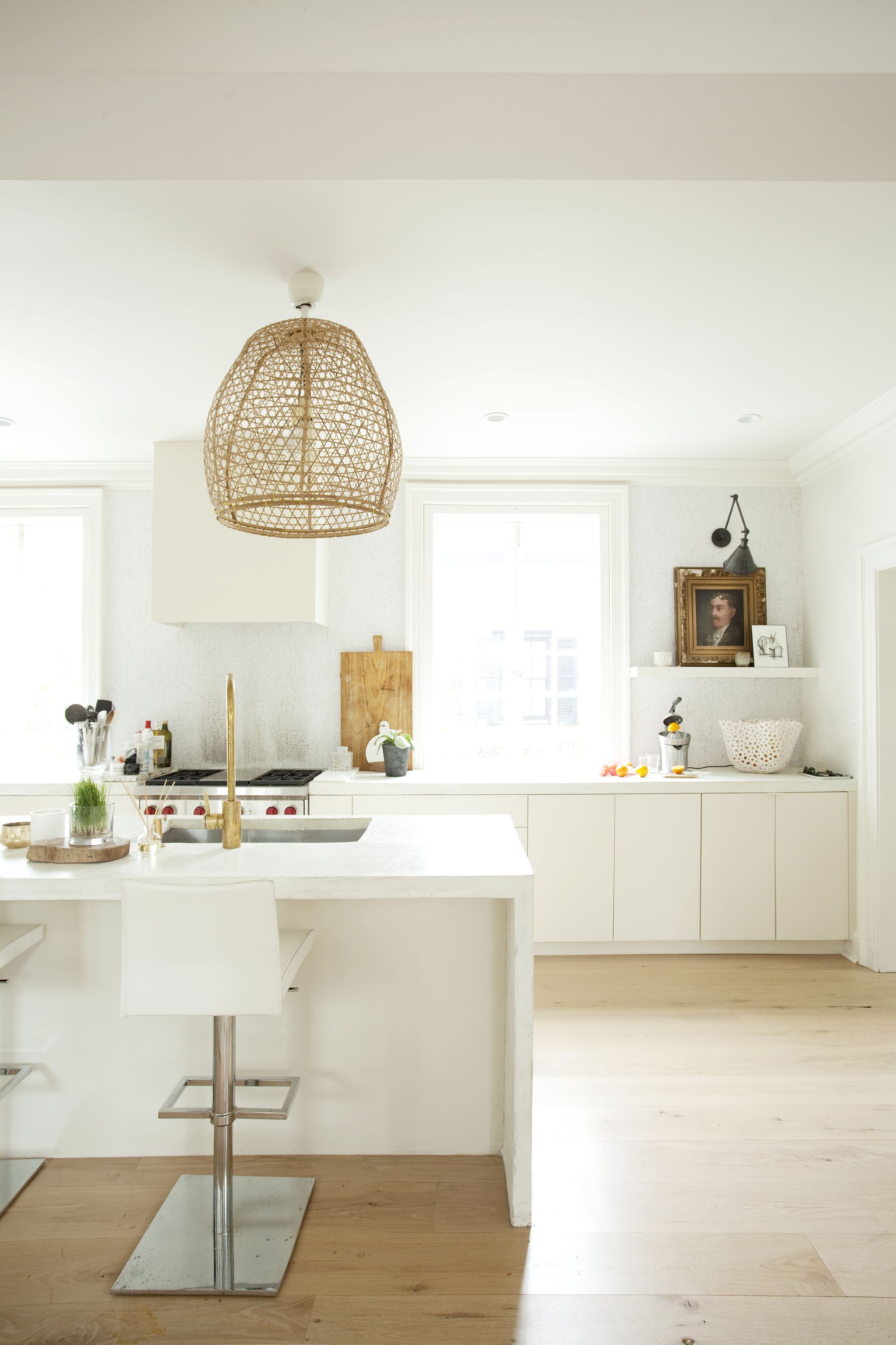
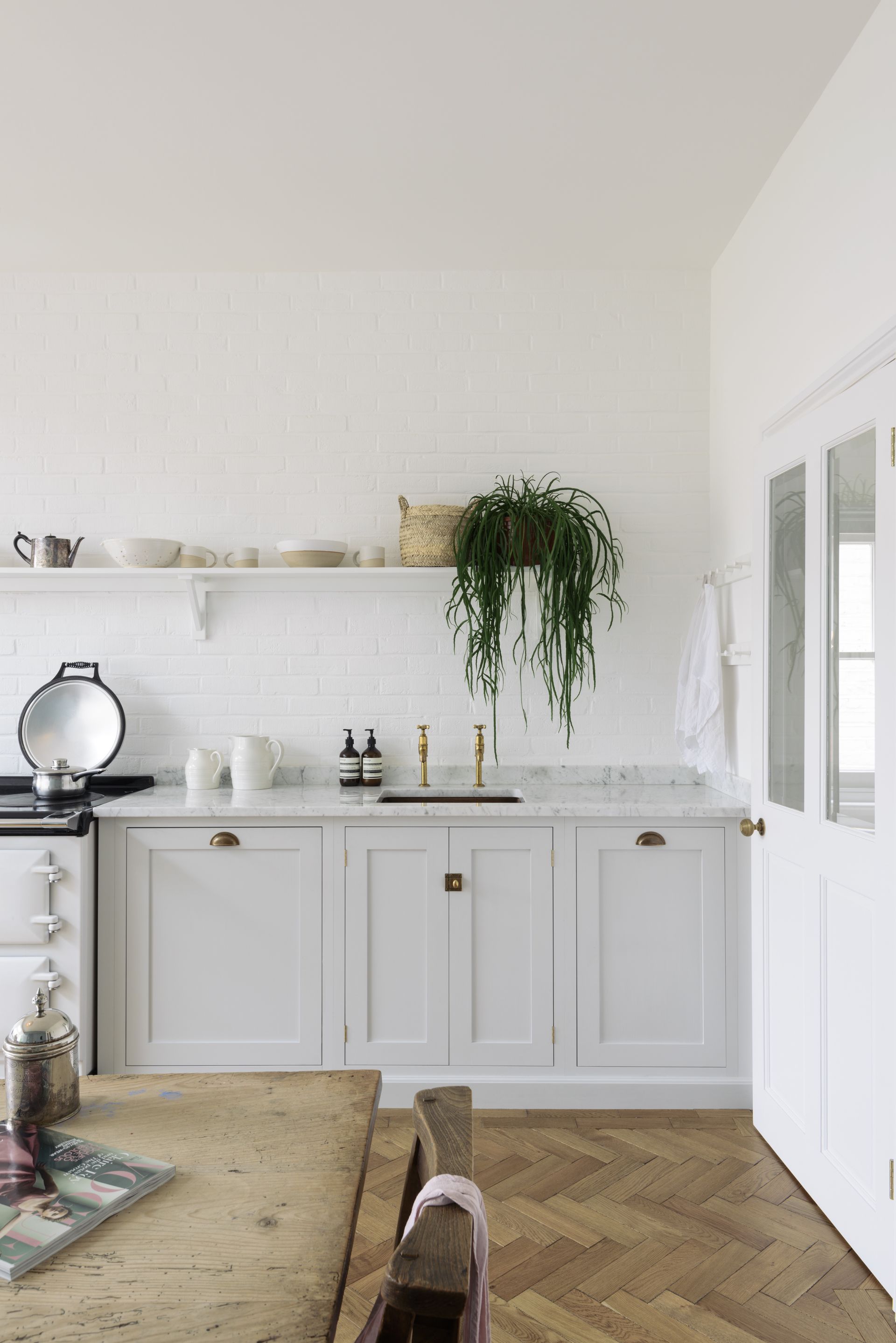
The biggest draw to cabinetless walls is how much clutter they take out of a kitchen. The room doesn't feel so full of the same (or similar) cabinets, repeated over and over, and instead looks clean and simple, with plenty of room for decor.
'I like simple delicious recipes and the same goes for kitchen design,' explains Lisa Sherry, who designed this beautiful white kitchen. 'So, when it makes sense for the design plan, I take cabinetry off the walls. Rethinking a kitchen covered in wall cabinetry is like “clean design.” It simplifies and clarifies the space. The absence of cabinetry frees up wall space for windows, mirrors, artwork, thoughtful open shelving (practical, beautiful, and accessible), and even the simple clarity of a wall.'
2. Get the balance between aesthetics and practicality
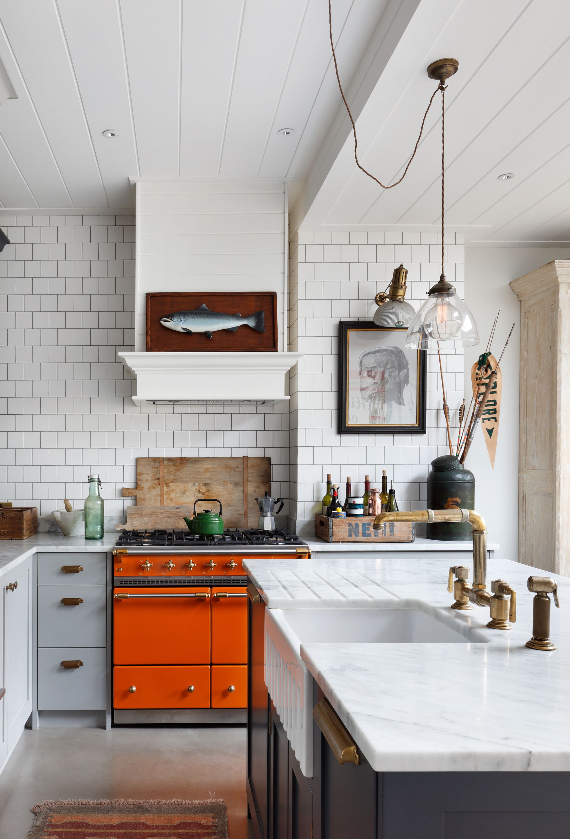
Now, when you strip your kitchen right back to just floor cabinetry, you are left with a sea of empty wall, and while that can be a vibe, it's important to ensure you create a balance by filling at least some of that space.
The lack of wall cabinets gives you so much opportunity to get creative with your kitchen wall decor – to inject some character into a room that is so often seen as being functional above all else.
As Tom Cox of HÁM interiors says, 'kitchens are such a focal point, they need to work functionally but also be a great place in which to hang out. We want our kitchen designs to be an extension of the home, a place full of beautiful architectural detail and personal objects; this means not always conforming to the look of a traditional kitchen. Taking away traditional elements like wall cabinets helps open up a space and makes room for artwork and objet, which adds personality, although we need to balance practicality.'
Shop your own home for pieces you can bring into the kitchen to give it more depth and character – prints, vases, antiques, memorable – and get it up on the walls. Note how in this kitchen the fact there are no wall cabinets means the kitchen countertops can handle more (aesthetic) clutter too, so get adding to that space too.
3. Make a kitchen look less like a kitchen
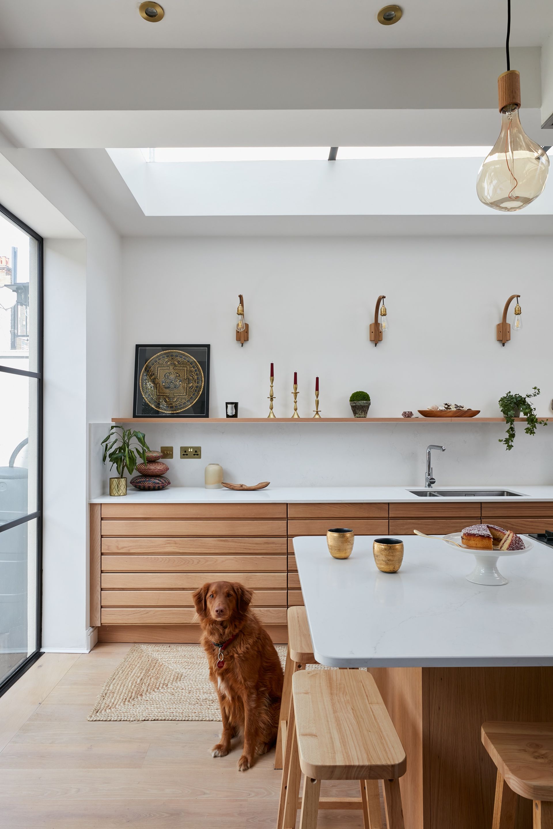
This is one of the main reasons designers and homeowners seem to be ditching the wall cabinets. There's been this ever-growing kitchen trend of trying to make our kitchens look less... kitcheny. And cutting out half of the cabinetry you would find in a 'traditional' kitchen is an easy way to do that.
'In this home, the clients wanted a kitchen that didn't look like a typical kitchen,' explains Rhiannon Phenis, Head of Design at Sola Kitchens. 'No appliances. No wall mounted units. Just clean lines, light, and perspective. As the client didn't want wall cabinetry within the extension area to allow for natural light, we took advantage of the space opposite. The simple shelf detail allows the family to add personality to the space.'
4. Fill the space with wallpaper

And is this not the most unkitcheny kitchen you have ever seen? Designed by Colombe, the upper wall cabinet space is instead filled with a beautiful hand-painted kitchen wallpaper.
'This apartment had an exceptional design concept. Its owners, lovers of classical music, organized private concerts in this space. The kitchen was visible from the living room, so we wanted the furniture to resemble typical kitchen cabinets as little as possible. That is why the idea was born to completely resign from the upper buildings and replace them with hand-painted De Gourney wallpaper,' explains founder Marta Chrapka.
'The advantages of wall cabinets are undoubtedly their functionality and ease of use. Things are at eye level, it is easy to reach them, easy to hide the hood or make comfortable lighting above the worktop. Yet if the home is to be more decorative, and the kitchen better integrated with an open place living space, it is better to avoid hanging cabinets on the wall and replace them with wallpaper,' she adds.
5. Make your most used items accessible with shelving
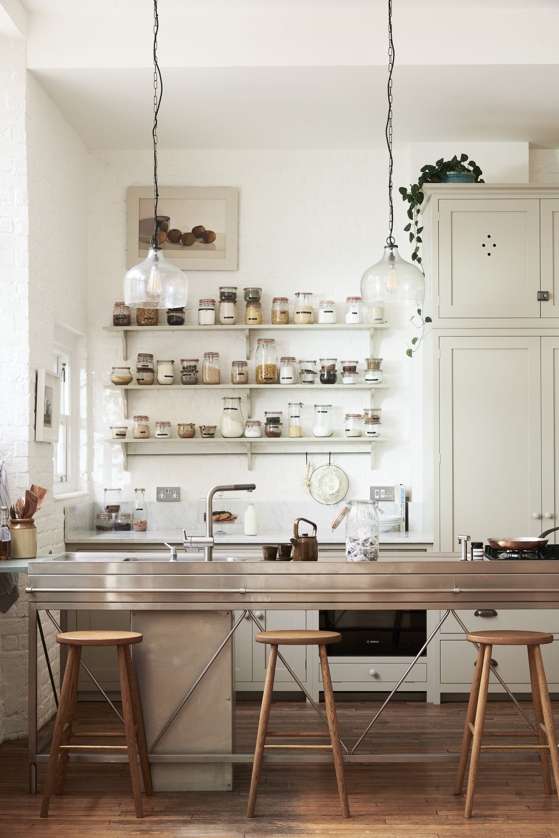
Kitchen shelving is the most popular (and potentially) most practical wall cabinet alternative. You still get all that storage space, but it looks great too and takes up far less visual bulk than cabinets. As we have mentioned, the key is that balance between things looking aesthetically pleasing but still being a practical addition to a kitchen. So unless you have plenty of storage elsewhere, your kitchen shelves need to work hard and house things that you actually use.
That's not to say these things can't be pretty – pots, pans, china, dried foods, etc. can all look lovely if displayed correctly. 'People who like their things on display rather than in cupboards are generally keen cooks or collectors. Cooks need to grab a pan or ladle quickly and efficiently so open shelves mean everything is easy to put away and easy to find and use quickly,' says Helen Parker, Creative Director of deVOL.
'People who have a love of beautiful things also love to display, why hide away all your treasures, which may be crockery or copper pans. Everyone’s displays are personal to them, straight rows of white plates or a jumbled mix of bits and bobs, a ceiling full of hanging herbs and utensils, or a perfectly arranged display of Italian coffee makers.'
6. Maximize corners
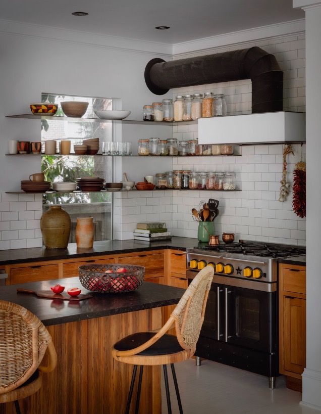
Not including wall cabinets allows you to get more flexible and get more out of awkward spaces. We all must agree that corner cabinets are the most underused part of any kitchen – they are where pots and pans get forgotten, and stacks of tins go unused.
So rather than fill a corner with a bulky cabinet that never really gets any functional use, be inspired by this kitchen designed by Lisa Staton. Run open shelving around a corner to create an interesting (and practical feature). And note the window too, having wall cabinets on either side would instantly suck any light coming in, but the slimline shelving can run straight across without too much obstruction. 'Placing open shelves instead of upper cabinets keeps a kitchen open and airy and allows for quick access to everyday dinner wear and often used Staples and spices,' says Lisa.
7. Plan how to arrange your shelving
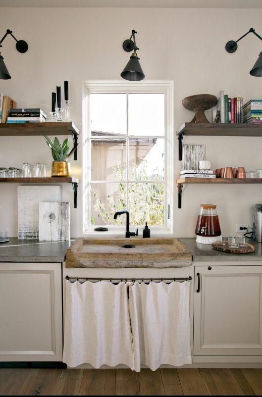
'I find that everyone is afraid of open shelving, and it turns out to be the easiest thing to use and keep looking fantastic if you follow a few rules,' says designer Dana Lynch. 'Firstly, make sure the shelving is correctly attached to solid blocking behind your surface. Even when our racks appear to be attached to a ceiling or a countertop, they are fastened to the wall – plates and books are HEAVY.'
'And make sure you measure correctly so that the shelves you intend to regularly access are within arm's reach. Typically, the bottom shelf if full depth would be about 18" off the countertop, a narrow rail/shelf of marble of maybe 4" depth could sit even lower. If you have shelves that aren't easily accessible, this is where you "stage" the shelf, use rarely used serving dishes, etc. and YES it will become dusty so plan to clean anything you want to actually use before you fill it with mashed potatoes.'
8. Soften a kitchen with layers and texture

It's a bit of a luxury to be able to use all your kitchen wall space purely for decoration. But this marble kitchen makes a strong case for ditching practicality for the sake of design and softening the space with lots of shapes and textures you wouldn't expect to find in a kitchen. Although, if you are clever with your kitchen storage elsewhere, why shouldn't you be able to dedicate one wall purely to non-kitchen-related items?
'Removing wall cabinets from a kitchen is a lovely way to open up a space and give the kitchen a greater sense of space and flow. Often we replace wall cabinets with floating shelves which allows decorative objects to be displayed,' explains Ash McCullough, lead designer at Blakes London. 'Wall cabinets are increasingly being replaced by floating and hanging shelves in a kitchen, especially in open plan kitchens where shelves adorned with decorative objects allow the kitchen space to blend in better with a more casual seating and relaxation space.'
'And we are noticing that clients are simplifying their kitchen storage needs too and returning to a less is more philosophy. Most clients no longer differentiate between day-to-day and 'for best' dining sets and as a result the amount of storage they need is reduced. This allows us to lose the wall cabinets and use this space in a more aesthetically pleasing way.'
9. Blend shelving into the walls

If you can afford to go without the extra storage, forgoing wall cabinetry in a small kitchen is instantly going to make the space feel larger and lighter. Take a tip from this space and avoid creating too much visual fuss by painting your open shelving the same color as your walls so they seamlessly blend into the background.
'We find that kitchens don't always work well with overhead cabinets, in fact, they can make your kitchen feel smaller and cramped. Open shelving and exposed cabinetry can look quite chic especially if you want to show off your coveted kitchen bowls and cutting boards. Put the "ugly stuff" in lower cabinets and drawers and let the eclectic pieces shine on their own,' suggests Jen and Mar founders of Interior Fox.
10. Take a lighter approach to wall cabinets

We love this idea from design studio Run for the Hills – it's almost half wall cabinetry and half shelving. The structure of the cabinets is still there but the bulk isn't.
'For this project, we had the luxury of a large kitchen (with plenty of storage, within the kitchen island) but we also had an open plan space to work with, and the kitchen was sited in the middle of a super large space encompassing an entrance area and then stairs down to a sunken lounge which then leads onto the kitchen area (which then in turn leads onto the dining area). So a key part of us designing open shelving here was to zone the kitchen area in a less ‘heavy’ way than using wall cabinetry,' explains Anna Burles, creative director of Run for the Hills.
'Shelves are contemporary and light and, in our case, we embedded a soft light glow within them so they also added nighttime glamour and useful task lighting onto the worktop. We also used these slim open shelves to keep the victorian terrace ‘width’ footprint of the house feeling as spacious as possible. Victorian terraces aren’t huge and open planning them can feel a bit like a corridor if you don’t create interesting and varied focal points along the run each side. So even though we had quite a decent-sized kitchen, you still need to let it breathe and not feel boxed in on both sides.'
11. Keep the walls bare
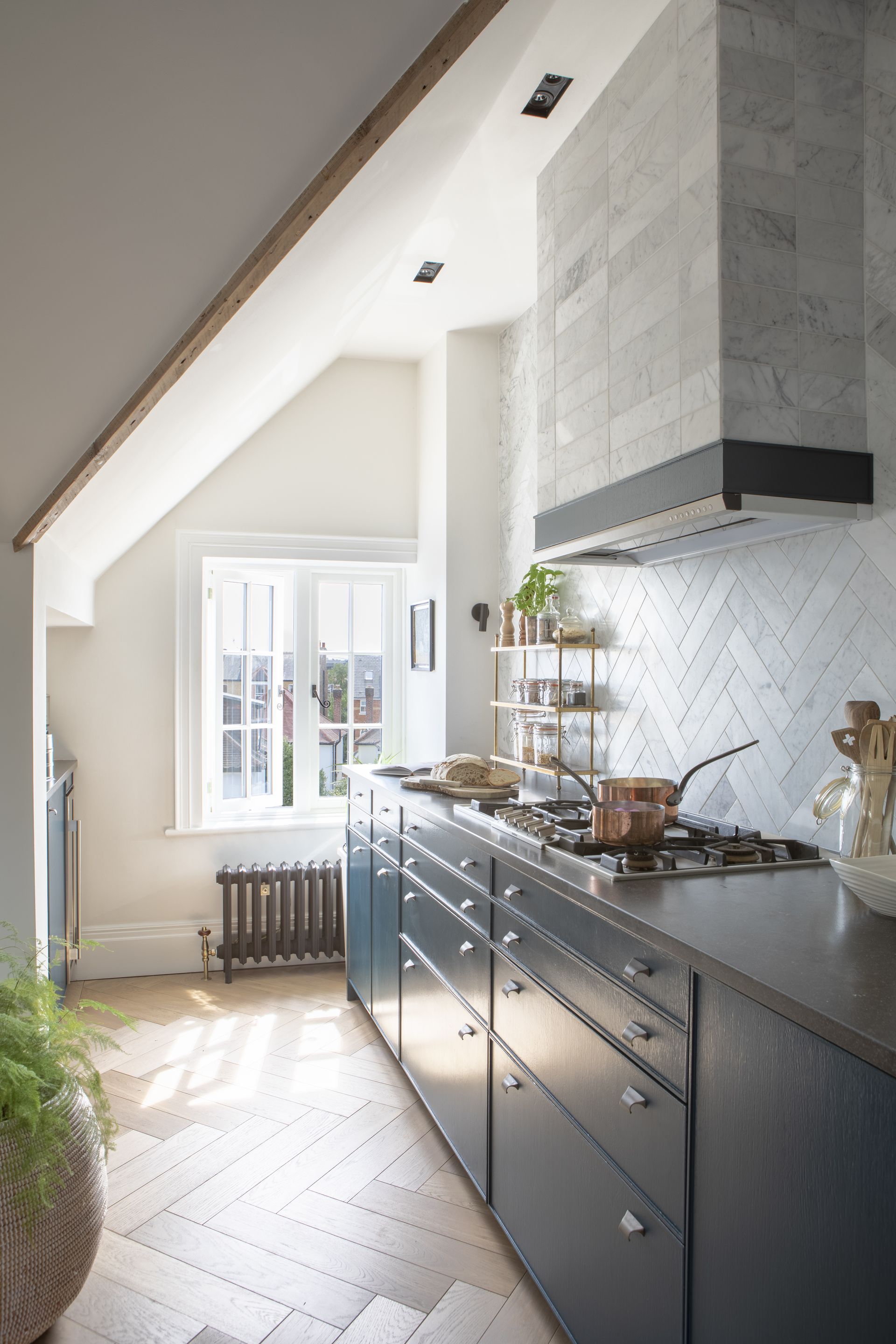
If space is really tight, or you are dealing with an awkwardly shaped kitchen, there is a case for just leaving your walls totally bare. Not only will this allow plenty of light to flow through the space, not having too much going on up top means you don't have to play it safe with your floor units.
In a narrow space, like this kitchen designed by Gunter & Co., opting for a dark or dramatic color does risk overwhelming the space – making it feel darker and smaller. But take away the wall cabinets and you instantly reduce that closed-in cramped feel so can afford to be braver with your kitchen color choices.
'When a kitchen is not very wide or the ceiling is low, wall units can make a space feel cluttered. This apartment kitchen is an excellent case in point,' says designer Irene Gunter. 'With a sloping roof on one side, we made the most of the opposite wall by running a bank of base cupboards along it. If I had also placed wall cupboards above to maximize storage, this would have made the space feel very enclosed and tunnel-like. In this layout, the natural light can shine through, really opening up the kitchen.'
'And perhaps you don’t want to line your walls with shelves (this could be because you’ve sourced particularly beautiful tiles for your kitchen walls or would prefer to hang a few of your favorite prints). Whatever the reason, why not steal my style and invest in stylish, freestanding kitchen shelves that can be moved around the worktop as needed.'
12. Take a splashback to the ceiling
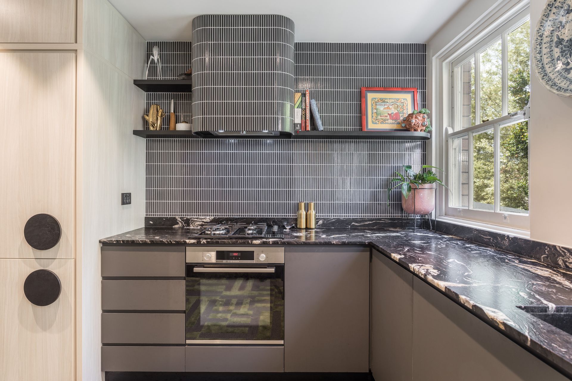
As all these kitchens have proved, the lack of wall cabinetry makes way for so much space to get creative and turn walls into a real feature. In this kitchen, designed by Kaiko Designs the dramatic black tiled splashback does just that.
'The decision to not add wall cabinets was down to the site constraints. The window to the right is very close to the wall, which would mean an odd junction/termination of the wall cabinets, so we designed around this. The resolution was to add some open shelving where our client could display some of their more precious processions.' explains design principal Nicholas Kaiko.
'The range hood is a great way to express some personality in the kitchen. Here we curved the surround to echo the period of the Art Deco apartment and tiled over it. Linear mosaics are the perfect finish to achieve curves. This finish could also be metal or even mirror, the possibilities are really endless. The kitchen, for me anyway, is such a big part of daily life – they host dinner with family or friends, they can be a part home office or even a homework station for kids, so they need to be beautiful as well as functional. So, if they're not essential I say ditch the overheads, the kitchen will feel even larger without them.'
13. Or blend the countertop material upwards

We are big fans of running kitchen tops into the splashback – it's such a sleek, seamless look. But when you don't have the addition of wall cabinets, why stop a quarter way up the wall? Take that countertop material all the way up.
'I love continuing your countertop surfaces up the wall for added drama and interest. Of course, floating shelves are great for displaying beautiful pieces and artwork is always a great option as well,' says designer Marie Flanigan.
'Really, the need for wall cabinetry truly depends on the homeowner and what fits their lifestyle. In a second home or guest home, it’s likely that wall cabinetry can be omitted because it isn't needed to support short stays. Some people need the additional storage that wall cabinetry provides, while others may prefer open shelving or possibly omit both,' she adds.
14. Prioritize windows and natural light

'Easy decision. If it’s a choice between wall cabinetry and windows, windows always win. I’ll manage the space and the design plan for ample storage AND the views,' says designer Lisa Sherry, and we couldn't agree more. Light is so key to making a space feel larger and more open, so don't crowd your windows with cabinetry that's going to instantly sap that natural light.
As Helen Parker, Creative Director of deVOL says, 'If your aim is to make your kitchen look bigger, then the best way to achieve this is by not filling the room full of cupboards and leaving plenty of light and space around windows, so avoid wall cupboards.'
What can you use instead of kitchen wall cabinets?
The most common (and probably most practical) alternative to kitchen wall cabinets is shelving. 'One of the major perks of open shelves is that they’re more affordable than wall cupboards. So, if you’re looking for ways to save, swapping out wall cupboards for shelves is a savvy solution,' suggests designer Charlie Smallbone. 'Just don’t forget to think about lighting, which not only helps to draw attention to the shelving but is a practical consideration too. For example, lighting tucked under each shelf will illuminate what’s below and can be used to provide relaxing, low-level lighting in the evenings.'
And as well as being a cheaper option, they often look nicer too and give more opportunity to inject some character into a kitchen. 'Having some open shelves with beautiful brackets to curate and design can be a fun way to express your personality and style and is a great way to get a little bit of extra storage space but keep things light and open,' explains designer Rhiannon Phenis. 'It could be a long single shelf or two or three wooden shelves above one another and you can accessorize with artwork, plants, and beautiful personal pieces you’ve collected over the years.'
'And removing those wall cabinets gives you the opportunity to create a show-stopping feature backsplash. That can be either as gorgeous, glazed tiles all the way to the ceiling or a stunning slab of countertop material. With the wall cabinets out of the way, the backsplash can be a fantastic focal point and add some visual interest to the kitchen. You can also include a hanging rail or rod which can add a little extra storage for those everyday pots and pans as well as introduce a bit of that ‘working kitchen’ vibe.'

If totally ditching wall cabinets isn't really an option for your home, consider a combination. Strip back on the amount of wall cabinetry and opt for shallower designs.
'Another option would have been to use a mix of open shelves and ‘some’ cabinetry - but strictly half-depth cabinetry (super shallow) and to keep it mostly glazed - with just a central open section of shelves - that would also have looked lovely. Super shallow cabinets and shelves can also house a single ’tier’ / single depth of bottles, oils, vinegars, wine bottles, and other nicely designed kitchen items or even cookbooks. You don’t want to hide those things, they add color and character and a homely touch, celebrating the kitchen as the heart of the home,' says Anna Burles.
Designer Andrew Griffiths agrees, 'It’s about striking the right balance when it comes to wall cabinets. You need enough storage to ensure your kitchen is clutter free, but wall units can look visually very heavy if done in the wrong way. If space allows, it’s nice to have a mix of areas with tall cabinetry and base cabinetry to create a visually interesting space. Ideally you want to create space for other details and textures like lighting, artwork or even just negative space, rather than an overwhelming amount of cabinetry.'
Be The First To Know
The Livingetc newsletter is your shortcut to the now and the next in home design. Subscribe today to receive a stunning free 200-page book of the best homes from around the world.
Hebe is the Digital Editor of Livingetc; she has a background in lifestyle and interior journalism and a passion for renovating small spaces. You'll usually find her attempting DIY, whether it's spray painting her whole kitchen, don't try that at home, or ever changing the wallpaper in her hallway. Livingetc has been such a huge inspiration and has influenced Hebe's style since she moved into her first rental and finally had a small amount of control over the decor and now loves being able to help others make decisions when decorating their own homes. Last year she moved from renting to owning her first teeny tiny Edwardian flat in London with her whippet Willow (who yes she chose to match her interiors...) and is already on the lookout for her next project.
-
 The 12 Best Table Lamps for Reading —I'm a Certified Bookworm (and Shopping Expert)
When it comes to table lamps for reading, I don't mess around. If you're the same, this edit is for YOU (and your books, or course — and good recommendations?)
By Brigid Kennedy Published
-
 "It's Scandi Meets Californian-Cool" — The New Anthro Collab With Katie Hodges Hits Just the Right Style Note
The LA-based interior designer merges coastal cool with Scandinavian simplicity for a delightfully lived-in collection of elevated home furnishings
By Julia Demer Published
