8 Choices to Make When Remodeling That Will Make Your Kitchen Look so Much More Expensive
From ceiling-height units to statement countertops and a curated choice of appliances, these tricks will create a luxury look
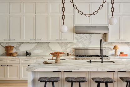

When it comes to kitchen planning, it always pays to have a clear vision and decide on what you want early. But if your end game is to create a space that oozes luxury and – let’s face it – looks expensive, then thorough preparation is absolutely key from the get-go.
The secret to achieving a high-end look is considering every single element of a modern kitchen, from the style and size of cabinetry and colors chosen to the fittings you include and where you place them. You should do this at the same time as your floor plan, so each element works in harmony. It goes further too: you should look closely at the style of furniture trims, metal finishes and how they coordinate and consider the smallest touches for that extra bit of finesse.
‘It’s important to have a cohesive plan from the start,’ says Jennifer Verruto, Founder and CEO of Blythe Interiors. ‘If you have a solid floor plan and design, like a set color palette, you can spread out purchases overtime, and buy what you really want while still creating a curated look.’
1. Choose cabinets up to the ceiling
)
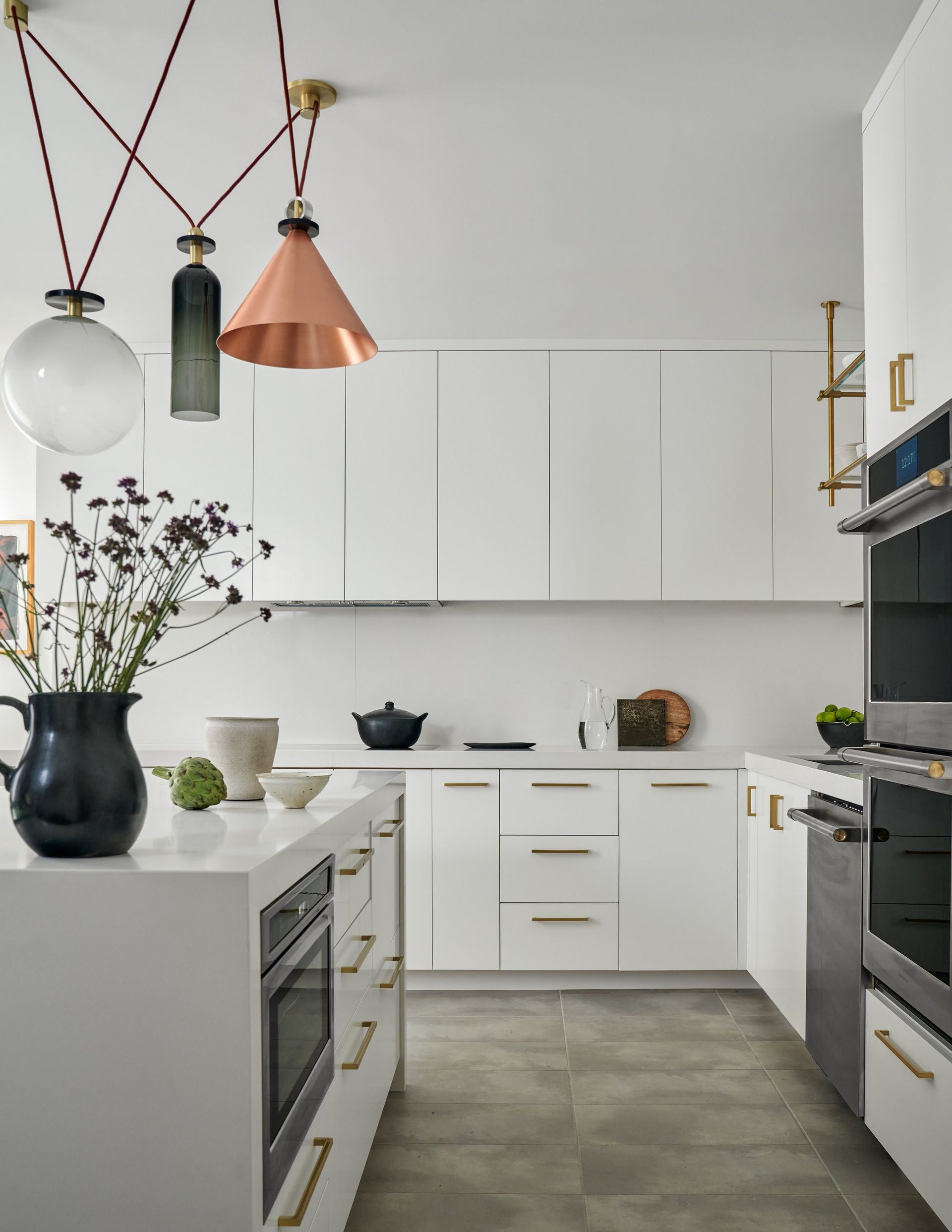
Should kitchen cabinets go up to the ceiling? Unless there’s beautiful coving that’s worthy of display, we think tall units should be built up to the ceiling regardless of the look you want to create. Not only will you benefit from more storage, you’ll make the room feel taller and maximise every inch of vertical space.
‘Finishing the cabinets to the ceiling has a very strong design appeal in the right circumstances. There is an elegance in embracing the height of the room and a more genuinely bespoke look as it gives the impression of furniture completely integrated into the room,’ says kitchen designer Simon Hosein of Smallbone, a classic British kitchen studio that's undertaken work in some of New York's most prestigious addresses.
This way, the kitchen becomes a core part of the architecture. It also allows for the inclusion of features such as a central section of worktop space or a bank of designer appliances, as well as a ladder that’s both beautiful and practical.
‘To be successful this method requires an understanding of the proportions of the room, and care not to overwhelm with too much furniture. One technique is to use the room coving to finish off the top of the cabinets to give continuity around the room,’ says Simon.
2. Integrated appliances
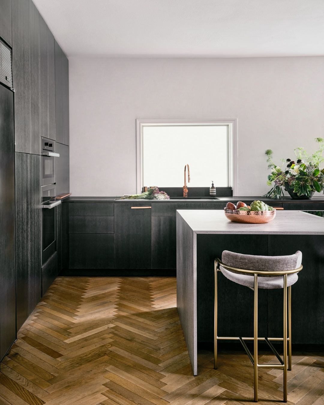
Hiding appliances or having them integrated into the kitchen joinery is a surefire way of making a kitchen look more luxurious.
‘Clutter on the surfaces can often look messy, so minimal appliances on show is best,’ says interior designer Amy Dalrymple, creative director at Dalrymple Studio. ‘For me that also includes microwaves. A microwave should never be visible, either enclose it in a kitchen cupboard or hide it in the pantry.’
Undercounter appliances such as a dishwasher, washing machine and tumble dryer can be easily integrated within kitchen units, while tall cupboards are the ideal way to disguise a fridge-freezer or stacked laundry arrangement, while also providing enough long storage space to keep things like brooms and the ironing board. The more you can keep behind closed doors, the better for a luxe appearance.
‘I would always choose to have appliances integrated unless they have an industrial feel, for example, Sub Zero & Wolf appliances are iconic and are a statement in their own right, therefore a kitchen automatically has a luxury feel if you can spot a serious high-end brand on show,’ says Amy.
With innovations such as invisible induction hobs, where the hob technology is integrated within the work surface itself, you can now create a totally seamless cooking zone that no one would guess was there when not in use.
3. Show-off appliances
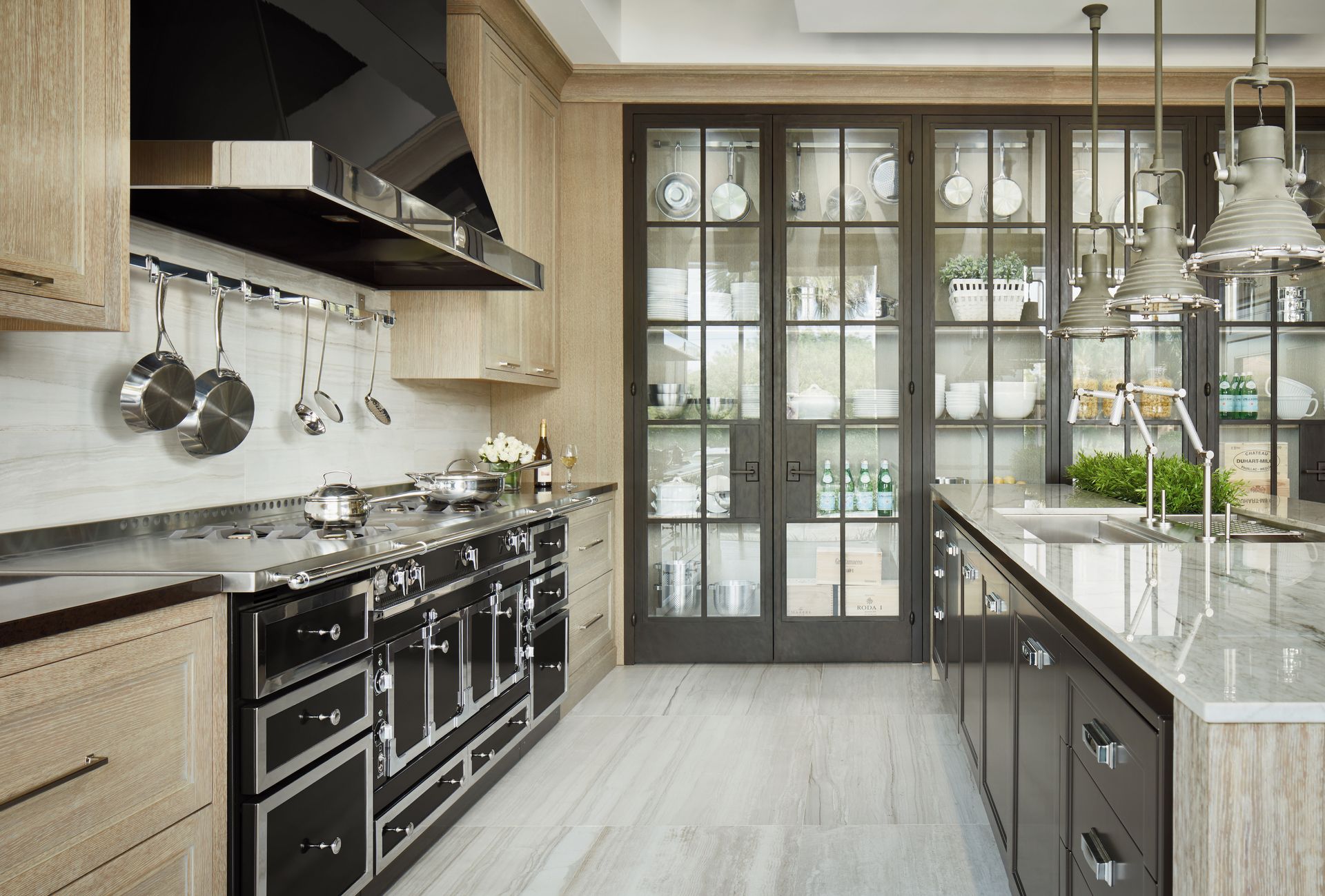
If you have any appliances on show, make them design features within their own right. The rise of the show kitchen has further increased the demand for the latest, trending appliances and gadgets, where you can entertain and express their individual style in a sharp, fuss-free environment.
‘Many homeowners today want a statement kitchen and careful consideration of appliances can help deliver maximum impact,’ says Ricky Davies from luxury appliance brand Sub Zero & Wolf. ‘An arrangement of fridge, freezer and wine refrigeration side-by-side is a classic combination for a knockout kitchen. We are increasingly seeing our products used in banks whereby refrigerators, freezers, wine coolers and hobs are designed together in one super-sleek chef-style hub.’
But how do you get the balance right between show-off and integrated appliances? Decide on which will best suit your use of the space. If you love to cook, a designer range cooker can form the centerpiece and introduce a touch of culinary theatre, or you may like to include a stand-out double-door fridge freezer to suit a large household. If you love to entertain, a wine display unit may form part of the dining area to wow guests.
‘A lot of our clients prefer to team integrated appliances with big statement pieces, for example undercounter wine units, fridge and freezer drawers, beverage centers can all be installed using the client’s own cabinetry and integrated, for example, in the central cooking kitchen island. In addition, it is possible using the column appliances to mimic the look of the extra-large set up,’ says Ricky.
4. Timeless colors and styles
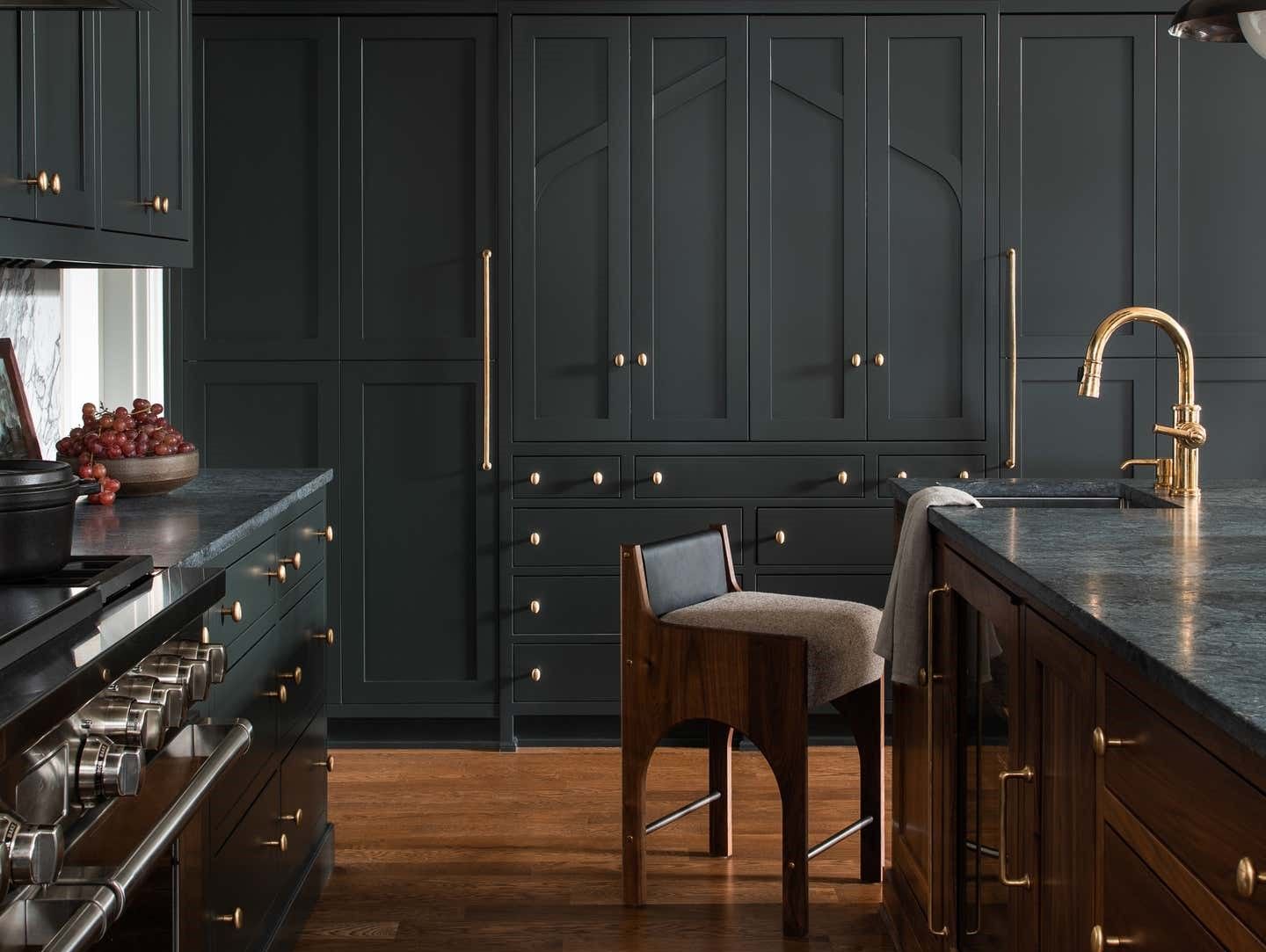
While kitchen color choice is entirely personal, there are inevitably certain shades that appear more luxurious than others. Colors with a warm undertone will appear more inviting that those on the cooler end of the spectrum, and anything too trendy will date more quickly than classic tones of white, cream, blue or green.
For an expensive-looking interior, stick to a restrained palette of one or two shades and add accents through elements that can easily be changed such as seating and artwork.
‘Often homeowners don’t take the time to choose the right paint color,' says San Diego-based designer Jennifer Verruto. 'If you have a warm palette and just ‘go with the standard white’ your painter uses, you could end up with a harsh hospital ‘glow’ that ruins the aesthetic you have worked so hard to achieve. Take the time to paint or get samples and place them in different sections of the room, to see how they look over the day and night, as well as with other details going into the space.'
5. Countersplashes
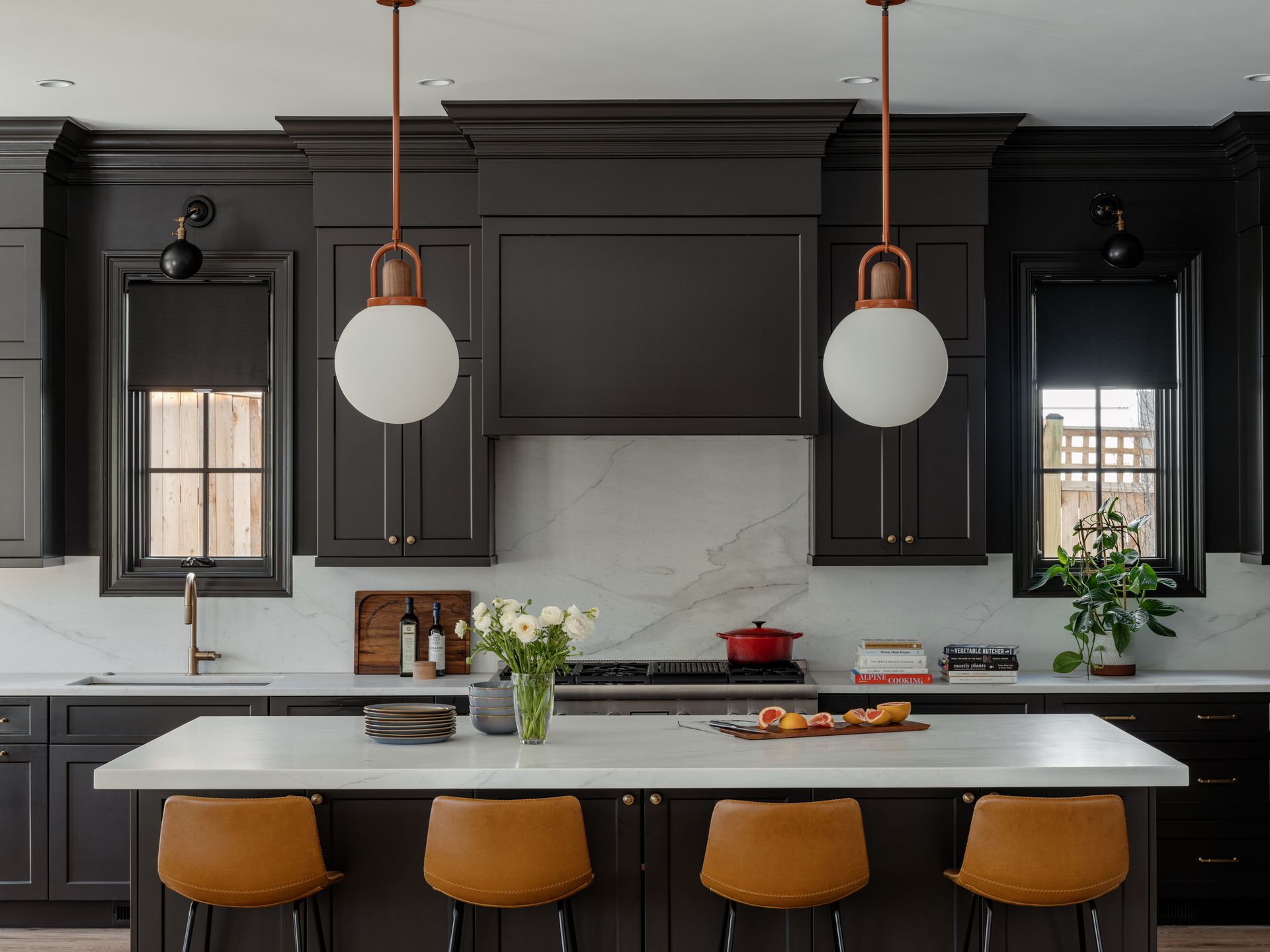
The right kitchen countertop material can take your kitchen from basic to extraordinary, adding an elegant feature that becomes central to the design and paves the way for a colour scheme. It may be that you choose a heavily veined marble or granite and the shades of the stone accentuate the cabinetry color. Or you might like to add a statement backsplash using a high-value material to show off your creativity.
‘Countertops come in a variety of materials from marble and granite to quartz and solid surface composites. With all these options, you have tons of ways to personalize your kitchen,’ says Jennifer. ‘I love to use waterfall islands, where the countertop extends down the sides of the cabinet, creating a seamless and striking focal point. Or for an elegant kitchen, ditch a tile backsplash and continue your counters up the wall for a high-end look. You can either go just to your upper cabinets or take it all the way to the ceiling.’ It's a kitchen countertop trend we're calling the "countersplash", and it's an easy, elevated way to streamline your kitchen design.
6. A back kitchen
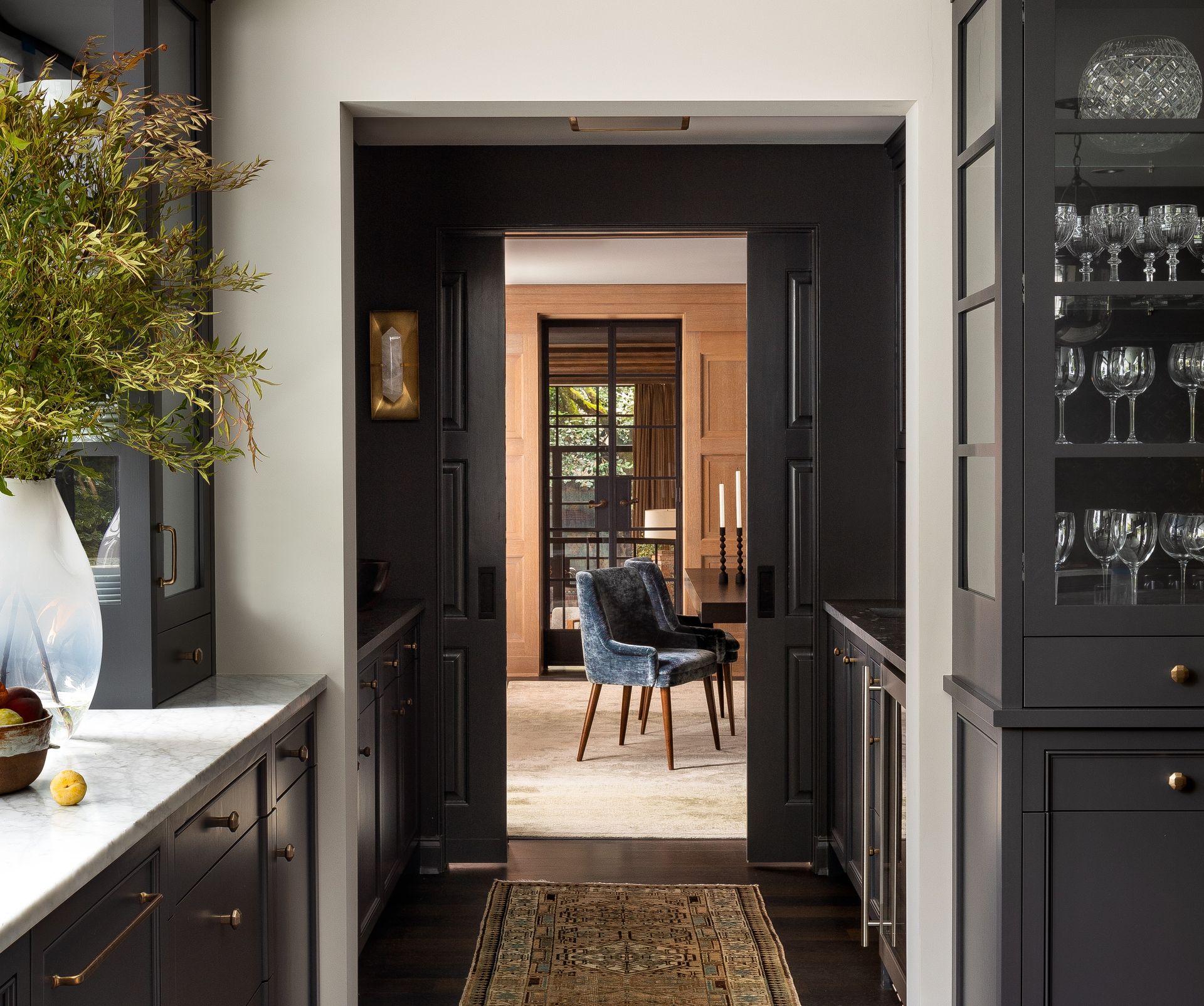
A clutter-free kitchen needs somewhere to keep the stuff that makes up everyday life. When planning your kitchen, allocate space for a secondary area, whether that’s a complete back kitchen with full cooking and storage capabilities, or a smaller utility area or a pantry.
These rooms are invaluable as extra storage space and somewhere to keep dirty dishes and extra food and drink when entertaining. Plus, by housing laundry appliances in a different room, you’ll free up space in the main kitchen.
7. Embracing architectural features
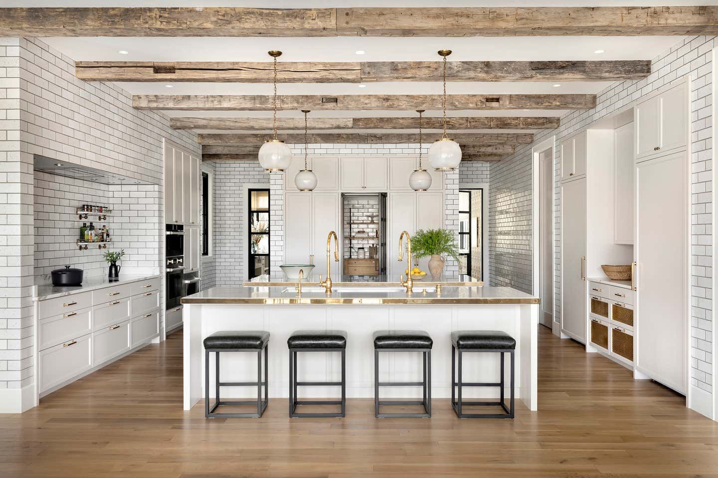
Does your space have elegant archways or original period features? Or maybe your property features exposed oak or steel beams? Lean into the character and architecture of your home when designing the kitchen.
‘It’s not about reinventing the wheel, but rather embracing the existing historical, craftsman style of a kitchen and updating it with top quality materials,’ says Jennifer.
Bespoke kitchen cabinet ideas can be designed to suit any space, so work with a good designer to embrace the unique characteristics of your home and create exquisite results that are perfectly in keeping with the surroundings.
8. Layered lighting
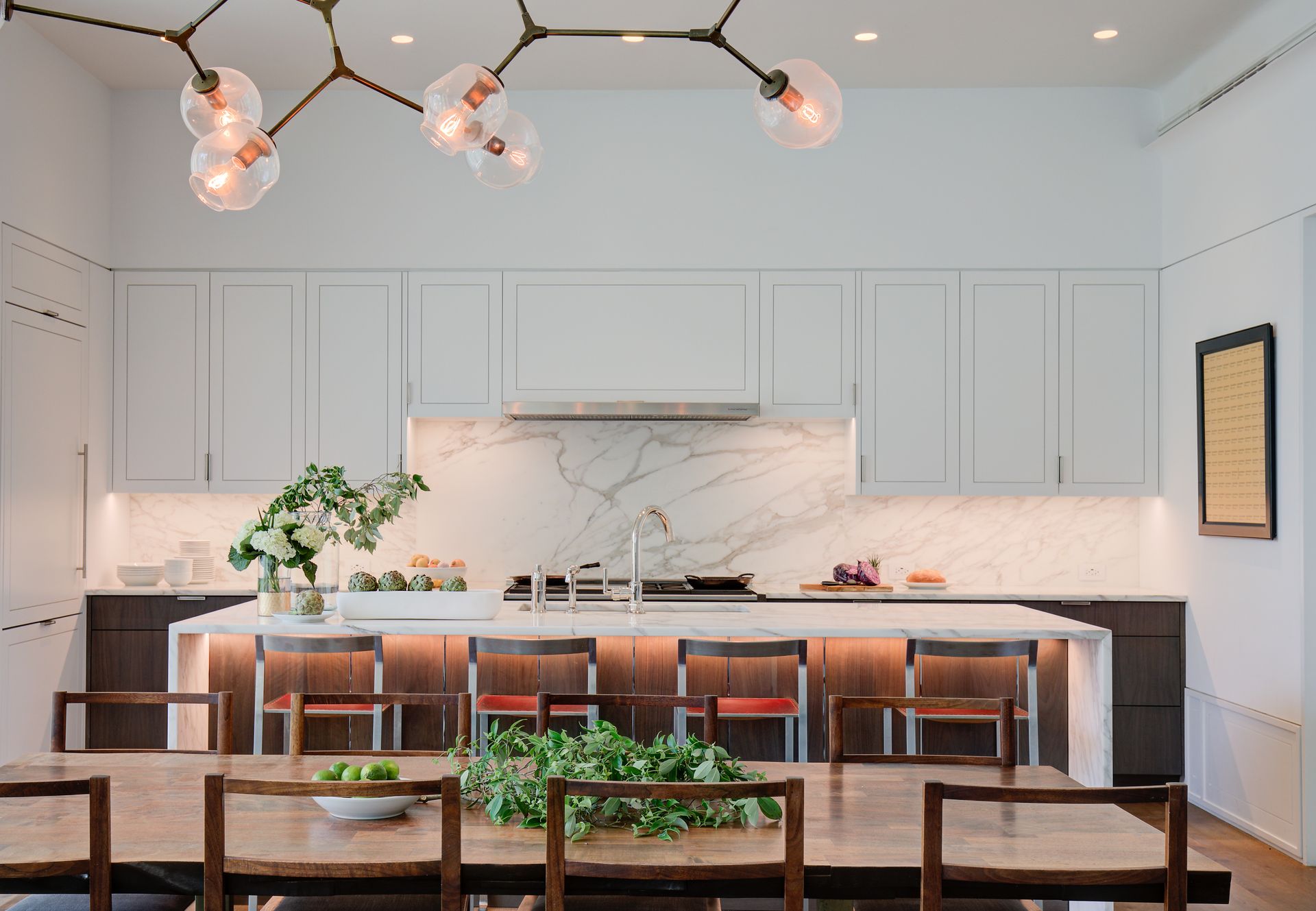
Choosing your kitchen lighting should come right at the start of your project. Think about where you’ll need task and accent lighting within your kitchen, whether that be overhead, as wall lights, or within glazed cupboards or beneath wall units or shelving.
If you’ve decided on a statement pendant, chandelier or series of overhead lights, make sure the kitchen plans account for this and work with the dimensions of your chosen fittings. Plus, if you want to add more lighting options than already available, draw these up into your floor and electrical plans from the outset.
The key to an elegant lighting plan is layers. A kitchen with flexible options for different lighting setups to suit different tasks and times of day will ooze sophistication. And always include dimmer switches to change up the mood at the touch of a button.
Price: $24.99
Price: $40.50
Price: $34.49
Be The First To Know
The Livingetc newsletter is your shortcut to the now and the next in home design. Subscribe today to receive a stunning free 200-page book of the best homes from around the world.

Lindsay Blair is a freelance editor, writer and content consultant with a focus on home design, interiors and lifestyle. Having spent more than a decade working in the UK publishing industry, she worked her way up to become the editor of Kitchens Bedrooms & Bathrooms magazine and now writes about all things home design for a range of national media. Follow Lindsay @lindsay__blair and check out her work at lindsayblair.co.uk.
-
 The 12 Best Table Lamps for Reading —I'm a Certified Bookworm (and Shopping Expert)
When it comes to table lamps for reading, I don't mess around. If you're the same, this edit is for YOU (and your books, or course — and good recommendations?)
By Brigid Kennedy Published
-
 "It's Scandi Meets Californian-Cool" — The New Anthro Collab With Katie Hodges Hits Just the Right Style Note
The LA-based interior designer merges coastal cool with Scandinavian simplicity for a delightfully lived-in collection of elevated home furnishings
By Julia Demer Published
