Kitchen peninsula ideas – 10 spaces that will convince you this island-alternative is a great layout option
A kitchen peninsula is suitable for all manner of spaces, helping your kitchen stay compact and stylish all at once
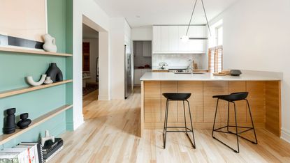

A kitchen peninsula is a useful addition to any kitchen. Jutting out from the wall, with space on three sides, they are space-saving, compact tools that can help to break up or zone space - creating a barrier between living and cooking stations. What's more, they are social spaces. 'Having a place to sit, perch, or prepare food in your kitchen is always a good thing, if you have the room then you should go for it,' says Helen Parker from deVOL.
When considering a peninsula for a modern kitchen, bear in mind the definition and the distinctions that make peninsulas so unique and different from U-shape kitchens or kitchen islands. 'A kitchen peninsula is attached to a wall or other kitchen cabinetry whereas an island is free-standing. In other words you can walk around a kitchen island but not around a kitchen peninsula,' says architect and designer, Uwe Schmidt-Hess of Patalab. 'The peninsula should add to the space and should look as little utilitarian as possible. It is more a piece of furniture.'
With this definition in mind, read on for our selection of kitchen peninsula ideas to add interest to your space.
10 kitchen peninsula ideas
Whether you have a large open-plan space, or a smaller kitchen, peninsulas work across the board. 'They’re perfect for more compact kitchens as you don’t need space all the way around them and are great for providing a little more worktop,' says George Glasier, Pluck co-founder.
'You can have fun with peninsulas – think about whether you want the same worktop as the rest of the kitchen. Also the material – the color or wood can be different, there is scope for shelves and even seating. There are so many fun aspects of the design to consider!'
1. Play with depth and height

When considering a kitchen peninsula, you need to really query whether you have space for one, and if not, reassess how you can make space. 'Kitchens need to be as functional as they are beautiful, and sacrificing floor space to fit an island will just give an awkward, uncomfortable look,' says Tom Howley.
'The importance of walkway space should be a key consideration. When designing your layout, always leave a meter of walkway space on either one or two sides of your worktop, island, or peninsula counter. This is a functionally and aesthetically effective dimension to keep in mind.'
If you don't have the space, consider building upwards. Standard kitchen countertop height is around 36 inches. However, if you are tight on space and looking for more storage, you can build your kitchen peninsula upwards, creating a kitchen peninsula with raised bar top. 'Factor in the possibility of using height to achieve what you wish with the peninsula,' says Benji Lewis of Benji Lewis Design. 'If the measurement from the floor to the top side of your worktop is 35 inches then you can still raise your pensinsula 4 - 6 inches above that if it’s going to gain you increased storage beneath it.'
Nook Architects remodeled this 220-square-foot apartment in Barcelona to accommodate a family of three. A marble peninsula counter comes out of the wall to divide the kitchen and dining area, and its width has been carefully calculated for breakfast bar space as well as kitchen storage on the other side.
2. Go for a stand-out material to draw the eye
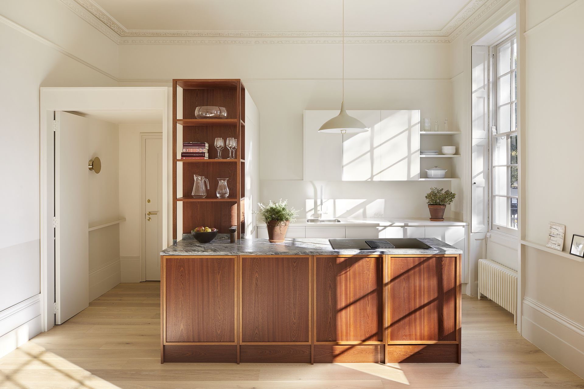
Kitchen countertops and kitchen cabinets do not have to match your peninsula. In fact, going for a contrasting color, stone or wood might make your peninsula pop all the more, helping it to standout from the kitchen design and making sure it is its own outright piece of beautiful furniture.
'In this project we made a point that it is very different from the rest of the kitchen,' says Uwe of Patalab. 'It is clad in Sapele panels and has a granite worktop whereas the rest of the kitchen is painted in warm white shades and has a white Silestone worktop.'
'The granite is durable and has a lot of character,' adds Uwe. 'Due to this choice of stone, the peninsula is a focal point in the open living space.'
3. Hang pendants above your peninsula
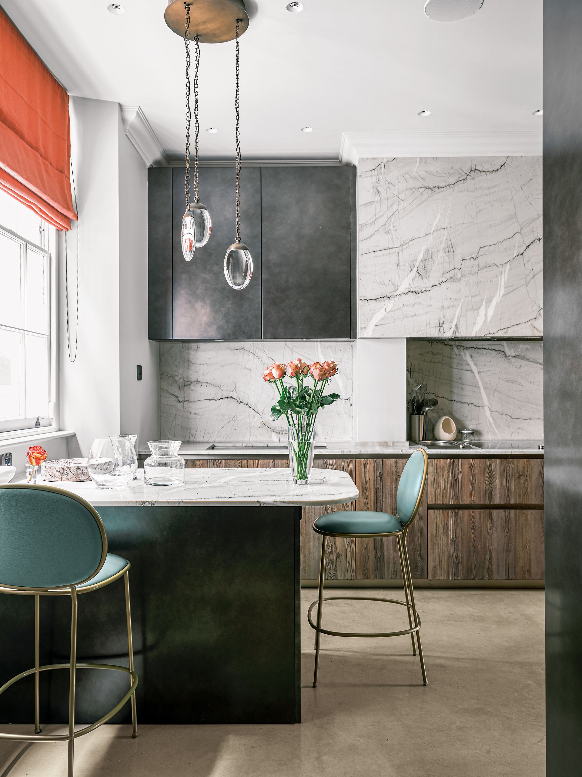
Lighting is of crucial importance in the kitchen. As a practical space, you need it to be well-lit with a solid number of lights, but equally transformable come evening time when you want to create a cozy room, perfect for entertaining guests. As well as your recessed lighting, LED lighting to illuminate space while at work, pendants are a kitchen classic, and give that decorative flair even thought they aren't the most functional of all the light sources. These sit perfectly above a peninsula - highlighting the space as a focus of the room.
'Always consider lighting, both as task and for creating an atmosphere; a single statement pendant light or a row of them look great to highlight your peninsula but arrange that these work on a dimmer so that once the job of chopping onions is over, you can reduce the illumination to cast a soft downwards glow,' says Benji Lewis of Benji Lewis Design.
One pendant alone, a pair, or an aesthetically pleasing grouping of three will do the trick, and go uniform for a stylish look.
4. Create a peninsula that doubles up as a breakfast bar

Your peninsula is a real space-saving tool, so consider how you can use the space you have to provide all you need in the kitchen area. 'Explore the option of doing something double depth,' advises Benji, 'so that you can get drawers storage (for example) one side of the peninsula and bar seating on the other.'
'If space is tight then use shallow drawers units - these can be 13 inches deep instead of full 23 inches depth,' advises Benji. This still gives you the space on either side of your peninsula.
When transforming into a breakfast bar setup, consider which side works best. You want more space for the side that will be seating, usually the side facing away and out of the kitchen area - avoiding stools in the way while you're trying to cook. This design is from Sola Kitchens.
Invest in your kitchen stools too. 'You can design the most beautiful kitchen but if the stools are unadventurous and bland the kitchen will fall flat,' says Ben Leavitt from PlaidFox. 'Great design is made in the last ten percent and when it comes to the kitchen that ten percent is the counter stools. Bold colors, textures and an interesting form will all add a level of complexity to your kitchen you will never grow tired of.'
When it comes to how many stools, you only need half the number of counter stools you think you do, advises Ben. 'The fewer the stools the more open and spacious it makes the peninsula feel. Tuck a few away in a storage closet and make more standing room around for all.'
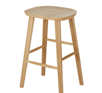
Oak kitchen island chair, Maison du Monde
These sturdy, solid oak stools are a lovely addition to any style of kitchen. Go for two or three for a casual breakfast bar setup.
5. Or make room for a cute seating area

Here, the kitchen peninsula creates a snug space for a cozy nook. 'In my experience, one of the main reasons a client would want a peninsula or island would be to introduce a seating area,' says Jonathan Mickelborough of Tom Howley.
Here, the kitchen island has created an opportunity for relaxed dining. Where previously there would've been an unused corner, there is now a corner bench that slots perfectly into place. The home is part of the Ghost Houses project by the architectural developers Fraher & Findlay.
6. Use two contrasting materials to add interest

Your peninsula needn't be one complete material on the kitchen countertop. Use two different materials that complement each other. In this instance, a San Simone quartzite worktop and the gleaming copper look beautiful together, and help the zones distinguish from each other.
'Each slab of San Simone has its own unique character and the stone can vary dramatically from batch to batch. Quartzite is similar to granite and consequently has a much higher resistance to scratching and staining than limestone or marble,' says creative director Helen Parker.
'The copper, we've coupled with it is shiny and looks rare and precious and turns out to have amazing antibacterial properties which now make it even more desirable. It has a gentle glint when the sun shines, and mixed with the San Simone, it creates a whole new look.'
'Using high-end materials paired with solid carpentry, makes a peninsula an integral part of your kitchen whilst still letting it be a feature in its own right,' adds Tom.
7. Create a neat spot for books

Another space-saving kitchen idea for your storage is to pop all your cookbooks and coffee table reads on display at the end of your peninsula.
It's a handy place for them all to sit, easily accessible and only means your peninsula has to jut out that little bit extra to accommodate your book selection.
8. Go curved
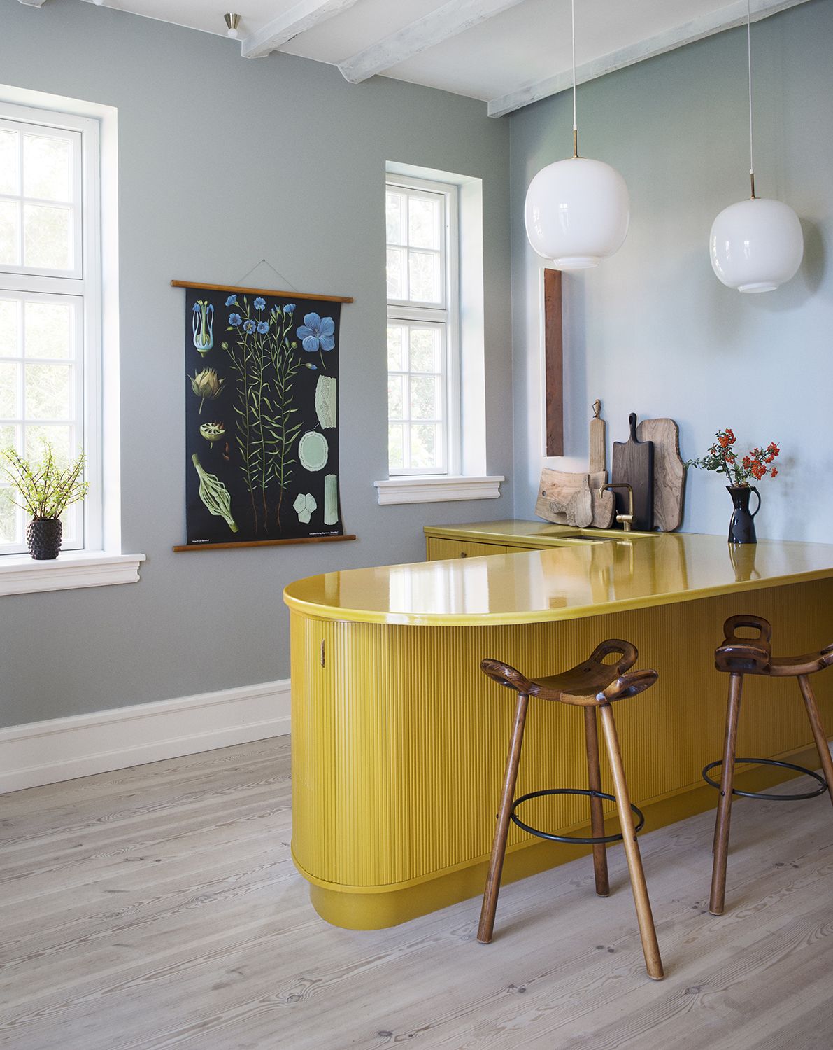
This handcrafted tambour kitchen is the work of Danish design studio and cabinetmakers Københavns Møbelsnedkeri, who created a bright sunshine yellow curved island to take center stage in this uplifting space and make for a colorful kitchen idea.
‘The cabinetry is painted in a warm and welcoming honey-mustard shade, which was created especially for the kitchen,’ say its designers, who collaborated with stone experts Made A Mano on the yellow stone countertop and tiles.
The curved aspect also helps soften those harsh edges in the kitchen, and avoids any nasty bumps into sharp corners. For another curved shape, consider the rounded edge, otherwise known as the bullnose. 'The edge profile of the stone greatly changes the feel and look overall. I think the bullnose adds a level of modernity and softness to a kitchen that a sharp edge does not,' says Ben.
9. Go luxe with natural stone
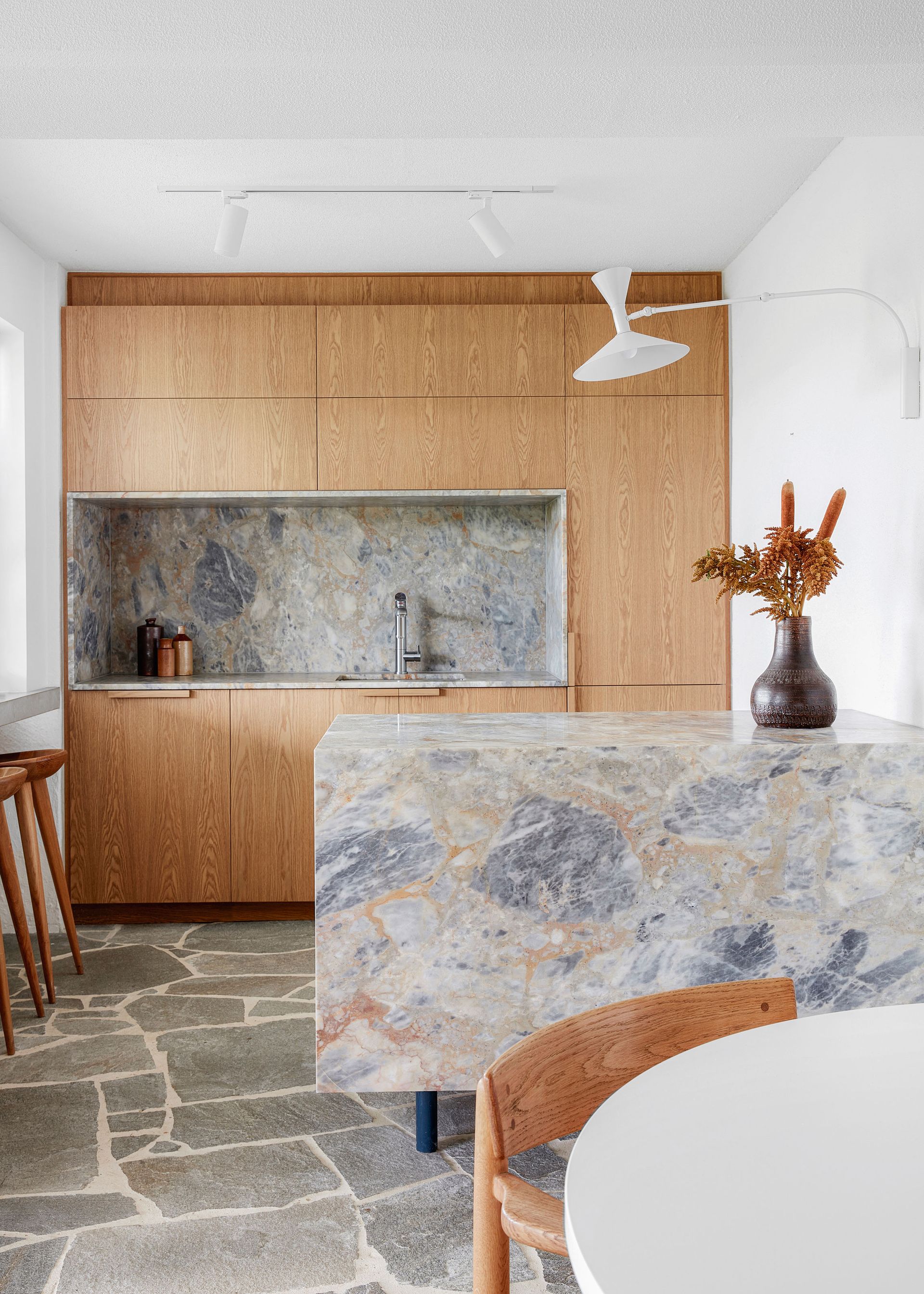
Solid surface peninsulas in one seamless material brings an impact and drama to your kitchen. Whether you choose a kitchen countertop material like quartz, or an incredible natural stone as in this kitchen by designers Studio Esteta, it brings a monolithic look that can help to simplify the design of an ambitiously minimalist kitchen.
However, bear in mind, for this look to work, you may be sacrificing storage in a peninsula, as well as the option for comfortable seating at your countertop.
10. Try tiling

Pick a luxurious-looking tile to give your peninsula some sheen. In this Madrid home, the glazed green tiling has been used to express the heritage of the homeowners - who are Mexican and Galician. The Sierra + de la Higuera team mixed focused on vivid colours: bright yellows, greens, blues and reds, paired with materials like tiles, ceramics and fine wood. The idea of mixing gloss peninsula tiles with the matt kitchen floor tiles makes for a beautiful finish.
Be The First To Know
The Livingetc newsletter is your shortcut to the now and the next in home design. Subscribe today to receive a stunning free 200-page book of the best homes from around the world.

Oonagh is a content editor at Livingetc.com and an expert at spotting the interior trends that are making waves in the design world. Writing a mix of everything and everything from home tours to news, long-form features to design idea pieces on the website, as well as frequently featured in the monthly print magazine, she's the go-to for design advice in the home. Previously, she worked on a London property title, producing long-read interiors features, style pages and conducting interviews with a range of famous faces from the UK interiors scene, from Kit Kemp to Robert Kime. In doing so, she has developed a keen interest in London's historical architecture and the city's distinct tastemakers paving the way in the world of interiors.
-
 These 12 Best Table Lamps for Your Desk — Perfect Glows for a Creative Home Office
The best table lamps for your desk is have a soft, targeted glow. Elevate your WFH set-up with these stylish picks endorsed by Style Editor Brigid Kennedy
By Brigid Kennedy Published
-
 The Nespresso VertuoPlus is 30% Off for President's Day, and it's Kim Kardashian's Coffee Maker of Choice
This sleek and stylish coffee maker was spotted in Kim's home bar, and you can currently save $60 if you buy yours from Amazon
By Lilith Hudson Published

