8 tricks to create a minimalist color palette that doesn't feel one-dimensional - elevated and enriching schemes
Leading designers explain how to create a minimalist color palette that is full of layers, depth and personality, despite being pared back and calm

When you think of minimalism, thoughts of empty, stark, and somewhat sterile spaces might spring to mind. But there’s a lot more to the interior design trend than simply ridding a room of clutter.
As Mark De Reus, Founding Partner at De Reus architects puts it: “Just because a lack of ornamentation is intrinsic with minimalism, doesn’t mean there is a risk of being one dimensional. In fact it’s the opposite, there is an integrity, an authenticity to work with that has a much deeper design meaning that decoration.”
How to create a minimalist color palette that doesn't feel one-dimensional
By thoughtfully bringing varying tones, textures and natural materials into your minimalist color palette, you can design a room that’s both calm and characterful. Keep reading for tips from leading designers on how to achieve this look.
1. Focus on one integrated idea

Minimalist living rooms must feel cohesive to create a sense of serenity and calm. That’s why the first step when designing a minimalist color palette must be to decide on a clear direction or concept for your scheme.
“Look at the objects/fabric/color that inspire the voice or idea of a space and let that particular element lead the direction of the rest of the space,” says Faith Swickard, Project Manager at Wittman Estes. “Create an environment where each individual component works towards one integrated idea.”
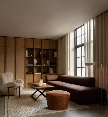
A simple way of creating cohesion is through color drenching – when a room is literally ‘drenched’ in a single hue. By painting areas like the ceiling, skirting, doors and radiators the same color, you can create a cocoon-like effect. You can even add furniture in a similar tone, as demonstrated in the design by MENU above.

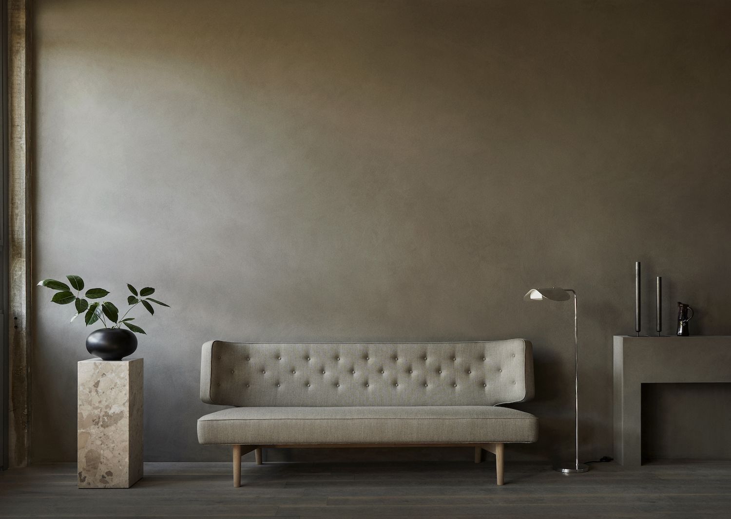
This glossy black vase by Anissa Kermiche adds a sensual element to a minimalist scheme.
2. Think low contrast, high texture

Create contrast through texture, rather than color. In the minimalist kitchen above by Norm Architects for Reform, the matt, painted wood kitchen cabinets contrast with the varnished, natural wood dining table. However, the gray of the cabinets and brown of the wood are tonally similar.
You can also use a mix of different paint finishes to achieve a textured effect. “If you paint walls/trim and ceiling the same color, it's nice to vary the finish of the paint so there's some visual depth created,” says the design team at Curated Nest. “A tone-on-tone approach can be nice as well, not too aggressive on the eyes as it creates a natural progression from one color tone to the next. I would keep the space low in contrast.”
Danielle Krieg, Interior Designer at Studio AM echoes their advice: “Playing minimally with subtle color materials, the mix of paint finish sheens and use of textures and patterns helps to create a minimalist color palette for use in virtually any space.”
3. Use a variety of tints and shades

Another way to create depth is by using a variety of tints and shades of a single color. In the example above by MENU, the varying earthy browns and beiges create a cohesive yet interesting look.
“The key to creating a successful minimalist color palette is to use a variety of tints and shades to create interest and variety while still maintaining a clean aesthetic,” says Jessica Earp, an interior designer at Cushing Terrell. “An example: while working with a design that centers around crisp white, bringing in soft creams and muted tans will add depth and shadow without taking away from the minimalist look.”
4. Add tiles to play with light and texture

Including tiles in your scheme – whether on the floor or walls – not only adds texture, but can help to redistribute light around the room in a way that creates depth and interest.
“We understand that color is not the only important factor to consider,” says the Salvatori brand. “Shape and texture bring a sense of interest and contemporary appeal that is emerging in 2023. Geometric tiles can be applied to the entire wall surface or they can be used sparingly to create a feature wall that adds interest to a space. Salvatori’s original Romboo texture, for example, creates hexagonal shapes by bringing three small diamond tiles together. When hit by the light, the textured pattern produces a striking three-dimensional effect.”
If you’re designing a minimalist bathroom, the brand team recommends using tiles to create “zones” within the space, whether that’s “a spa area or make-up counter”.
5. Create a blendable scheme and layer with textiles

If you want to use different colors in your scheme, go for colors that are easy to blend together. Then, to avoid the room feeling flat, build up layers of texture through varying textiles. In the design above by MENU, the beige living room could risk feeling one-dimensional if it wasn’t for the elevated use of texture in the room.
As Mark De Reus of De Reus Architects explains: “Dimensionality can be achieved in recognizing the overall space is the essence to build off of, then layers are added to enhance the spatiality: natural light, geometry, materiality, etc.”
6. Use alternatives to painted walls

Many designers are currently using wooden wall paneling as a warmer and more dimensional alternative to paint. “If you are concerned that your minimalist design plan might feel too stark, consider (natural or painted) paneling that matches cabinetry included in the room or elsewhere in the home,” says Kathleen Glossa, Principal Designer at Swivel Interiors. “If the wall is brick and a structural component of the home, then allowing its presence as part of the greater plan works.”
If you decide to invest in paneling, make it blend with the space rather than apply it as a ‘feature’ wall. “Don’t be afraid of using a unique material (such as wood, plywood, tile, brick etc.) for more than just one wall,” says Faith Swickard at Wittman Estes. “To keep the space feeling minimal, repeat the wood on more than one wall or in the color of the furniture.”
7. Let materials speak for themselves

Minimalism today evokes a sense of calm by reconnecting us with the natural world through organic materials. Bringing wood and stone into your scheme is also a great way to include rich, warm and neutral tones. To treat these materials in the most minimalist way, keep the finishes natural and authentic.
“An approach which could be considered minimalist—or as we consider our own work, essentialist—is to simply let materials express themselves without layering on sheetrock, paints or finishes,” says Ben Waechter, Principal at Waechter Architecture. “We recently completed a mixed-use infill project (where I both live and work) employing all mass timber construction. In this way the nature of the material really influences the character of the space.”
Waechter continues: “We are all for authentic materials and honest construction. Pairings of wood and brick, or wood and stone, or concrete and wood, etc. can all feel minimal and essential, so long as each is serving a legitimate purpose. It’s all in the handling of each, and their points of intersection.”
8. Create an indoor/outdoor connection

As minimalism seeks to reconnect us with the natural world, try letting nature guide your color palette. Whether you use wooden furniture and paneling (like in the design above by Wittman Estes) or paint your walls in colors from nature, it will help achieve an indoor/outdoor effect.
“The strength of minimalism comes from its ability to bring nature inside: the light, shadows, stone, and wood,” says Faith Swickard at Wittman Estes. “An example of a design language one could use for a space is an ‘indoor/outdoor connection’. With this idea, choose colors that bring nature into your space. The key is to create a design language that speaks to one integrated whole. Then, implement that idea in the color, fabric, shape, and volume choices.”
Be The First To Know
The Livingetc newsletter is your shortcut to the now and the next in home design. Subscribe today to receive a stunning free 200-page book of the best homes from around the world.
Kate Hollowood is a freelance journalist who writes about a range of topics for Marie Claire UK, from current affairs to features on health, careers and relationships. She is a regular contributor to Livingetc, specializing in reporting on American designers and global interiors trends. Based in London, Kate has also written for titles like the i paper, Refinery29, Cosmopolitan and It’s Nice That.
-
 The 12 Best Table Lamps for Reading —I'm a Certified Bookworm (and Shopping Expert)
When it comes to table lamps for reading, I don't mess around. If you're the same, this edit is for YOU (and your books, or course — and good recommendations?)
By Brigid Kennedy Published
-
 "It's Scandi Meets Californian-Cool" — The New Anthro Collab With Katie Hodges Hits Just the Right Style Note
The LA-based interior designer merges coastal cool with Scandinavian simplicity for a delightfully lived-in collection of elevated home furnishings
By Julia Demer Published

