Designers agree on the perfect minimalist color palette - 'beautiful, pared-back, very curated'
A minimalist color scheme should be as the name suggests, minimal, but how many shades can you bring into a pared-back space?


Minimalist color schemes, sound fairly simple to get right. There's not a rainbow of colors to choose from a first glance, which makes things slightly easier when it comes to picking out shades, however, the risk with minimalist color schemes can be that they lack depth and interest. So as well as the actual colors you choose, the amount of colors you choose matters too because it's this layering of shades that's going to give the space that much-needed depth.
But how many shades should you choose for a minimalist scheme? How many is too many so you lose that simplistic vibe? How many is too little so the scheme feels a bit two-dimensional? We spoke with minimalist interior designers and color experts to get their advice.
How many colors should be in a minimalist color scheme?

We always recommend playing relatively fast and loose with any interior design 'rules' but when it comes to the amount of colors to use in a minimalist design scheme, it's best to stick with the tried and tested.
So what is the perfect number of shades to bring together in a minimalist space? You want to achieve that lovely layered look that synonymous with this style, but at the same time remains chic and simple?
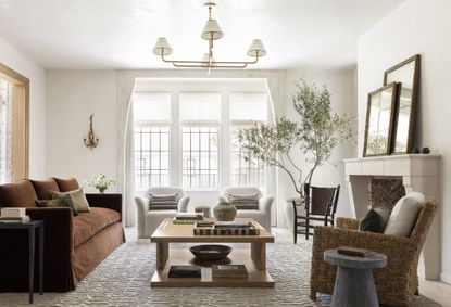
'If you are going minimalist you want that beautiful, pared-back very curated selection of pieces and colors. I would say actually say this rule applies to any style, not just minimalism – never bringing more than three colors into a room and no more than six to eight colors for a whole house,' explains Tash Bradley, head of interior design at Lick.
Designer Kathy Kuo agrees that 'For a truly minimalist color scheme, I would recommend no more than three colors in your motif. That said, I always think it's nice to use multiple shades of one color and let them play off one another. As long as the other hues you choose are analogous rather than contrasting, the effect will still be beautifully minimal and sophisticated.'

So three to four colors work best when decorating with neutrals in a minimalist sheme. However, as Kathy mentioned, within those colors you choose are different tints and shades so it's not just a case of using three of exactly the same colors across the whole room you can bring in versions of those colors to create a layered, tonal look.
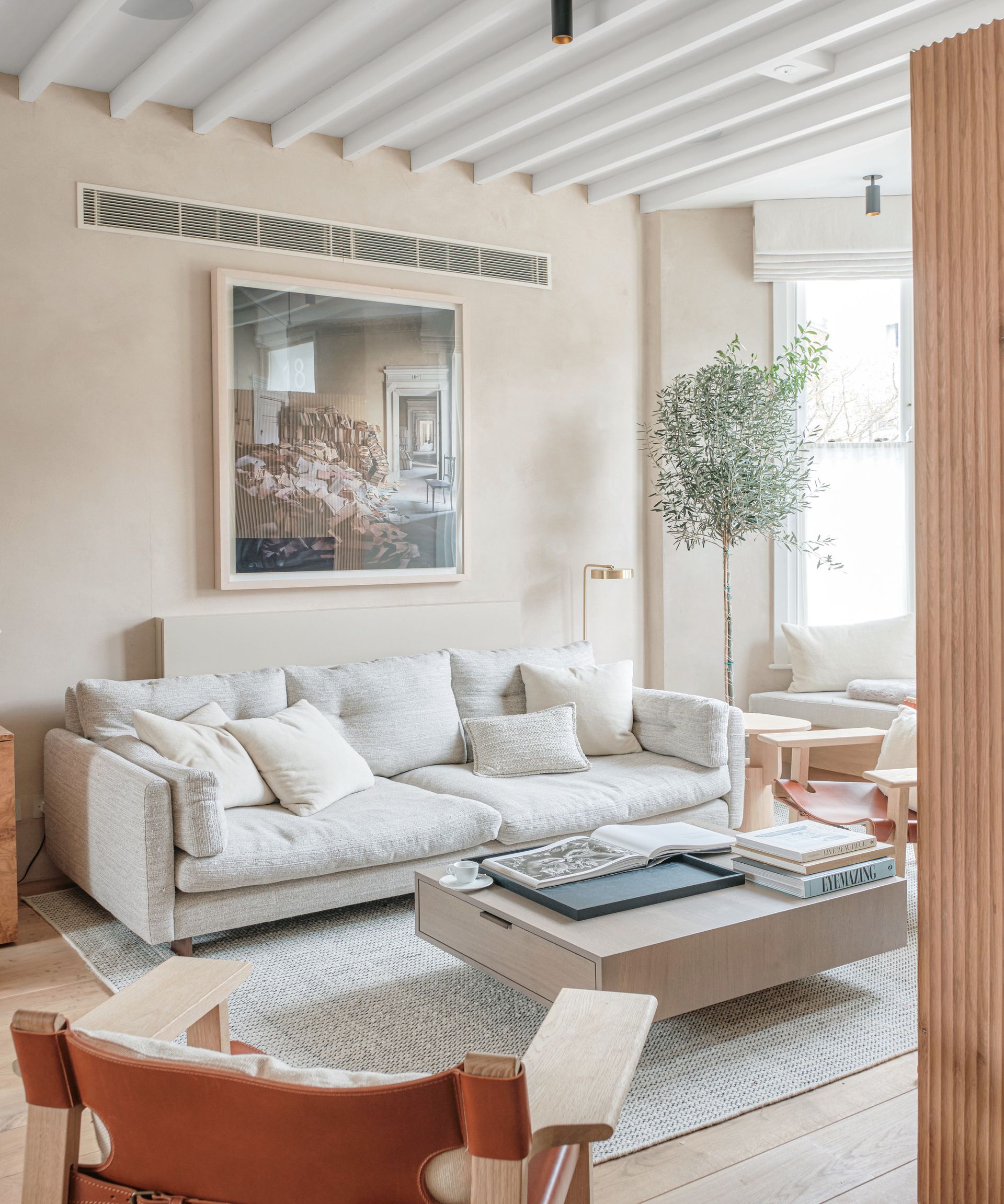
As Kati Curtis explains, 'A minimalist color scheme typically includes a range of three to four versions of the same hue. This palette generally consists of subdued hues such as whites, grays, and beiges, which create a calm and uncluttered atmosphere.'
'An additional one or two accent colors, often derived from cooler or warmer undertones of the hue’s shades, can be incorporated to add subtle variety and visual interest. Balance and harmony are key in a neutral color scheme, preventing it from becoming too monotonous or overwhelming.'
Tom Rutt, founder of TR studios agrees, 'In a minimalist color scheme, you’re looking at using three or four complimentary colors in the same tone. Neutrals including grey, taupe, beige, black, and earthy wood tones are commonly used in minimalist interiors. The trick is to choose variations on a color and layer it through your interior in a broad and textural materials palette. This will add a timeless, classic elegance and a luxury aesthetic to your space.'

You could also go for a monochrome approach, taking just one shade and using its tints and shades to create a soft, serene, harmonious space that's super minimal but has a depth too. 'I think one of the most interesting takes on a minimalist color scheme is to use the same color and add various saturations to the mix. So, while there might be one dominant color in the room, experienced in multiple tones, showcasing the versatility of one color,' explains Marie Flanigan.
'Further, if you’re more of a purist and looking for minimal color variation, adding different textures and a few accent colors is important to keep the room inviting. If you’re working with light colors, these accents keep the space from feeling too sterile. My suggestion would be to add at least two complementary accent colors and weave those tones into your artwork, throw pillows, rug or accessories while keeping walls, drapery, and most soft furnishings true to the room’s main color.' she adds.
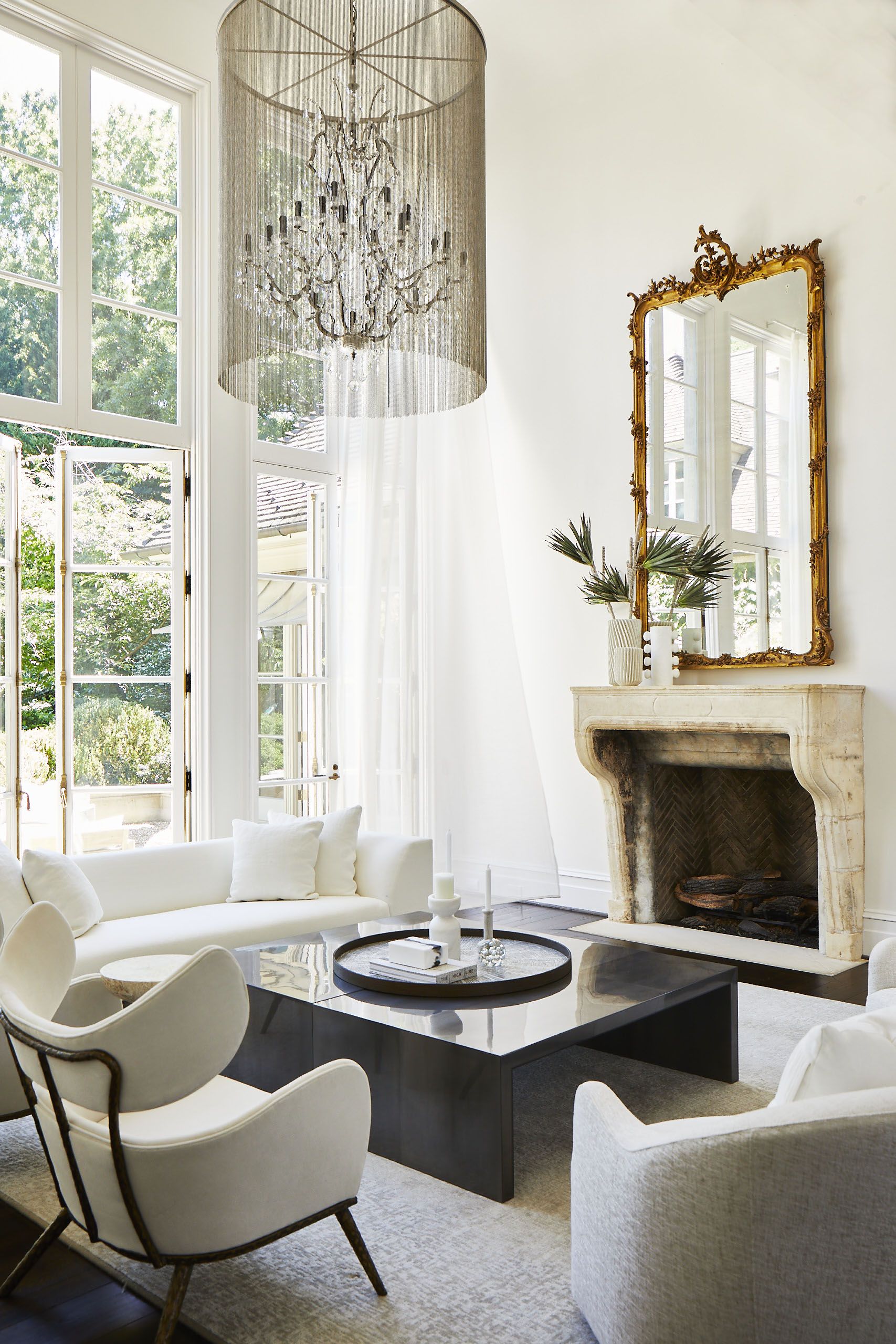
Notice with all these minimalist spaces, there are no super bold contrasts, even if darker shades are added, there are variations on that shade that make it less intense. 'When it comes to decorating in a minimalist way, you want less contrasts,' adds Tash. 'So would color drench the room. So if we are going for a warm white, wrap the whole room - the walls, woodwork, ceiling, windows, everything. And then bring in a second color with the largest piece of furniture and then the third color could be added with an area rug.'
What combination of colors work in a minimalist color scheme?

Despite usually always being based around a neutral color scheme, the colors associated with minimalism do change slightly with interior design trends.
'Right now, an on-trend minimalist color scheme, is very earthy, it's all about warm neutral tones,' explains Tash. 'What I am really enjoying at the moment is people are totally moving away from grey. I am seeing less and less grey in color trends and it is not a color that any asks for in their homes anymore. It's all about the warm earthy neutrals. So, red or yellow-based whites and beiges and taipes that really suit minimalist schemes. These colors go very well with the natural textures you also often find in a minimalist scheme.'
'In a minimalist interior, it is crucial to maintain a sense of simplicity by limiting the variety of materials and colors used. When opting for color, consistency is key to creating a striking impact. Neutrals are classic choices that consistently work well, I tend to favor warmer tones to infuse a sense of comfort into the minimalist setting and I like to avoid using clean white which can look too flat,' explains
Kashi Shikunova founder of Yam Studios.
'Additionally, muted yet rich colors can be highly effective in minimalist interiors. Examples include soothing olive greens and deep browns. The muted tones contribute to a sense of serenity and tranquillity, while the deeper shades can add almost a spiritual ambiance to the space. The key principle here is to apply the chosen color consistently throughout the design, aligning with the core ethos of minimalism.' she adds.

Texture is also a key part of the minimalist color scheme. Yes okay, texture isn't exactly a color but it's as important as the color you choose and all part of the scheme as the shades.
'In my world and in my rooms, texture is the new color,' explains Lisa Sherry. 'Texture is expressed in natural fibers, weaves, and layers; tactile surfaces, found objects, reclaimed wood, stones, and metals. Smooth is even a texture. I use texture rather than bold and divergent colors to add personality to a space. Texture is dynamic. And subtle. It elevates a neutral color scheme in modern, minimalistic interiors.'
Minimalist buys to elevate your home

Price: $42.99
Height: 11 3/4 in

Price: $105
Height: 5.9in

Price: $15.96 for three
Height: 3.35in, 4.33in, 5.12in
Be The First To Know
The Livingetc newsletter is your shortcut to the now and the next in home design. Subscribe today to receive a stunning free 200-page book of the best homes from around the world.
Hebe is the Digital Editor of Livingetc; she has a background in lifestyle and interior journalism and a passion for renovating small spaces. You'll usually find her attempting DIY, whether it's spray painting her whole kitchen, don't try that at home, or ever changing the wallpaper in her hallway. Livingetc has been such a huge inspiration and has influenced Hebe's style since she moved into her first rental and finally had a small amount of control over the decor and now loves being able to help others make decisions when decorating their own homes. Last year she moved from renting to owning her first teeny tiny Edwardian flat in London with her whippet Willow (who yes she chose to match her interiors...) and is already on the lookout for her next project.
-
 The 12 Best Table Lamps for Reading —I'm a Certified Bookworm (and Shopping Expert)
When it comes to table lamps for reading, I don't mess around. If you're the same, this edit is for YOU (and your books, or course — and good recommendations?)
By Brigid Kennedy Published
-
 "It's Scandi Meets Californian-Cool" — The New Anthro Collab With Katie Hodges Hits Just the Right Style Note
The LA-based interior designer merges coastal cool with Scandinavian simplicity for a delightfully lived-in collection of elevated home furnishings
By Julia Demer Published

