8 'grown-up' ways of decorating with pastels that show how to take this color trend beyond kids' bedrooms
Pastel color palettes can be grown-up and sophisticated if handled right. The experts tell us how
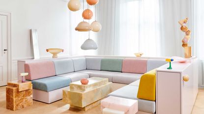

Pastel colors have long been associated with children, youth, innocence, and whimsy. In contemporary homes, the delicate palette is limited mainly to children’s bedrooms. Pastels contain a heavy dose of white, giving them a high brightness value and low saturation that awards them a soft, soothing quality that is easy on the eye. It’s worth remembering that pastel shades were de rigueur in 18th-century high society and, slightly more recently, in the 1950s post-war context to channel a sense of calm and joy. So, how can we stretch the pastel shades beyond kids' bedrooms and restore their reputation as a sophisticated, contemporary ‘grown-up’ palette?
‘Pastel shades work in any space,’ says London-based interior designer Naomi Astley Clark. ‘From duck egg blue joinery in a country boot room to a calamine pink London kitchen, when you apply the tones correctly, they work anywhere.’
This color trend is also a great way to brighten up and invigorate a space. Though, as Poland-based interior designer Marta Chrapka of Colombe Studio rightly reminds us, ‘despite their delicacy, pastels are a bold choice in the interior. So, before you convince clients - or yourself - to use them, it’s important to ensure they match their - or your - character and style.’
Regan Baker, founder and principal designer of Regan Baker Design, agrees, ‘you have to be personally open to color. Lighter pastels with a more nature-inspired feel, like green, earthy, and peachy colors, can work well when used thoughtfully.’
Interior designers and color experts peel off the ‘childish’ label previously attached to these delectable ice cream shades by sharing creative ideas on decorating with pastels in a sophisticated manner. Ready to broaden your pastel perspective?

Sophie is a freelance writer and interior designer, who has contributed to some of the world's best interiors magazines. She asked the experts how to elevate a pastel color palette and make it fit for contemporary, adult spaces.
1. Apply the 60-30-10 rule
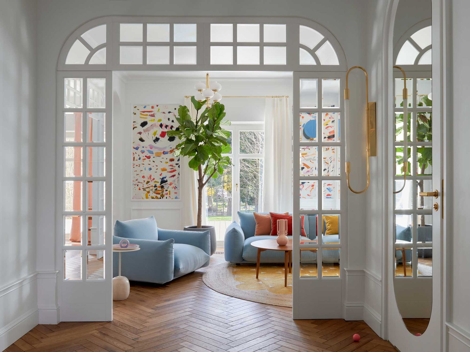
‘It would look too sickly if everything were pastel,’ says Tash Bradley, Director of Interior Design and Color Specialist at Lick. ‘When a color is overused, particularly in a frequently visited space, it can elicit an adverse effect. However, when you use it in the correct proportion, you get all the positive qualities from it.’ To achieve a balanced color scheme and get the best out of your preferred pastel shade, she suggests abiding by the 60-30-10 rule.
Under this rule, 60% of your space will feature the base color covering the largest surface area, i.e., the walls. 30% is the scheme's secondary color or ‘accent color’ and usually contrasts the primary color to command attention. This could be a sofa, window treatment, bedding, or an area rug. The final 10% will be your pop of color, introduced through decorative accessories, artwork, or fittings and finishes. Start by deciding how much pastel you want to feature, and take it from there.
‘It’s all about layering,’ explains Tash. The idea is to layer different tones on top of each other to create interest and dimension.
2. Anchor pastels with darker shades

‘Team pastels with strong, dark colors to counterbalance them in a modern way,’ suggests Patrick O’Donnell, Brand Ambassador and Color Consultant at Farrow & Ball. ‘This will change their character from pretty and restful into something more dramatic and edgy.’ High tonal contrasts add depth and dimension and prevent a color scheme from falling flat.
Naomi agrees on this trick for creating a color palette. ‘The key to making sure pastels are not too playful or childlike is to blend them with more serious and somber shades,’ she says. ‘Layering too many pastels in one space can be overbearing and nursery-like.’
3. Go monochrome

Monochromatic color schemes are a fun and contemporary way to introduce pastels. ‘Monochrome refers to a one-color scheme created using different tones of that one color,’ explains Tash. ‘So, let's take blue as an example. You could incorporate pastel blue as the lightest shade on your walls as the dominant 60% color. Then, you go up one shade to a mid-pastel so that it has a little more depth to it and use that as your 30%, and then you introduce your final color, which is almost like a dark blue, adding depth and giving the room a more mature feel.’
‘If you want to design an entire room in pastel shades, more tonal play and texture will help elevate it and make it feel more sophisticated,' interior designer Regan Baker agrees. She suggests using supple textures like velvet coupled with metallics like brass to create a more decadent and refined look.
4. Color drench a powder room

'You don’t spend much time in the bathroom, especially a powder room,' says says Tash from Lick Paint, 'so if you wanted to go all out pastel, that would be a good place to do it. Because it’s a small space and, unlike a living or dining room where you may host or sit in it for hours, there’s less chance of you getting sick of it.’
Marta Chrapka of Colombe Studio’s downstairs bathroom in her Saska Kępa project is a case in point. Pastel pink tiles grace the floor, walls, and basin area, and the door is painted in a matching shade, resulting in a fun, playful, and refreshing space.
5. Make pastels the new neutral

‘Because of their heavy white pigment, pastels can almost play as a neutral,’ says Tash. ‘The best one would be a very pale pink because pink pairs with every color. That’s why it is often referred to as a "new neutral".’
Using pastels as a neutral also presents a good opportunity to play with an analogous color scheme. Stick to three colors that sit next to each other on the color wheel, like red, orange, and yellow, and create variations with different shades and tones of each color. ‘Imagine you’re refurbing your living room; you could do a pink plaster wall, with a pastel orange ceiling, and then a dark orange sofa and sunny yellow scatter cushions,’ suggests Tash.
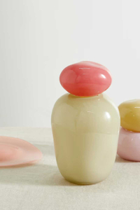
Shop Helle Mardahl at Net-a-Porter
You can shop Helle Mardahl's contemporary pastel glassware at Net-a-Porter for a modern take on this color trend.
6. Use pops of pastels

If you’re experimenting with pastels for the first time, start with small things you can gradually build up. Interior designer Regan Baker of Regan Baker Design showcases effective use of playful pops of pastels in her Duboce Colorful Contemporary project. ‘Sherbet colors were used in the dining room and as accents in various rooms throughout the home, which infused the space with the client's more playful personality,’ she says. ‘By using them in small doses, like fun and unexpected pops, it makes it more palatable and “grown up.”’ For example, she suggests featuring artwork with pastel shades for a subtle introduction to the colors. ‘It’s a great way to incorporate more playful pastel shades that still feel sophisticated.’
‘Small pops of pastels bring so much joy because they add soft touches of color to a space,’ adds Tash. ‘Where a trendy bright pillar box red catches your attention as soon as you walk into a room, pastel shades don’t command as much attention,’ she explains. ‘Because they have all the saturation knocked out of them, they are an easy, gentle way to bring color into the home.’ Pops of pastels don’t scream at you from the other side of the room but become a pleasant surprise as you move around and focus on the space.
7. Sweeten up the contours

Tap into the trend of muted walls and colorful cornices, crown moldings, and baseboards. Pastel trims look fresh and contemporary and offer a quick and inexpensive way to update the space and highlight your home’s unique architectural features. Paint the walls white with a subtle undertone that matches your chosen pastel shade for a subtle effect.
Tash recommends using a high gloss finish when using color on trims because ‘it looks more designed. High gloss is more reflective than eggshell, giving it a bit more edge and adding a textural difference to the matt walls,' she explains.’ If you have a window with a nice view of the garden, Tash suggests opting for a pastel green ‘to bring the outdoors in and make a soft transition.’
8. Experiment with pastel wallpaper
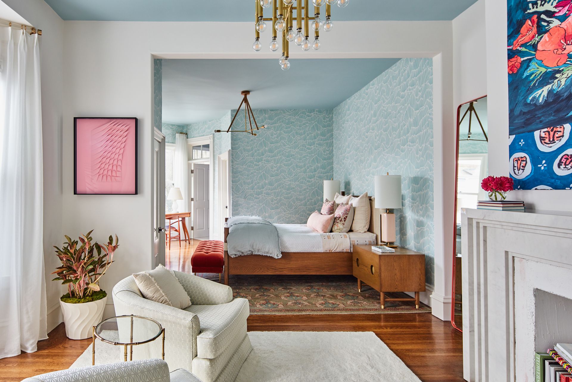
‘Wallpaper is another great way to introduce pastel shades into a space because your eye travels through pattern,’ says Tash. ‘A pastel stripe or florals would look lovely in a bedroom. What’s great about wallpaper is that you can pick the other tones out and use them to guide the palette for the rest of the room.’
Naomi agrees and suggests opting for a large pattern to achieve a contemporary look. ‘Small patterns can sometimes give a ‘grandma’ effect,’ she warns.
Be The First To Know
The Livingetc newsletter is your shortcut to the now and the next in home design. Subscribe today to receive a stunning free 200-page book of the best homes from around the world.

Sophie is a home interiors writer and all-around design aficionado. With a degree in History of Art and Spanish, she has a keen interest in the influence of art, history, and culture in design. Having lived in Buenos Aires for five years, Sophie is an experienced communicator in both English and Spanish with a professional background in public relations and marketing. Sophie is also an interior design student at KLC, paving the way to tell stories through interiors that inspire, serve and create experiences worth remembering. Sophie currently writes for Livingetc, Better Homes & Gardens, and Foter Magazine.
-
 7 Ways Expert Organizers Reduce Visual Clutter in the Kitchen — 'They're Virtually Effortless!'
Follow these expert tips to reduce the cluttered look in your kitchen and create a visually harmonious space perfect for hosting
By Imogen Williams Published
-
 The 12 Best Table Lamps for Reading —I'm a Certified Bookworm (and Shopping Expert)
When it comes to table lamps for reading, I don't mess around. If you're the same, this edit is for YOU (and your books, or course — and good recommendations?)
By Brigid Kennedy Published
