How to create a color palette – 7 ideas for finding inspiration for your home
Feeling daunted by how to create a color palette for your home? Experts offer their advice for how to come up with a scheme
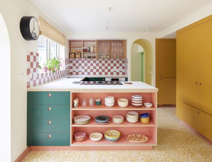

When you're starting a room scheme from scratch, how do you create a color palette? Narrowing down your options is one thing, but pulling together a cohesive, well-balanced scheme is something else entirely.
And while some people prefer simple, neutral interior design, many others love to fill their homes with vibrant, saturated hues. In that case, choosing a color palette can be even trickier - after all, finding the right colors for your home isn't as organic as it may seem, there's a science behind it.
To help you pin down a color palette for every room in the house, we've enlisted the help of experts to find the rules to create an effective palette that works together perfectly.
How to create a color palette for your home
‘Paint or color is an effective way to transform a home quickly and easily,' says Ruth Mottershead, creative director at Little Greene. 'Use color to add personality and character to your spaces and create a home to welcome guests and entertain and relax. When planning your scheme, consider the ceiling too, as this is your room's fifth wall and can create a real impact. Use a bold, contrasting hue to draw focus to the height of the room.’
1. Create a mood board
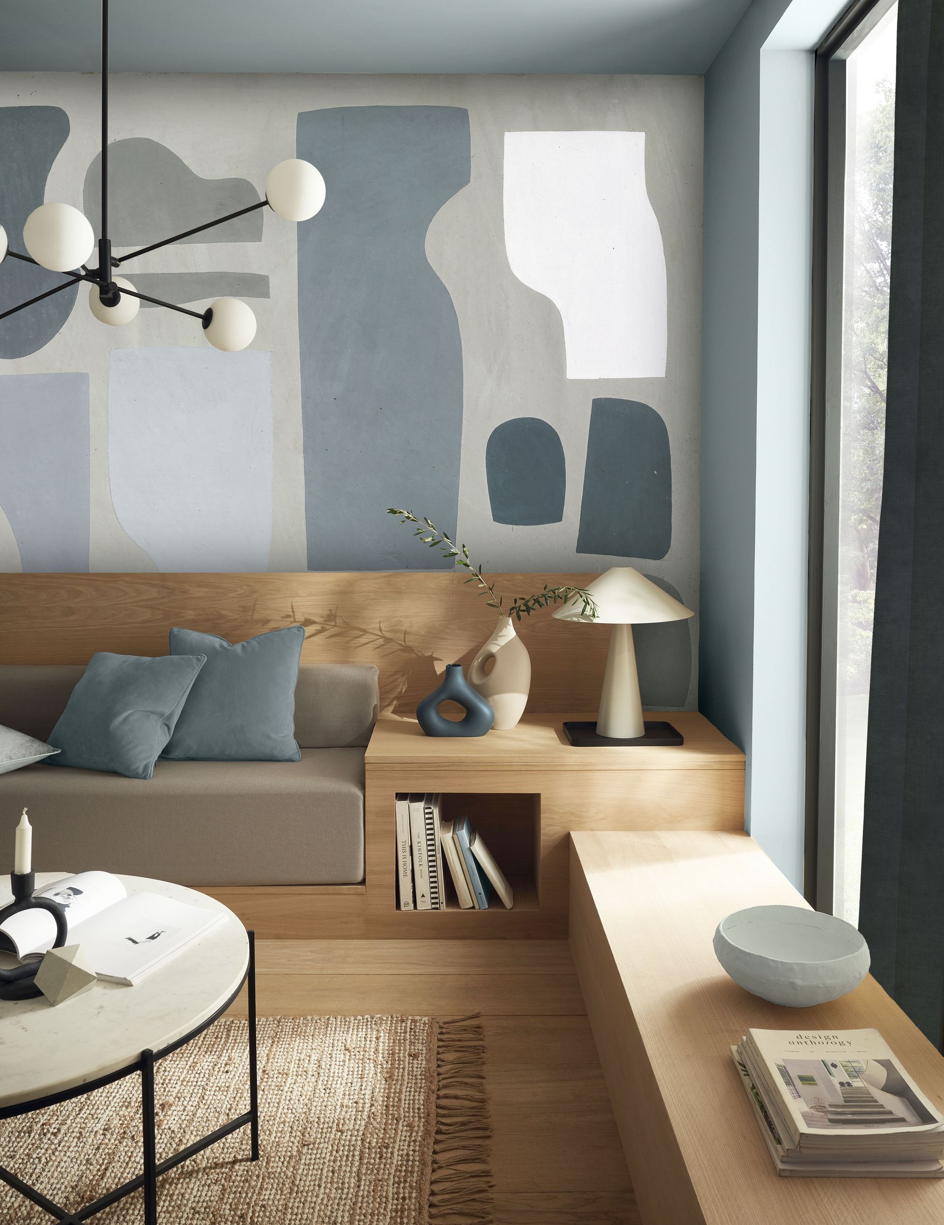
Start with a blank slate and think of everything that gives you pleasure. Does a walk in the park pique your interest as you look at the hues of the blooming flowers and the tall grass? Does the latest billboard's color scheme appeal to you? What about your wardrobe – are there certain colors you gravitate towards when it comes to clothes?
If you're still in a pickle, you can always refer to the current interior design trends to decorate your home.
'When it comes to creating a color scheme, start by thinking about how you want the overall feel of your home to be,' says Chelsea Clark, head of brand at Lust Home. 'The right color scheme will make your home feel relaxing and harmonious, or bold and playful. It’s easy to get pulled into the latest trends, however, a color palette should be imbued with your favorite color. Look at magazines, Pinterest, and Instagram - you’ll start to notice what your favorite color combinations are and you can build from that.'
'Before committing to anything, pull together a mood board (physical or digital) and layer all the elements that will exist in your space, such as fabric samples, flooring ideas, lighting, and of course, paint samples,' says Patrick O’Donnell, brand ambassador at Farrow & Ball. 'You can then start to see the possibilities of adding layers of color. The other vital thing to consider is your light direction before selecting a scheme. An extraordinary response to light is paint’s most distinctive asset. This can add an extra layer of complexity when choosing how to decorate.'
2. Look for inspiration in what you already own
Inspiration for a color palette doesn't always have to come from an outside source. 'Sometimes you might have a style you already gravitate toward; if that’s the case, the colors and patterns you love are probably already in your home,' says Sue Wadden, director of color marketing at Sherwin-Williams.
'If you’re starting with a blank slate, you can find inspiration from anywhere, including artwork. No matter where you look, these sources are the perfect way to get an idea of the colors and styles that speak to you.'
Something like artwork, wallpaper or a textile is a great place to draw a color palette from, as it's like that you enjoy that piece so much because of how the colors hang together.
3. Choose your neutral shades
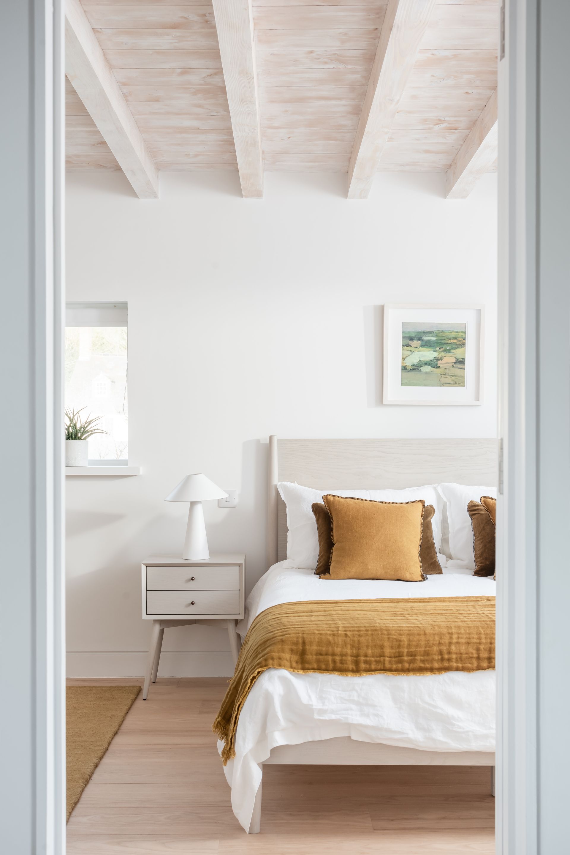
Choosing a base or a foundational color is essential because you will build your scheme around that. A neutral doesn't only mean white. It can be any hue although it should be a subtle shade.
When choosing a color combination, it's best to choose a foundational color that works well with most hues. Largely, a warm white (with yellow or pink undertones), to grey, brown, light pink, or off-white can work. These can work well with blue, green, pink, or purple.
'Always begin by choosing your neutrals first,' says Chelsea from Lust Home. 'These are the colors that may appear in every room to tie everything together. Most people choose white as their base color, however warm neutrals with grey, beige or pink undertones can elevate your color scheme.'
'Since your base makes up the biggest part of your palette, it’s important to choose something relaxing to the eye,' says Sue from paint brand Sherwin Williams. 'Neutrals offer the most versatility because they go with anything and are easy to build off on. Shades like Evergreen Fog, Urbane Bronze, and Naval all have neutral undertones.'
4. Use a color wheel
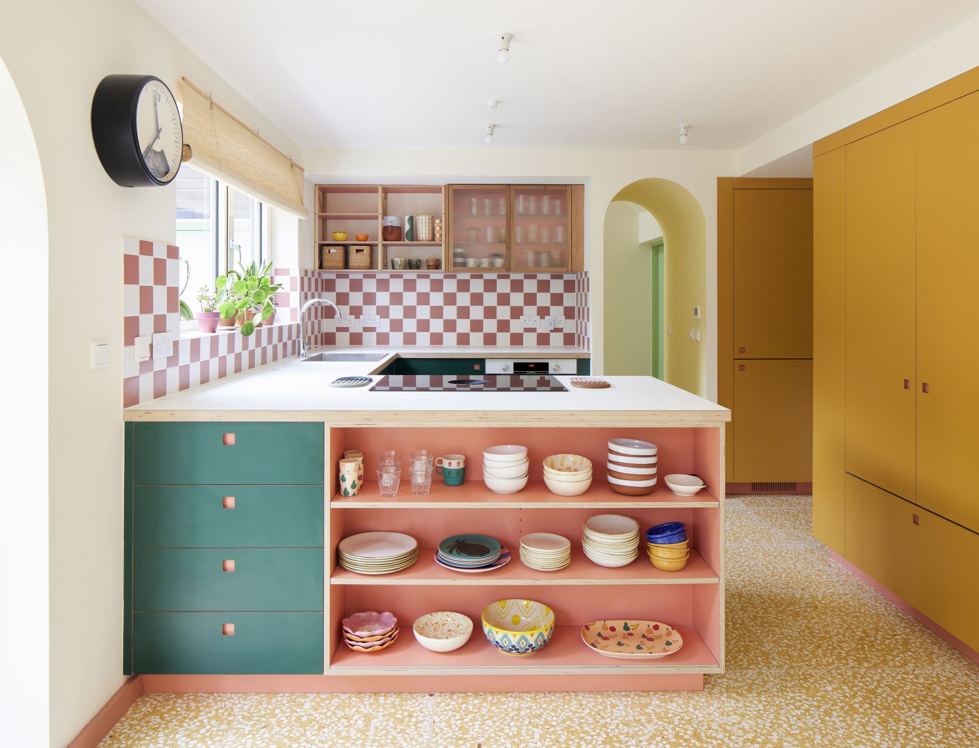
When it comes to layering colors, it's a good idea to get to grips with color theory to understand color rules and determine what type of palette you want to create
Colors that are beside each other are analogous as they tend to share similar tones. So, red, orange, and red-orange would make an interesting color combination. Usually, analogous schemes help create a more monochromatic look and need to be used with a peppering of bolder hues else the scheme can seem too one-dimensional.
Opposing tones on the color wheel are said to be complementary, which create an effective and eye-catching palette. For instance, orange and blue are opposites, and using them will help create a striking interior.
'The tonal spectrum of monochromatic hues uses the same color in light and dark shades,' says Chelsea. 'The finished effect is serene and relaxing, perfect for bedrooms, living rooms, and home offices. Analogous color schemes provide a little more energy and are perfect for brightening up hallways or dining areas. This color scheme is a great way to incorporate wallpaper, pick a design in an analogous color scheme to instantly energize the space.'
'Contrasting yet complementary color schemes create bold combinations, are fun, and inject life into any room,' says Chelsea. 'A harmonious color scheme can help stop your home feeling disjointed, allowing continuous flow from room to room.'
'Color is a powerful way to infuse a space with personality, so it’s just as important to think about the mood you want to create,' says Sue. 'If you love a space that feels dramatic, you can explore a color scheme that’s bold and saturated, but if you’re looking to create a natural color scheme, soft and earthy hues can help you get the look. This simple trick helps narrow down the color families and tones you want to stick with for your palette.'
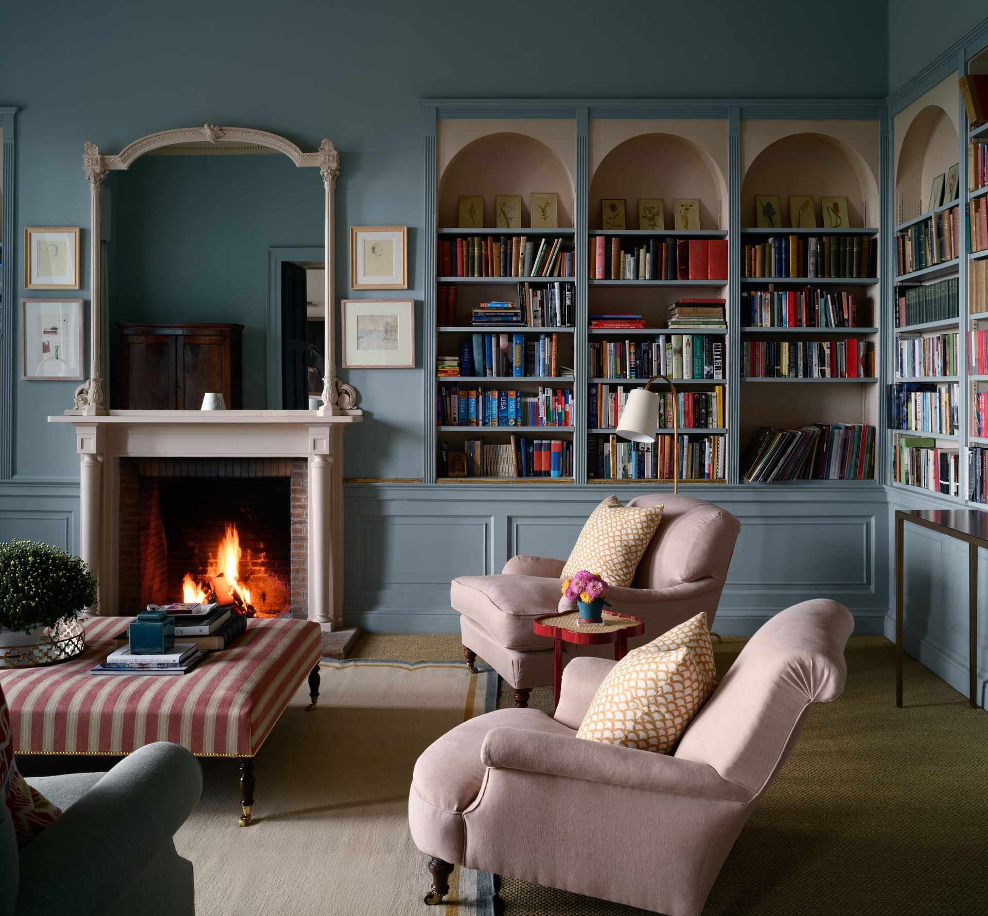
Of course, a color scheme doesn't only mean matching or contrasting wall paints but also taking into account the fabrics, furnishings, and furniture tones. All the hues together help create a room's overall palette.
'In this space, the client was keen to use Edward Bulmer Ethereal Blue on the walls, and I wanted to make this library room feel cozy and almost like it was hugging you so I chose to use the blue on the paneling and woodwork as well,' says interior designer Olivia Emery. 'I wanted some of the features to stand out so we painted the mirror, the mantlepiece, and, the inside of the shelves with the Edward Bulmer Lilac Pink which is a lovely soft dusty almost neutral pink. We also used this on the ceiling to add a bit of interest. These lovely antique chairs were not a pair but by re-covering them in the same subtle pink linen it made them work well together on this side of the room.'
'The sofa you can see in the corner is in an elegant blue linen which complements the walls,' says Olivia. 'I think room designs are always made better by a stripe and a bit of red, the fabric on the ottoman helped provide both aspects, and then I added the bright red lacquer table between the two chairs for a bit of wow-factor.'
5. Nail your accent colors
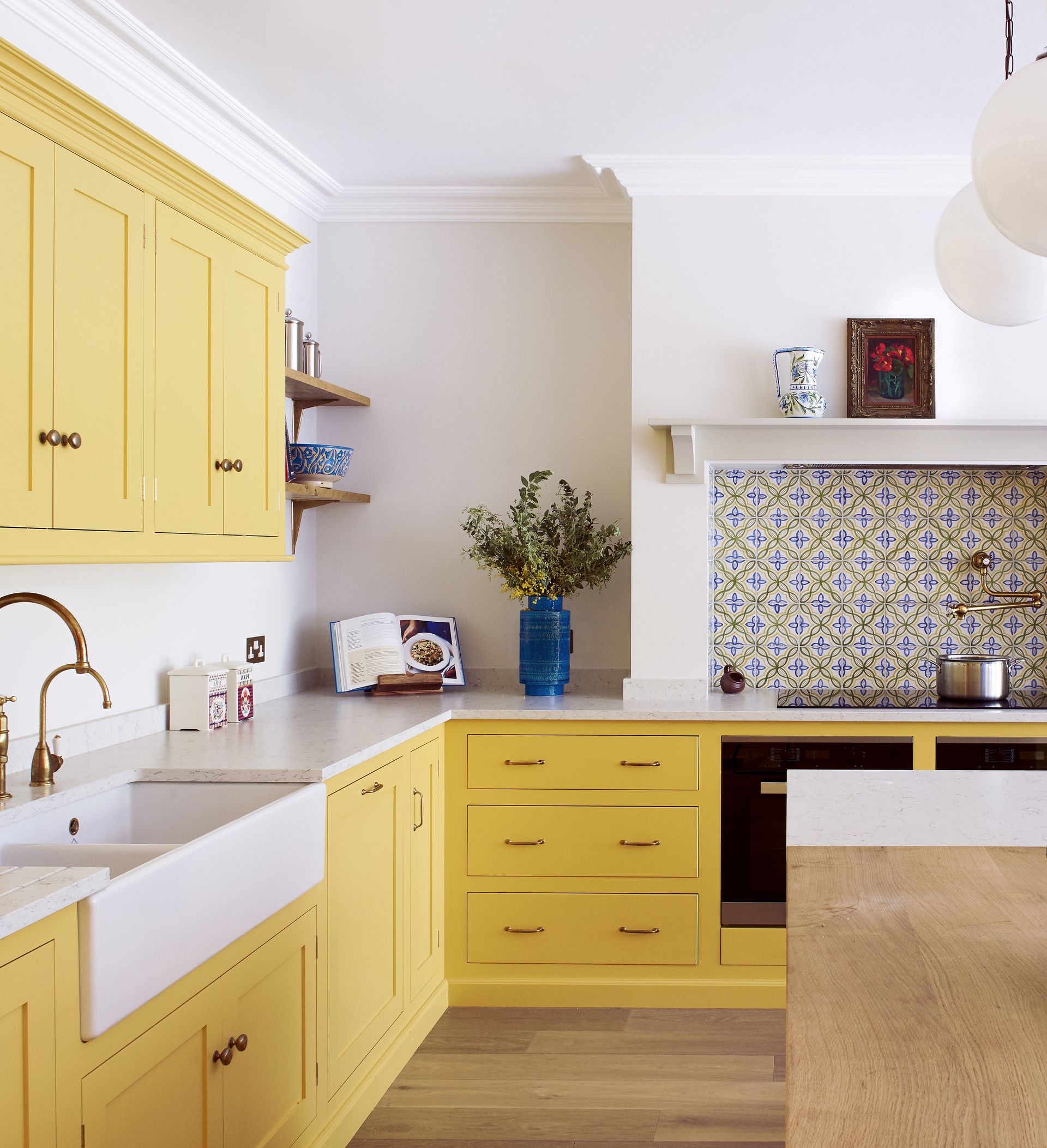
An accent color is a shade that stands out against the rest of your interior scheme, ensuring your palette doesn't fall flat.
In an analogous palette, go for a bold tint along the wheel, next to the colors you've chosen. For example, if your scheme has purple and blue, then for the accent color, go for either a light blue or green. And, if it's a complementary color palette, then your accent wall idea can be a split complement. Essentially, instead of simply taking the opposing hue, so for instance green and red, you veer to the right or left of the color wheel.
If your scheme has complementary hues of blue and green, the accent color can be red or pink.
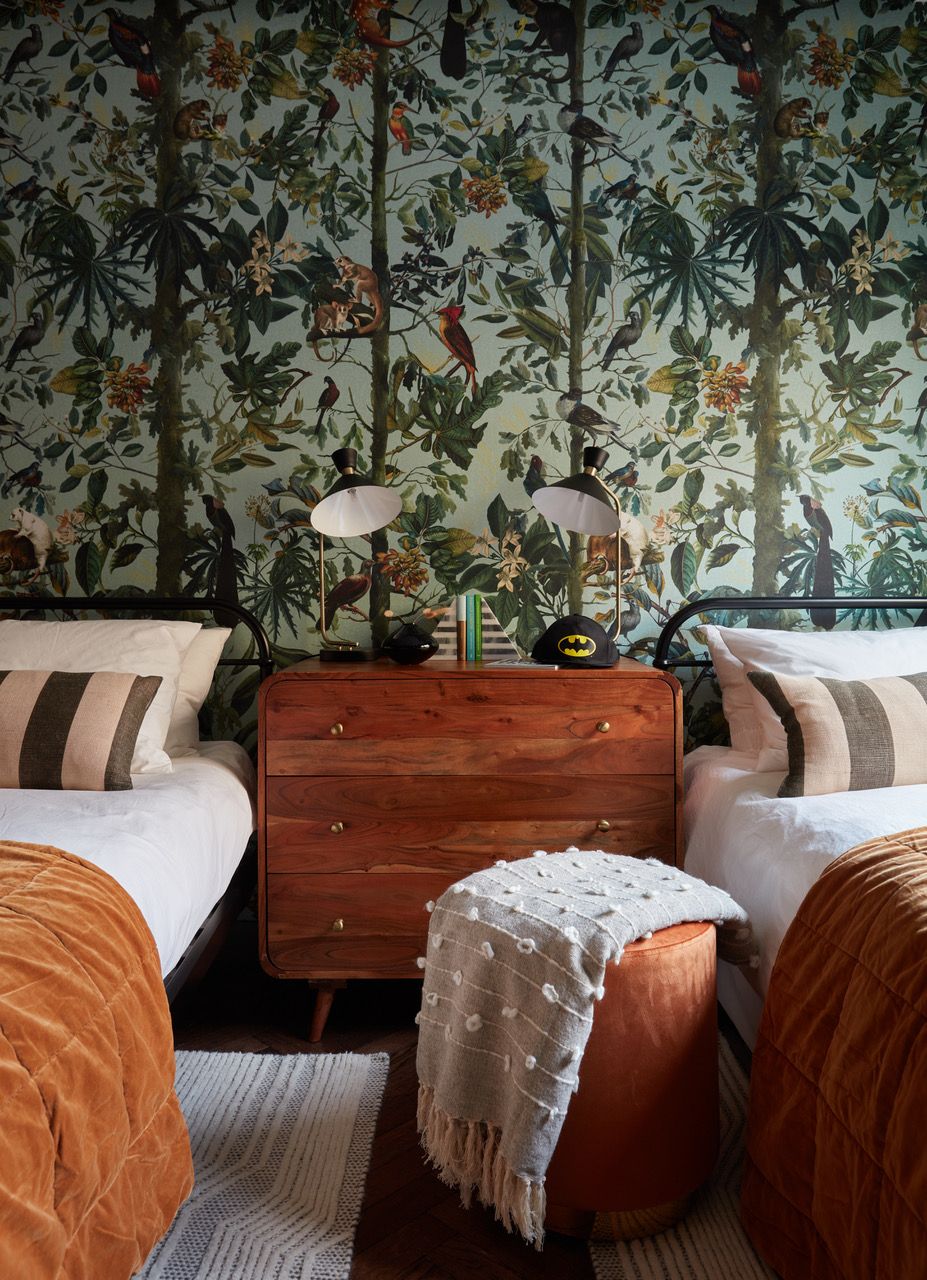
'Our top tip would be to opt for the wall with the biggest impact, which will have either some amazing furniture against it or a feature piece of art,' says Anna Burles, founder of Run For The Hills. 'And then look to tie in the rest of the scheme so that the feature wall doesn’t pop out too crudely. It needs to feel 'supported’ by the rest of the design scheme on the walls and ceiling and floors, rather than a jolt.'
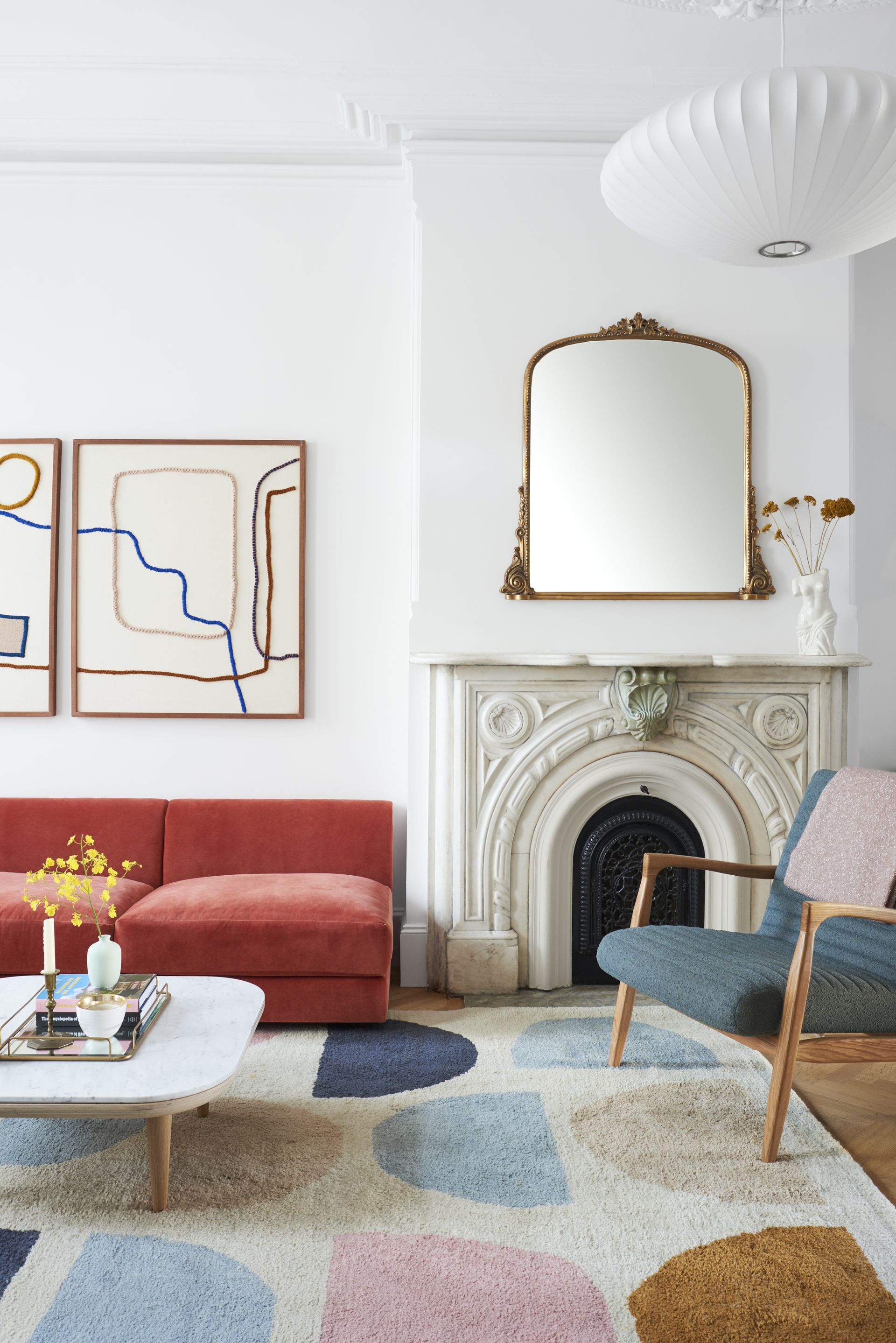
'However, we’re big fans choosing more than just a single wall, as the classic ‘feature wall’ possibly feels a bit done,' says Anna. 'So in this kid's room we did full wallpaper and it looks amazing and turned a boxy room into a real adventure. For a twist, we could have just used wallpaper ‘above’ a dado, or we could have had a higher picture rail to contain the feature.'
6. Keep the 60-30-10 rule in mind
When it comes to bedroom, bathroom or living room color ideas, the best way to juggle several different colors is to adhere to the 60-30-10 rule.
'There isn’t a rule to the number of colours you can use,' says Patrick. 'Your space should reflect your personality, so use as much or as little. But if you work better with a formula, the 60-30-10 decorating principle is tried and tested. This technical approach is primarily a balance of three colours within a space. 60 is your wall colour (the largest surface area), 30, the secondary colour could be your sofa or your bed (the second largest surface area), and 10 is an accent shade such as cushions or a lampshade.'
'As a pure painterly perspective, it can be the balance of three colours – the wall, ceiling, and an accent on woodwork,' says Patrick.
'If you want to add more than three colors, you can build a bigger palette with varying shades of complementary colors to give yourself a few more hues to work with,' says Sue.
7. Consider connecting rooms
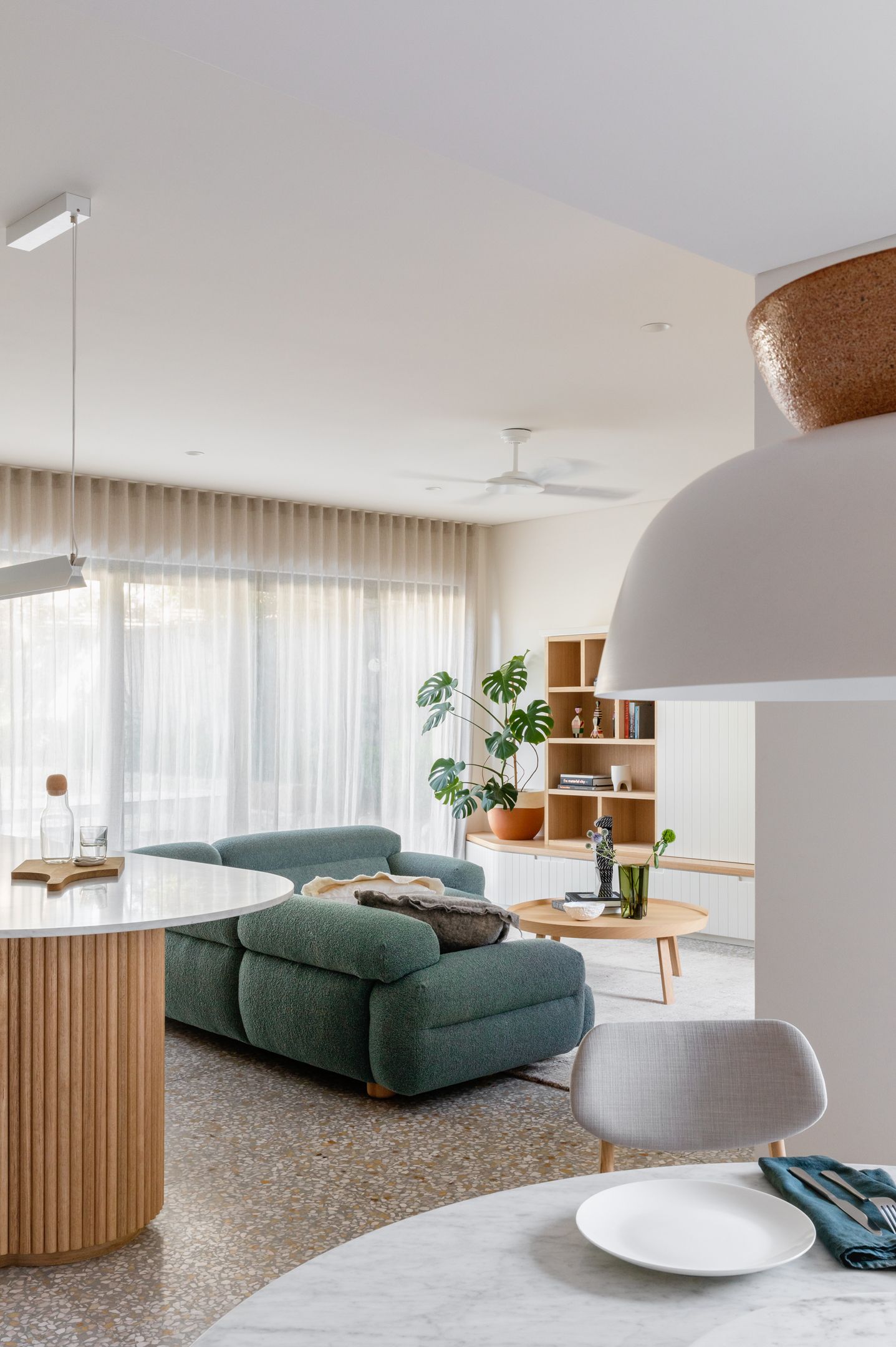
When you have an open plan space or when much of the home is visible from one room, picking colors that work together is especially important. Consider shades from the same color family and sprinkle them around the room and beyond, creating a throughline.
Another approach is to use thematic colors that complement each other. For instance, the colors of nature. You could go for a blue living room and move the scheme to green in the adjoining kitchen or balcony. Many colors go with blue, and the overall scheme will look cohesive.
'When it comes to decorating new areas of the home, your decision-making process will be easier,' says Chelsea. 'Your base tone is already set, so you’ll find it easier to either choose complementing bold or monochromatic colors for feature walls, furniture and smaller decorative accessories. Colour also plays a pivotal role in our mood. Bright colors can help boost us first thing in the morning whereas soothing blues and greens can help relax us at the end of the day.'
What are the six color schemes?
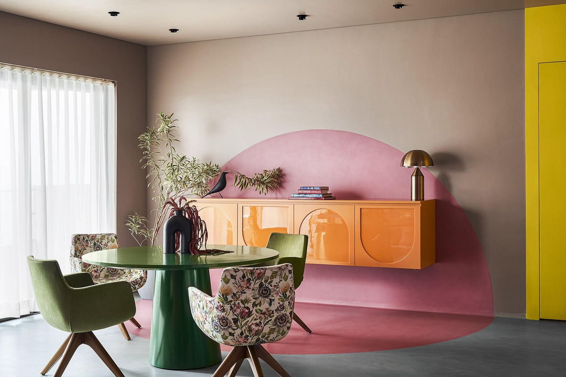
The six color schemes are monochromatic (using a single color with varying shades and tints ), analogous (pairing one main color with the two colors directly next to it on the color wheel), complementary (pairing colors directly opposite each other on the color wheel), split complementary (two colors directly adjacent to the dominant color's complement), triadic (choosing three colors that are equally placed in lines around the color wheel), square (four colors equidistant from each other on the color wheel), and rectangle (a more subtle approach to square of choosing four hues on the wheel).
What 3 colors go well together?
The color wheel opens up several possibilities of mixing, pairing and contrasting colors together. The world is your oyster for choosing striking hues. However, if you’re looking for a few basic but timeless three color combinations, then yellow, red, and blue; green, orange, and purple; and teal, magenta, and gold are winning combos.
Be The First To Know
The Livingetc newsletter is your shortcut to the now and the next in home design. Subscribe today to receive a stunning free 200-page book of the best homes from around the world.
Aditi Sharma Maheshwari is an architecture and design journalist with over 10 years of experience. She's worked at some of the leading media houses in India such as Elle Decor, Houzz and Architectural Digest (Condé Nast). Till recently, she was a freelance writer for publications such as Architectural Digest US, House Beautiful, Stir World, Beautiful Homes India among others. In her spare time, she volunteers at animal shelters and other rescue organizations.
-
 The 12 Best Table Lamps for Reading —I'm a Certified Bookworm (and Shopping Expert)
When it comes to table lamps for reading, I don't mess around. If you're the same, this edit is for YOU (and your books, or course — and good recommendations?)
By Brigid Kennedy Published
-
 "It's Scandi Meets Californian-Cool" — The New Anthro Collab With Katie Hodges Hits Just the Right Style Note
The LA-based interior designer merges coastal cool with Scandinavian simplicity for a delightfully lived-in collection of elevated home furnishings
By Julia Demer Published
