Natural textures like clay plaster walls and oak floors add warmth to this modern Chelsea townhouse
The raw materials used in this renovation give this gorgeous family home the look of a lovely laid-back idyll

After eight years living in New York City, Tina Orlando and Ian Waring made the call to return to the UK, choosing Chelsea as their new base.
‘We’d only intended to stay for two years but we loved life stateside and then discovered Shelter Island in the Hamptons, buying a holiday home there and becoming absolutely transfixed by it,’ says Tina.
The island, surrounded by thick forest and sandy beaches, was to have a resounding impact on the family’s values as they searched for a new modern home in London.
Opting for a tall, narrow five-storey Victorian townhouse, in stark contrast to their old Manhattan loft apartment, Tina and Ian enlisted the help of Tom Rutt of TR Studio to refocus the property for a young family. While the architecture was by TR Studio, the interior design was in collaboration with Riley Brooks. Let's see what they did inside...
Living room
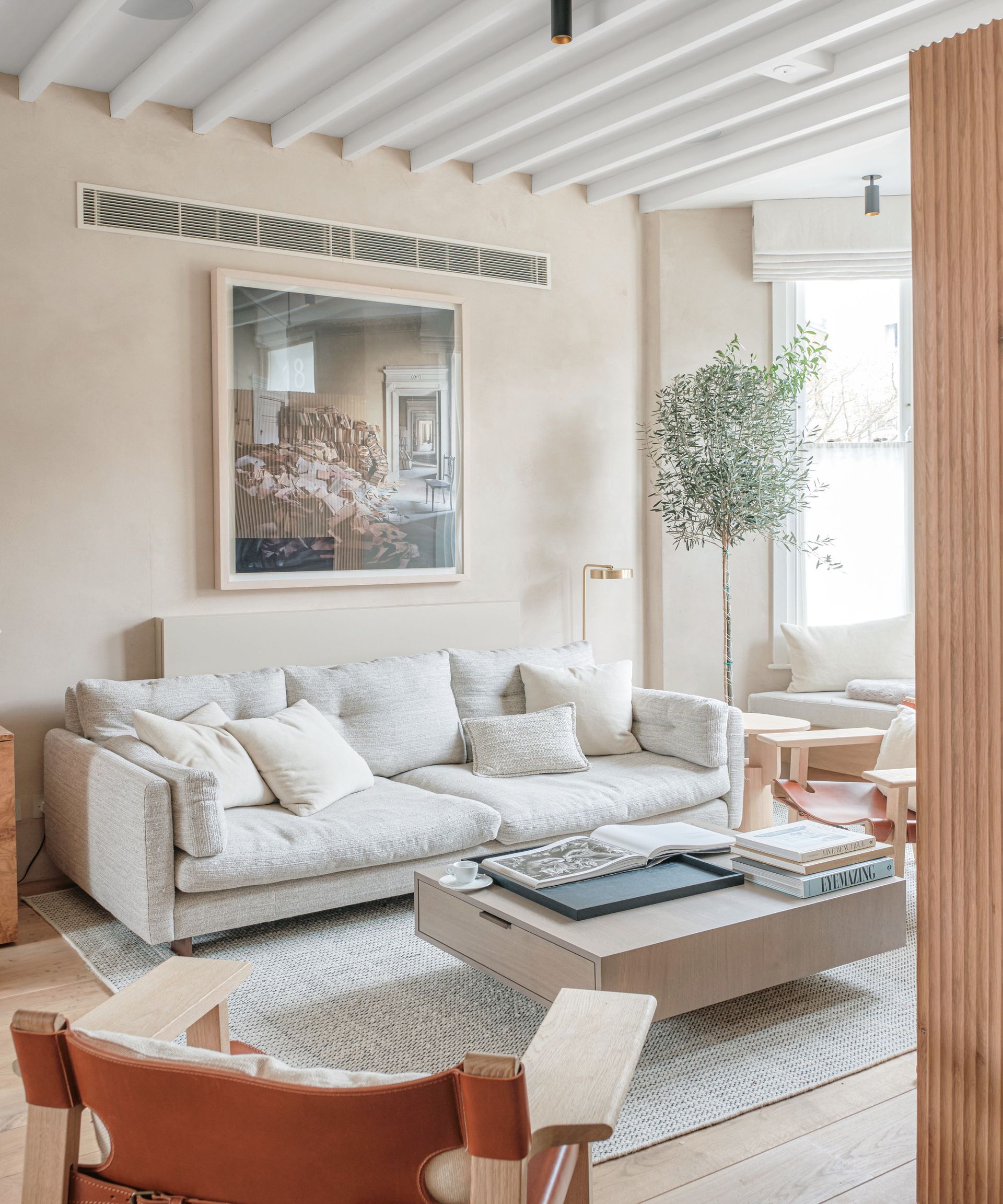
‘A huge driver for the renovation was to recreate a sense of the Shelter Island house in London,’ says Tom. ‘Inspired by a connection with nature, it had to feel warm with materials influenced by driftwood and fossils. Often, Chelsea houses can seem traditional or overly slick, and we wanted to avoid both those things.’
Kitchen
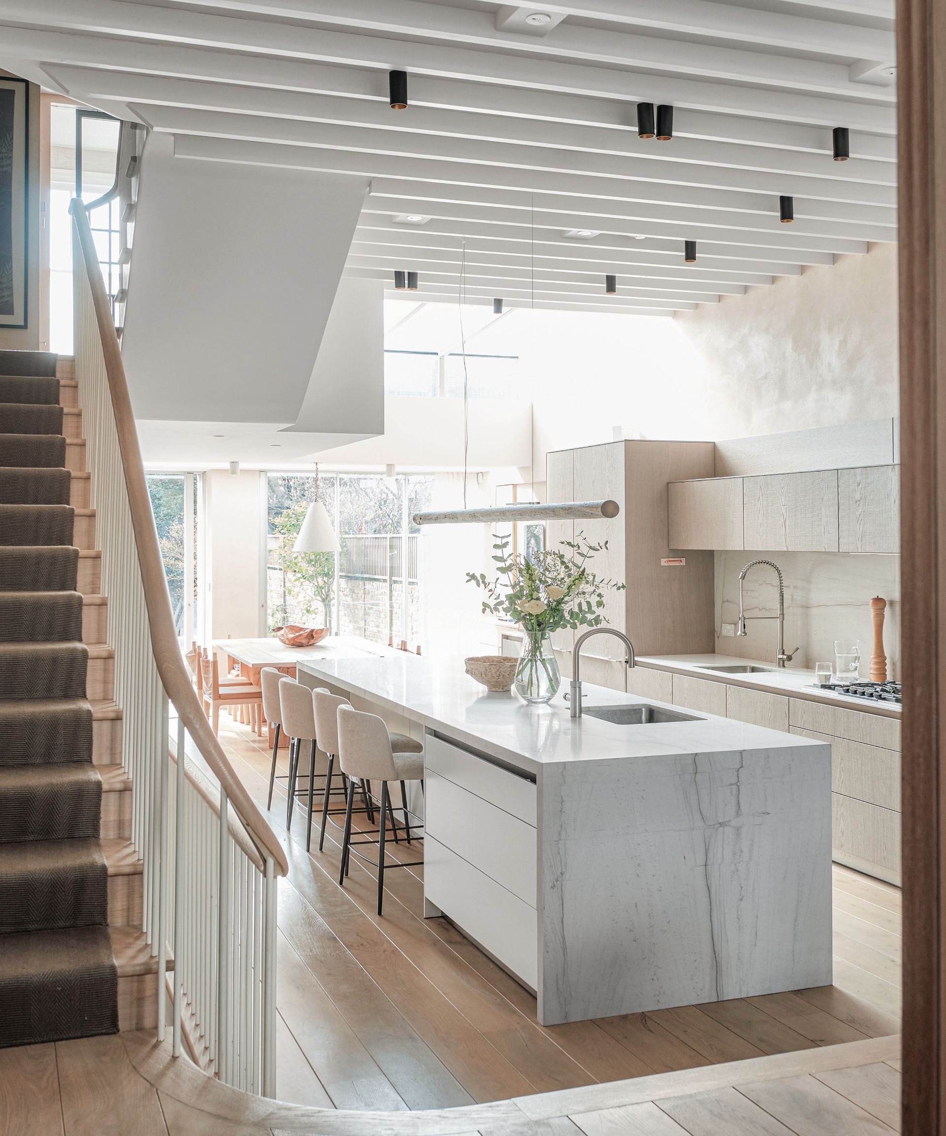
Giving the house a cohesive identity is the warmth of the cross-sawn oak and the flawed, aged look of the clay plaster walls. ‘One of the things Tom brought to the table that we’d never have known about was the wall treatment,’ says Tina.
‘I’m half Italian and it’s something of an ode to my family’s heritage. I love the way it resembles the aged walls of a palazzo with character, as though it has seen life. There is a slightly pink tone to it that we were initially worried about but now I look at those walls every day and I feel calm.’
Horizontal beams give the illusion of the space being wider and also contribute to the room's easy living, rustic vibe.

The brief for the cabinetry was for it to be modern and functional but with a natural texture to it. The symmetrical mirrors conceal glassware storage.
Hall

While the house had been renovated 10 years previously, Tom was conscious that the space and flow needed to be reorganized.
‘It had lost some of the hallmarks of a period house and the modern changes looked dated. We replaced the clunky staircase with a sweeping new version with a curved wooden handrail that unites the house from top to bottom,’ he explains.
Bedroom
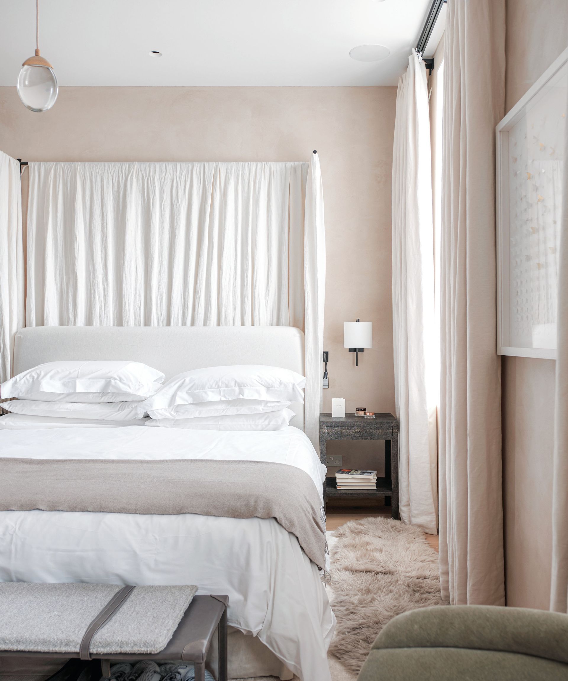
The tall canopy ensures the bed fits in with the scale of the high ceilings. 'I wanted to give it a spa-like sense of sanctuary,' says Tom.
Children's bedroom

Pared-back furnishings ensure that the large format tropical palm wallpaper makes maximum impact.
Bathroom
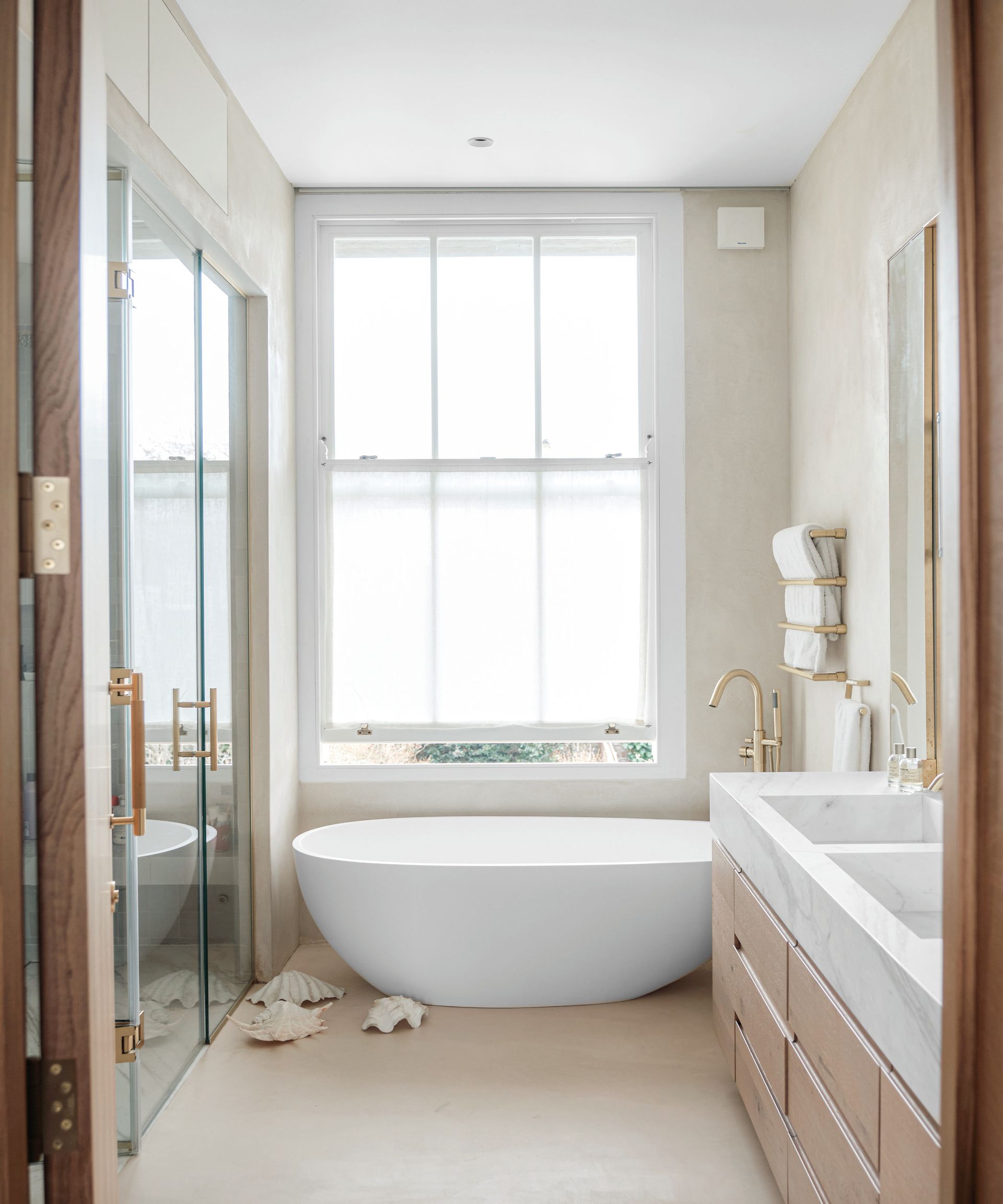
Despite its central location, the family have found the house and its walled garden to be a sanctuary. ‘Coming from Manhattan, where there’s constant traffic noise and sirens, it feels like a marked contrast and has a relaxed and tranquil feel,’ says Tina.
Be The First To Know
The Livingetc newsletter is your shortcut to the now and the next in home design. Subscribe today to receive a stunning free 200-page book of the best homes from around the world.
Interiors and architecture writer Juliet Benning regularly writes for Livingetc and Homes and Gardens, as well as Grand Designs and Country Homes and Interiors. She was once the features editor of Homes and Gardens, and also contributes to 25 Beautiful Homes magazine.
-
 5 Trees You Should Prune in Your Backyard in February — 'It Makes Much Sense to Cut These Ones Back Now'
If you think pruning trees is best left to spring, think again. These trees all could use some cutting back now for several very important reasons
By Hugh Metcalf Published
-
 The 4 Things People With Really Organized Kitchen Drawers Always Have
Level up your ‘drawer decor’ and keep things tidy and organized with these 4 essential ideas for uncluttered storage
By Becca Cullum-Green Published
