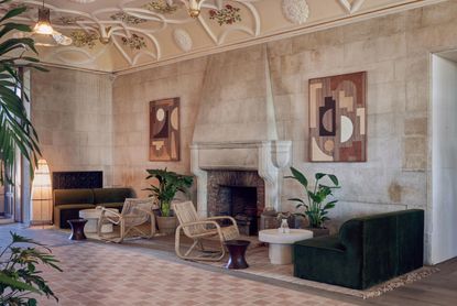
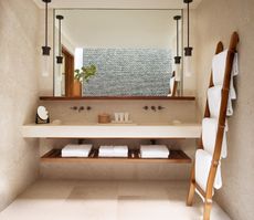
7 minimaluxe color schemes designers use to combine warmth, calm and elegance in the most wonderful way
Minimaluxe color schemes tend to be fairly neutral but what they lack in range they make up for in depth. These clever palettes will create spaces you can relax in


Minimalist style has reigned supreme in the world of interior design for decades. It's by far the most popular, long-lived style out there. But what tends to happen with these ever-loved styles, is every now and then a new approach starts to come through. A new twist on the original that morphs the look into something very similar, very familiar, but just slightly different. And that's what minimaluxe is.
Chances are you have already been seeing minimaluxe styles. They are the spaces that are still very simplistic and clean, but there's a softness to them too. They aren't all about the bright whites and stark lines we see with minimalism, they are warm and softer, more inviting, and let's just say it, cozier.
Because, while we love minimalist style and always will, there's always the risk of it looking a tad cold and clinical. And an easy way to avoid that go warmer and softer with the color scheme. And that's what minimaluxe does differently, it moves away from bright whites and greys and incorporates warmer shades like terracottas, creams, and browns.
7 minimaluxe color schemes
We asked designers for their take on this new minimalism, and what color schemes they think work best.
1. Warm beige toned greys

You'll notice a similarity between most minimaluxe living room color schemes – they are all warm-toned colors. Even the greys are in their more slubby, beigey-toned forms. Whereas traditional minimalist style is focused more on the cooler side of the color wheel – sharp whites, cold greys, silver tones – this soft approach is all about the pink, brown, and yellow undertones.
So when looking for a grey to bring into a minimaluxe scheme, think griege. It's been a color trend for years now. A beautiful mix of grey and beige that gives you the chicness and sophistication of grey with the cozy warmth of beige.
'For this living space, the client wanted a refined yet laid-back space to call home. To bring a bit of subtle drama and warmth to the living/dining room, we chose a muted palette and painted the bottom third of the wall a gorgeous greige color, Benjamin Moore Pale Oak,' explains Molly Torres Portnof of DATE Interiors. 'Natural colors and materials (think warm gray, tan, beige and white) help a space feel cozy, soft, and minimal. We love added pops of deeper tones, like the green and umber used in this space, to bring a bit of depth.'
Designer Nina Magon agrees that 'I believe that choosing the right color scheme is essential to achieving a minimalist look and feel in a space. While gray is often thought of as a cool color, warm shades of gray with hints of beige or taupe can create a sense of warmth and softness in a minimalist space.'
2. Earthy rust tones

A-nrd studio for Birch (Selsdon)
Terracotta tones have been popular for years, but mostly in their laid-back, Ibiza-style way, paired with relaxed shapes and beachy decor. But now, it's shifting into the world of minimalism. 'Colors such as terracotta, rust, and ochre can add warmth to a minimalist space without overwhelming the design. These colors can be used on accent walls or in accessories such as pillows or rugs,' says Nina Magon.
'When incorporating warmer colors into a minimalist space, it's important to maintain a sense of balance and restraint. Too much color or pattern can overwhelm the design and detract from the minimalist aesthetic. By using warm colors in strategic ways and keeping the overall design clean and uncluttered, you can create a minimalist space that feels warm and welcoming.'
Color expert at Lick, Tash Bradley, says the best way to use these soft, earthy tones is to take them over the whole room. 'Luxurious minimalism is definitely a movement that's here to stay and I am seeing more and more people gravitate towards having this style. It's very much about less is more and all down to the quality and every element is very carefully thought through.'
'This is where we are seeing color drenching come in, where the ceiling, the walls, the woodwork all harmoniously fall in and give you this very luxurious, very clean, simple, very designed feel. This approach works well with earthy terracottas and pinker tones and you can create a lovely minimalist feel where all the surfaces are one soft hue and the furniture is varying hues of the same color for a tonal look.'
3. Soft nature inspired shades

A-nrd studio for Birch (Selsdon)
Not all minimaluxe color schemes need to be neutral. Think natural rather than just neutral. Colors inspired by nature can work just as well in their softer more muted forms – pale greens, watery mid-blues, and beiegy browns pair perfectly together to create a more modern, slightly bolder take on the soft minimalist style.
'Using natural colors such as warm browns, greens, and blues can create a sense of calm and serenity in a minimalist space. These colors can be used in conjunction with natural materials such as wood or stone to create a sense of warmth and texture.' says Nina Magon.
Jennifer Jones of Niche Interiors adds, 'Warm grey tones, slate blue, and muted greens are our favorite tones to introduce in modern spaces. In general, opt for subtle, toned-down version of these colors and avoid anything too bold or saturated.'
4. Oaty whites

'Choose anything with a warm base,' suggests Tash Bradley. 'Creamy, oaty whites or beiges nudes. Wrap the room in these colors and let them be the backdrop to something textural like a statement marble bath or a stone sink, or a hero piece sofa.'
The key to decorating with white is you need to add interest with layers. In a minimalist space, a crisp white color scheme works with the stripped-back vibe, but minimaluxe is all about a tonal approach to give rooms some depth.
'Soft minimalistic color schemes tend to be tonal – often they include layering soft whites and creams, bleached or natural woods, and aged brass or black tones. They shy away from jarring contrasting colors. To warm it up a bit, dial in putty and camel, even milk chocolate colors,' says Virginia Toledo, co-founder of Toledo Geller.
'To achieve a soft and minimalist color scheme, I would choose about three main colors in light, muted or earth tones. Then, strategically layer variations of that palette through the space. These layers will keep the aesthetic clean and minimalist feeling without being cold or uninviting,' advises designer Marie Flanigan. 'The trick to a monochromatic room is to make sure you choose a light and slightly warmer tone for your wall color that can be easily translated into other saturated variations in the soft finishes.'
'Whilst whites seem the natural destination for a minimalist space, look to whites that are more nuanced rather than true,' suggests Patrick O’Donnell of Farrow & Ball. 'Consider something with a specific undertone that will carry with the sparse elements of the interior. Err to more earthy whites or neutrals – something with a little brownish warmth. Jitney will bring a balance, so whilst the interior may be blessed with lack of clutter, a gentle neutral will add a dash of character whilst letting your aesthetic bent breathe!'
5. Charcoal grey with brown tones

Darker shades can work well with this trend, you just have to make sure to balance them out with warmth. Choose a dark charcoal grey as opposed to a true black so there's some depth and duskiness there and pair it with a really orangey-toned brown or wooden tones to kick any of the coolness from the grey.
This dining room is the perfect example. The darker accent colors ground the room and make it feel more clean and contemporary – as you would expect from minimalist style. Then those brown, wooden tones and soft whites bring the softness. 'Clean lines and a neutral color palette create a calming space for relaxation and mindful living' is how Ginger Curtis, President of Urbanology Designs describes this space.
'The best color schemes for a minimalist space are those that incorporate warm color tones and balance different textures. Going too monochromatic can be a mistake as it can make the space feel too cold and bare. Using an accent wall with a warm color tone can help create a well-balanced and inviting minimalist space.' she adds.
6. Dirty peach and plaster pinks

Dirty peach, what a delicious-sounding color. We can't take credit, designer Sheena Murphy says 'In order to soften a minimal space, we recommend finding and using tones with more yellow or red in them, think pale butterscotch, dirty peaches, and sandy mustards. And if strictly neutrals are your thing, move toward those that feel more brown or beige over cooler, grey versions of the past. The benefit of these softer, warmer hues is that they actually provide a glow to a space which naturally makes it feel more inviting and easy on the eye.'
And of course, in a very similar vein, there is the plaster-tone, putty pinks that are the perfect not quite neutral shade to use in a soft minimalist space. 'Embracing a neutral paint scheme is the perfect foundation for creating a soft minimalist space. Warm white is a popular choice for those looking to avoid the clinical feel of a pure brilliant white, however if you are looking to add a hint of color, opt for the ‘new neutral’ plaster pink,' suggests Helen Shaw of Benjamin Moore.
'The soft, dusky rose tone flatters any space and works perfectly to create a blank canvas. Layer with natural textures and colors in accessories such as rattan and linen to create the ultimate soft minimalist decorating aesthetic. This look is especially suited to spaces with a lot of natural light so ideal for south-facing rooms.'
7. Texture

A-nrd studio for Birch (Selsdon)
Not technically a color but in a minimaluxe space, texture acts like a color. Since a lot of the colors are soft and neutral, it's texture that can add the depth and interest to a space. 'I believe texture is the new color,' says designer Lisa Sherry. 'I layer lots of thoughtful textural variety into soft neutral spaces to create interest and add life. Think rugs, throws, tactile neutral fabrics, wall art, and objet d’art with lots of “hand".'
Designer Christian Bense agrees that 'when it comes to minimalist color schemes, it really is a case of more is more. The "more" obviously isn't color in this instance, rather textures, materials, and finishes. Whilst colors can pop and interest added by way of bold print, a minimalist color scheme needs to work a little harder to retain that level of depth and interest, so it is all about the layering, layering, and layering. With that being said however, a minimalist color scheme doesn’t mean a “no colour scheme” it just means a careful selection of lighter tones and textures. It's more about less color than less options.'
Be The First To Know
The Livingetc newsletter is your shortcut to the now and the next in home design. Subscribe today to receive a stunning free 200-page book of the best homes from around the world.
Hebe is the Digital Editor of Livingetc; she has a background in lifestyle and interior journalism and a passion for renovating small spaces. You'll usually find her attempting DIY, whether it's spray painting her whole kitchen, don't try that at home, or ever changing the wallpaper in her hallway. Livingetc has been such a huge inspiration and has influenced Hebe's style since she moved into her first rental and finally had a small amount of control over the decor and now loves being able to help others make decisions when decorating their own homes. Last year she moved from renting to owning her first teeny tiny Edwardian flat in London with her whippet Willow (who yes she chose to match her interiors...) and is already on the lookout for her next project.
-
 How to Organize your Bathroom for a Better Morning Routine — 6 Steps for a Seamless Start to the Day
The ease of your morning routine can have a huge influence over the rest of the day, so make sure you optimize you space for a stress-free start to the day
By Lilith Hudson Published
-
 5 Trees You Should Prune in Your Backyard in February — 'It Makes Much Sense to Cut These Ones Back Now'
If you think pruning trees is best left to spring, think again. These trees all could use some cutting back now for several very important reasons
By Hugh Metcalf Published

