A modern side return extension and calming neutral tones complete this Scandi-inspired Victorian semi
A simple and chic palette with a big dose of design classic furniture delivers laid-back Nordic luxe in this reimagined family home in south London

Danish design is in Kirsten Miller’s DNA, thanks to growing up in homes around the globe full of Scandi furniture. ‘My Danish father worked for Nato and wherever we went the furniture came with us,’ she laughs, ‘along with Danish food, family traditions, Christmas celebrations, everything.’
So it’s hardly surprising that the late Victorian-meets-modern family home she has created with husband Alex, founder of a marketing technology agency, has more than a nod to Nordic style.
When the couple bought the house in 2012, they gave it a quick refresh, then six years later, rather than move again for more space, they opted to stay put and turn it into the home of their dreams.
With a time-poor lifestyle - Kirsten is a non-exec director in advertising - and two young children, they decided to bring in expert interior design help. Sheer serendipity led them to Steve Nash of All & Nxthing (whose home appeared in Livingetc, May 2018) when Alex discovered his work on-line and, simultaneously, a friend gave him a gold star recommendation. ‘Steve matched our energy from the moment he bounced through the door,’ laughs Kirsten. ‘He was excited about the house, had great ideas and, crucially, we had instant chemistry.’
Kitchen diner

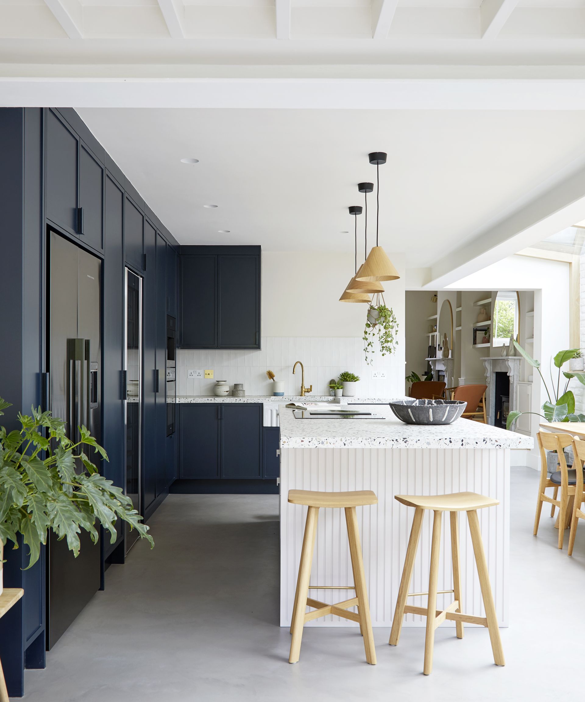
The Miller’s home was a classic Victorian semi with a redundant side return. ‘Extending into it to create a contemporary kitchen was obvious,’ she says, but we were unsure how it would blend with our traditional two front rooms, and our desire to incorporate Danish design.’
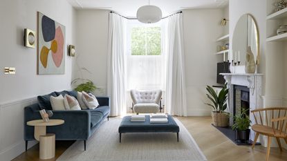
Steve’s solution was to pare back the front rooms to create one modern-minimal space to echo Scandi style that in turn would harmonise with the open-plan kitchen.
‘I love that the living room is laid back but has personality thanks to its distinctive zones and nooks,’ says Kirsten. It’s connected to the kitchen with a soothing off-white palette and its oak flooring and furniture is mirrored there - on shelves, tables and chairs - and, Steve’s stroke of genius, the bracing on the skylight glazing.
Kitchen

The whole renovation, with its high quality finish, took an admirable nine months, despite the pandemic, largely thanks to Steve’s contractor recommendation, Grego’s, and the hands-on specialist trades and artisan makers he introduced.
In the kitchen, cabinetry is dark, painted in Basalt by Little Greene, to ground the otherwise light space.
Living room

To keep a sense of flow, this space is open plan to both hallway and kitchen-diner.
‘It’s the details, like beautiful joinery, smooth concrete, tactile brass fittings and the doors to the garden which look streamlined but are also double-glazed, that we would never have known about,’ says Kirsten.

From its Dinesen oak flooring ‘a special treat’ and design classic furniture to its calm and serene color palette, this house has good-taste Scandi written throughout.
Bedroom

Handsome mid-century Danish furniture dances around the entire ground floor and extends to the upstairs which had a mini makeover, decorated in warm, calming shades.
‘Previously everything was boring grey and white.' she says. Beautiful panelled wardrobes are now installed in the couple’s room. ‘They hold every inch of clutter and it’s so soothing to lay in bed not to see any mess. We definitely sleep better,’ says Kirsten.
Bathroom

The old bathroom was reconfigured as a large family shower room, with two basins. ‘It’s a very Scandinavian trait, and no one misses the bath,’ says Kirsten.
She was hands-on during the building work, ‘I love a demolition,’ whereas Alex, with his strong creative vision, focused on the aesthetics of colours, furniture and textiles.
Overall, the house resonates with Kirsten's design mantra ‘simple, serene, clean, calm’.
See more: a Georgian Stucco-fronted townhouse that's modern and sleek on the inside
Be The First To Know
The Livingetc newsletter is your shortcut to the now and the next in home design. Subscribe today to receive a stunning free 200-page book of the best homes from around the world.
A legendary houses editor, Mary Weaver held the job of Homes Editor on Livingetc for over a decade. She set the aesthetic for which the brand has become known. She is now a freelance stylist, art director and writer, regularly contributing to Livingetc and overseeing the brand's successful House Tours franchises of live and webinar events.
-
 The 12 Best Table Lamps for Reading —I'm a Certified Bookworm (and Shopping Expert)
When it comes to table lamps for reading, I don't mess around. If you're the same, this edit is for YOU (and your books, or course — and good recommendations?)
By Brigid Kennedy Published
-
 "It's Scandi Meets Californian-Cool" — The New Anthro Collab With Katie Hodges Hits Just the Right Style Note
The LA-based interior designer merges coastal cool with Scandinavian simplicity for a delightfully lived-in collection of elevated home furnishings
By Julia Demer Published

