Scandi style kitchen ideas

When it comes to clean, uncluttered kitchen design, nobody does it better than the Scandinavians. With their sleek, streamlined surfaces, clever storage for hiding clutter, and light, muted colour palette, Scandi style kitchens appear brighter, lighter and super stylish.
Inspired by the cool colours of the landscape, pale kitchens are a natural choice in Nordic countries. They look sophisticated, but do require textural interest.Keep the palette to a specific range of whites and cool greys, adding some metallics for extra warmth and to make your kitchen feel brighter and more spacious, without compromising on the minimal feel.
See more Scandinavian style interiors
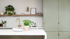
In terms of texture, not all of your surfaces have to be made from the same material. If there’s a finish you particularly love, but practicality is an issue, consider using it as a highlight in an area with less heavy traffic. If designed and fitted cleverly, this can add visual interest and texture to your kitchen.Plywood is the material of the moment for kitchen cabinets. Its humble beauty is reminiscent of Thirties Scandinavian modernism.Expanses of white marble also createan elegant, luxurious feel without compromising on simplicity.
Storage is also a key element of Scandinavian kitchen design.If you have the luxury of a separate room next to the kitchen, think about converting it into a pantry – these traditional features are back in vogue.Floor-to-ceiling cabinets also help to createa sleek, uncluttered look, and nothing says ‘clean and contemporary’ like handle-free cabinetry.For more inspiration, browse these stylish Scandi style kitchen designs.

Mood Lifter
Walking into the kitchen is an instant mood-lifter, with windows looking out over London, and the lofty atrium above the kitchen adding great height to the space. Get the look: The kitchen is bespoke through Andy Martin with a worktop by Diespeker & Co. The pendant light is also by Andy Martin. The Déjà-vu stools are by Naoto Fukasawa for Magis at Viaduct.

Go With The Grain
Floor-to-ceiling cabinets create a clean, uncluttered look, but to keep them from appearing flat, choose a finish with interesting texture. This design is the Qi kitchen by Japanese design studio Nendo for Scavolini, which comes in a pale wood laminate with a beautiful grain. Get the look: Project details Scavolini’s Qi kitchen is shown here with a Hono Elm laminate wall system, from £15,000, at Multiliving. For a similar light fitting, try the A440 pendant, £472, by Artek at Skandium. Native & Co sells Japanese kitchenware that would complement this look, including wood caddies and cast-iron tea kettles.

Metal Works
White and warm metal is a foolproof combination if you want your kitchen to feel brighter and more spacious, while maintaining that minimal feel. Copper is a good partner for timber flooring and tan leather seating and can also work well for structural elements such as splashbacks, where it will acquire a rich patina over time. Get the look: This ultra-simple kitchen is transformed with a glamorous copper splashback, which is complemented with parquet flooring and leather bar stools, £150 each, by Rockett St George. T&S Architectural has copper splashbacks from £255.78 – the material will tarnish over time, which is part of its charm, but you can protect it with coatings and polishes from Everbrite.

Copper Accent
White and ivory tones make the most of natural light levels and allow you to be creative with accent colours and materials.Earthy shades such as terracotta or copper are not only on-trend, but will also soften bright whites and introduce cosiness and warmth. Get the look:John Lewis of Hungerford’s painted Urban kitchen, from £25,000, has a modern Shaker feel and featuresa wealth of concealed storage to create a neat, minimal look. Arow of industrial-style copper pendants adds a warm glow – Cox & Cox’s Industrial Copper pendant, £150, is a good match.

Smooth & Seamless
Nothing says ‘clean and contemporary’ like handle-free cabinetry. It’s a good look to go for if you’re installing a lot of units at wall and floor level as it gives a more streamlined feel. Equally, if your kitchen is small, it makes for an uncluttered space. With this type of cabinetry, you’ll need to be extra careful about opening and closing mechanisms – push doors should open easily and smoothly, even with wet hands. Get the look: This bright, white Bulthaup kitchen, price on request, has a distinctly Scandi feel, with the lightness of the space accentuated by lifting the base units off the floor. Recessed spotlights complement the streamlined design – we like Dyke & Dean’s ultra-minimal version in white or black, £220. For similar pale wood flooring, try Dinesen’s Douglas fir, from £65sq m.

Hands Free
Look for units with discreet finger notches or slots, which are functional without compromising a sleek profile. Get the look: Harvey Jones’s new Linear Edge kitchen, from £18,000, is its first handle-free design and features discreet finger-pulls inspired by dovetail joints. It can be painted in any colour you like (it’s shown here in Farrow & Ball’s Pigeon estate eggshell). For a similar light, try the Vessel pendant, £264, by Holloways of Ludlow. Michael Marriott’s ash Bird stool, £186, by Very Good & Proper at Twentytwentyone, is similar.

Flush Finish
In tight spaces, units with a flush finish and pull-out drawers can be more practical – as seen here with this bespoke sink tucked into the corner of a kitchen. There’s more storage recessed into the wall behind. Get the look: Kitchen designed by Interior Elegance London, price on request. For a similar tap, try Vola.

Art Class
In a pared-down white kitchen, it’s easy to add a personal touch without overwhelming the eye. Open shelves for displaying your best crockery and glassware are one way to do this, but we also like the idea of creating an art wall, just as you would in your lounge or hall. Just ensure your pictures are protected from steam and splashes with glass-fronted frames. Get the look: The bespoke units were designed by Daulby and Tickle. For similar light fittings, try Retrouvius.

Back to Basics
Plywood can look surprisingly luxurious with a lacquered or oil finish that highlights its grain and with the right preparation prior to installation, it’s sturdy and hard-wearing. It’s lightweight, though, so heavier worktops may not be compatible. Many companies now specialise in this eco-friendly finish, including Uncommon Projects and Sustainable Kitchens. Get the look: 31/44 Architects designed this birch-plywood kitchen, price on request, teaming it with dark stone floors for added luxury. For lights like these, try Design House Stockholm’s Form pendants, from £172, at Skandium, which also sells Artek’s Table 83, £1,457.

Magic Marble
Expanses of white marble create an elegant, luxurious feel without compromising on simplicity. Choose carefully – certain types of marble are more porous, and thus liable to staining, than others. The stone is sold in grades, so check that you’re using one with low porosity and have it sealed regularly. A high-tech quartz composite is a great alternative as it's impervious to stains, scratches and cracks and is resistant to heat and cold. It also comes in various thicknesses and can be used anywhere, from worktops to walls and floors. Get the look: This kitchen island and splashback are clad in Caesarstone’s Statuario Maximus quartz, from around £300sq m, which resembles Italian Statuario marble, but is non-porous and easy to take care of. For similar lighting, try the Saturn pendant, from £690, from Hector Finch Lighting.

Textural
Here, classic Carrara marble was used to construct an island, worktop and splashback in this kitchen. Get the look: Try Gerald Culliford for a variety of white marbles, from £250sq m. The cabinets are bespoke oak designs by Aldworth James & Bond. Find the NA4 oak stool, £245, by &Tradition at Nest.co.uk.

Hidden Treasure
With store cupboard essentials and gadgets hived off to one side in a pantry, walls are freed up in this white-and-wood kitchen, creating a light, airy feel. Get the look: Humphrey Munson designs bespoke walk-in pantries, from £10,000. For a wide range of wicker storage baskets, try Garden Trading.

Clever Storage
Hidden behind tongue-and-groove panelling, this storage cupboard is almost invisible once the doors are closed. Get the look: If you don’t have a deep wall to build storage into, try Ikea’s Metod corner cabinet with storage carousel, from £167 for a space-saving design; and The Cotswold Company, which sells standalone units, from £299.

On The Tiles
As they’re a relatively small area, splashbacks are an ideal place to add personality to a pared-down kitchen. Stick to muted tones and focus on texture, pattern and shape. Porcelain tiles are highly practical as they’re resistant to everyday wear and tear, whereas natural stones will age over time. Think beyond the conventional border-style design and extend tiles all the way up to the ceiling to accentuate a room’s height. And if you’re using pale colours, pay extra attention to furniture and fittings. Subtle tones feel soft and peaceful, but it’s important to add statement pieces such as lighting, artwork and appliances. Get the look: A cream stove (try Aga) and huge splashback in light grey tones bring warmth to this otherwise all-white space. Smallbone of Devizes makes hand-painted kitchens similar to this one. For individually cut tiles with a beautifully irregular finish, try Fired Earth’s Stonelustre range, £299.71sq m. Maisons du Monde is good for freestanding kitchen storage.
Be The First To Know
The Livingetc newsletter is your shortcut to the now and the next in home design. Subscribe today to receive a stunning free 200-page book of the best homes from around the world.
Lotte is the Digital Editor for Livingetc, and has been with the website since its launch. She has a background in online journalism and writing for SEO, with previous editor roles at Good Living, Good Housekeeping, Country & Townhouse, and BBC Good Food among others, as well as her own successful interiors blog. When she's not busy writing or tracking analytics, she's doing up houses, two of which have features in interior design magazines. She's just finished doing up her house in Wimbledon, and is eyeing up Bath for her next project.
-
 How to Thaw a Frozen Pipe — Learn Everything You Need to Know in 5 Minutes With This Guide
Winter storm caught you off guard? We asked an expert — just how do you thaw a frozen pipe?
By Hugh Metcalf Published
-
 The 12 Very Best Silk Bedding Pieces — As Our Style Editor Says: 'It's What Dreams Are Made Of!'
Slumber in lustrous luxury with the very best silk bedding sheets, duvets, pillowcases, and more — your sleep score will thank us later
By Julia Demer Published
-
 Crittall-style doors – 20 ideas that prove this timeless trend is here to stay
Fall for the charm of crittall-style doors, windows and room dividers all over again with our gallery of the best ideas
By Lotte Brouwer Published
-
 Grey kitchen ideas - designers explain how to get the most from this wonderful color
Grey kitchen ideas are the height of liveable luxury - smart, chic and calming. Interiors experts explain how to get them right
By Lotte Brouwer Last updated
-
 Modern kitchen backsplash ideas - 10 inspiring ways to add flair to your decor
Our edit of the modern kitchen backsplash ideas that will protect your walls while adding personality too
By Yvette Murrell Last updated
-
 Small kitchen island ideas – clever styles to prove you can fit in an island
Think you can't squeeze in an island? Let these beautiful and innovative small kitchen island ideas prove you wrong...
By Hebe Hatton Published
-
 Small kitchen layout ideas - 10 clever designs to make the most of space
Got a compact kitchen? We've spoken to the experts to find small kitchen layout ideas to make even the tiniest of kitchens work
By Hebe Hatton Published
-
 Kitchen countertop ideas – stylish and practical looks for your worksurfaces
Our kitchen surfaces work hard so your choice of material and overall design needs to be practical as well as stylish
By Hebe Hatton Last updated
-
 10 kitchen diner ideas – how to create a stylish and functional open plan space
Let these kitchen diner ideas help you design the dream space to cook, dine and entertain...
By Hebe Hatton Last updated
-
 21 Wine Room Ideas – these chic ideas are the ultimate in wine storage
These chic wine room ideas will inspire you to organise and showcase your wine collection – or give you the perfect excuse to start collecting.
By Lotte Brouwer Published

