5 things that just make sense in this tiny apartment, including a hidden bedroom – can you guess where it is?
You might not notice this micro-apartment's bedroom at first glance, but it's hidden within this small space in a very clever way


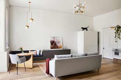
In a small apartment, it's all too easy for the rooms to feel like a rabbit warren, and those spaces to the back of your floorplan to feel starved of light. That was the case for this studio apartment in Melbourne, Australia, and in the hands of the architects at tsai Design, there was only one course of action - to open up the space.
'Our first move was to excise the half-height partition wall that defined the bedroom, creating a generous open plan living environment embracing the existing high ceiling,' explains architect Jack Chen, director of tsai Design.
A quick glance around this modern home and you'll probably wonder - where is the bedroom now then? Well, the bed has been integrated into this micro-apartment in a super clever way. In fact, you might not spot it at all. In fact, there are all kinds of genius ideas for small space living in this apartment. Take the full tour below, and then head to the end of this article to find out exactly where the bed is.
1. The 'entryway' closet

In the new layout, there's no distinct apartment entryway to welcome you into the space, but rather than have the owners come in and have to throw coats over the couch, Jack Chen introduced a piece of storage, which also allowed for a more minimalist kitchen design, too.
'With countless eateries on the doorstep, our client wanted a kitchenette instead of a traditional kitchen,' Jack says. 'To achieve this, we separated the full height fridge and pantry units into the entryway allowing us to create clear, clean lines.'
'It has a few functions,' Jack adds. 'It contains the fridge, pull-out pantry, a coat storage, and general big storage like for the vacuum cleaner, for example.'
2. The flexible dining table


A large table would have cannibalized the apartment living room and dining space, but for the potential of hosting a dinner party every now and again, the designers took a bespoke approach to furnishing this space. 'We custom designed the dining table for the apartment,' Jack tells us. 'The drop leaf table is an elegant folding table for two that expands into a dining table for six or more people when required.'

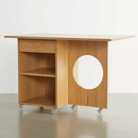
Flip down table, Urban Outfitters
Fold out dining tables rarely look as good as Jack's design, but if bespoke isn't in the budget, this offering from Urban Outfitters is ideal for a small apartment that needs flexible furniture.
3. This wrap around countertop

Instead of ending the kitchen countertop at the end of the run of units, the architects designed the space so that the surfaces wrapped around to incorporate the bathroom vanity, too. It may seem like a small detail, but it not only maximizes the countertop space, it adds storage and avoids visual clutter in the bathroom, all helping these rooms feel bigger.
'The expanse of counter space helps to create an impression of a larger space,' Jack says. 'It's 22 feet long all together.'
4. This cut-out door


But, wait, isn't that extra countertop in the space where a door would be? Jack's design only works because of a hidden door design that has the countertop and cabinet cut out of it.
'The door is designed to conceal, as the whole apartment is essentially one big space, the bathroom would feel quite exposed otherwise,' Jack says. 'It was constructed as a solid core door with concealed hinge - the solid panel allows us to reshape the door to suit the profile of the countertop running through.'
5. This kitchen turned closet

This timber-clad niche was once the apartment's kitchen, awkwardly small and ill-positioned for the studio's needs. 'One of the most challenging spaces we had to resolve was the tiny windowless kitchen,' Jack explains. 'We reconfigured this into the hero of the apartment, a luxurious walk-in closet.'
'This room is crowned with an elegant timber vault embracing the existing arch of the doorway to create a cozy, warm timber nook,' Jack adds, 'at once part of the now bright and welcoming open plan living, yet intimate and enclosed.'
But, where's the bedroom?
So, where's the bed? You might have guessed it, but it's hidden away in the walk-in wardrobe as a Murphy bed. And while it might seem like a tight squeeze to climb into bed at night, this space has been cleverly designed to work wonders for this small space.
'We created two nooks on either side of the bed head, creating an additional 24 inches on either side to make you feel like you can stretch out without being confined,' Jack says.
It also doesn't put your closet out of action when the bed is lowered. 'We designed the wardrobe to make sure it can function with the bed up or down,' Jack tells us. 'I think realistically sometimes you just want a lazy day and leave the bed down, so we made sure the wardrobe is designed with this in mind.'

Be The First To Know
The Livingetc newsletter is your shortcut to the now and the next in home design. Subscribe today to receive a stunning free 200-page book of the best homes from around the world.

Hugh is the Editor of Livingetc.com. From working on a number of home, design and property publications and websites, including Grand Designs, ICON and specialist kitchen and bathroom magazines, Hugh has developed a passion for modern architecture, impactful interiors and green homes. Whether moonlighting as an interior decorator for private clients or renovating the Victorian terrace in Essex where he lives (DIYing as much of the work as possible), you’ll find that Hugh has an overarching fondness for luxurious minimalism, abstract shapes and all things beige. He’s just finished a kitchen and garden renovation, and has eyes set on a bathroom makeover for 2024.
-
 The 12 Best Table Lamps for Reading —I'm a Certified Bookworm (and Shopping Expert)
When it comes to table lamps for reading, I don't mess around. If you're the same, this edit is for YOU (and your books, or course — and good recommendations?)
By Brigid Kennedy Published
-
 "It's Scandi Meets Californian-Cool" — The New Anthro Collab With Katie Hodges Hits Just the Right Style Note
The LA-based interior designer merges coastal cool with Scandinavian simplicity for a delightfully lived-in collection of elevated home furnishings
By Julia Demer Published

