This kitchen's designer went through rounds and rounds of tests before perfecting this pink-tinged cabinetry stain
This cool, calm kitchen features warm-toned cabinetry that has been uniquely and expertly stained to suit the room's exact lighting conditions
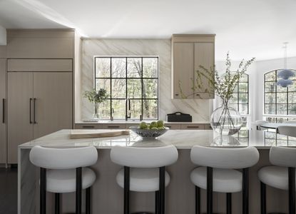

Creating a cool and calming kitchen that doesn't fail on functionality isn't easy, but this recent renovation by Nicole Hirsch Interiors gets it just right. Located on the outskirts of Boston MA, the kitchen of this family home was in desperate need of a modern refresh. Now, thanks to the work of Nicole and her team, it's a modest, minimalist, and totally serene space with beautifully understated warm-toned cabinetry.
With three college-age daughters, the client wanted a kitchen and breakfast area suitable for entertaining. Filled with convivial curved furniture, fun pops of color, and functional finishes, this space is now the ideal spot for friends to gather. The neutral scheme is punctuated with clean, matt black hardware that helps modernize the room and offer a contrast to subtler hues, such as the delicate pink-tinged wood stain on the cabinets.
'The aim of the kitchen was to create a livable, clean space for a large family to enjoy cooking and time together,' explains Nicole Hirsch, founder of Nicole Hirsch Interiors. 'I think the final results are a perfect blend of function and style which is exactly what this family needed. It's also timelessly elegant which was one of the main goals when creating the design brief for this space.' Below, Nicole explains more about how she turned the faded kitchen into a cool, calm chillout zone perfect for this modern home.
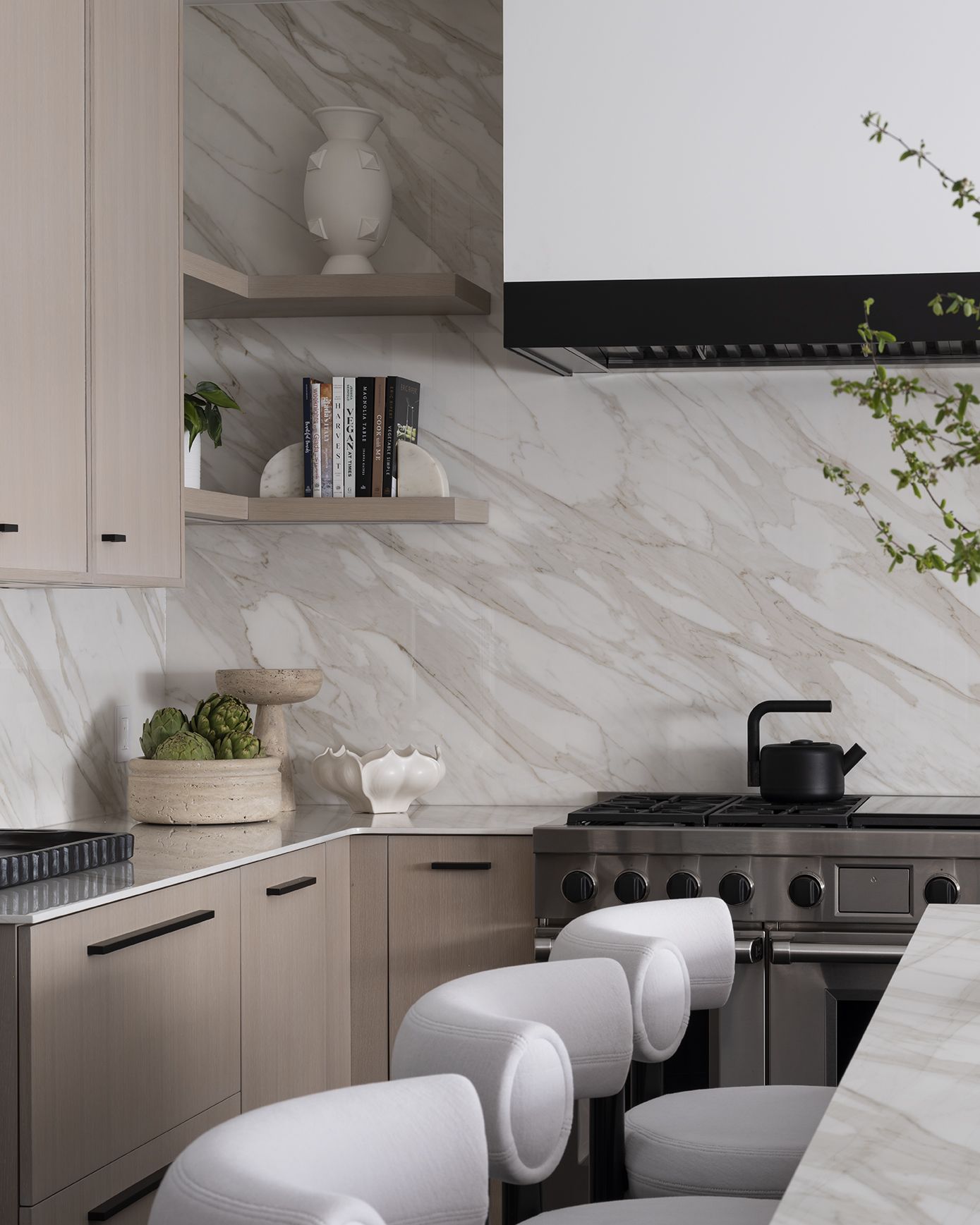
By far the prettiest addition to this modern kitchen is the delicate taupe-colored cabinetry which marries perfectly with the veining in the Calacatta Gold backsplash. Rather than use a paint color, however, Nicole and her team used a custom millwork stain for this truly unique shade.
'We worked with Pierre Matta and his team at Newton Kitchen Designs for this project. No one can master the very tricky and delicate art of achieving the perfect custom millwork stain like he and his team,' explains Nicole of Nicole Hirsch Interiors. 'This is not a paint color, but the perfect blend of multiple hand-rubbed stains to achieve the perfect combination of wood grain and finish.'
To get there, they started with white oak cabinetry and went through rounds of mixes to get the perfect shade for this serene space. The delicate pink tinge makes for a beautifully warm feel when combined with general natural lighting. 'When building out this space we removed the small older window on the sink wall and replaced it with a much larger one, so there's a ton of natural lighting coming in,' Nicole says. 'We had to evaluate each round of stains in the space to make sure it married perfectly with the light streaming in.'

For a modern feel, those delicate tones are contrasted with matt black finishes on the window frames, cabinet hardware, and bar stools. Despite the black flooring it avoids feeling overbearing, instead working to layer the space from top to bottom in a gradient of neutral color.
'The beauty of this kitchen really lies in its clean lines and elegant mix of materials,' explains Nicole. 'The way the polished island stone pairs with the stained oak and the black metal and glass - there's nothing busy or ornate, but just an incredibly luxurious feeling.'

The kitchen island stools were sourced from Tom Dixon Studio and help to bring another structural element to the space, the clean lines of the black chair legs juxtaposed with the curved white backrest. 'We definitely played with various shapes in the space to make it feel a little softer,' adds Nicole. 'From a design standpoint, we worked very closely with Pierre to ensure all the angles and finishes were complementary to one another.' The monochromatic color scheme creates a sense of timeless luxury perfect for the kitchen, a space that's arguably the heart of the home.

Of course, that just left enough room for a hint of playfulness in the dining area. Pops of pastel color in the pendant lamps and wallpapered display cabinet interior pair beautifully with the taupe tones, but depart from the otherwise neutral feel. For Nicole, these subtle spatterings of color were essential in achieving a sense of visual cohesion in the open-plan space.
'We traditionally like to design with a very neutral color palette and heavily play up texture and mixes of material, so the basis of our design is always going to be calming, neutral colors,' she says. 'In this particular home, we wanted to sparingly bring in some unexpected accents and we decided to do this through kitchen lighting and the wallpaper we applied in the curved cabinet. We loved the moody shade of blue and how it gives an unexpected punch within the space.'
Amongst the many matt surfaces, the high-shine gloss sheen in the lighting also adds to the playful unexpectedness, injecting personality into this convivial space. 'The pendants are from &Tradition and come in various colors and sizes so we worked to create the perfect scale and configuration with the three pendants over the black oak dining table,' explains Nicole. 'With the arched cabinet details in the breakfast room, the unique shapes work together and add a sense of organic serenity and a more traditional accent to an otherwise very modern space.'
The result is a kitchen that's at once calming and convivial that also masters the transitional trend with just the right mix of classic and modern touches thrown in. It's a lesson in pairing style and functionality, and acts as the perfect chill-out zone for this modern family.
Get the look


Be The First To Know
The Livingetc newsletter is your shortcut to the now and the next in home design. Subscribe today to receive a stunning free 200-page book of the best homes from around the world.

Lilith Hudson is the News Editor at Livingetc, and an expert at decoding trends and reporting on them as they happen. Writing news, features, and explainers for our digital platform, she's the go-to person for all the latest micro-trends, interior hacks, and color inspiration you need in your home. Lilith discovered a love for lifestyle journalism during her BA in English and Philosophy at the University of Nottingham where she spent more time writing for her student magazine than she did studying. After graduating, she decided to take things a step further and now holds an MA in Magazine Journalism from City, University of London, with previous experience at the Saturday Times Magazine, Evening Standard, DJ Mag, and The Simple Things Magazine. At weekends you'll find her renovating a tiny one-up, one-down annex next to her Dad's holiday cottage in the Derbyshire dales where she applies all the latest design ideas she's picked up through the week.
-
 The 12 Best Table Lamps for Reading —I'm a Certified Bookworm (and Shopping Expert)
When it comes to table lamps for reading, I don't mess around. If you're the same, this edit is for YOU (and your books, or course — and good recommendations?)
By Brigid Kennedy Published
-
 "It's Scandi Meets Californian-Cool" — The New Anthro Collab With Katie Hodges Hits Just the Right Style Note
The LA-based interior designer merges coastal cool with Scandinavian simplicity for a delightfully lived-in collection of elevated home furnishings
By Julia Demer Published
