What pastel colors go together? 5 perfect palette pairings designers use to create relaxed and elevated schemes
Embrace the all-pastel look in the home for a bright interior full of the joys of spring with these effortless combinations
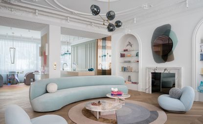

Pastel shades are playful without being too childish, sugary without being too sweet, and they have been slowly creeping into the color palette of the modern home.
From uplifting wall paint to big-ticket furniture items like a sofa, to the more decorative elements - color-pop kitchen appliances or perfectly placed cushions - you can count on pastels to bring joy into the home in a tasteful way.
'Color is incredibly emotive and we have deeply rooted associations with certain colors,' says says Jo Littlefair, co-founder and director of Goddard Littlefair. 'Layered onto this is a joyfulness when you see color and pattern mixed together in a skillful way that makes your heart sing a little. It’s experiencing something refreshing and just a little bit different or unexpected that gives us all mental lift.'
What unites pastels from across the spectrum is their inherent freshness due to their white undertones, meaning they work together with ease. Using pretty pinks with sky blues, buttercup yellows with pale greens creates a comprehensive scheme. ‘You can mix and match any pastel hues to create a symphony of happiness,’ says Emma Bestley, co-founder of YesColors.
Here’s my top five pick of pastel color combinations that bring living room color in abundance.
1. Lilac and mint green
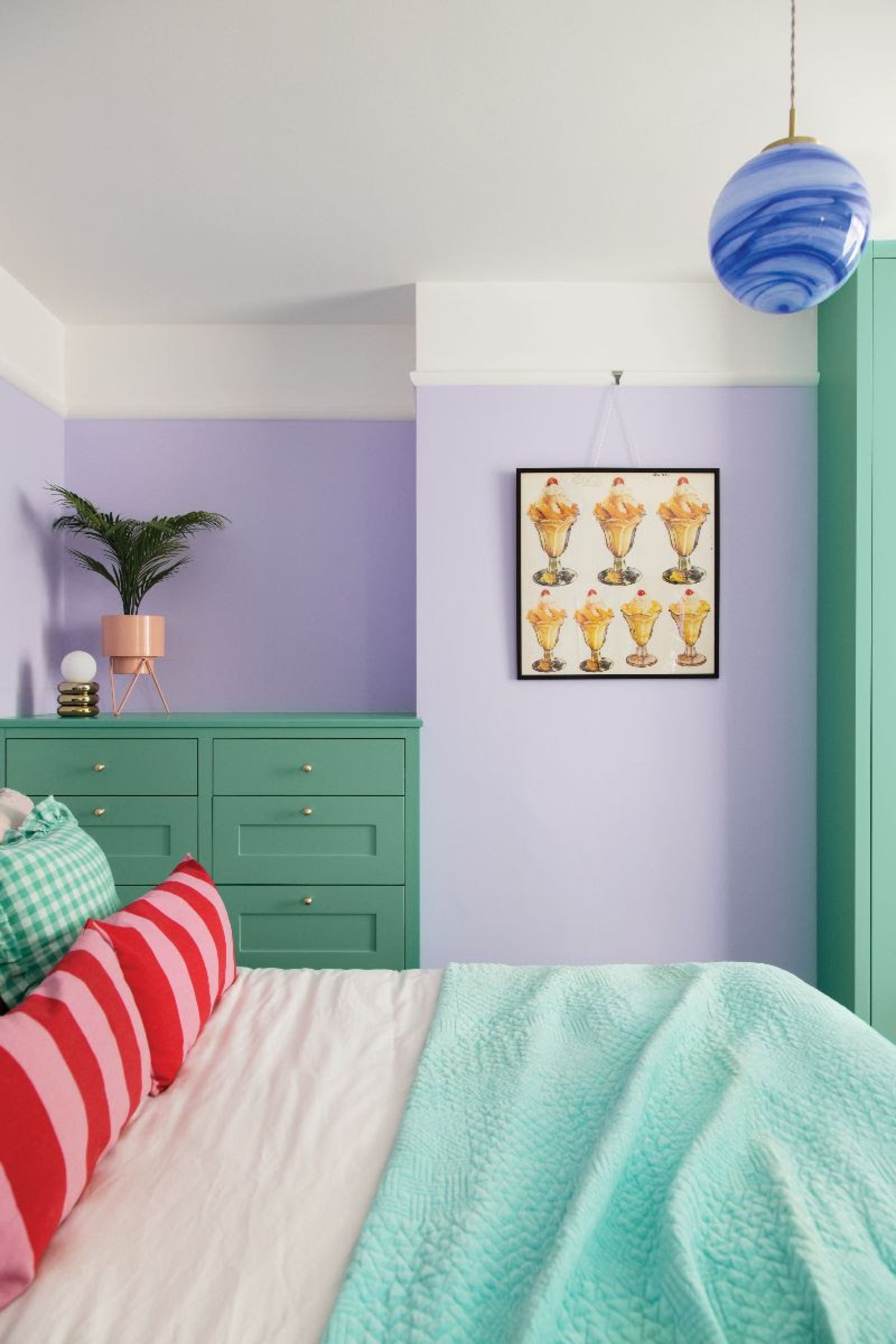
Lilac is having a bit of a resurgence. We've seen the color burst into the fashion world, and it’s filtered through to interiors too. Fresh and rejuvenating, it's no longer seen as outdated, especially when brought to life with a minty green. 'Lilac is having a real moment,' says Emma. 'As lilac is generally a cooler tone color, it works best in rooms that get lots of natural light. However, that’s not to say it wouldn’t work in other areas of the home. If the room is in a north-facing area and is usually cooler, lilac can be complemented with warmer hues like a soft green.'
This combination is a great option for a relaxing bedroom scheme that needs a new lease of life. With connotations of lavender, the two-tone effect gives off a peaceful and tranquil feel, not least because the plant has long been used for its medicinal properties to calm and relax. 'Soft, muted hues such as dusky lilac and sage green are tranquil in nature whilst also having a connection to botanicals and nature, and help relax our brains and entice creative thinking,' says Helen Shaw of Benjamin Moore.
'Pastels reflect more light into the eye, keeping you mentally active while providing good emotional support. These hues are great colors for walls or pieces of furniture if you find it difficult to wake up in the morning,' says Suzy Chiazzari, color and design consultant.
Finish off your relaxing bedroom by decorating with pastels in other shades - a pastel-colored taper candle or colorful coffee table book on your bedside table will do the trick and tie the space together.

Purple 06 matt paint
This comforting shade of lilac in a matt finish will create a tranquil atmosphere in any room, and with an undertone of pink to it, there is an underlying warmth that will radiate from your walls.
2. Pastel pink and light green
Pink is a great pastel shade to play around with because it is being redefined as a new neutral. ‘Because of their heavy white pigment, pastels can almost play as a neutral, and pale pink works best because it works with every color,’ says Tash Bradley, director of interior design and color specialist at Lick.
Pink and green is a classic combination that we have seen time and time again in interior design. It's timeless and shows no sign of waning, with pink bringing a warmth to the coolness of green.
But designers are having fun exploring the classic combination, mixing paler tones with more saturated versions of these colors to create a combination that is familiar yet unexpected.
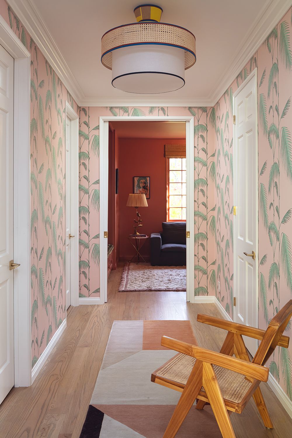
On a muted level, the combination of pastel pink and pastel green works to soften a space. You need only look at this calming hallway by LALA Reimagined to see the results. The colors work cohesively to bring a calmness to this high-traffic space, leading the eye through to the next room.
3. Pale pink and buttery yellow
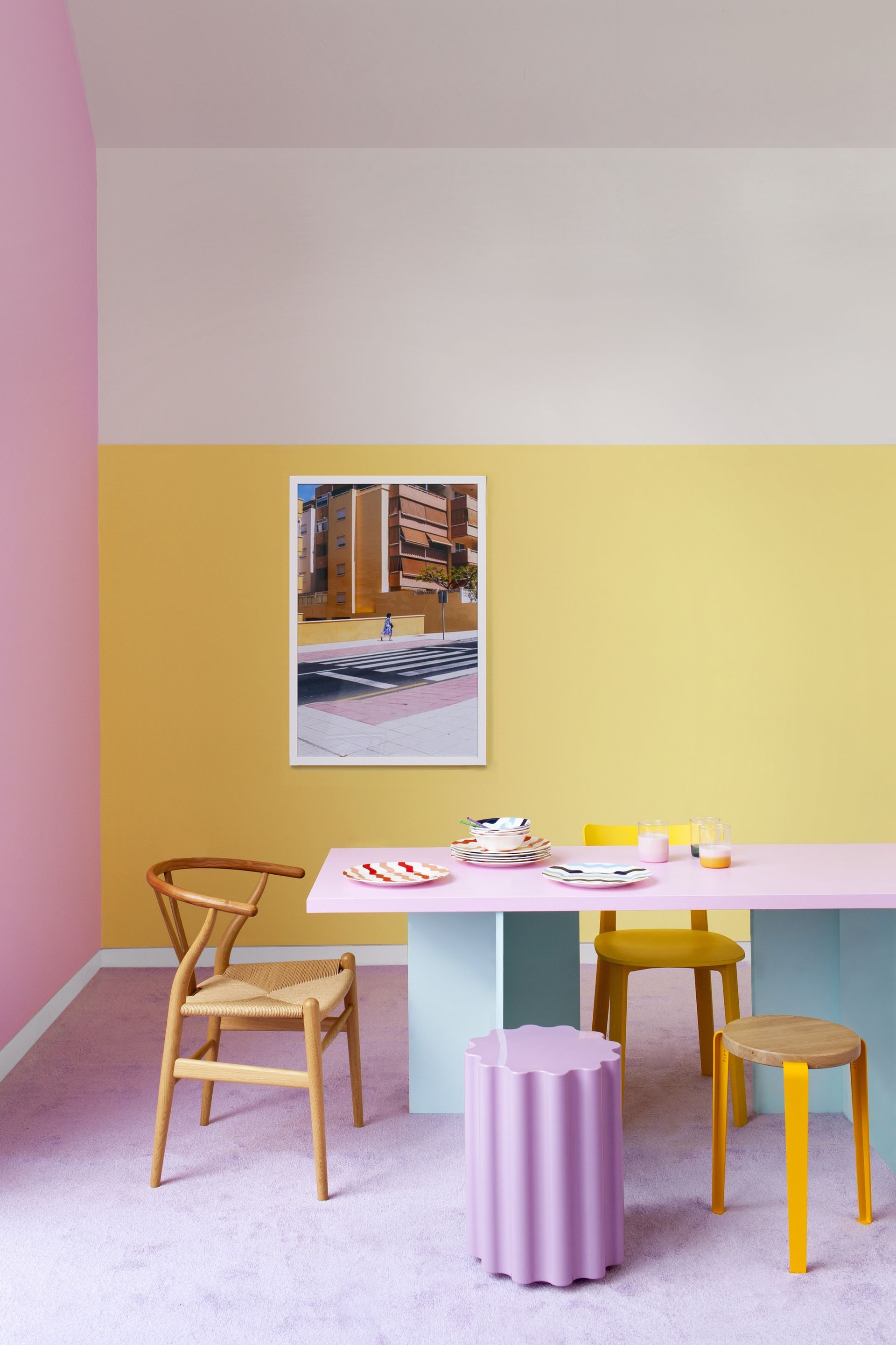
A pale, buttery yellow is a beautiful addition to your pastel scheme, and when paired with pastel pink can make for a charming finish. With strong connotations of spring, this tried and tested combination can bring an uplifting feel to your home, and the cheeriness of the yellow stops the pink from feeling too sugary sweet or Barbiecore.
As Nathan Cuttle, founder of Studio Nato explains, using pastel pink and yellow together can create a great foundation. 'Pastel colors make for an interesting background against which other colors can come forward,' he says.
'In the bathroom of a Brooklyn brownstone restoration, we used pastel yellow and pink in the room to provide a background against which the black aggregates of the terrazzo come forward in a beautiful, graphic way. This creates a room that is interesting but not overwhelming.'
Les Courbes Jaune poster from Desenio
Bring pastel yellow and pale pink together with a bit of wall art like this print from Desenio. The abstract illustration of light yellow coral has a modern graphic feel to it which can light up a dull white wall in need of some aesthetic attention. It's also a simple and inexpensive update you can make to bring joy to a space.
4. Pastel blue and pale pink

Pale blue is a color that goes with pink in a pastel tone as the coolness of blue works against the warmth of pink's red undertones, creating the perfect balance of color.
'A dusty blue is something I turn to a lot in my projects,' says interior designer Olivia Emery. 'It has a smart and serene feeling and when used with pastel pinks it lightens and softens the scheme.
'I think soft pinks against a light, pastel blue give a more subtle contrast than a white with a blue which is also a firm favorite.'
For this bedroom designed by Studio Nato, pink and blue work together perfectly as the choice of bed linen color, and using the pastel combination against a bright white wall helps the colors to really stand out. 'Using pastels was about creating a bedroom that felt calming and inviting,' says Nathan. 'The soft, muted colors also brought into focus the uniqueness of the materials and the interesting textures.'
5. Pale yellow and pastel green
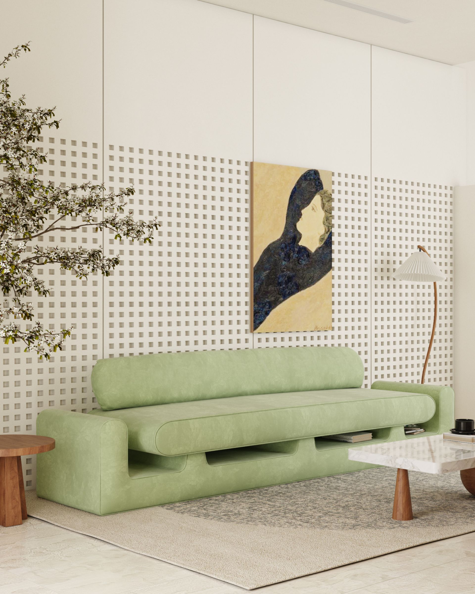
Pale green with a buttercup pastel yellow also works together to create an uplifting space. Yellow can be tricky to use. It is inherently vibrant, carrying energy with it wherever it is used in the home. But when toned down and used in an otherwise neutral and pared-back setting, like this pastel living room design from REJO Studio, it is calming and quietly positive.
It is also a great foundation from which to layer with other materials - think natural wood for a natural feel. 'We achieved harmony between the two colors by using specific materials and specific color shades to create a feeling in the space,' says Reem Olyan, founder of design studio, REJO Studio. 'It is not just the green and yellow colors here, it is the velvet and the rough white wall mixed with the wood of the table, which produce this harmonious scene as a whole.'

Riverdale green by Benjamin Moore
If you're looking for the ultimate pastel shade of green, this from Benjamin Moore is near perfect. It's got a yellow tinge to it, so in certain lights, it practically glows. Use on the walls and pair with decorative pastel yellows for space full of the joys of spring.
Be The First To Know
The Livingetc newsletter is your shortcut to the now and the next in home design. Subscribe today to receive a stunning free 200-page book of the best homes from around the world.

Oonagh is a content editor at Livingetc.com and an expert at spotting the interior trends that are making waves in the design world. Writing a mix of everything and everything from home tours to news, long-form features to design idea pieces on the website, as well as frequently featured in the monthly print magazine, she's the go-to for design advice in the home. Previously, she worked on a London property title, producing long-read interiors features, style pages and conducting interviews with a range of famous faces from the UK interiors scene, from Kit Kemp to Robert Kime. In doing so, she has developed a keen interest in London's historical architecture and the city's distinct tastemakers paving the way in the world of interiors.
-
 The 12 Best Table Lamps for Reading —I'm a Certified Bookworm (and Shopping Expert)
When it comes to table lamps for reading, I don't mess around. If you're the same, this edit is for YOU (and your books, or course — and good recommendations?)
By Brigid Kennedy Published
-
 "It's Scandi Meets Californian-Cool" — The New Anthro Collab With Katie Hodges Hits Just the Right Style Note
The LA-based interior designer merges coastal cool with Scandinavian simplicity for a delightfully lived-in collection of elevated home furnishings
By Julia Demer Published
