4 colors you should avoid painting your kitchen, according to designers and color experts
These are the shades you should never use in your kitchen if you want a welcoming space, say those in the know
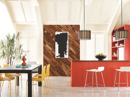

Deciding what color to paint your kitchen isn't an easy task. As the heart of the home, we tend to spend a lot of time in this functional space (including those groggy early morning starts), and so, you want to choose a color that will always be happy to greet you.
Whichever color you choose is also likely to be part of your home for several years. As such, you want a shade that's on-trend enough for a modern kitchen, while also having a timeless quality that will endure the years to come.
Anyone who's kept an eye on the latest color trends will know that this year has been all about embracing colorful hues, and the vast options out there make it easier than ever to build a home that reflects your unique personality and style. And yet, there are still some colors that just don't gel well with the atmosphere of a kitchen.
Color is subjective, and realistically, no color is out of the question - it's just a case of finding the right shade to compliment your space. With that in mind, we've asked a few of our favorite designers and color experts for their advice on which colors it might be safest to avoid when designing your perfect kitchen.

Lilith is an expert at following news and trends across the world of interior design. She regularly shares color stories with readers to help them keep up-to-date with ever-changing trends that promise to add personality into the home, as well as those you ought to avoid. For this piece, she spoke with designers and color experts to learn which colors you shouldn't use in your kitchen and why.
1. Bright red
We all know color has the power to completely transform a space. While bright bold colors can be fabulous, it takes a certain degree of bravery to use them in design as they come with greater risks.
'When choosing a color to paint your kitchen, it is the intensity and shade of any given color that is really going to determine how the space feels, along with how much of the color you use,' explains Chloé Batteson, interior designer at Batteson Studio .
As Chloé points out, this is particularly the case with bright reds. Despite being a popular choice for colorful kitchen ideas, scarlet and ruby hues can feel overwhelming, especially under the brighter lights typically used in this room.
'These shades create drama and can make a kitchen feel overheated and tiring, so they're best avoided unless you are aiming for a kitchen to be in and out of very quickly,' says Chloé. 'Try more muted earthy tones instead for a calmer atmosphere.'
Tobie Lewis of Valspar paints, is in agreement. 'The kitchen is a space where you should unwind and relax while cooking, eating or hosting your friends,' he says. 'For many, the color red is a bit too powerful, and quite distracting for this specific space.'
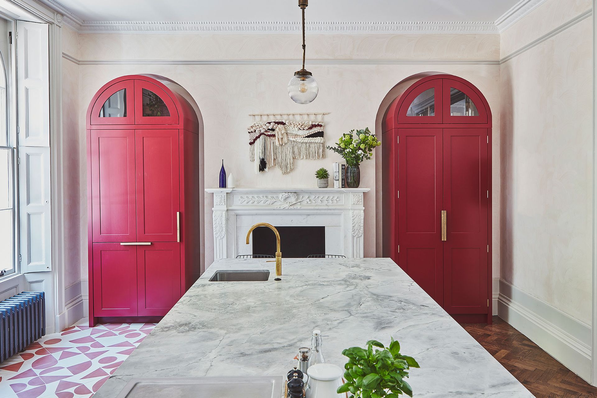
If you're still keen on adding brighter reds to your kitchen's color palette, consider using it on smaller areas like your cabinets or cupboards, as seen in this kitchen from Blakes London. 'This transforms the space by adding a pop of color into the room, without being too dominant,' Tobie adds.
2. Brilliant white
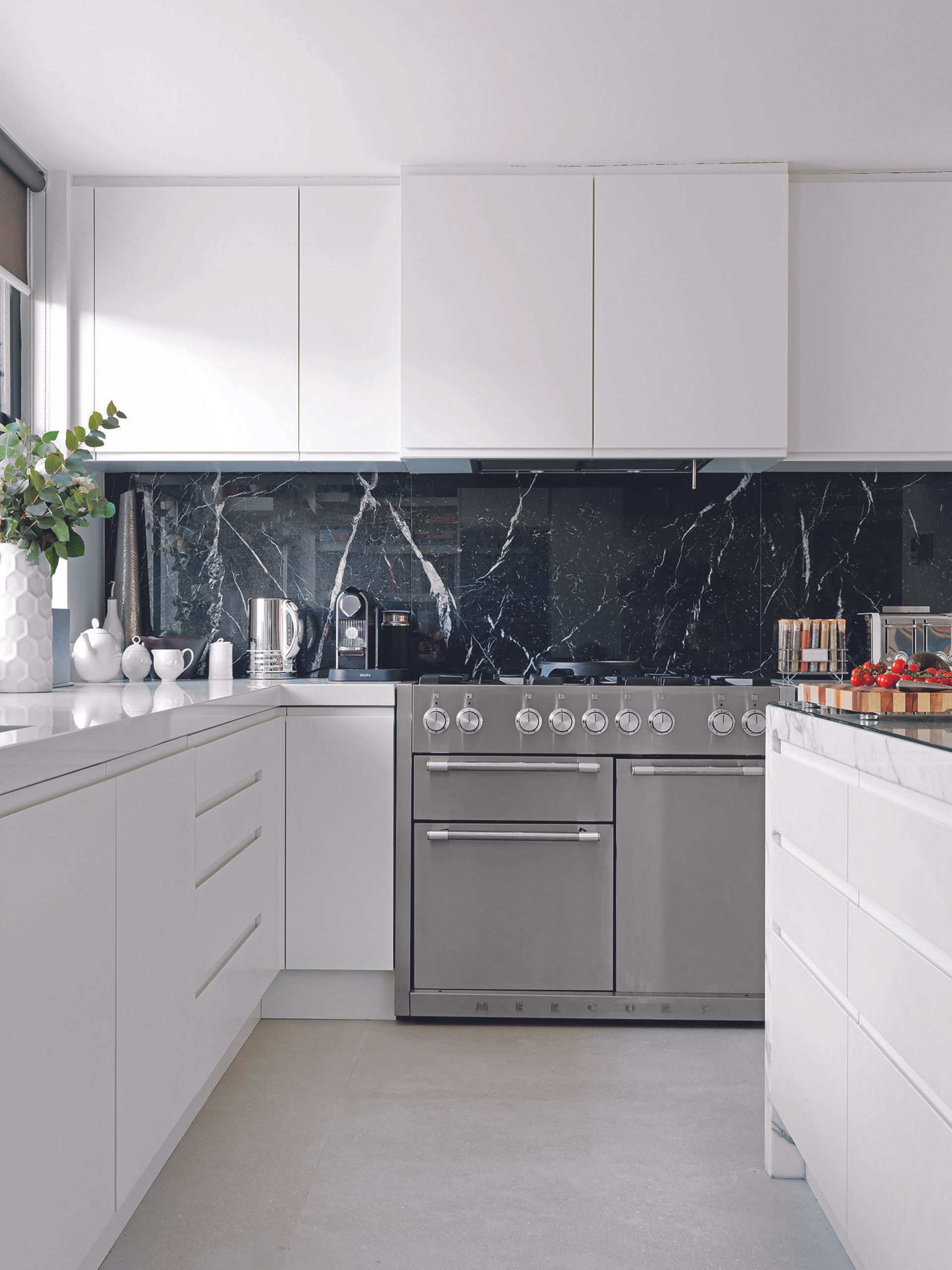
White kitchen ideas are the traditional choice for this room (and the walls of the home more generally). For most, bright whites are the default option as they make the space look clean and fresh. However, brilliant whites can make your space feel too clinical, as well as being impractical, we all recognize those stubborn tomato sauce stains on the wall, after all.
'I wouldn’t recommend brilliant white as it creates a cold and clinical environment and is not conducive to a homely feel,' Chloé says. 'As a manmade color it is the only one that does not appear in the natural world, making it feel particularly jarring.'
When it comes to how to make a white kitchen look warm, Chloé has some advice. She recommends looking at shades with warmer undertones like a soft pink or cream. A brilliant white can also work well with a gloss finish on your cabinets, especially when contrasted with darker colors elsewhere. Try using a dark marble or granite countertop or backsplash for a timeless yet modern look.
3. Dark brown
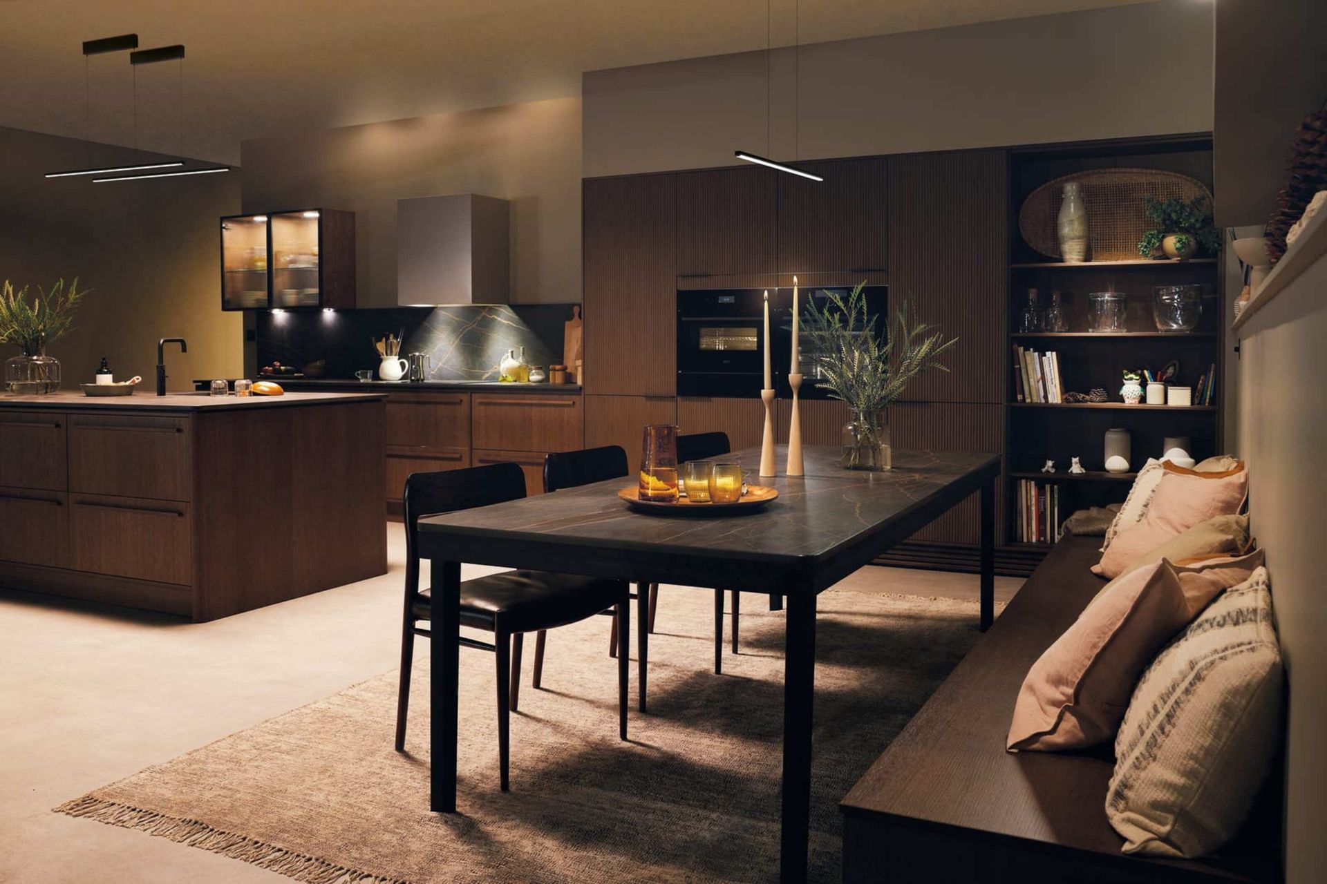
Brown might not seem like a controversial color for the kitchen, especially in light of the recent move towards more organic materials such as wooden kitchen cabinets. However, as the saying goes, you can have too much of a good thing.
The brown color trend certainly guarantees a modern look, but it isn't always executed well in the kitchen. 'If you want to keep your kitchen color scheme neutral, choosing shades of dark brown can leave the space feeling unwelcoming and uninviting, the last thing you want for a room that should be the soul of the home,' says Tobie.
In the case of browns, the key to success is tonal layering. Avoid color drenching and sticking to one hue. For example, you should avoid using dark walnut cabinetry alongside a dark brown wall. 'However, pairing neutral tones together by using one or two darker tones for cabinets can keep things interesting,' Tobie notes.
Try combining dark cabinets with a dark beige on the walls, with splashes of cream thrown into the mix. This can create a more comforting, homely feel instead of being oppressive.
4. Warm yellows
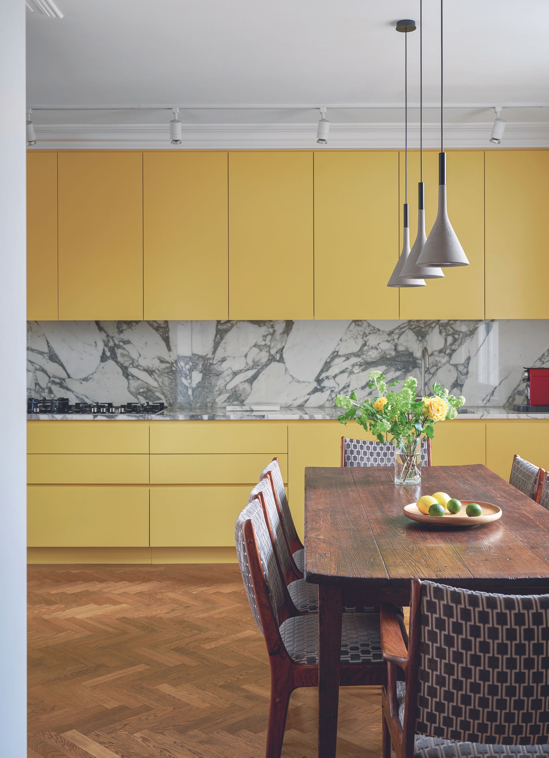
As an uplifting and cheery color, yellow might seem ideal for the kitchen - after all, drenching a room in this color is said to improve wellbeing. You might be tempted to add a warm glow with this shade so you're met by a sunny space when you wake up for your morning coffee, even in the depths of winter. However, it's a tone that experts encourage you to use wisely, if at all.
'We advise people to stay away from warmer colors like yellow and orange,' says designer Amy Youngblood, owner of Amy Youngblood interiors. 'These colors can easily make a kitchen look outdated and feel closed in and stressful.'
To embrace sunny shades for a yellow kitchen idea, she recommends using them on the cabinets instead of the walls for a bold statement that doesn't feel too overwhelming. You should also take into account the natural light in your room. West or south facing kitchens, especially those with conservatories or skylights, can be overbearing if painted yellow.
Instead, try a cooler yellow with greenish undertones for a more relaxing space. 'This is because cooler colors create a sense of calmness, and creams and white will actually make the space feel brighter,' says Amy.
Be The First To Know
The Livingetc newsletter is your shortcut to the now and the next in home design. Subscribe today to receive a stunning free 200-page book of the best homes from around the world.

Lilith Hudson is the News Editor at Livingetc, and an expert at decoding trends and reporting on them as they happen. Writing news, features, and explainers for our digital platform, she's the go-to person for all the latest micro-trends, interior hacks, and color inspiration you need in your home. Lilith discovered a love for lifestyle journalism during her BA in English and Philosophy at the University of Nottingham where she spent more time writing for her student magazine than she did studying. After graduating, she decided to take things a step further and now holds an MA in Magazine Journalism from City, University of London, with previous experience at the Saturday Times Magazine, Evening Standard, DJ Mag, and The Simple Things Magazine. At weekends you'll find her renovating a tiny one-up, one-down annex next to her Dad's holiday cottage in the Derbyshire dales where she applies all the latest design ideas she's picked up through the week.
-
 The 12 Best Table Lamps for Reading —I'm a Certified Bookworm (and Shopping Expert)
When it comes to table lamps for reading, I don't mess around. If you're the same, this edit is for YOU (and your books, or course — and good recommendations?)
By Brigid Kennedy Published
-
 "It's Scandi Meets Californian-Cool" — The New Anthro Collab With Katie Hodges Hits Just the Right Style Note
The LA-based interior designer merges coastal cool with Scandinavian simplicity for a delightfully lived-in collection of elevated home furnishings
By Julia Demer Published
