How to make a white kitchen look warm, interesting and full of life
Decor tricks for how to make a white kitchen look warm from an expert in home design

Every minimalist needs to know how to make a white kitchen look warm. For even if the palette you're playing with is sparing, there are still plenty of design tricks you can have up your sleeves to inject a bit of personality, charm and depth to a neutral scheme. Making that kitchen pale and interesting, as it were.
Kitchen color ideas often revolve as much around texture and finish as they do the actual hues. And this is never more true than with white kitchens, which require a bit of extra work to stop them seeming flat and dull. Thankfully, there are pletny of tricks for achieving a layered look with a pared-back palette, and Roundhouse Design’s Ben Hawkswell knows just how to do so. 'While I can appreciate the modern, architectural simplicity of a totally neutral palette, pairing a white kitchen with warmer materials is far more liveable,' Ben says.
How to make a white kitchen look warm

Kitchen designed by Roundhouse
1. Choose just the right shade of white

Kitchen designed by Roundhouse
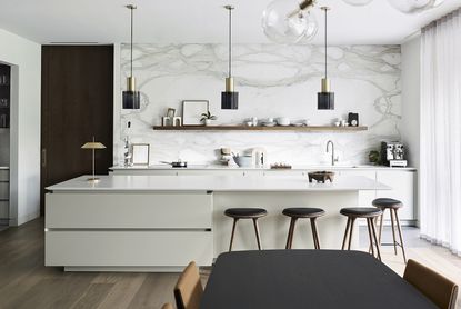
For this kitchen project, Ben knew the owners wanted a neutral space which celebrated the home's architecture and views, but that didn't mean he didn't want to think hard about his white kitchen ideas. 'Located centrally in the house, near the main entrance and with full-width garden views, the kitchen needed to be a striking focal point but also work in harmony with the natural colours outside,' Ben says.
'We started by selecting our core neutral, Hardwick White by Farrow & Ball. This clean off-white can look like a traditional grey in some lights, but it has chalky undertones that, in a sun-filled room, appears much brighter and more contemporary,' he adds. 'Most homeowners understand the benefits of testing paint colours in location but, with whites, it is crucial as they can be altered beyond recognition by light and shadow.'
2. Blend the countertop and cabinetry

Kitchen designed by Roundhouse
Unlike when it comes to two tone kitchen ideas, the trick with using white is to make the eye feel rested, like it can glide seamlessly over the room. This means picking complementary tones for fixtures and fittings alike. 'Using similar tones for the countertops and cabinetry provides a modern, modular look that’s particularly effective with a handleless design,' Ben says.
On closer inspection, you’ll notice the countertops are actually a few degrees whiter than the cabinetry, which was a deliberate move to create subtle contrast. 'Tonal variation is key when developing a neutral palette,' Ben says. 'A total white-out will look flat and bland.'
3. Play around with textures

Kitchen designed by Roundhouse
The finish is just as important as the tones, and this is a factor to include in your modern kitchen backsplash ideas. 'Switching textures can also help enliven a white kitchen,' Ben says. 'Here we used matt lacquer on the cabinets and the quartz worktops are honed, which is also matt, while the backsplash is polished. Again, it’s a subtle change, on a tactile level, but it can really add an extra layer of interest to a neutral scheme.'
4. Add details to edging
The chamfered worktop edge, sometimes called Shark’s Nose, is a contemporary detail that makes the surface look thinner without impacting structural integrity. It also adds a deep shadowline that matches the line of the recessed handles while making them easier to access.
5. Include some subtle patterns
The star of the show in this kitchen is undoubtedly the backsplash, proof that marble kitchen ideas are not going out of fashion. 'Early on in the project the owners knew they wanted an amazing stone feature and chose the striking Calacatta marble from a quarry in Italy,' Ben says. 'The base stone is a very crisp white, similar to the worktops, with veining that complements colour tones in the pale grey cabinetry. We worked with a specialist marble fabricator to achieve the amazing four-piece book-matching pattern that’s centred perfectly on the wall.'
6. Use wood to add warmth

Lastly, if you can stomach the idea of not having a totally all-white kitchen - and here at Livingetc we think it's the details that make a difference - then the odd flash of wood will truly lift the scheme.
Here, the shelf adds just a dash of warmth which truly lifts the whole scheme. 'Together with the walnut display shelf and rich timber flooring, the natural stone adds warmth to an otherwise neutral scheme,' Ben says. 'Which, overall makes it feel more homely yet still undeniably modern.'
Be The First To Know
The Livingetc newsletter is your shortcut to the now and the next in home design. Subscribe today to receive a stunning free 200-page book of the best homes from around the world.
Linda is a freelance journalist who has specialised in homes and interiors for the past 19 years, beginning on a trade rag for the Daily Mail Group and now writing full-time for the likes of Homes & Gardens, Livingetc, Country Homes & Interiors, Ideal Home and Real Homes. Linda is our resident mattress reviewer. She spends a couple of weeks on every mattress she tests for us, as does her ever-patient husband. In reviewing mattresses for us for more than two years, she has become something of a very opinionated expert. She lives in Devon with her cabinetmaker husband, two daughters and many pets, and is locked in an on-going battle to drag their red brick Victorian home out of 1970s swirly-carpet hell...
-
 How Can I Hide the Lights Under My Kitchen Cabinets? 4 Effective Ways to Conceal Wires
While undercabinet lights are super practical, they have a small downside — their visible network of wires can spoil the look of the room. Experts tell us how to hide this eyesore
By Aditi Sharma Maheshwari Published
-
 5 Things People With Flattering Bathrooms Never Have — (And You Shouldn't Either!)
Designers say you should avoid these five things if you want a bathroom that flatters your reflection and therefore uplifts your mood
By Oonagh Turner Published

