Colors That go With Burgundy — 11 Surprising Combos You Might Not Have Considered
These colors that go with burgundy help create the most captivating and deeply relaxing interiors, suggest experts


Given it's such a bold, moody shade, the number of colors that go with burgundy might surprise you. The right combinations can help tone down this deep red, and make it feel softer and more calming than you'd ecpect. In other, more confident pairings, It can create a dynamic look, trend-forward look.
'Sometimes interior design color trends mimic fashion yet it’s also not uncommon to see color trends work the other way around,' says Julia Mack, founder of Julia Mack Design. 'Consider the popularity of burgundy in fashion and you will notice how well it pairs with warm mushroom taupe, white, brown, and, of course, black. Also, burgundy stands up nicely to texture too – think of it on tweed, houndstooth, or a textural shag rug.'
It is a color that goes with grey, white, dusky pink, and blue as well as neutral shades. If you're looking for inspiration, you've reached the right place.
1. Blue

A complementary color for burgundy according to the color wheel is green, but burgundy is a color that goes with blue as well. The two tones can wonderfully offset each other and create a vibrant interior.
'Burgundy and blue work nicely if both colors are of the same value so when pairing the two, consider a dark burgundy with a dark blue or navy, especially if the goal is to have the color scheme balance, with neither taking the spotlight away from the other,' says Julia Mack, founder of Julia Mack Design.
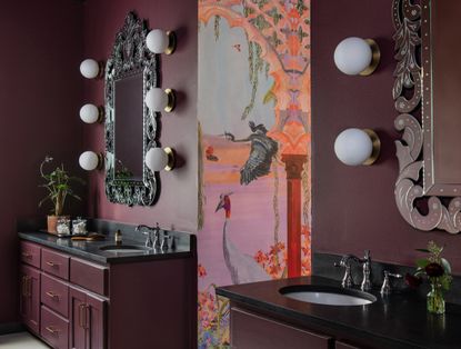
2. Pastel pink

If you want to decorate with pastels, a good way would be to bring in a grounding color that gives the entire scheme a grown-up look. Consider burgundy that acts like a neutral yet doesn't allow the scheme to look too saccharine or dull.
'The bathroom had an existing stained glass window that the client wanted to incorporate into the new design,' says Sarah Stacey, founder of Sarah Stacey Interior Design. 'It is fairly dramatic so we opted for a high-impact wallpaper so no singular element stood out. Careful consideration was given to selecting a color that not only complemented the wallpaper but also coordinated seamlessly with a rug in the nearby bedroom.'
3. White

While many colors go with red, a muted, neutral such as white or cream can help balance a scheme that otherwise might feel a little overwhelming. Create a tonal theme with various shades of red, and punctuate it with neutrals.
'If the color palette calls for burgundy paired with white, it is imperative to select a white that is more of a tonal cream color to avoid a sterile, clinical look,' says Julia. 'Consider a glossy cream paint color; maybe Farrow and Ball's New White No. 59 then add in light oak furniture with a textural cream boucle upholstery and an abundance of burgundy in textural linen throw pillows. Other places to add burgundy are in artwork and decorative accessories like eye-catching Venetian glassware vases and lamp shades.'
4. Grey

Another great way to create an impactful yet warm scheme is by pairing burgundy with charcoal or a light grey. Plus several colors go with light grey, allowing a third tone to join in, in the palette. A burgundy can be used as an accent tone in a grey-toned space, with upholstery, decor objects, or lights. It's almost like the interior design equivalent of an exclamation point.
'Burgundy is a rich sultry color that can be paired with several hues,' says Jasmin Reese, founder of Jasmin Reese Interiors. 'Burgundy paired with greys works best when the other materials are an eclectic mix of materials like brass, wood, and fabrics to make the color stand out.'
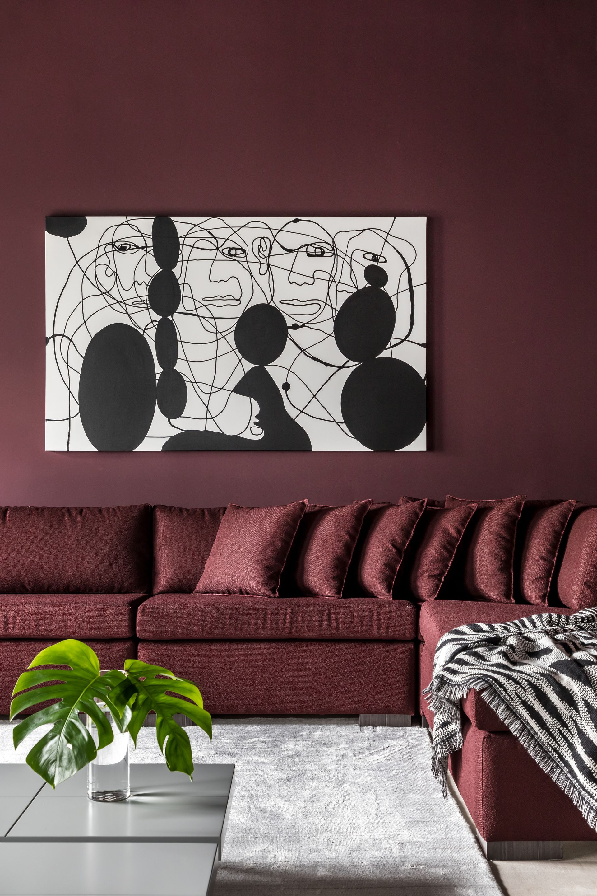
5. Black

To crank up the drama, a black and burgundy combination could be a good way to go. Amongst the colors that go with black, burgundy could contribute to creating a moody, caved-in style interior. Two dark tones can create a layering like no other; although you may want to ensure that the space is well and evenly lit. Add touches of neutrals to open up the space just a bit.
'The beauty of burgundy is it has a very interesting range of variations – from brown untoned burgundy to plum with more of a rosy purple-plum feel to it,' says Jane Lockhart, founder of Jane Lockhart Design. 'There is also a 'blackened' burgundy where the color is super saturated with black, which can make an excellent alternative to blue-based black and gives a warmer, more luxurious feel. Burgundy is a color that almost always has a feel of luxury and history to it, given its naturally deep color value.'
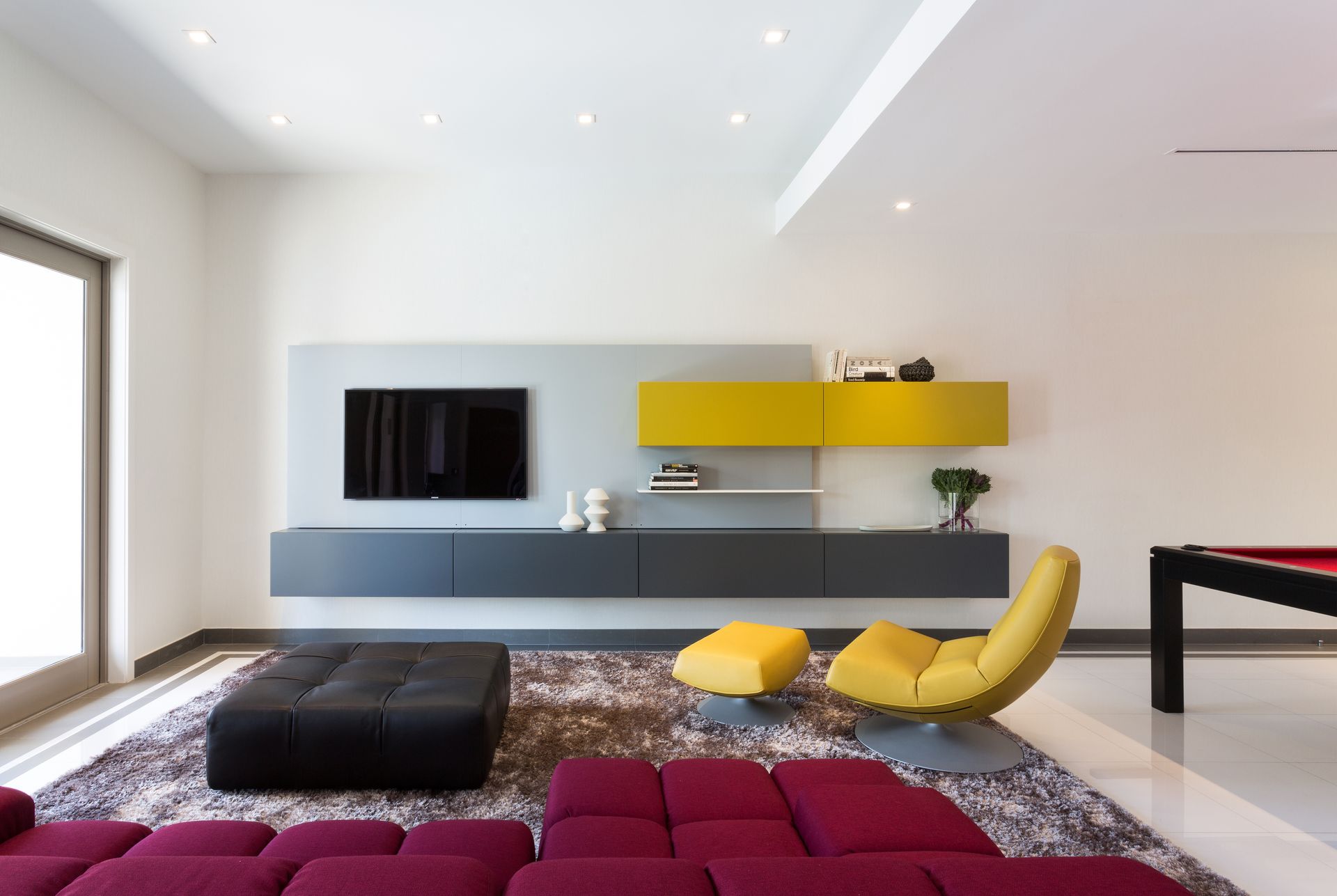
6. Yellow

For an interior that is immediately striking and color-rich, you could consider a triadic scheme. This means, combining three colors on the color wheel. An example of this scheme would be burgundy, navy blue, and mustard yellow. These tones together can help give life to a staid space and inject a fun energy. Consider this for your bedroom or living room paint color ideas.
'Our client wanted a bold and fun use of color for this living room,' says Jacqueline Gonzalez Touzet, principal of Touzet Studio. 'Her favorite colors were plum and burgundy, which are used throughout the house. For this particular assemble we added chartreuse for another pop of color.'
7. Gold

A deep-toned burgundy has an inherent royal, rich and sophisticated quality to it. A good way to add to its charm is to complement it with jewel tones of gold or silver. For a home office paint idea, consider drenching the walls in this earthy red tone, and adding a glittering copper element for a little bit of oomph, as seen in this image.
'We took advantage of this nook in the overall front space,' says Barbara Reyes, director of design, interiors and branding at Frederick Tang Architecture. 'We wanted to visually separate this from the rest of the room, which is painted in a lime wash green. A metallic copper wallpaper in burgundy was by Sarkos called Elia in Sun Drench. Because it is next to the window, the light hits the wallpaper, offering an overall shimmer.'
8. Orange

Pull the red tones out of a burgundy shade by pairing it with a subdued orange to create real warmth. The reason burgundy works as a color that goes with orange is because the two are so similar, creating the perfect monochromatic room.
'This is a dynamic color combo and one that speaks of intensity and drama in a space,' says Jane. 'A blue or pinkish-toned burgundy paired with a bright orange will help make each color hum when side by side. To lower the intensity of these colors together, select a burgundy with a deeper brown undertone so it blends more with the orange. Look for wallpaper or fabric that bears this combination to tie these two colors together, then continue to add each of these colors in separate materials, accessories, or furniture.'
9. Pale pink

Burgundy is a color that goes with pink, especially in light, dusky tones, giving a good balance of shade.
'Being a deep jewelry tone, burgundy can be quite a moody color by itself,' says creative director and founder, Fanny Abbes from the NYC-based firm, The New Design Project.
'That said when paired with a lighter color like light pink or with brighter patterns, especially in a fairly bright room it takes on another life whilst still keeping its intrinsic strong character making it a focal point without being overpowering.'
10. Red

Burgundy is a form of deep red on the color wheel, so is a color that goes with red in lighter tones well.
By pairing the tone with others from the same family, it can work to blend the color scheme and keep your interiors warm. Here, a dark burgundy choice of paint provides a great background for the light pops of red to come to the fore in the form of the lamp and accent soft furnishings on the bed.
'If you are looking for a big wow factor for your room, consider a deep, dark burgundy for your walls then pair it with red accent colors, keeping in mind that it’s all in the balance, not the clash of warm colors,' says Julia. 'The key is to add enough of a creamy white to the color palate. Here’s how: begin with dark burgundy walls which will recede in your space then add in a textural white. Consider a warm tonal boucle, then add the pops of red as an accent color in throw pillows, artwork, and decorative accessories to create eye-catching warmth and a layered, interesting space. Remember to make thoughtful selections that work in your room; not overwhelm it.'
11. Green

Burgundy, according to color theory, is one of the best colors that go with green, given its position on the color wheel. Opting for a dark tone of green, like a deep, muddy olive green can work well as a combination, reminding us of nature and bringing a real cozy feel to a scheme.
'Burgundy with green is a timeless combination seen in tartans, plaids, paisley, and floral prints from bygone eras,' says Jane. 'Burgundy and green naturally complement each other because they sit opposite one another on the color wheel. This means they intensify each other when used together, which ultimately results in more visual energy within a room. Paint walls a medium-toned olive green and add burgundy pillows to neutral furniture if you want to try using this combo together. This is an easy way to manage the color combination as pillows can always be changed.'
How do you make a burgundy scheme feel cozy?
Size should be a consideration, but the mood you are looking to create and the level of light in the space are far more important to consider. Dark hues such as burgundy are wonderful for bringing a real sense of opulence and warmth to a space.
Consider adding a palette of richer colors to create a cocooning space that you can relax in. You could paint all four walls in a dark, inviting hue of burgundy, using a lighter shade on woodwork or alcoves with the same undertones to add contrast. These colors work beautifully in any space in the house which you would like to feel intimate and restful.
What color flowers go with burgundy?
If you're using burgundy-toned flowers such as roses, dahlias, and ranunculus, consider pairing them with more muted flowers such as peonies or hydrangeas.
3 paint colors to pair with burgundy

Type: Acrylic
Price: $75 for 3 liters

Type: Water-based paint
Price: $70 for 3 liters

Recommended Primer & Undercoat: Red and Warm Tones
Price: $74 for 2.5 liters
Be The First To Know
The Livingetc newsletter is your shortcut to the now and the next in home design. Subscribe today to receive a stunning free 200-page book of the best homes from around the world.

Oonagh is a content editor at Livingetc.com and an expert at spotting the interior trends that are making waves in the design world. Writing a mix of everything and everything from home tours to news, long-form features to design idea pieces on the website, as well as frequently featured in the monthly print magazine, she's the go-to for design advice in the home. Previously, she worked on a London property title, producing long-read interiors features, style pages and conducting interviews with a range of famous faces from the UK interiors scene, from Kit Kemp to Robert Kime. In doing so, she has developed a keen interest in London's historical architecture and the city's distinct tastemakers paving the way in the world of interiors.
-
 How to Thaw a Frozen Pipe — Learn Everything You Need to Know in 5 Minutes With This Guide
Winter storm caught you off guard? We asked an expert — just how do you thaw a frozen pipe?
By Hugh Metcalf Published
-
 The 12 Very Best Silk Bedding Pieces — As Our Style Editor Says: 'It's What Dreams Are Made Of!'
Slumber in lustrous luxury with the very best silk bedding sheets, duvets, pillowcases, and more — your sleep score will thank us later
By Julia Demer Published

