Colors that go with orange – from vibrant citrus to earthy terracotta here's how to use this versatile shade
Orange can be a tricky color to navigate, but finding the right colors that go with orange means you can include it with confidence using advice from our experts

Orange is a color that grabs your attention, and if you want it to be for the right reasons, you’ll need to know the best colors that go with orange. While its arresting character is undeniable, it’s also fundamentally a warming tone making it the perfect hue to hunker down within the season ahead.
It’s a color that’s rooted firmly in nature too as Rob Whitaker, Creative Director at Claybrook, explains, and color theory experts oftern use it to bring an earthy warmth to a space. ‘It has associations of spice and taste for many people, due to so many fruits and vegetables being this mix of red and yellow. It’s also the color of Autumn as leaves start to lose their pigment, and so considered a nostalgic hue as summer ebbs away,’ he says. ‘These links to the cycle of life and the natural world make it a popular choice for interiors; reflecting a yearning for renewal and regrowth, future possibilities and adventure.’
So whether you’re wanting to make a bold statement and bring a new color trend into your decorating scheme, or get cozy with a palette of sunset tones, we asked the experts for their advice on the best colors to pair with orange.
What colors work well with orange?
‘Orange has long been recognized by color experts as stimulating, even a little unconventional’, says Rob Whitaker, Creative Director at Claybrook. Created by mixing primary colors red and yellow, it’s an instantly striking tone that feels vivacious and energetic.
Its root colors are a good place to start when it comes to creating a cohesive decorating scheme. ‘Pinks, corals, and yellows are all complementary shades within a similar spectrum,’ says Rob. ‘You can lean into its warm and natural feel by using this muted, dusky palette and layering it within a room across lots of different textures.’

What colors go with burnt orange?
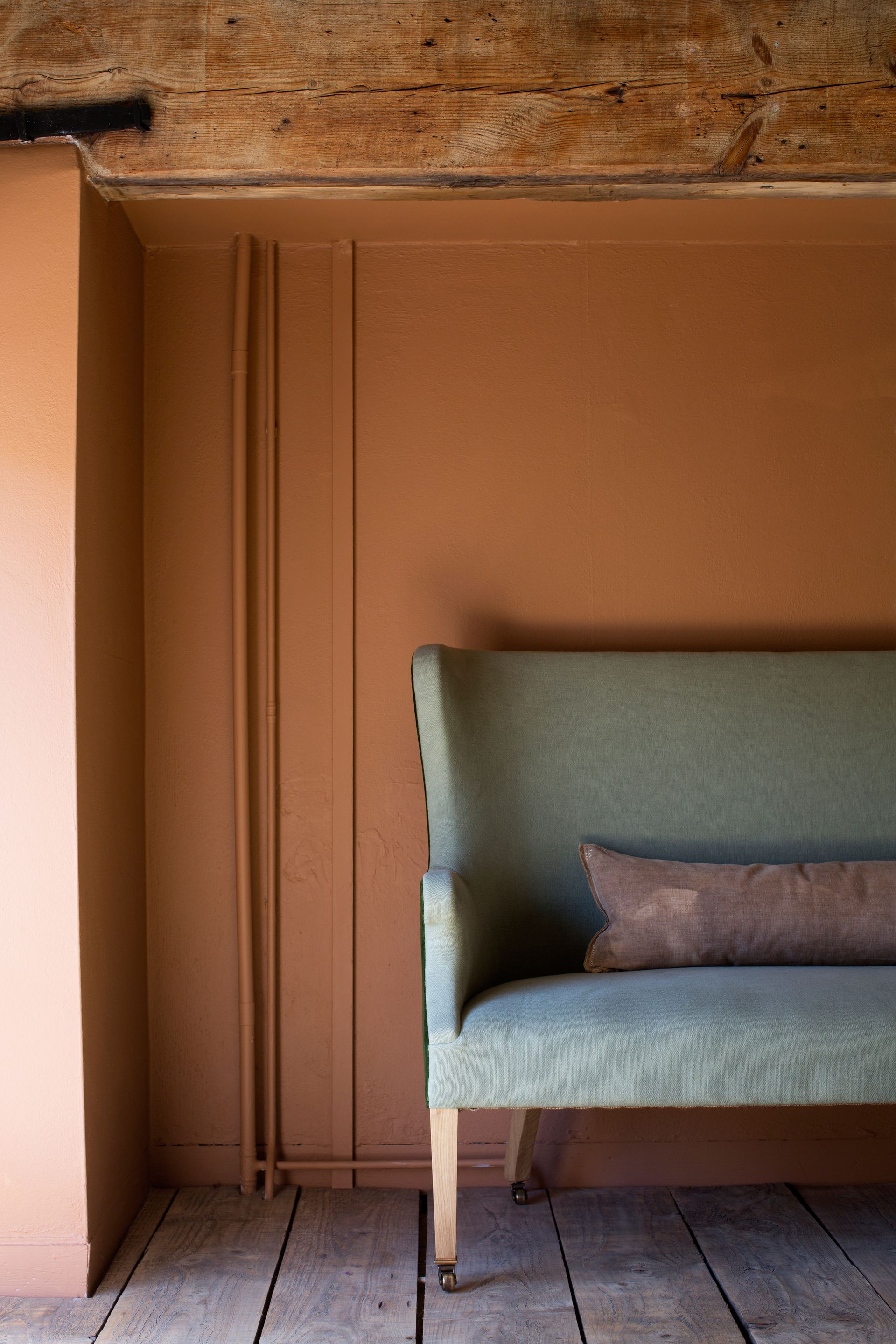
If this more muted approach appeals, you may want to look towards earthier shades. Terracotta, sienna, and burnt orange are easy to decorate with and layer into many schemes comfortably. Atelier Ellis’ paint color ‘Hari’ is a particularly pleasing option. ‘We love Hari as it is an incredibly warm, happy, and saturated hue’, says the founder Cassandra Ellis. ‘By using umber as a pigment to ground it, it’s super easy to live with and loves to host art and objet’.
Tapping into these earthy pigments is the key to finding colors to work with it. ‘We like to pair burnt orange with other colors you might find in nature,’ says Cassandra. ‘Warm browns, soft greens, pale blues or umber-based pinks. It makes a room feel very human and comfortable to be in.’

Does orange go with black?
For something altogether bolder, you can’t beat the dramatic combination of orange and black. It may signal a warning, but it’s also a sign of style and color confidence. ‘Black is a fabulous accent color for a hot orange because it allows the orange to project more vividly,’ explains Annie Sloan, Colour and Paint Expert. ‘Our eyes interpret the orange as being even crisper, more vivid and brighter when transposed against a dramatic black.’
Annie advises using black accents sparingly and introducing a third shade into the mix. ‘I absolutely adore vivid, juicy, Vitamin C packed orange with a soft pastel pink. I’m hoping it’ll be the new green and pink for 2022, because it’s such a rewarding contrast and the juxtaposition is knowingly retro yet elegantly contemporary,’ she says. ‘Both colors are playful and beautiful, so they work fabulously in a social space such as a kitchen, living room or diner.’

Neutral colors that go with orange
As with any other color, there are certain neutrals to look out for when creating a scheme with orange. While there is a vast spectrum of shades to choose from, it’s key to pick the right one for a harmonious look, rather than something that will fight with the vibrancy of orange. Stark or brilliant white is off the cards, and won’t do your scheme any favors. Instead, Ruth Mottershead, Creative Director at Little Greene, advises going for something more subtle.
‘A pop of bright, rich contrasting color is a great way to add impact, but keep the rest of the scheme muted,’ she says. ‘Bright and warm oranges such as ‘Marigold’ work beautifully alongside both mid-tone greys and cooler greys, while a warm white is ideal if you want to create a little more contrast’. Orange bathroom accents are a good way to add a hit of warmth to a functional space.
Annie Sloan agrees, ‘The knack is to treat the rest of your space with restraint; a very soft, slightly warm grey will allow the orange accents to do the talking rather than competing for attention.’

Is orange a good color for upholstery?
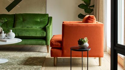
If orange on the walls or floor isn’t for you, then a sofa or armchair in this statement shade may be the answer. ‘We’ve definitely noticed an increase in popularity for orange shades,’ says Chelsea Appleford, Buying Manager at Arlo & Jacob. ‘The fashion world has seen a return to the aesthetics of the 1970s, which has directly influenced the world of interiors too - and orange shades fit right at the center of this trend.’
Despite its boldness, orange is a surprisingly versatile choice for upholstery. ‘In its brightest form it’s playful and lively so it brings energy to the room, while more muted and rusty shades work as a neutral base’, explains Chlesea.
Again, we can look to the natural world for inspiration on how to help oranges sit comfortably in our homes. ‘For a calm and grounding look, orange can be easily dialed back,’ says Chelsea. ‘Pared with olive greens, browns and russet reds, it creates a beautiful organic flow through a room.’

How to make an impact with orange
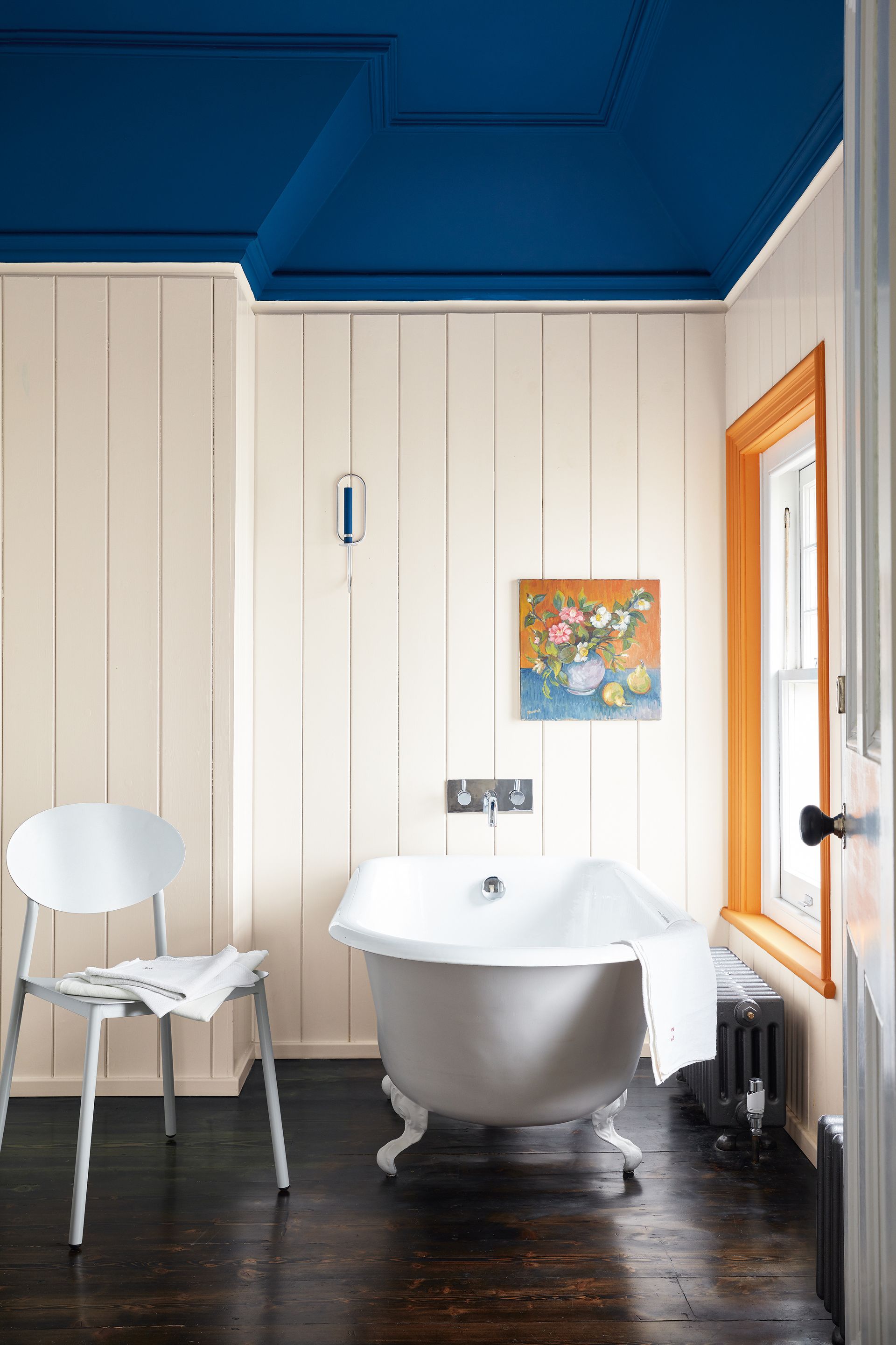
Take to the opposite side of the color wheel if you’re looking to make a statement with orange. ‘Orange and blue go well together as they are complementary colors, sitting directly opposite each other on the color wheel,’ explains Dominic Myland, CEO of Mylands. ‘The combination creates a dynamic look, while also being easy on the eye’.
The tone of blue you go for will impact the overall feel of the space. ‘A deep blue can make a bright orange feel heavier and more grounded, while a paler hue will bring a feeling of light and openness’, says Dominic.
Taking bright orange to the walls will offer maximum impact, but it won’t necessarily overpower a room if you follow Dominic’s advice, ‘Use pictures, wall art and large light fittings to break up the orange color on your wall, this will remove some of its punch for a more sophisticated look’.

Be The First To Know
The Livingetc newsletter is your shortcut to the now and the next in home design. Subscribe today to receive a stunning free 200-page book of the best homes from around the world.
Interiors stylist and journalist Amy Neason was the Deputy Style and Interiors editor at House Beautiful for years. She is now a freelance props and set stylist, creating work for a range of national publications and brands such as Imogen Heath. She has previously worked at Established & Sons, and her skills include styling still life and interiors shots for editorial features and sourcing unique products to create inspirational imagery.
She is particularly respected for interpreting seasonal trends into feature ideas and style stories.
-
 The 12 Best Table Lamps for Reading —I'm a Certified Bookworm (and Shopping Expert)
When it comes to table lamps for reading, I don't mess around. If you're the same, this edit is for YOU (and your books, or course — and good recommendations?)
By Brigid Kennedy Published
-
 "It's Scandi Meets Californian-Cool" — The New Anthro Collab With Katie Hodges Hits Just the Right Style Note
The LA-based interior designer merges coastal cool with Scandinavian simplicity for a delightfully lived-in collection of elevated home furnishings
By Julia Demer Published

